Jungle Scout Pricing Page Redesign
Nicole Buloran
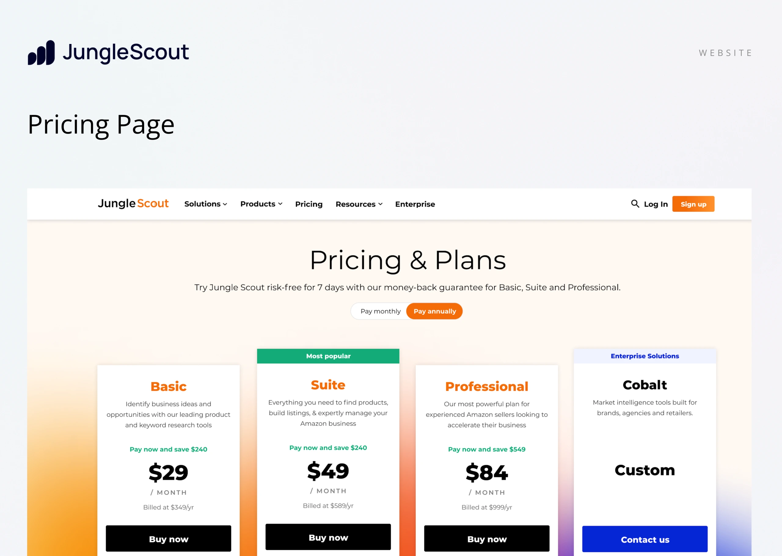
As Jungle Scout scaled, its pricing page—once functional—began falling short of both user expectations and brand positioning. Originally designed with incremental improvements over time, the page struggled to keep pace with the company’s evolving product offerings and growth trajectory. The Marketing team initiated a full redesign to address these challenges. The goal: improve clarity around plan value, reduce decision friction, and guide users more effectively toward conversion—all while elevating the overall user experience and aligning the page with the company’s maturing brand.
Identifying Pain Points
Unclear Value Communication: Inconsistent messaging made it difficult for users to understand plan differences, contributing to high churn.
Insufficient Content Clarity: The page failed to answer key user questions, leading to confusion, refund requests, and lost trust.
Low Enterprise Lead Quality: The structure and messaging did little to attract or convert qualified enterprise prospects.
Outdated Visual Identity: The design no longer reflected the brand’s maturity or product evolution, weakening credibility.
Cumbersome Content Updates: The internal team faced inefficiencies when updating pricing or content, slowing marketing and sales efforts.
Business + UX Goals
Optimize for Mobile: Redesign the layout—especially the feature comparison table—for improved usability and readability on mobile devices.
Unify Messaging: Clearly communicate the value of each plan and align messaging with users’ goals to reduce confusion and improve decision-making.
Reduce Churn: Increase transparency around plan inclusions to build trust and set accurate expectations.
Boost SMB Conversions: Drive new customer acquisition, increase billings, and grow ARR among small to medium-sized businesses.
Strengthen Enterprise Funnel: Improve messaging and structure to generate more marketing-qualified leads (MQLs) and sales-accepted opportunities (SAOs) for enterprise customers.
Phase One: Mapping Behavior & Aligning Strategy
To inform the redesign, we began with a deep dive into user behavior—analyzing both quantitative and qualitative insights to understand how users interacted with the pricing page and what obstacles they encountered.
Google Analytics: Entry Points & Messaging Continuity
We discovered that a large portion of users arrived at the pricing page from internal pages like the Estimator, Solutions, Features, and Homepage. This revealed an opportunity to improve content continuity. By aligning messaging and tone across these entry points, we created a more cohesive user journey—keeping users engaged and reinforcing their purchase decisions as they moved toward checkout.
FullStory: Interaction Insights
High-Intent Behavior: Most users scrolled directly to the pricing table, confirming their intent to compare plans.
UI Confusion: Many users clicked on non-interactive, styled text—signaling a need for better visual hierarchy and clearer affordances.
Team Alignment & Scope Planning
With insights in hand, we defined the project scope, timeline, and technical feasibility. This included close collaboration between the design team (3), developers (2), and the product manager to ensure a well-aligned, realistic execution plan built on real user data.
Phase Two: Wireframes & Visual Strategy
Structuring for Growth
In this phase, we moved into wireframing with a dual focus: improving usability—particularly on mobile—and aligning the design with growth objectives for both SMB and enterprise segments.
Key strategic priorities included:
Balanced Visibility: Elevating both SMB and Enterprise plan visibility to serve diverse audiences without overwhelming users.
Pricing Table Optimization: Designing for clarity, ease of comparison, and mobile responsiveness to reduce decision fatigue.
Conversion-Driven Elements: Thoughtfully placed CTAs and urgency cues to guide user flow and increase plan selections.
By focusing on layout clarity and strategic UX decisions, the wireframes laid the groundwork for a high-performing pricing page that supports scalable business growth.
Evolving the Visual Language
While Jungle Scout’s brand identity was already established, the original pricing page leaned heavily on greys and oranges—creating a somewhat flat, incomplete experience.
To elevate the design and user engagement without straying from the brand, we introduced tertiary colors and refined spacing, adding visual depth and hierarchy. The result: a more vibrant, intuitive interface that feels on-brand, modern, and purposefully designed to guide user action.
Phase Three: Bringing It All Together
A Unified, High-Impact Experience
The final design brought together all strategic elements—clear messaging, balanced layout, and visual refinement—to create a cohesive, user-friendly, and conversion-focused pricing page.
The result is more than just a new layout—it’s a narrative-driven experience that:
Engages users with a clear value proposition
Encourages exploration through intuitive structure
Reinforces trust with consistent branding and transparent plan details
Company-Wide Launch & Reception
The redesigned pricing page was unveiled during a company-wide town hall, where over 300 employees saw firsthand how the new design aligned with business goals and user needs. The presentation highlighted key improvements in usability, accessibility, and conversion strategy—and the response was overwhelmingly positive.
Like this project
Posted Oct 14, 2025
Redesigned Jungle Scout's pricing page to improve user experience and conversion rates.