Vitrum Group — A Renewed Brand Vision
Luís Teixeira
Vitrum Group — A renewed brand vision
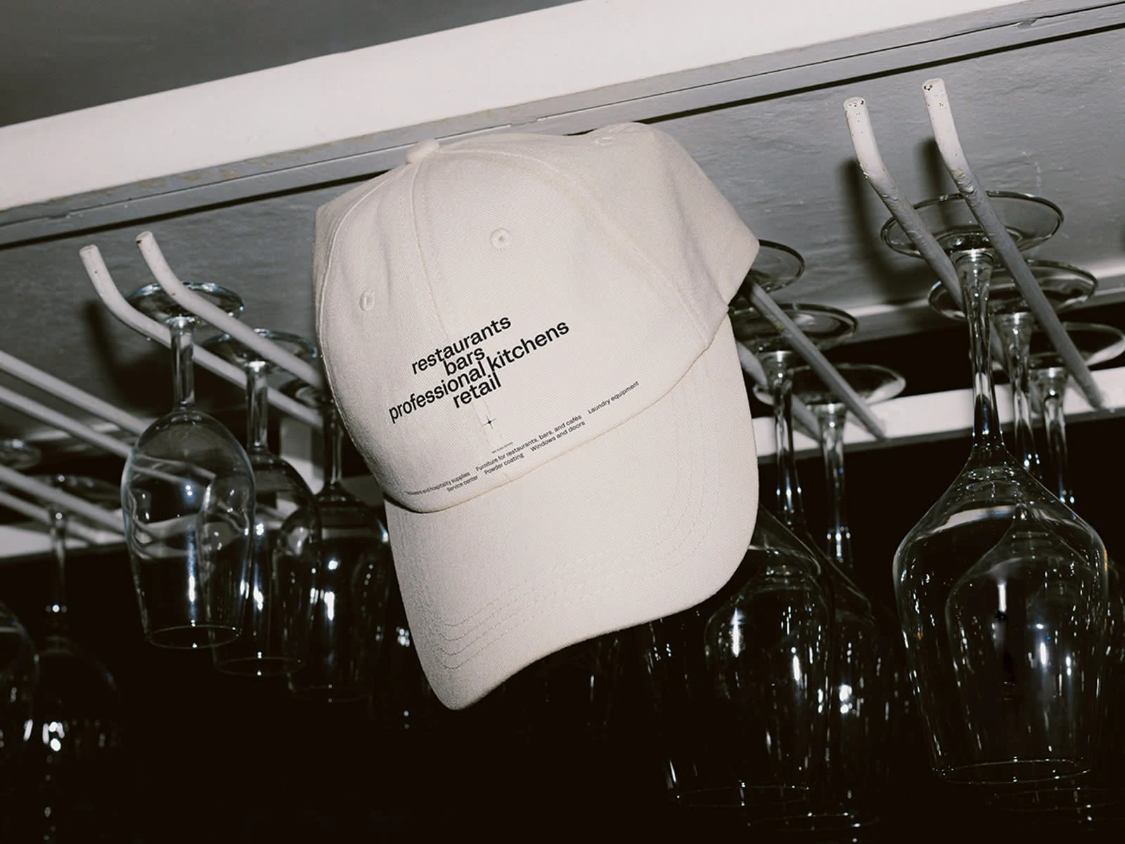
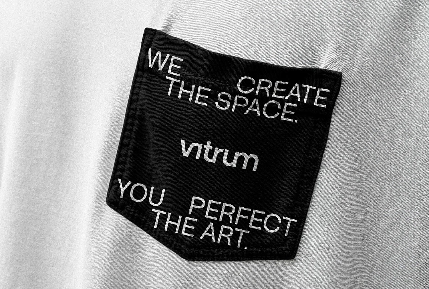
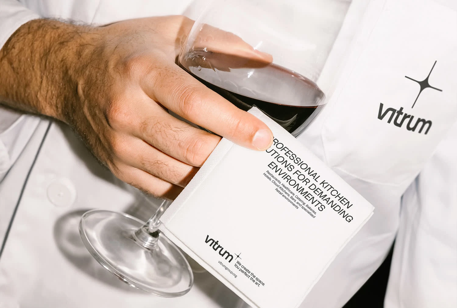
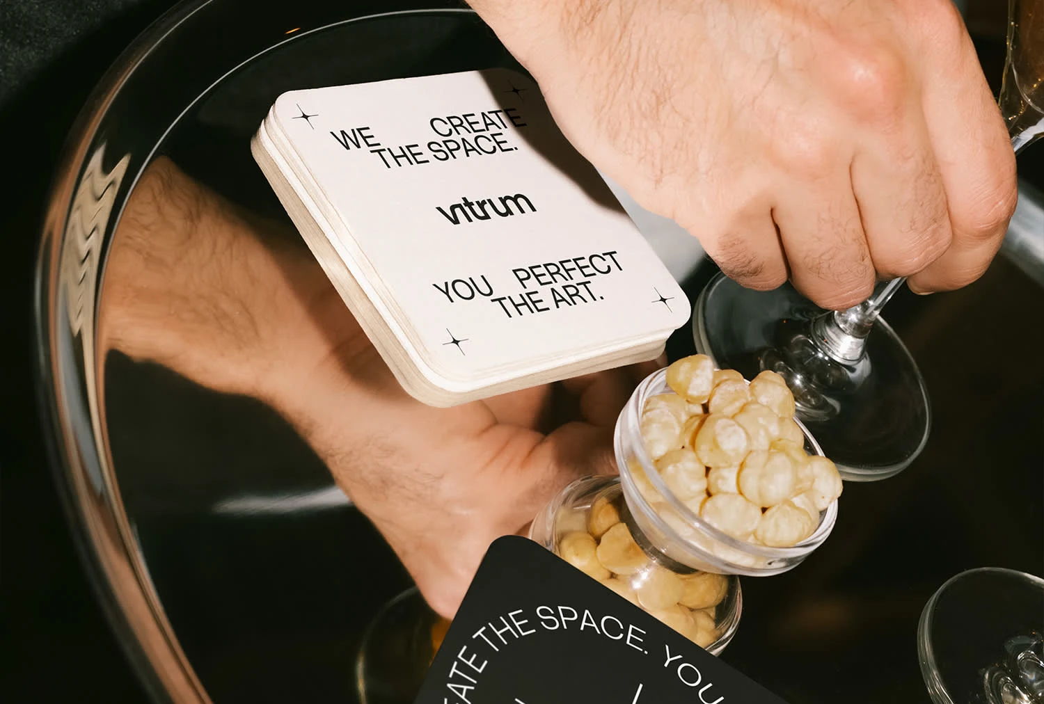
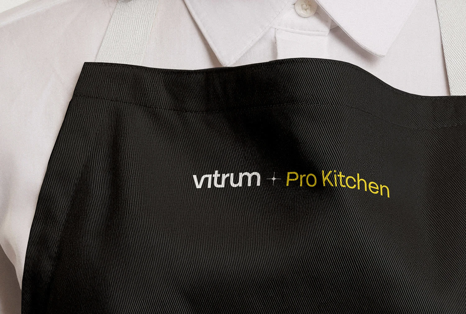
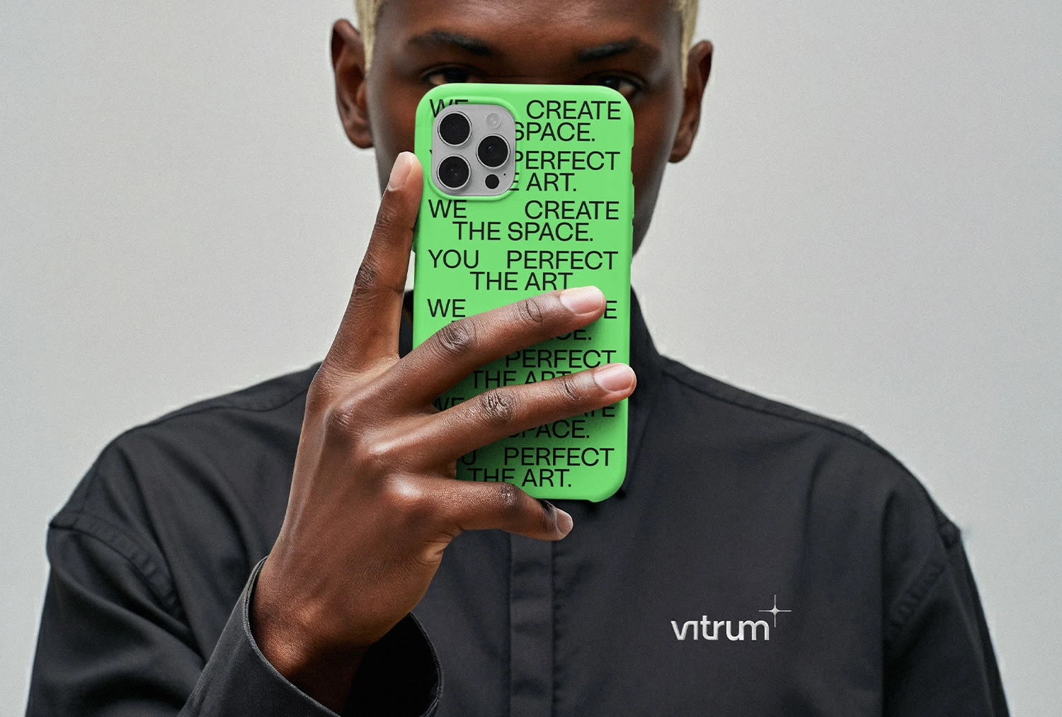
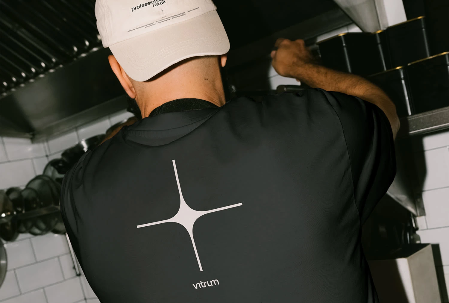
With over 30 years of experience, the Vitrum Group brand identity was redesigned to reaffirm the brand’s relevance and reconnect with its evolving audiences. The project modernises the identity through a refined visual language and a renewed typographic approach, while unifying four sectors—Restaurants, Bars, Professional Kitchens, and Retail—under a cohesive and scalable framework that allows each area to retain its own character.
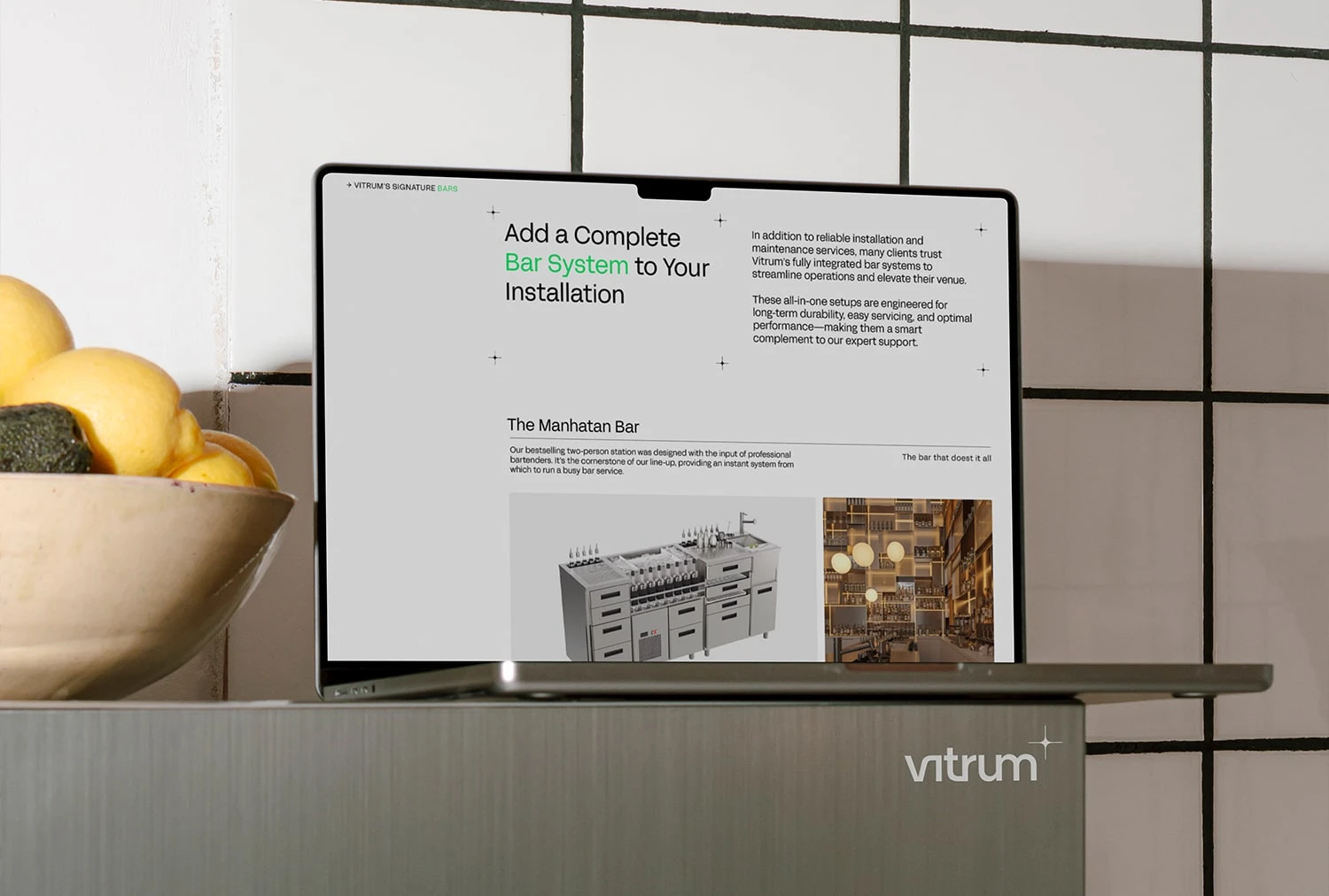
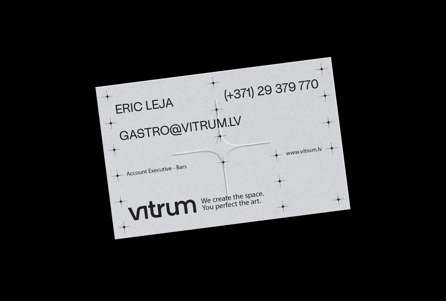
Built around a modular symbol derived from the star and cross, the identity balances structure and flexibility. Colour functions as the primary element of differentiation, supporting clear application across catalogues, digital platforms, and industrial contexts, and responding to the standards of high-end hospitality contexts.
Like this project
Posted Dec 31, 2025
Brand identity redesign for Vitrum Group, built around a modular visual system that unifies four sectors across print, digital, and industrial contexts.
Likes
1
Views
24
Timeline
Oct 1, 2025 - Ongoing