
Designing a Contemporary Care Brand
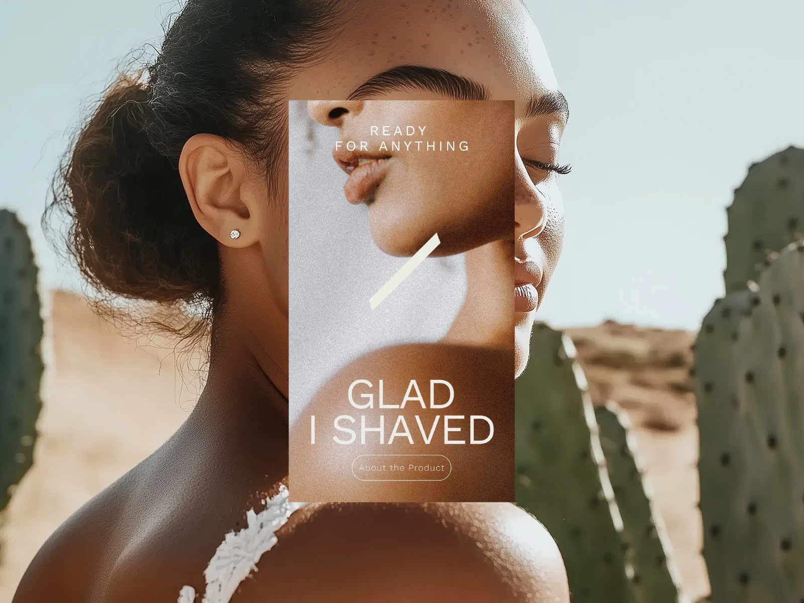
A comprehensive brand strategy and visual identity rooted in the insight that preparation shapes how we show up to life’s moments. This thinking led to the tagline “Glad I Shaved” — a simple expression of confidence and readiness.
The visual language, shaped by a tactile approach to imagery, uses texture and surface as narrative elements. These references subtly evoke skin as material — familiar, responsive, and human — reinforcing care.
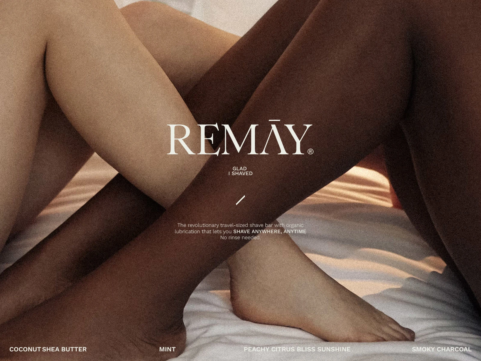
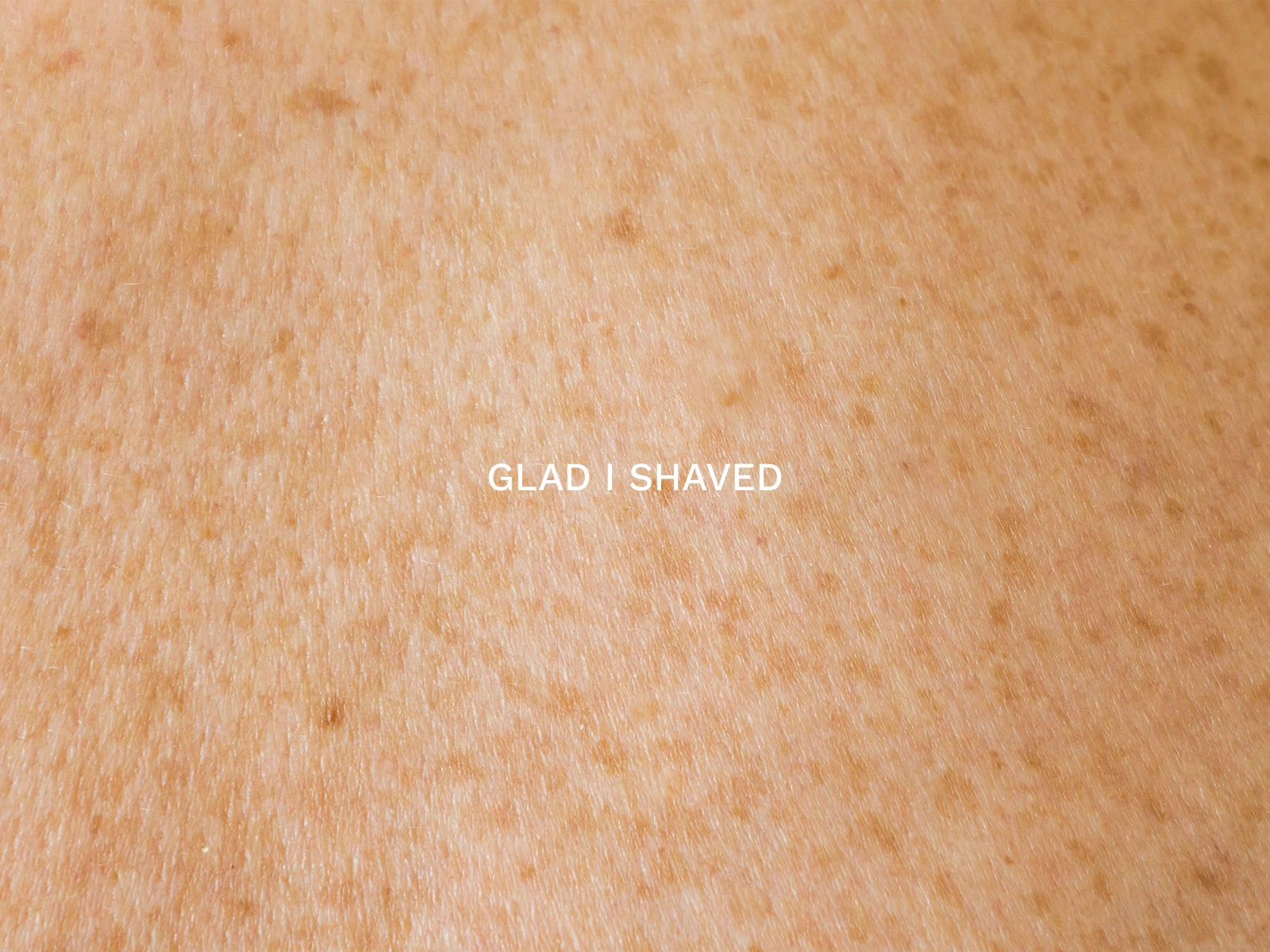
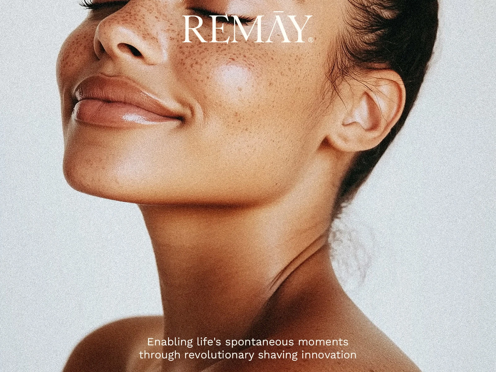

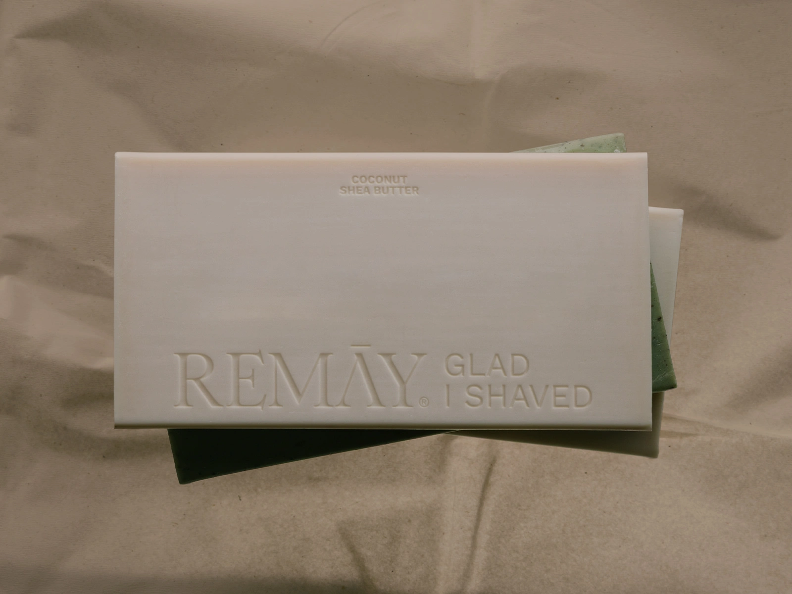

Shave Bar Three-Pack Packaging
A Subtle Shift
A restrained typographic gesture sits at the core of the identity, transforming a small intervention into a scalable brand device. What begins in the logo extends across the system, creating rhythm, alignment, and a consistent visual logic.
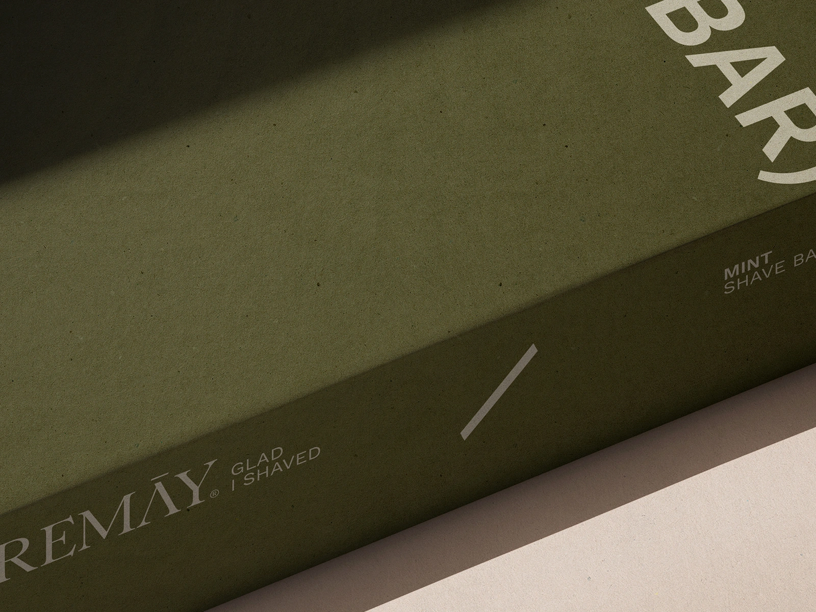
Shave Bar Three-Pack Packaging — Detail

Packaging Sticker for Wrapping Paper
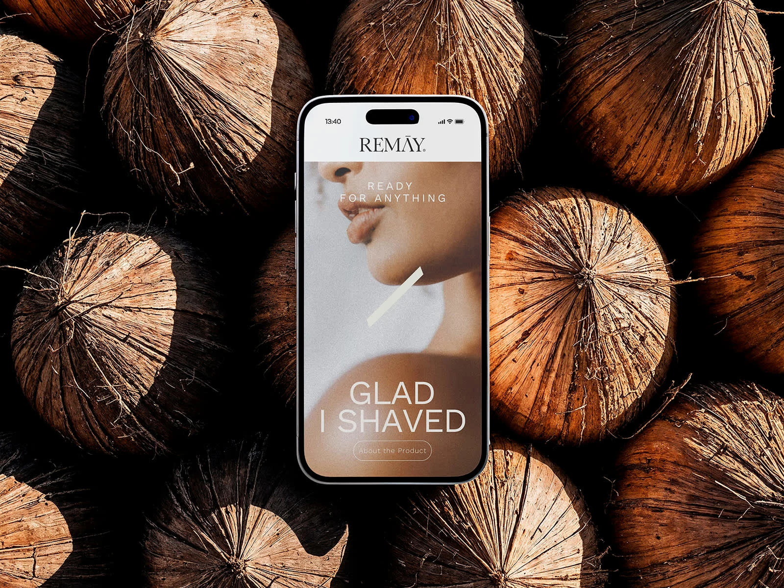
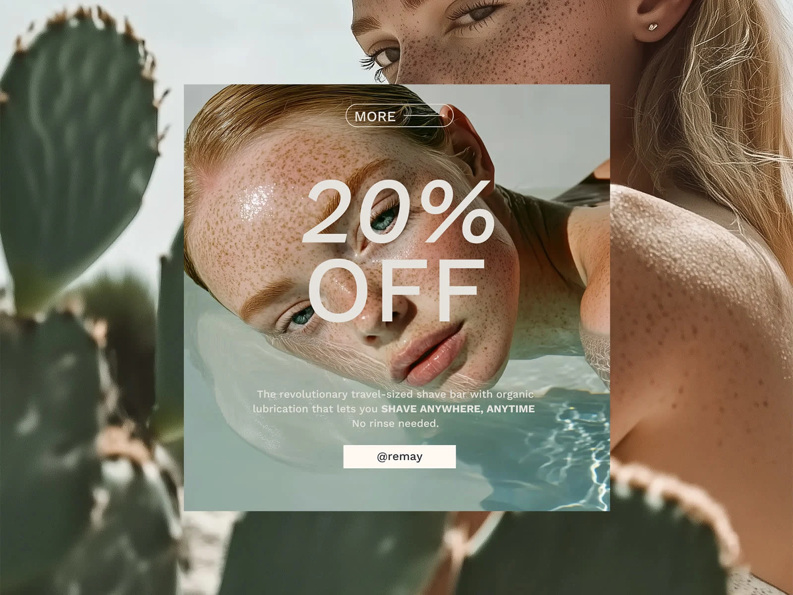
Digital CTA Banner


A visual language shaped by intention
The brand design for REMAY reflects a considered approach to shaving, where clarity, function, and visual restraint come together. The identity feels contemporary and purposeful, expressing freshness through simplicity rather than excess. A clean, modern language supports the brand’s focus on ease, care, and intelligent design — positioning REMAY as a confident, forward-looking take on everyday shaving.
0 likes · 13 views · Jan 9, 2026
Contemporary brand identity for REMAY, built around clarity, restraint, and intention — shaping a visual language that feels confident, modern, and considered.


