Culture in Motion
Luís Teixeira
More Growth. More Impact — Brand Repositioning

A Core Narrative Element

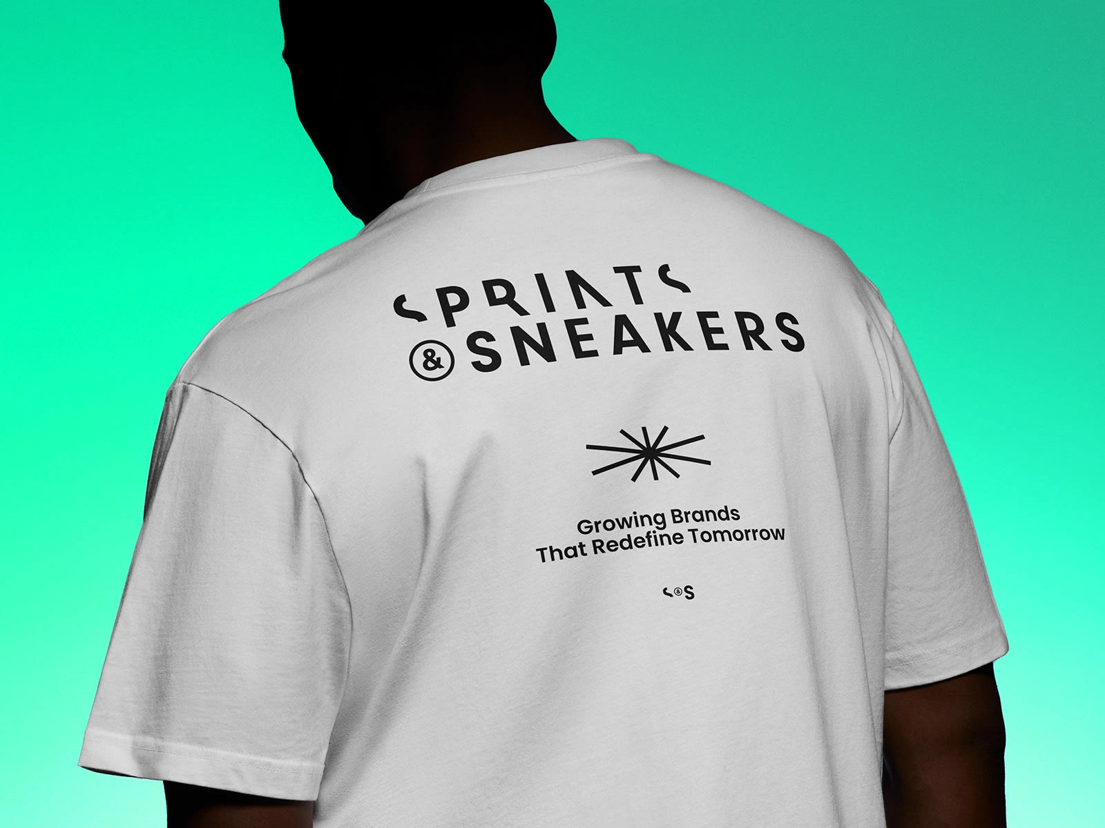
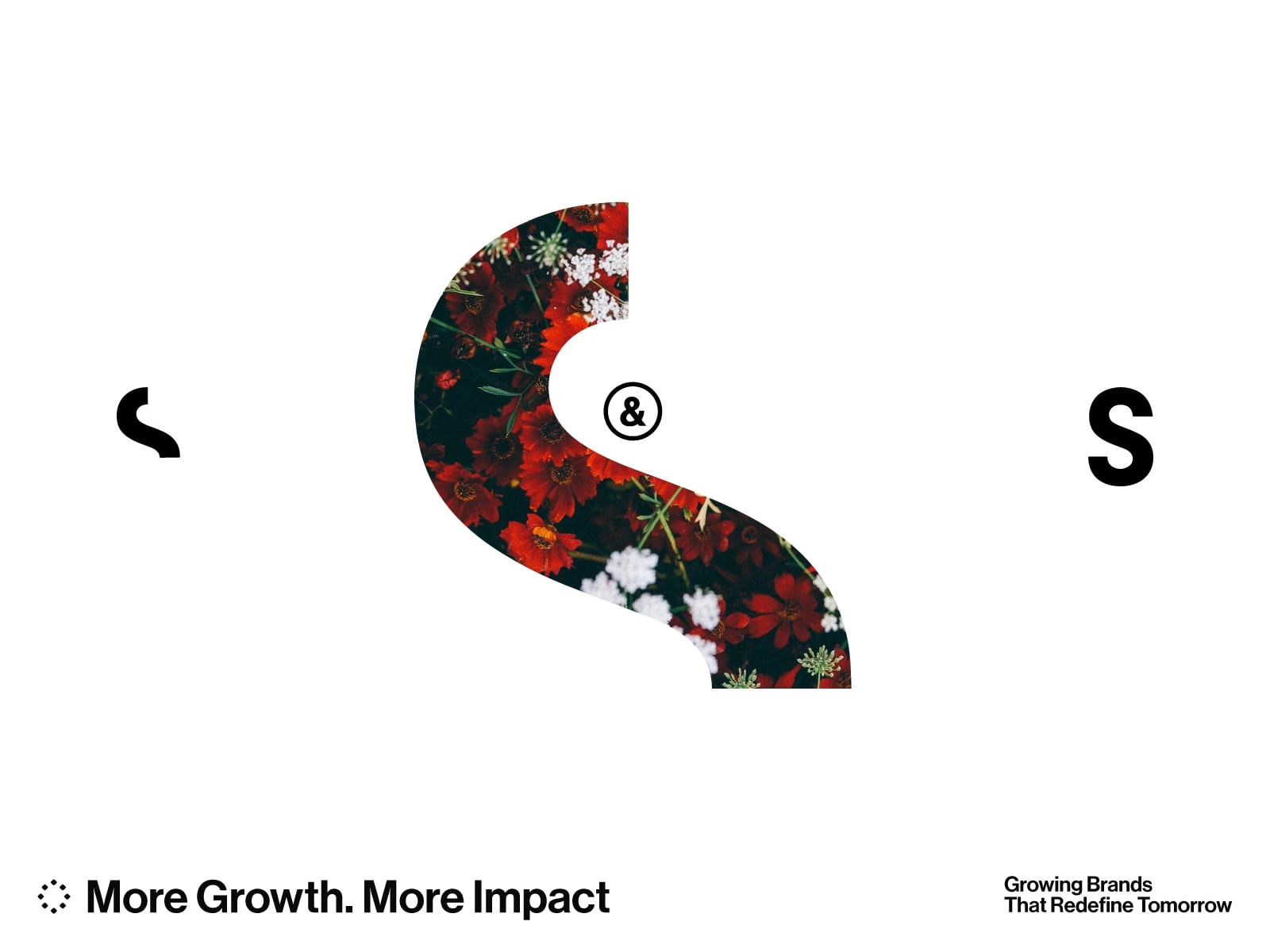
The ambition was to extend the brand beyond the logotype by distilling an element capable of carrying its spirit forward. More than a visual signature, this device expands the language of S&S, creating a consistent yet open system for communication. Rooted in the brand’s energy and momentum, it expresses a clear desire to look beyond the expected — toward a different way of seeing, thinking, and growing.
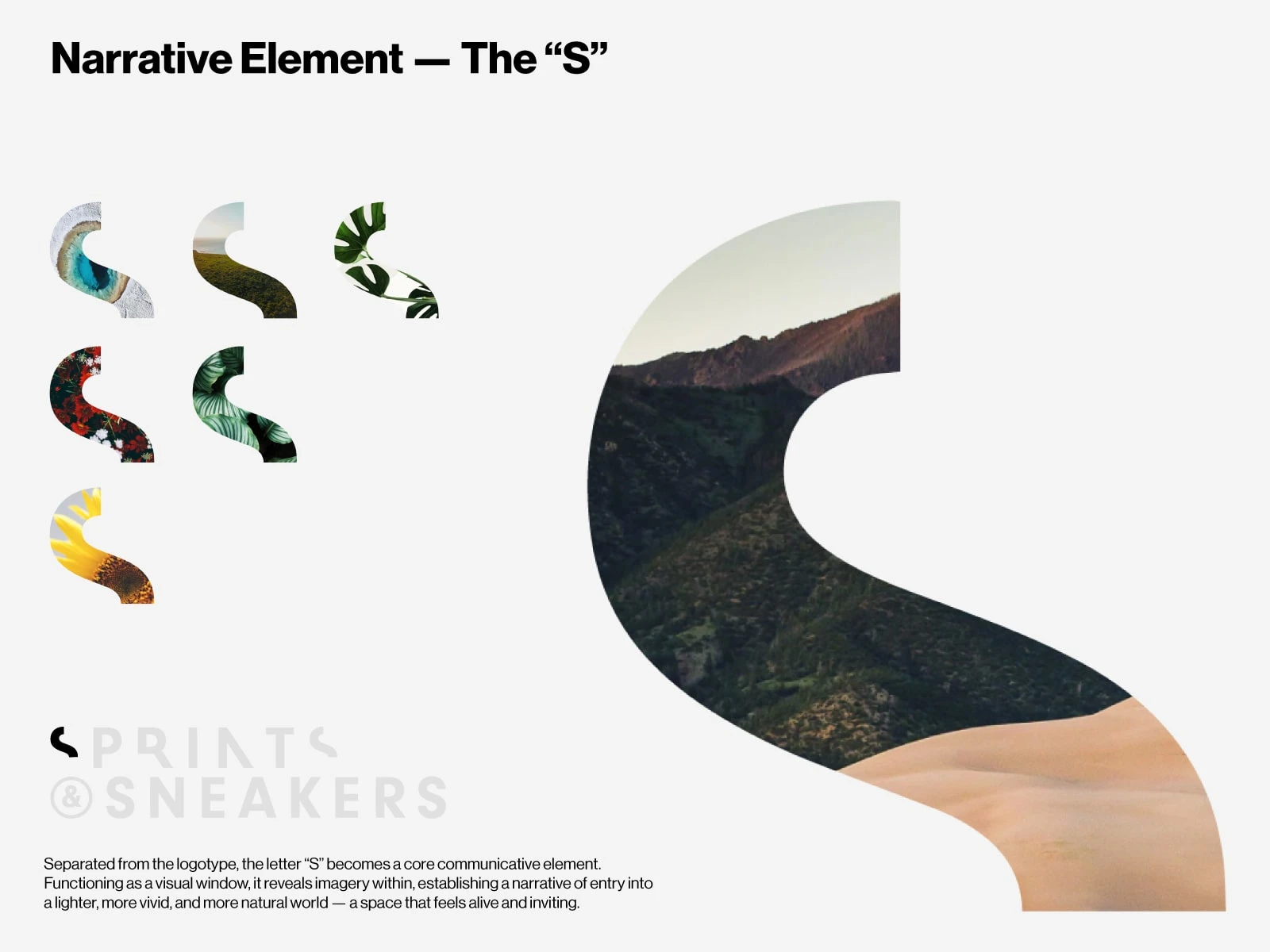
When colour imagery appears within the core element, background photography shifts to black and white. This contrast reinforces a sense of new direction, focusing attention on what is changing and moving forward.
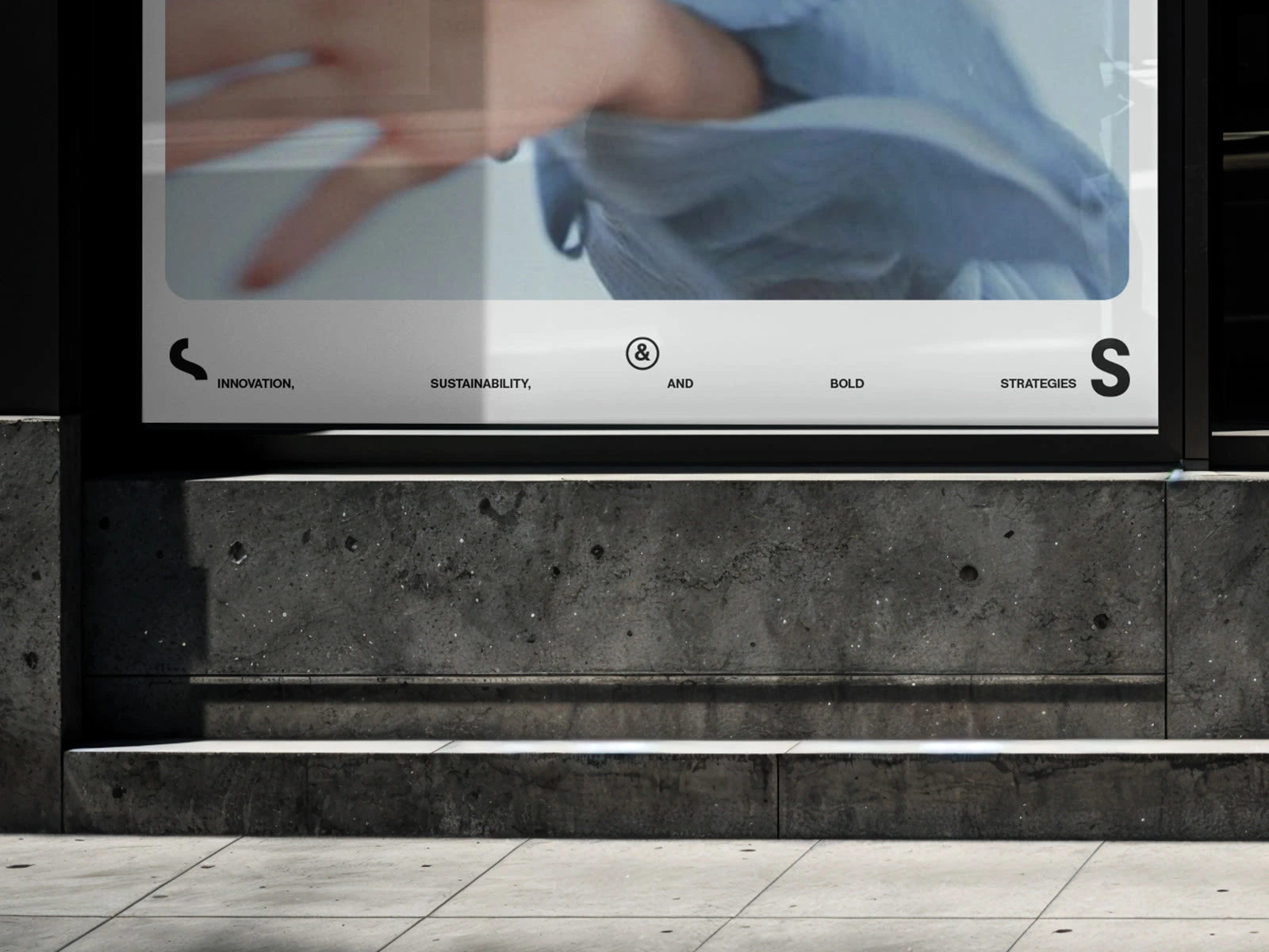
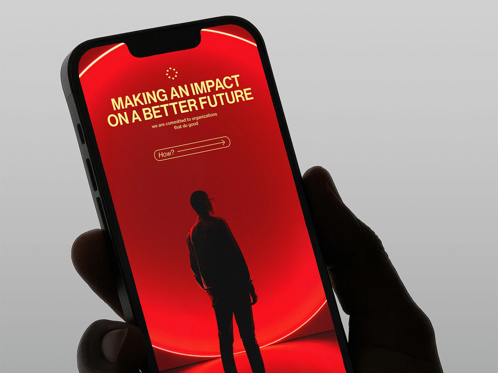
Colour
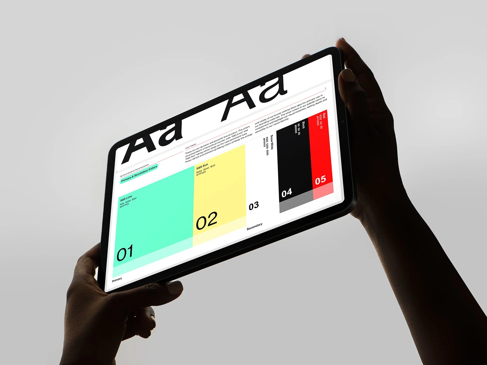
Colour plays an active role in the identity, introducing a more vibrant and expressive palette within a grounded system.
These colours are not decorative — they signal energy, momentum, and optimism, reinforcing the brand’s forward-looking mindset. Vibrancy becomes a way of shifting perspective, inviting attention and emotion while pointing toward a world that feels more dynamic, open, and alive.
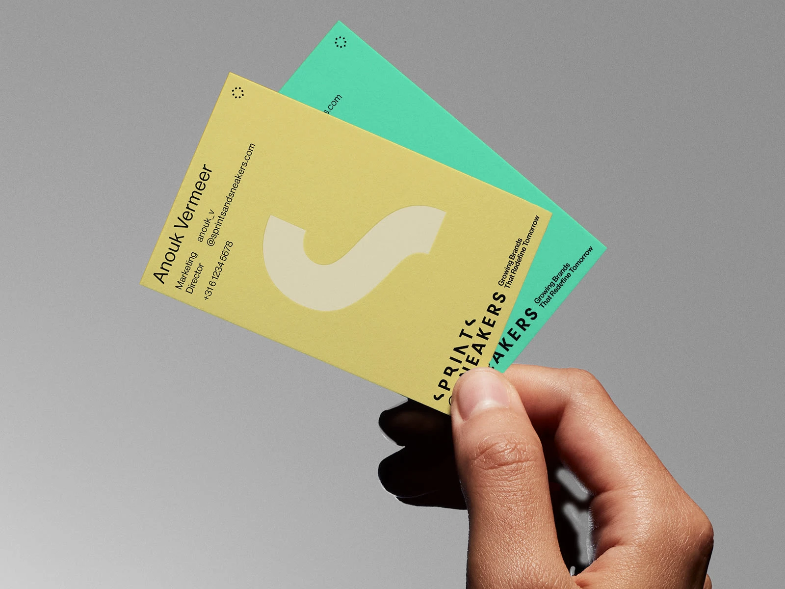
S&S, a fast-growing growth marketing agency based in Amsterdam, refreshed its brand identity while retaining the existing logo. The goal was to expand the brand’s expressive capacity, creating a system that communicates momentum, experimentation, and a clear forward-looking mindset.
At the core of the identity is a distilled element extracted from the logotype, conceived as a central narrative device. It extends the brand beyond its mark, opening the communication to a more dynamic language and expressing a desire to look beyond the expected. A vibrant colour palette reinforces this direction, while the contrast between colour and black-and-white imagery signals focus, change, and motion.
Together, these elements form a flexible, culture-led identity that positions Sprints and Sneakers as a brand in motion — confident, expressive, and built to grow.
Like this project
Posted Jan 3, 2026
Rebranding a fast-growing Amsterdam growth marketing agency, refreshing Sprints and Sneakers’ identity while retaining logo and amplifying its cultural edge.
Likes
1
Views
6
Timeline
Jan 6, 2025 - Feb 19, 2025