Creating a Design System for a Fintech Company
Nohelia Pereira
Project
Develop a comprehensive design system to standardize the company's visual and functional elements, ensuring consistency, improving collaboration, and enhancing efficiency.
Objectives
📌 Identify and address inconsistencies: Conduct a thorough audit to pinpoint design inconsistencies and areas needing standardisation.
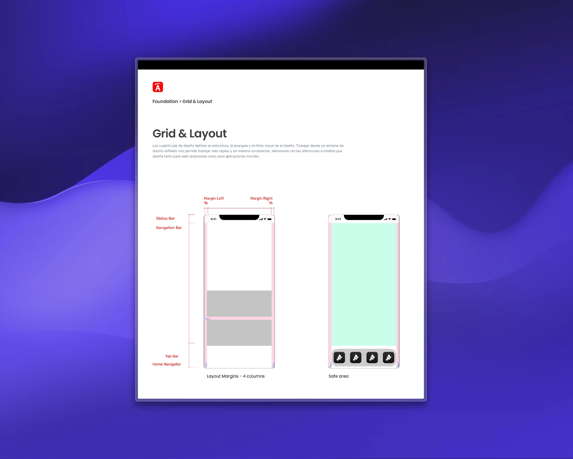
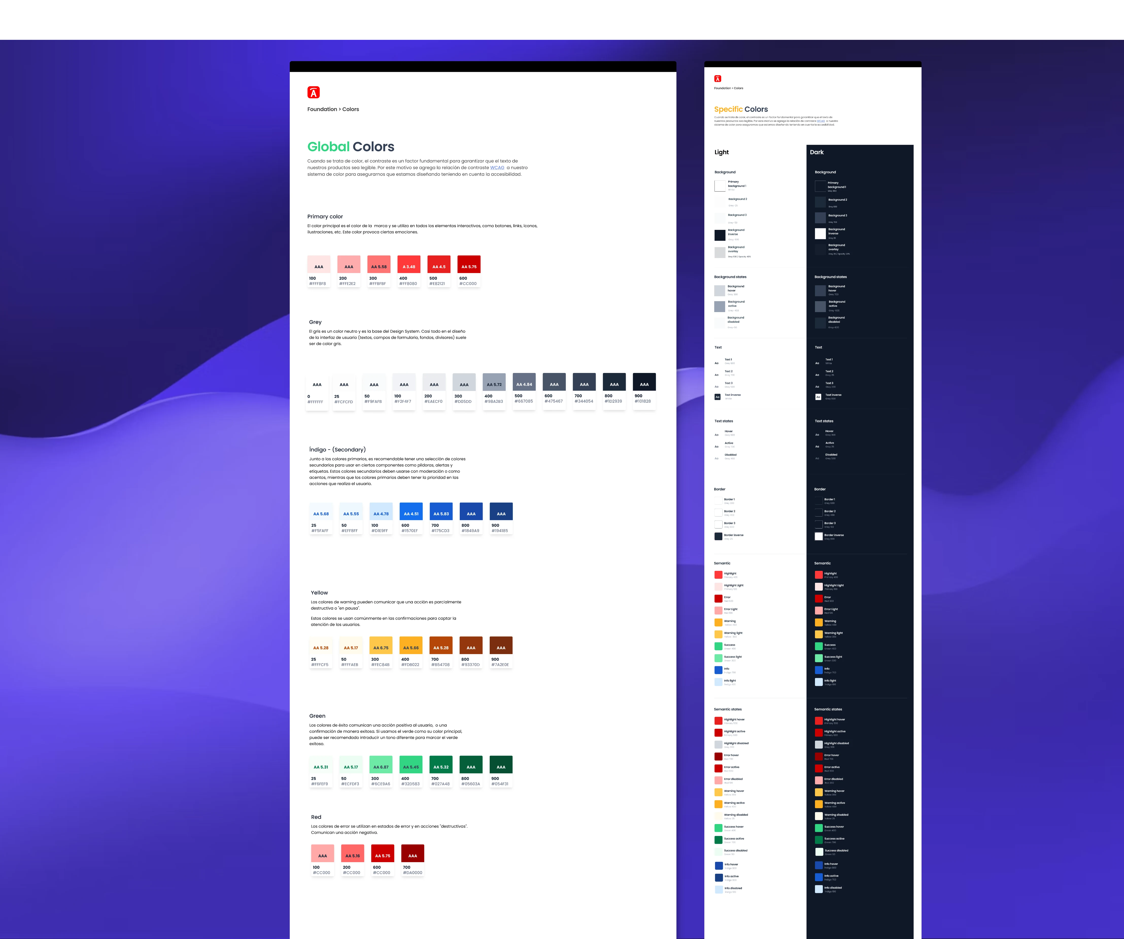
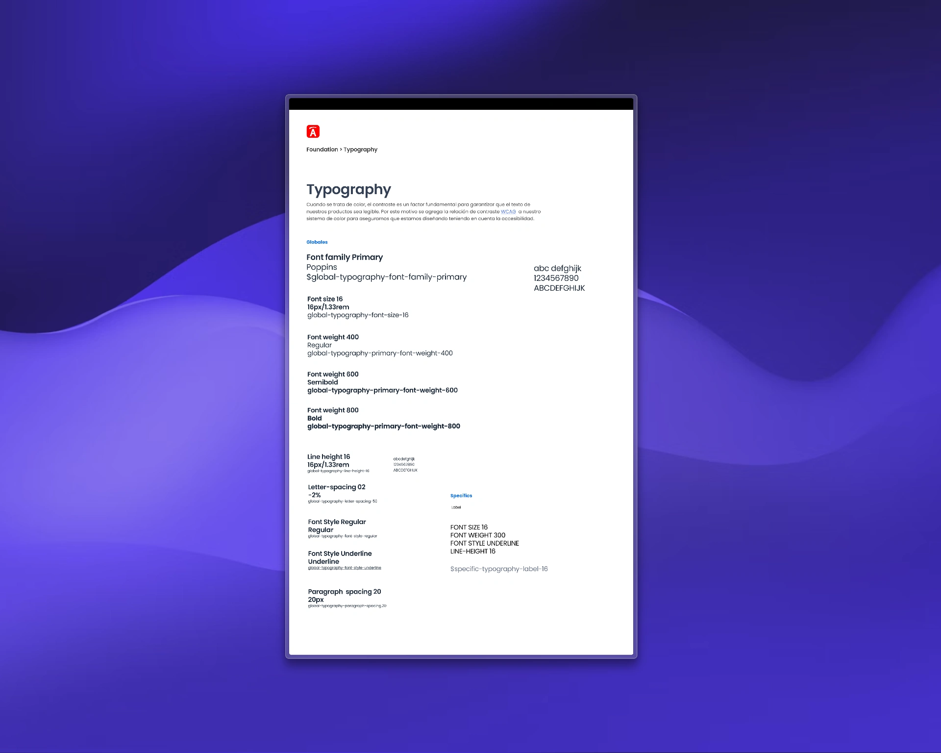
📌 Develop a unified design system: Create a comprehensive design system that includes visual elements, components, patterns, and guidelines.
📌 Improve team efficiency: Facilitate better collaboration between design and development teams through clear documentation and shared standards.
Solution
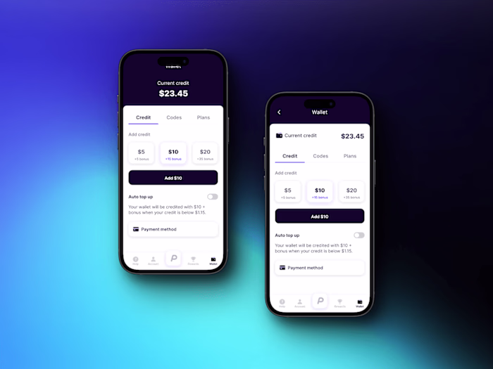
Our design studio partnered with a rapidly growing fintech company facing significant design inconsistencies and inefficiencies. We began with a thorough design audit, identifying issues such as inconsistent use of colors, typography, and spacing, as well as redundant UI components. By understanding these pain points, we developed a unified design system encompassing a standardized color palette, typography, spacing, and layout guidelines. We created and documented a comprehensive set of UI components and interaction patterns, ensuring they met accessibility standards. This cohesive design system was implemented in Figma for designers and as a React component library for developers, complete with detailed documentation and usage guidelines.
Results
The results were transformative. The fintech company achieved a consistent visual language across all products, enhancing brand recognition and user experience. The clear standards and comprehensive documentation improved collaboration and communication between design and development teams, significantly reducing design and development time. This streamlined process enabled faster product iterations and time-to-market, empowering the team to focus on innovation and higher-level problem-solving.
Learnings
Creating a design system from scratch taught me several valuable lessons:
✅ Collaboration and Alignment: Involving stakeholders and collaborating closely with different teams is essential to ensure the design system meets their needs and aligns with the overall brand strategy.
✅ Scalability and Flexibility: Design systems should be designed with scalability and flexibility in mind, allowing for future growth and accommodating the evolving needs of the organization.
✅ Consistency and Branding: Establishing clear design principles and guidelines is crucial for maintaining a consistent brand identity across all products and services.
✅ Documentation and Training: Providing comprehensive documentation and conducting training sessions help ensure successful adoption and implementation of the design system, fostering collaboration and consistency across teams.
Like this project
Posted Jun 1, 2024
Improve efficiency and build consistent digital experiences across different platforms, products, and services for fintech company.
Likes
2
Views
37