Enhancing User trust through User Interface Design
Oluwatobi Adetunji
Pear VC Landing page reimagined
Introduction
Pear VC is a prominent early-stage venture capital firm based in Menlo Park and San Francisco. They specialize in Seed and Pre-seed investments where they have seeded companies worth over $300B.
Problem
Pear VC’s current landing page appears visually outdated, which may negatively impact first impressions and visitor trust
Current Pear VC Landing page
Solution
I approached this with the aim to improve the aesthetics of the landing page while sticking to their assets, copies, and branding.
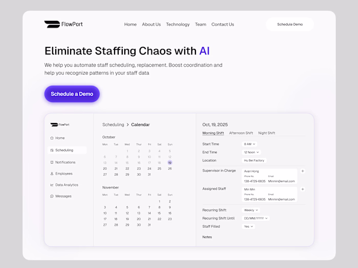
Reimagined Pear VC Landing page
Side by side comparisons of a few sections
Side by Side of Hero section
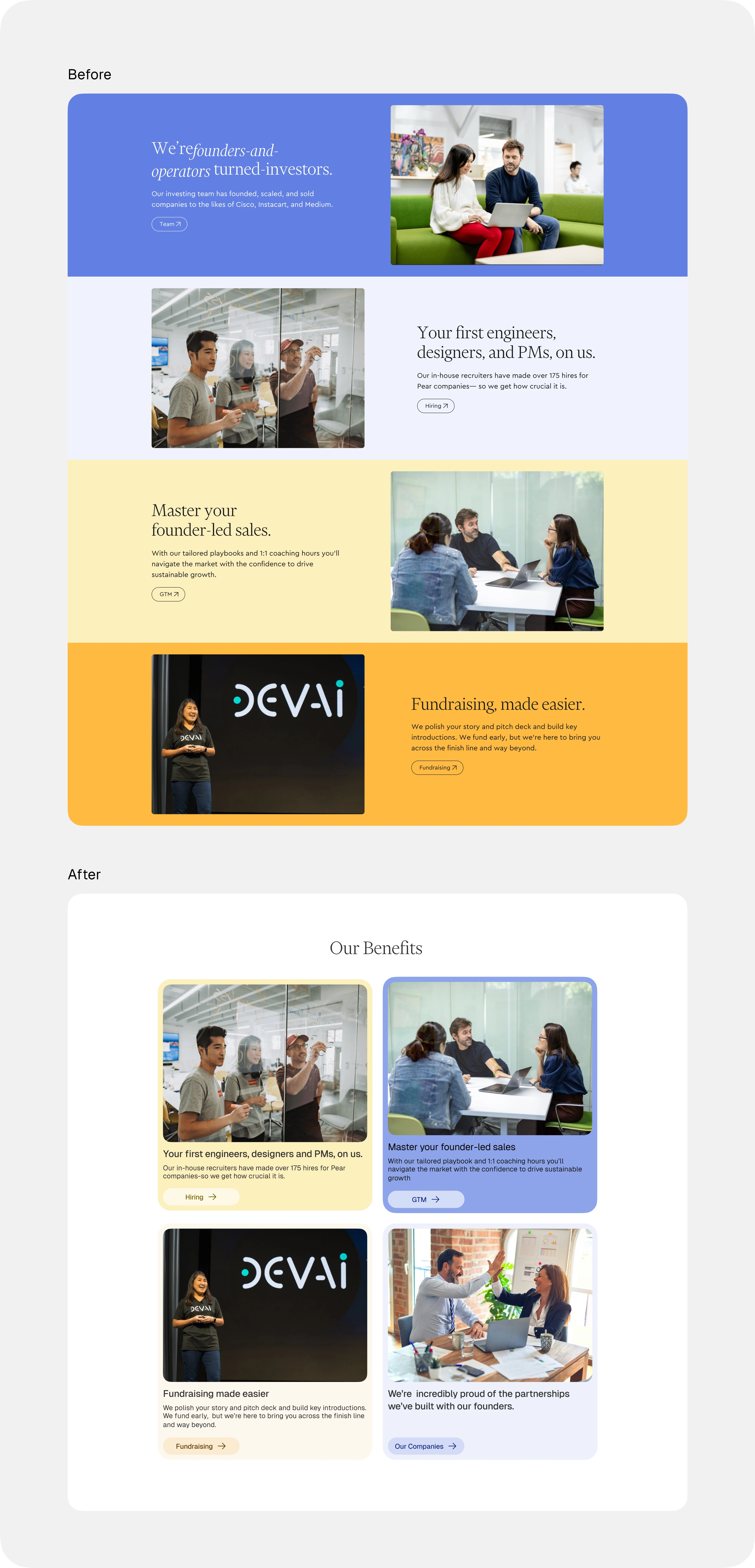
Side by Side of Benefits section
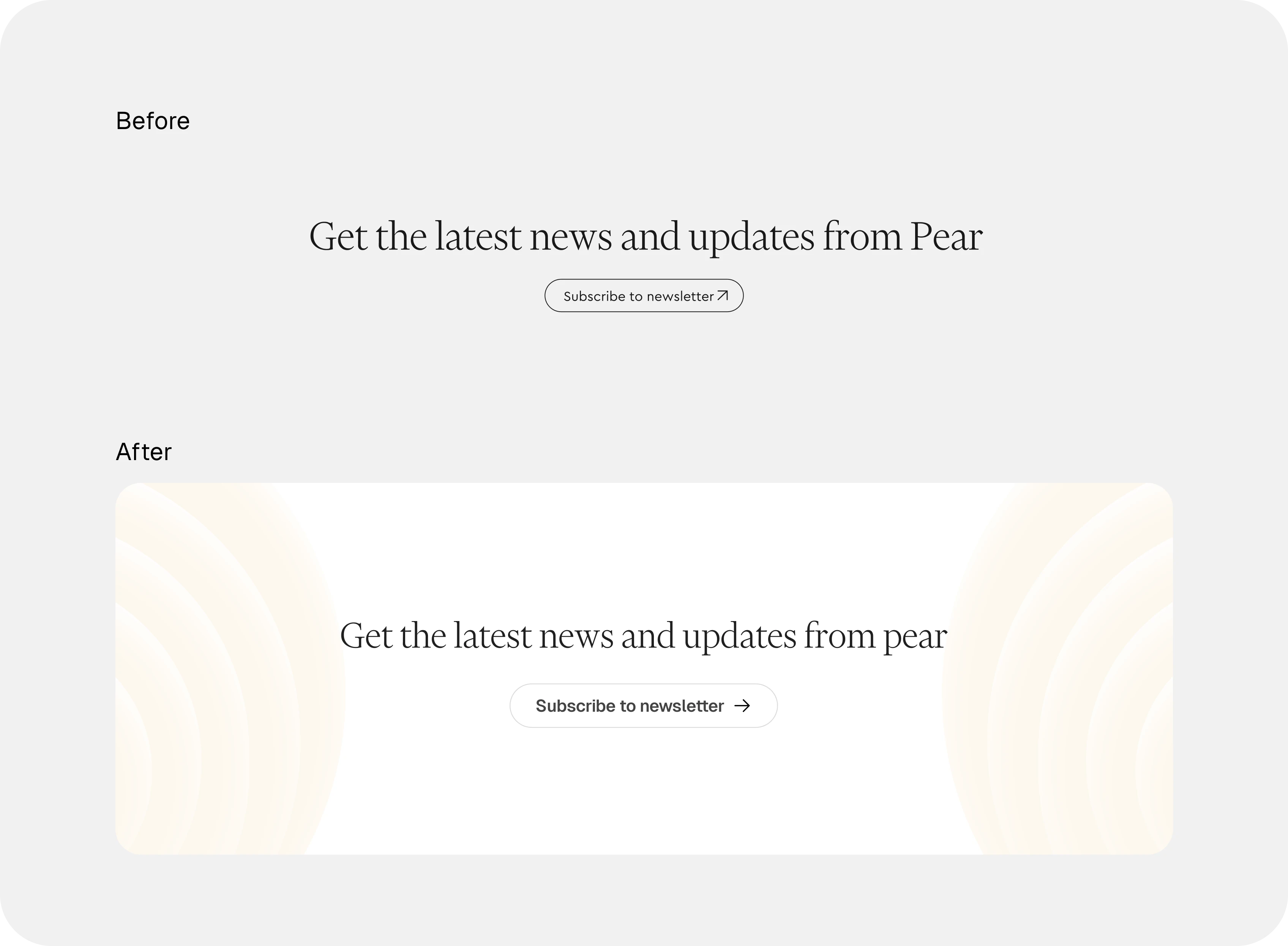
Newsletter CTA
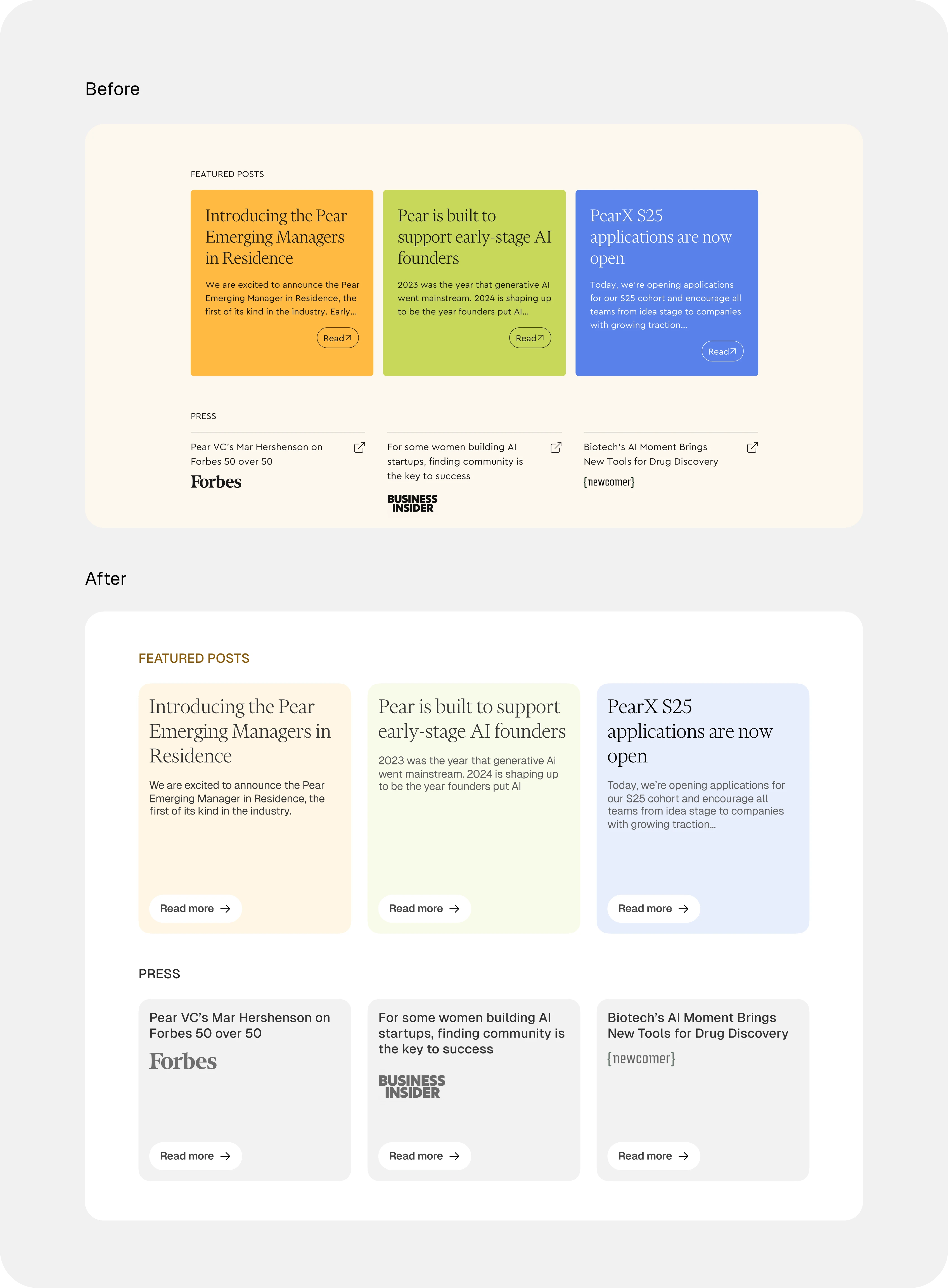
Press and Featured Posts
Lessons
When approaching a redesign like this where the entity is already an established brand, it is important to keep in mind their value, brand tone and identity because making a drastic shift from what people are already used to can cause a disconnect between the people and entity.
To avoid this, I ensured that the brand identity, assets, typography and copy were exactly the same with the only difference being the aesthetics which are based on the existing brand identity still.
Like this project
Posted Dec 31, 2025
Researched user needs and behaviors, designed clean and visually appealing interface to improve visitor trust
Likes
0
Views
5