Terac Brand Design
Shantanu Roy
Verified
Terac Brand Design
BACKGROUND
When I joined Terac, it was clear most “insights platforms” were built for managers who never actually run interviews. Terac was going after the people in the trenches: the ones scheduling back-to-back calls, trying to make sense of mountains of raw transcripts, and needing to turn scattered conversations into something you could actually use to make decisions.
My role was to lead brand and product design. I worked alongside founders, engineers, and our earliest users to strip away anything that felt like fluff. We focused the UI around real workflows: reviewing, tagging, and surfacing the moments that actually matter, without the clutter you find in most research tools. The end result? A brand and interface that’s simple, direct, and actually respects the messiness of real interviews.
Here’s how I approached the brand design:
Created a brand noun list with the client: every object, idea, or metaphor that felt close to their ethos.
Explored rough sketches based on that list, focusing on vibe before polish.
Shared a final mark in grayscale (no color, no noise) to validate structure and logic.
Built out a full system with mark, color, and type once the core mark passed the test.
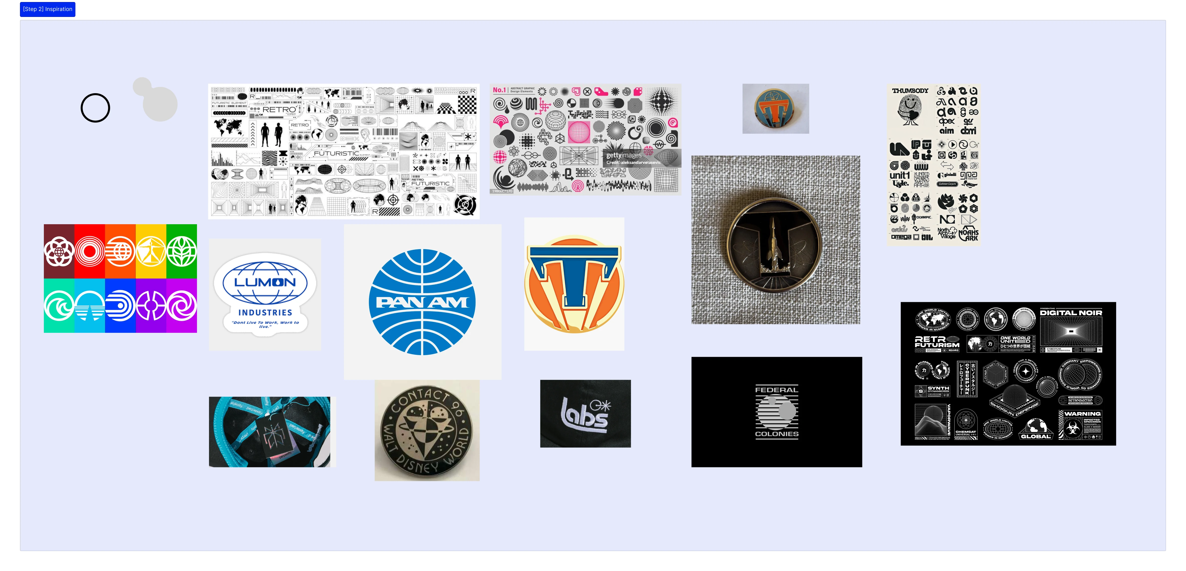
EXPLORATIONS
The initial brand noun list when working with the client had words like sharp, atlas, globe, Epcot, dome, circular, spirograph, shield, lock, pillar, ring, chain, loop, lattice/loop, mesh. From there, I had a few sketch explorations for what I thought could be interesting.
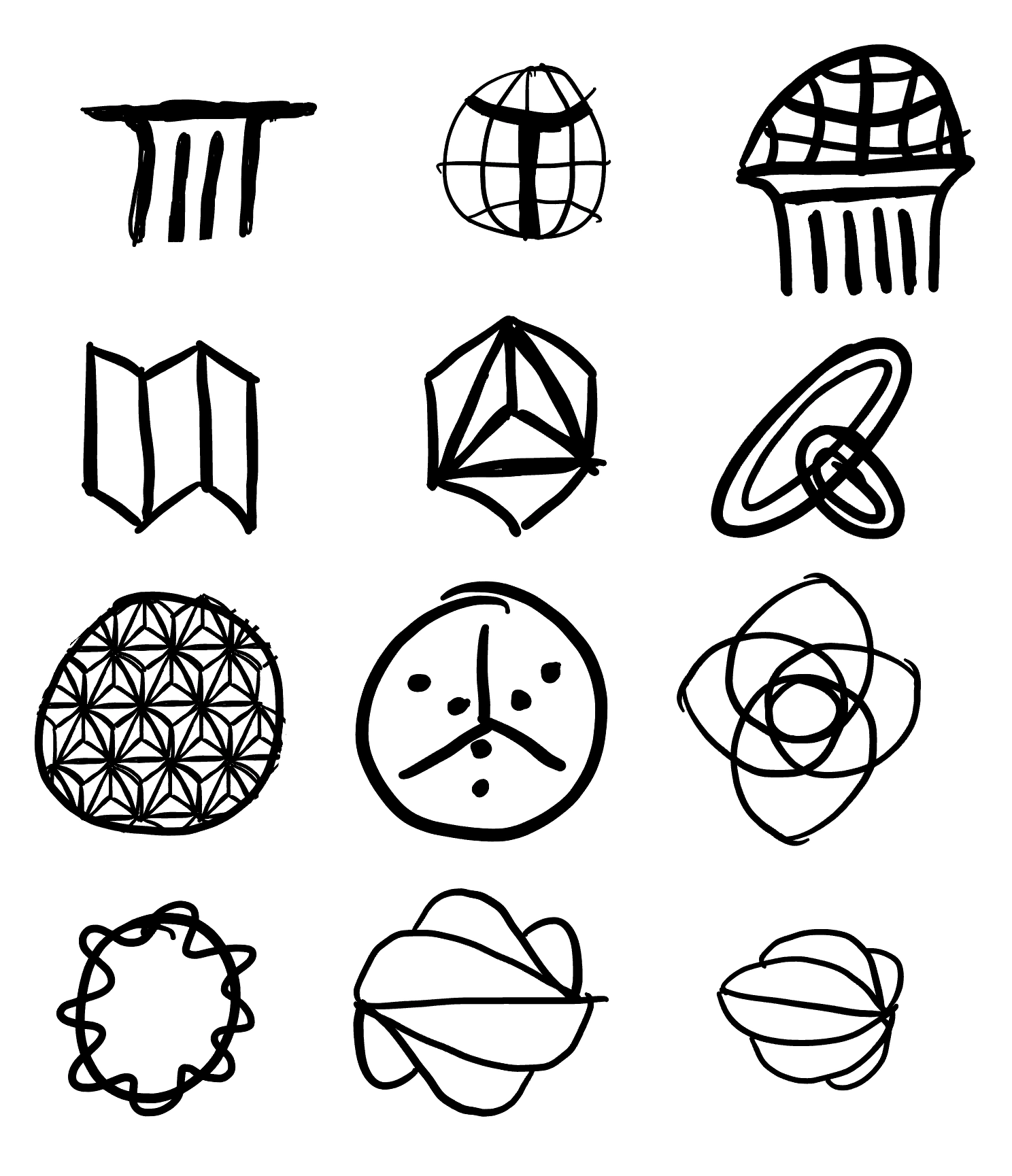
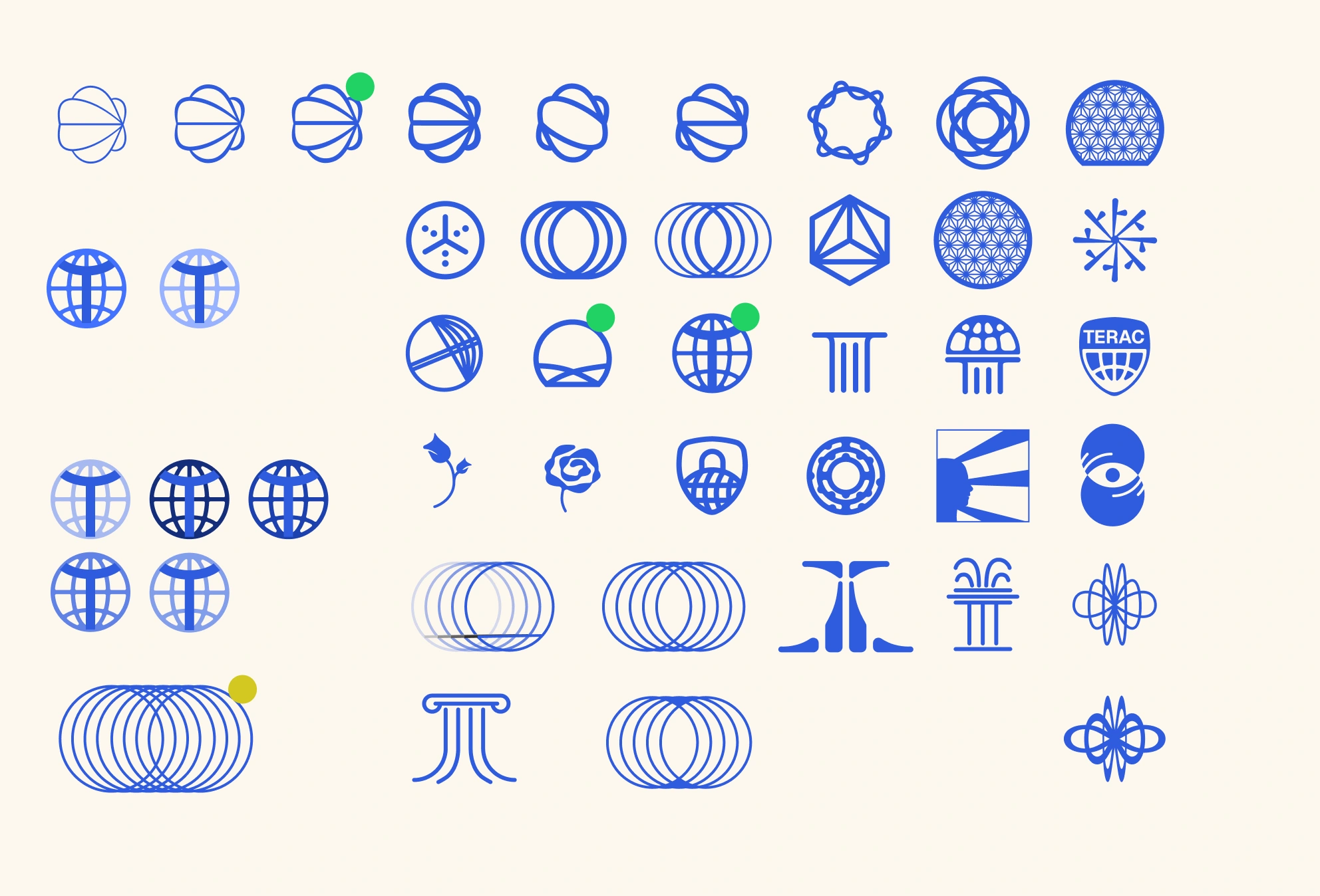
After a few designs and explorations, I went into Figma to start drafting even more variations based on these vibes.
FINAL SOLUTION
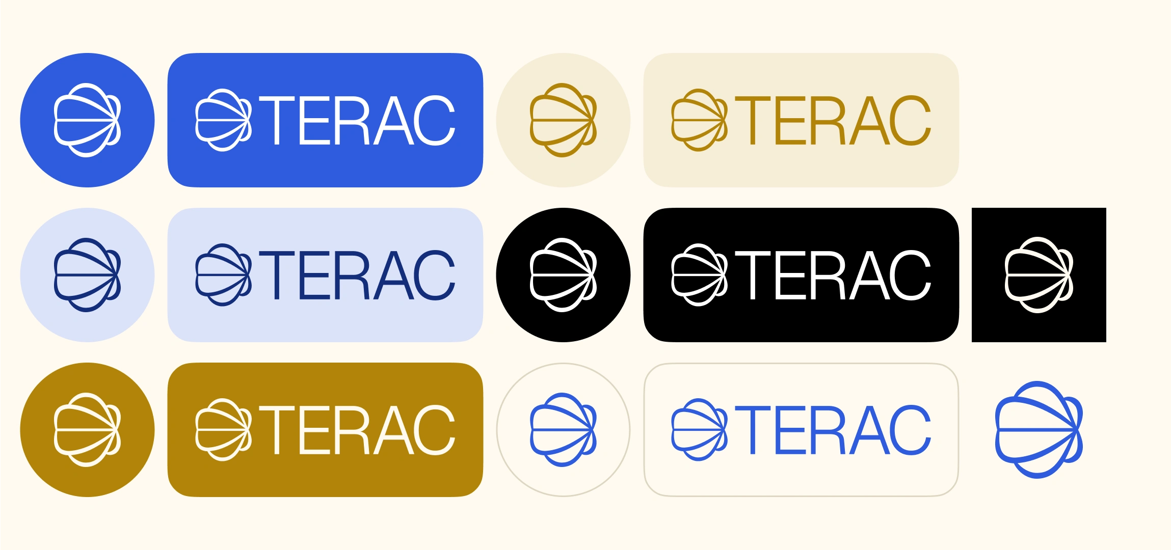
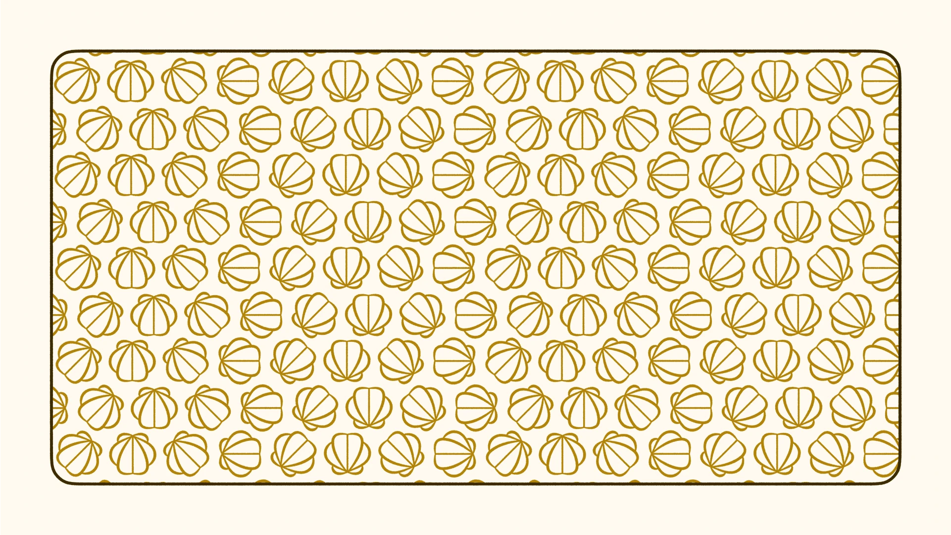
The final brand system for Terac was generative. The logo brings together movement and order. Its shape is inspired by a spinning propeller and the gentle spiral of a seashell. The curved lines show flow and direction, much like how Terac surfaces resources when and where they are needed. The overall look gives off a retrofuturistic vibe.
When animated, the logo spins to show real-time action, tying back to how our company works behind the scenes.
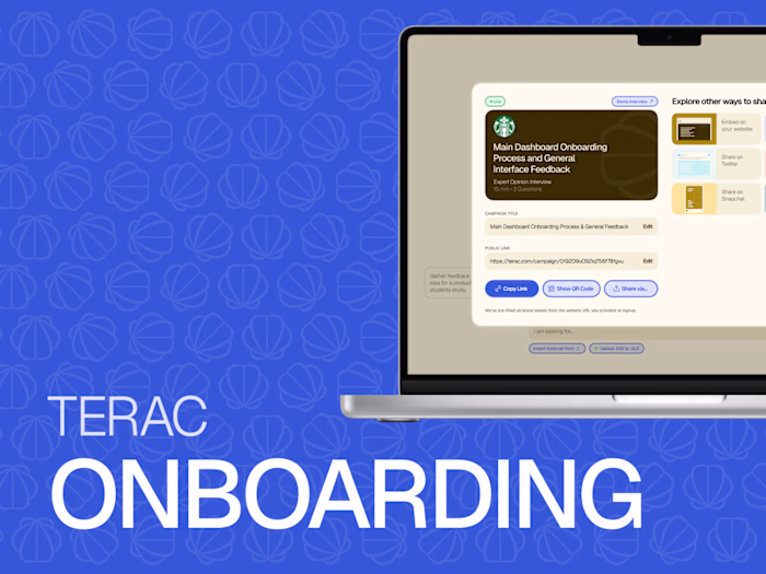
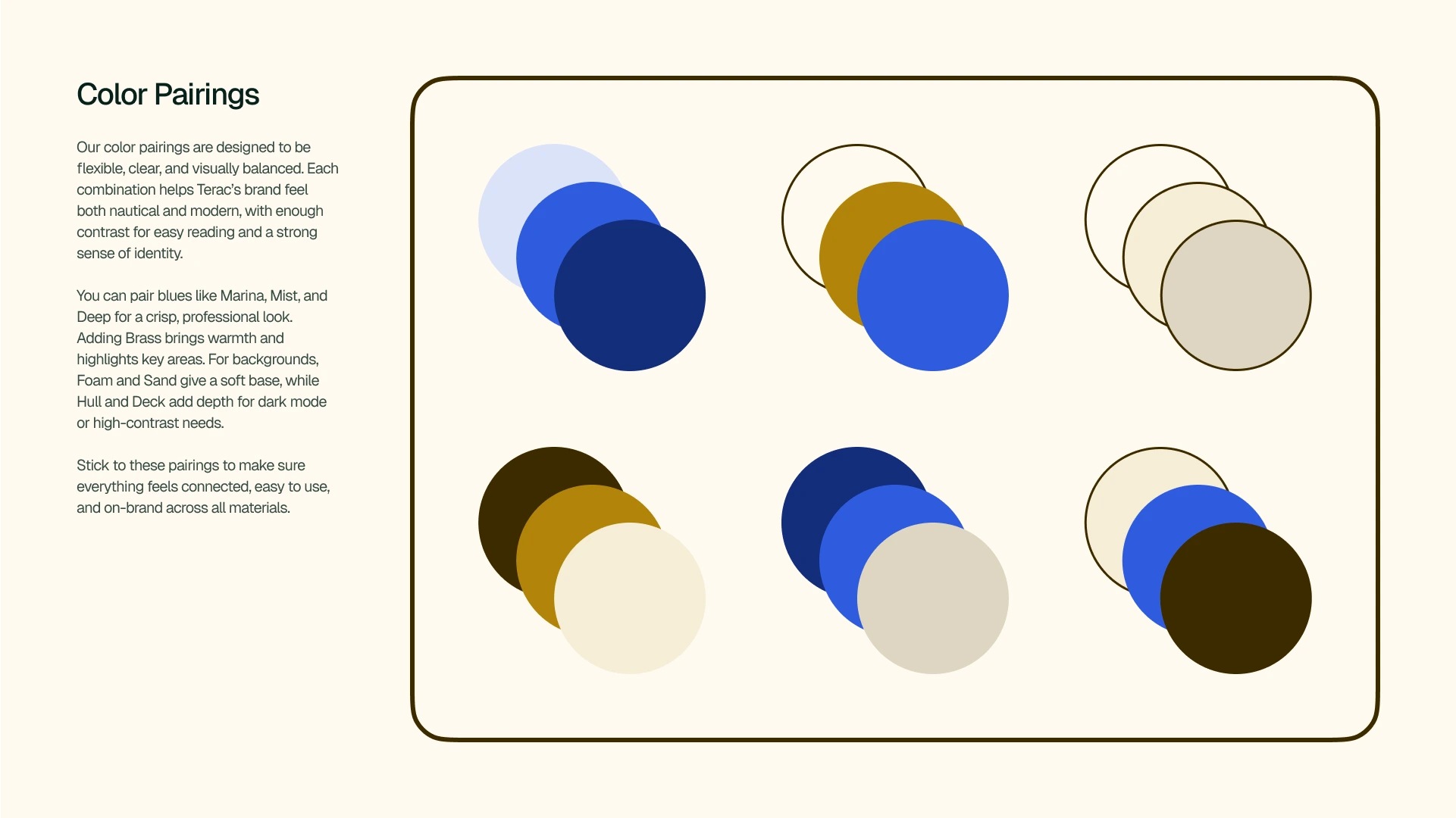
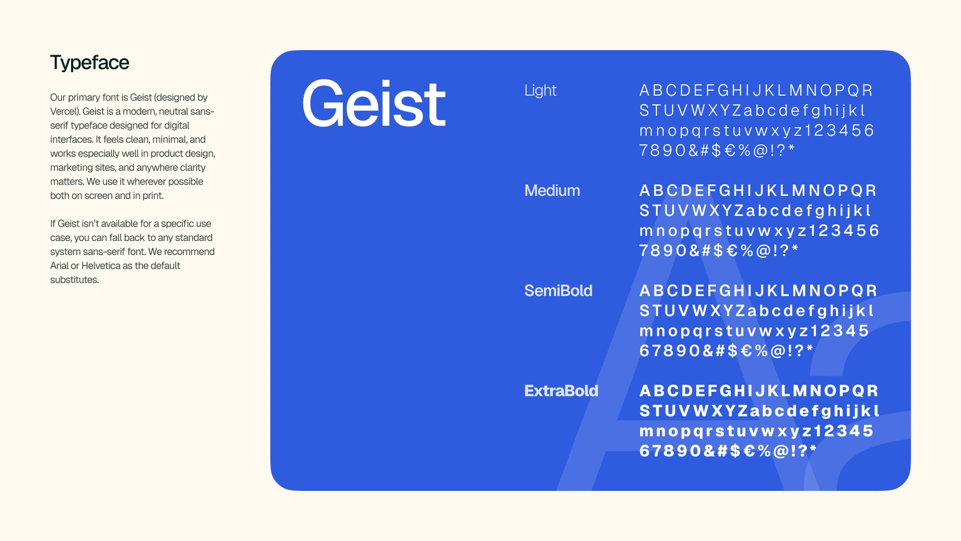
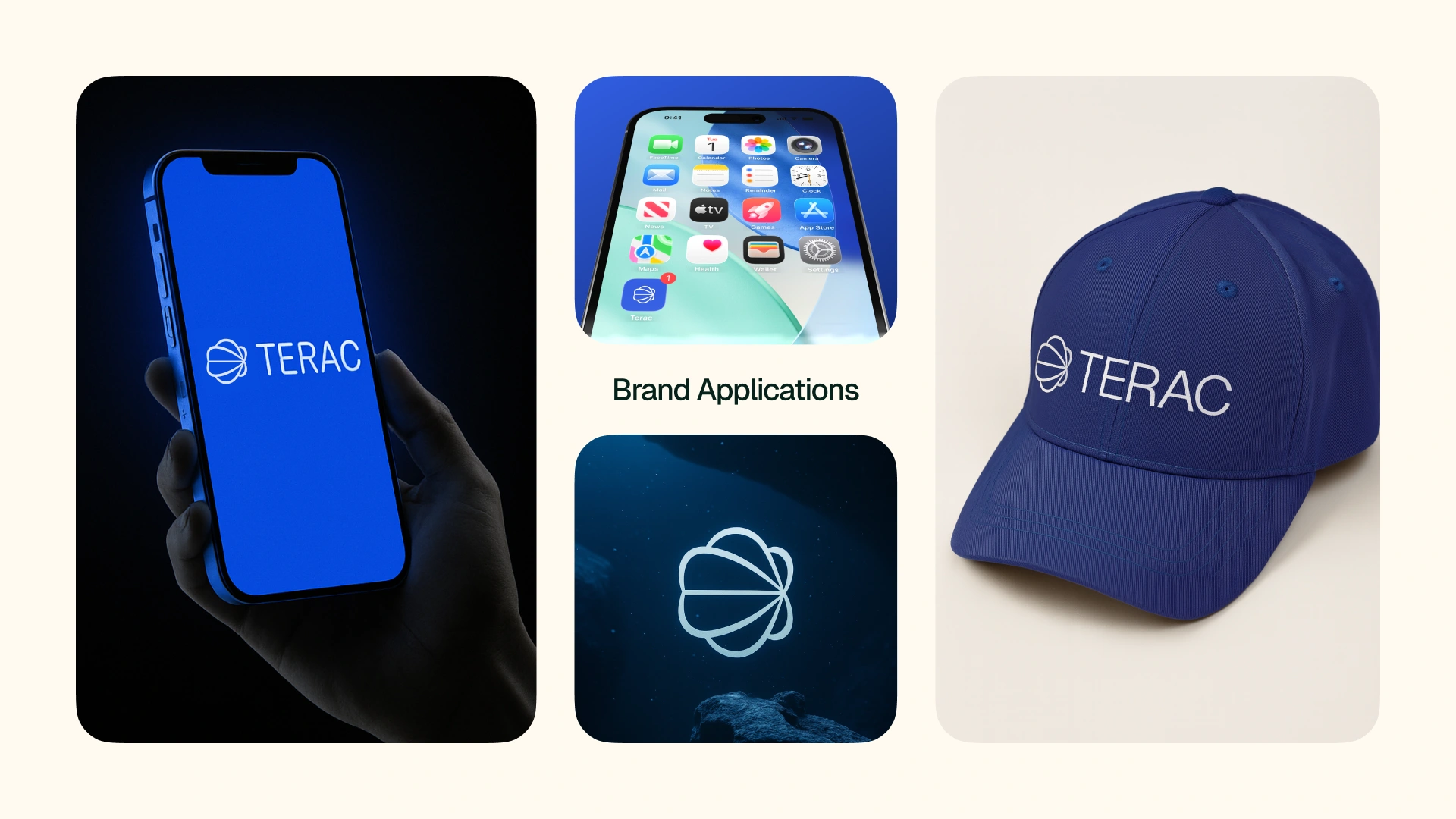
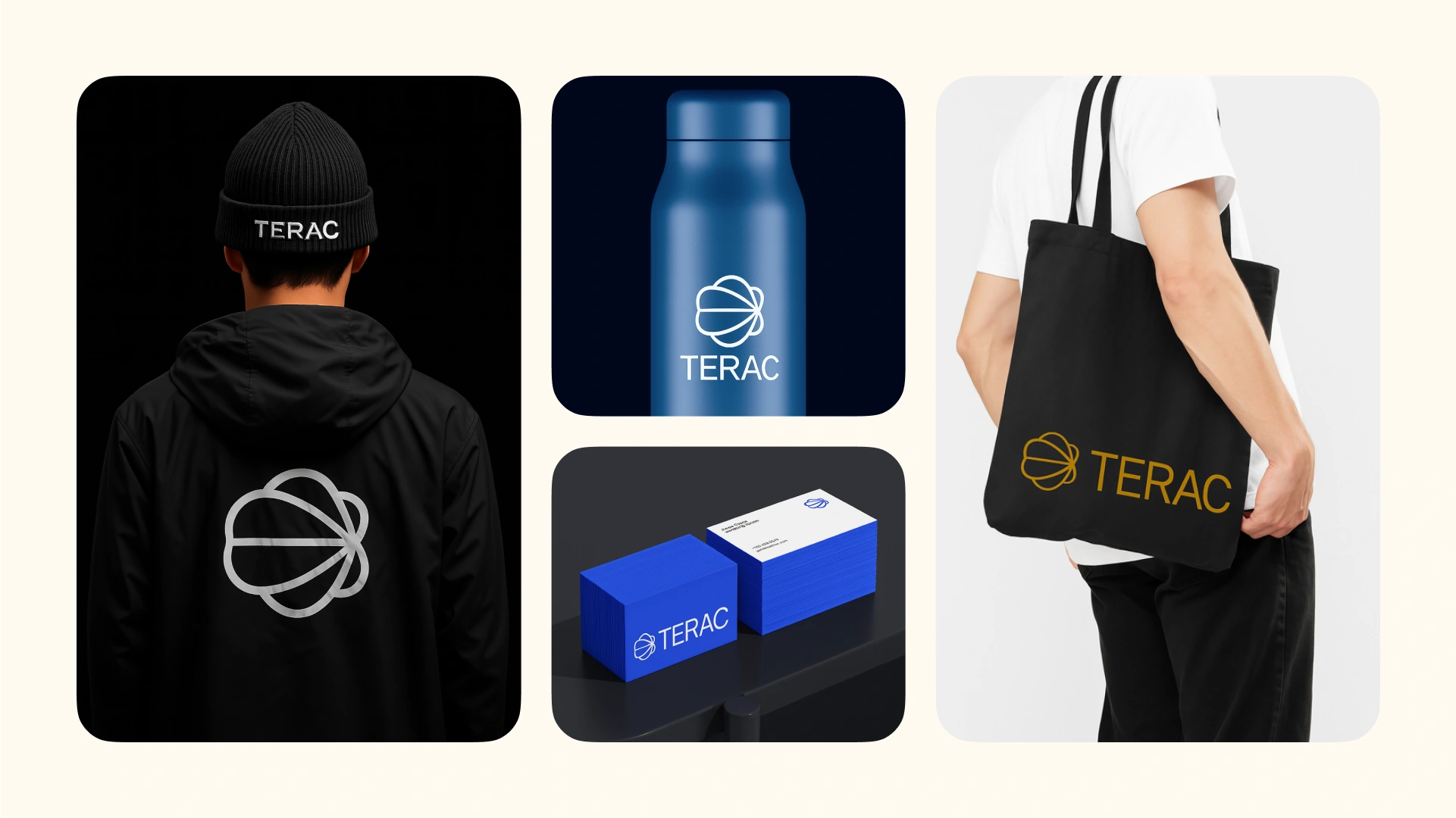
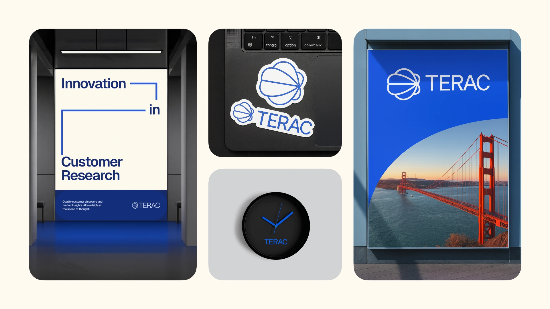
BRANDING KIT
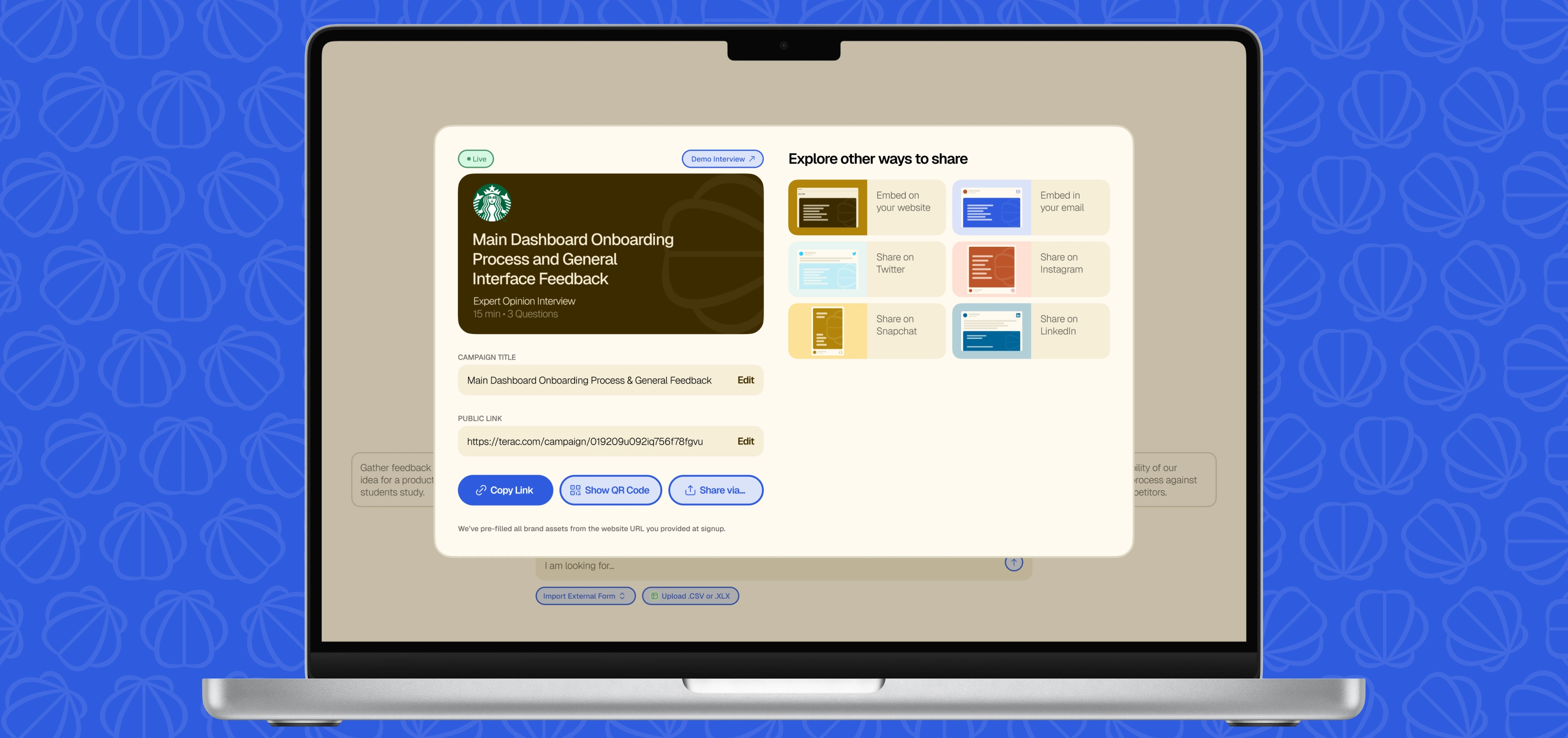
Here are a few of the slides in the Terac brand guidelines that I designed and delivered to the client.
Like this project
Posted Jul 24, 2025
Built a brand for Terac, an AI market research company. I built a comprehensive brand identity inspired by retrofuturism and nautical themes.
Likes
3
Views
68
Timeline
Jul 11, 2025 - Jul 14, 2025
Clients
Terac