Terac Onboarding Redesign
Shantanu Roy
Verified
Overview
Terac is an end-to-end research platform that helps companies source panelists, conduct interviews, and analyze results. I was brought on as an ongoing design consultant to conduct a design audit and overhaul the platform’s onboarding and web experience.
Terac’s onboarding flow had a 50% user dropoff.
The flow spanned 11 pages and took an average of 3 minutes and 30 seconds to complete, creating unnecessary friction before users could even start their first campaign.
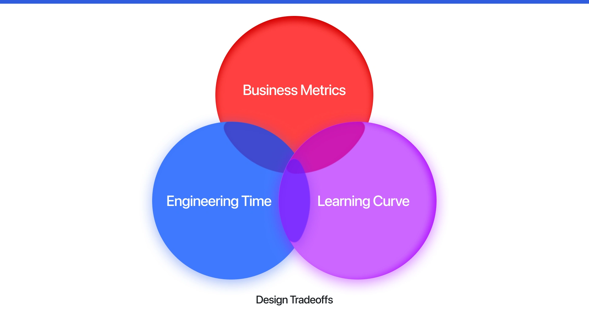
Approach
After auditing the onboarding journey, we identified three competing forces driving design tradeoffs:
Business Metrics: Reduce user dropoff and improve activation.
Engineering Time: Minimize development overhead for quick iteration.
Learning Curve: Simplify the process for new users without losing data fidelity.
We prioritized business metrics, focusing on lowering friction and improving activation without major engineering refactors.
I explored several directions to simplify onboarding, from interface refinements to automated data fetching. The insights came from two questions:
What information can we infer rather than ask?
How can we make onboarding feel like setup, not a survey?
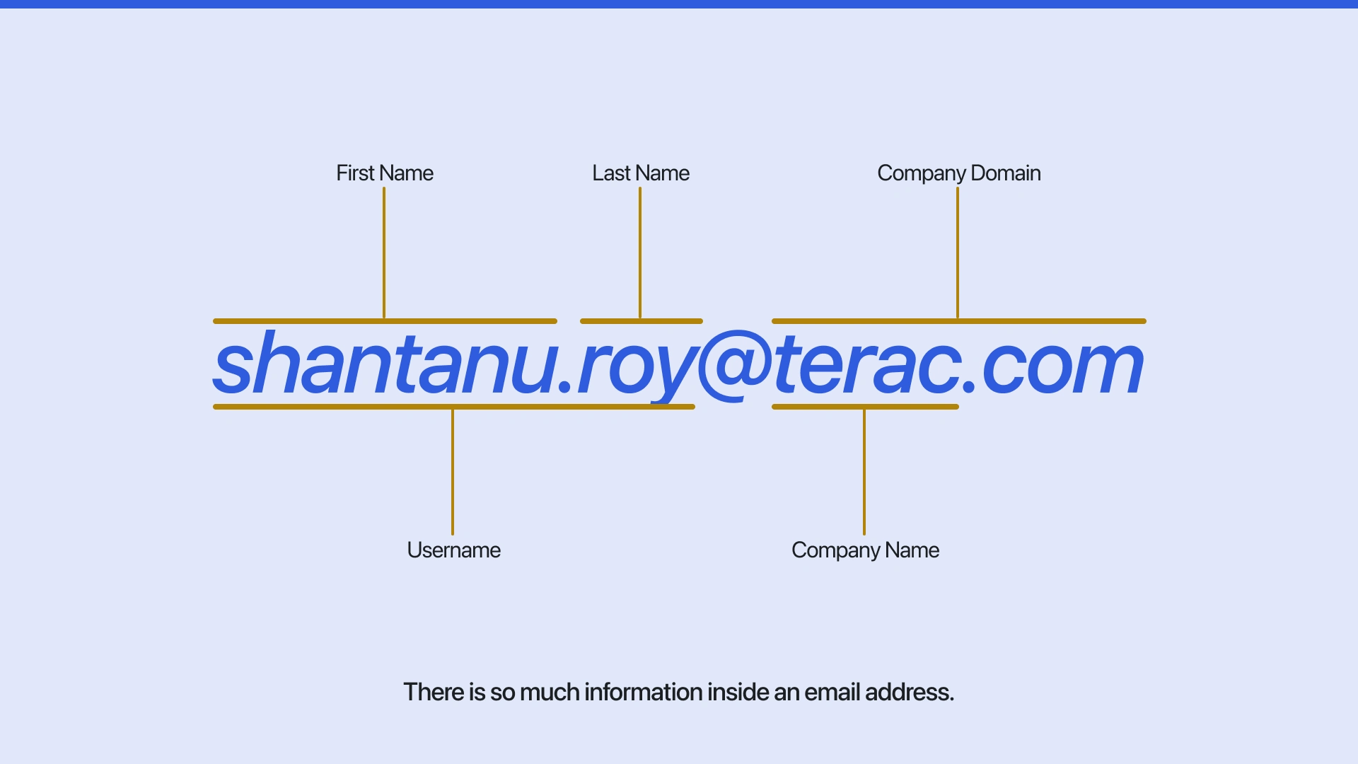
Key Insight
There’s a surprising amount of structured data inside something as simple as an email address.
By parsing name, domain, and company info, we realized we could auto-generate much of what users were being asked to type manually.
This led to leveraging enterprise SSO and Brandfetch APIs to auto-populate user and company data.
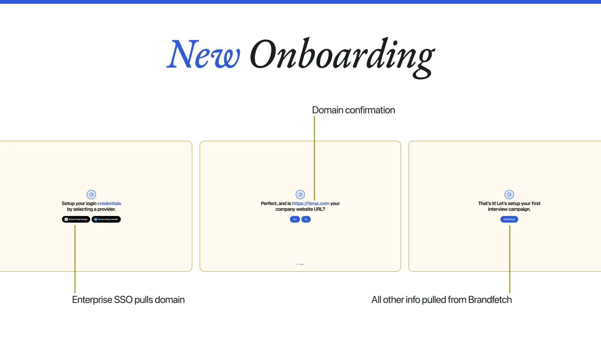
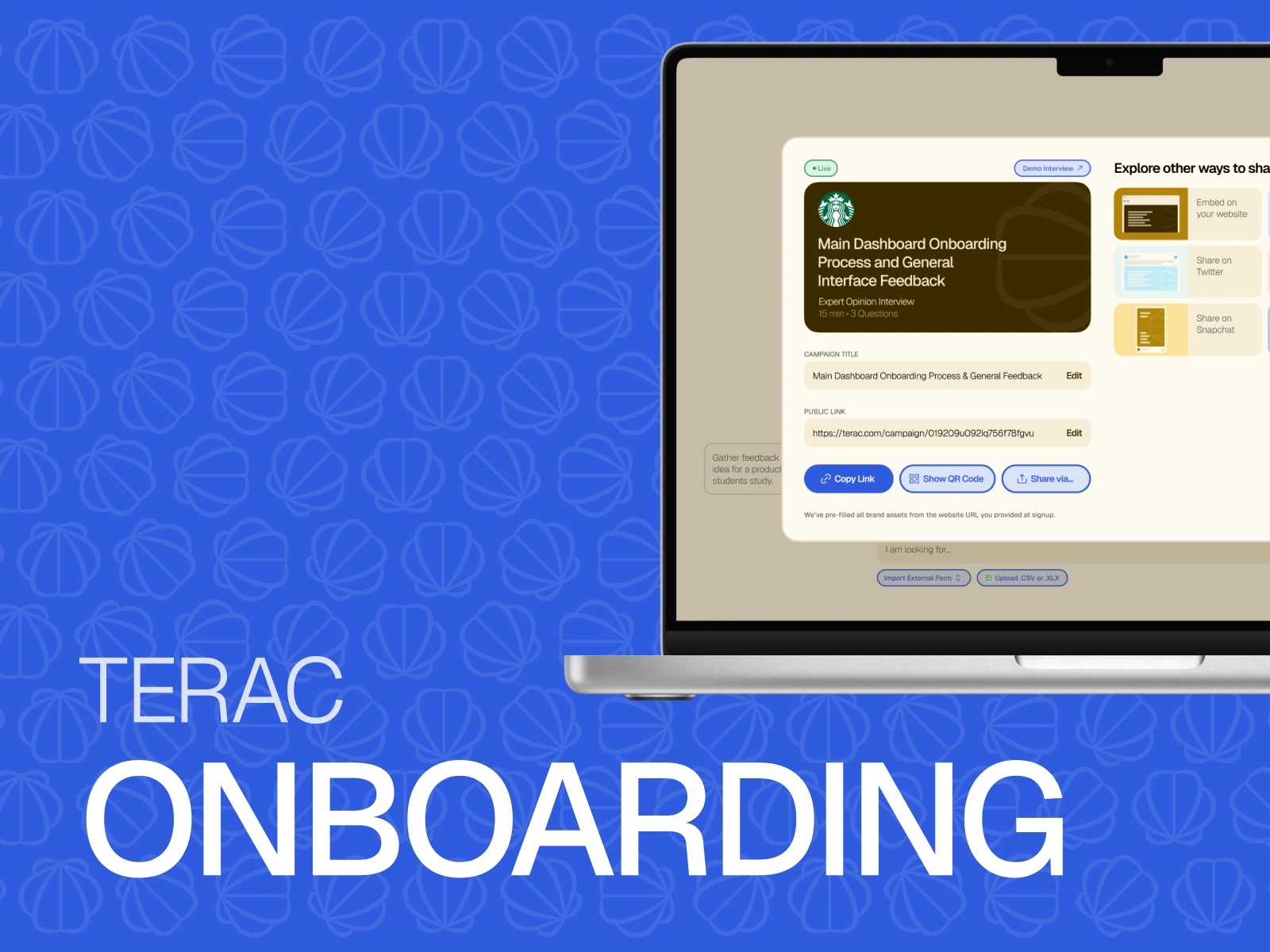
Solution
The redesign focused on turning onboarding into a moment of clarity rather than confusion. Instead of treating signup as a questionnaire, I reframed it as a setup experience that felt automatic, guided, and personal.
Using enterprise SSO, Terac could instantly recognize a user’s domain and authenticate their identity. The next step, powered by Brandfetch, automatically pulled brand assets like logos, colors, and company names. This eliminated most manual input fields and gave users a sense that the platform already understood their context.
The design also strengthened connection. Each step was conversational and focused on user intent, such as “Let’s set up your first campaign,” instead of system prompts like “Enter your company name.” That shift in tone built trust and reduced hesitation.
Finally, by cutting the flow from 11 screens to 3 and dropping onboarding time to under 30 seconds, users regained control. They could focus on what mattered most: launching their first interview campaign.
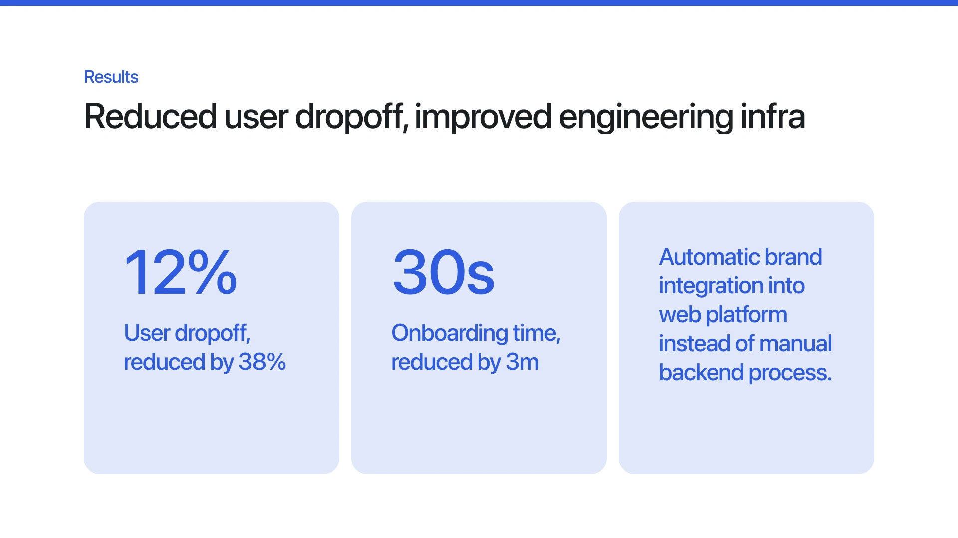
The redesign not only improved conversion but also streamlined Terac’s internal engineering processes by automating brand setup entirely.
Reflection
This project reinforced that onboarding is part of the product’s storytelling. Every unnecessary field signals friction, not trust. By turning data into design leverage, we transformed the experience from form-filling to instant activation.
If you found this helpful, interesting, and/or are facing similar situations with your product, schedule a call!
Like this project
Posted Oct 15, 2025
Redesigned Terac’s onboarding, cutting completion time by 3 minutes and reducing user dropoff by 38% through automation and smarter data inference.
Likes
1
Views
35
Timeline
Jul 11, 2025 - Jul 24, 2025
Clients
Terac