Leveraging growth through solving the right problems
Leveraging growth through solving the right problems
Overview
MyDigiPay is a mobile payment app that has more than 2 million users. Its primary purpose is to offer a comprehensive payment solution for users, including money transfers, personal finance management, SIM card top-ups, and data package purchases. It is also the only payment gateway used by Digikala.com, which has more than 40 million monthly active users. Additionally, it offers an “installment payment” solution for purchases made on the e-commerce website.
In 2020, I became an on-demand UX Lead for MyDigipay to help them overcome a specific challenge. At the time, the company was striving to increase its customer base by 500K. They were investing significant amounts of money in marketing and branding, generating plenty of product leads. However, after installing the app, new users tended to stop using it after an average of only one month. This was causing the company to lose customers and miss out on potential revenue.
There were six UX designers on the team, including myself. I served as the UX lead for this project and was in communication with various stakeholders such as the Marketing lead, Product managers, developers from each squad, and Customer Success specialists.
The problem
To ensure better clarity regarding the issues, the business case and expectations were thoroughly reviewed with the stakeholders. Following this, a design workshop was conducted to align the thoughts of our target audience with the values the app was promoting for the new users. Let’s take another look at the problem we were trying to solve. Users downloaded our app and signed up but ultimately churned out after only a month on average.
Our marketing team promoted the app through various channels, but the primary source was Digikala.com, our parent company with more than 40 Million active users. Digikala users could add their MyDigiPay wallets to their Digikala accounts and earn vouchers for online purchases.
In light of this, we decided to contact users who exhibited this behavior and invite them for UX interviews to uncover the reason for this trend.
What were the users thinking?!
We interviewed 20 individuals for a total of 10 hours. The interviews were held remotely, and we recorded each session. Since we didn’t have an AI assistant then, we had to listen to each recording multiple times to extract essential phrases.
Overall, there were 228 key phrases. We categorized them into 15 codes and extracted 4 themes.
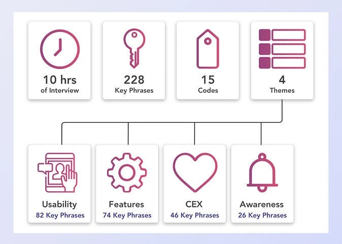
Image 1 — Thematic analysis of the interviews
Based on the feedback received, the users faced the following issues while using DigiPay:
1. Usability: The users had to switch between Digikala and DigiPay apps to use their digital wallet, which complicated the process.
2. Features: The users could only use their wallet on their Digikala shopping card, and they couldn’t shop directly from merchants within the DigiPay app. Therefore, they didn’t find enough motivation to use the app.
3. Customer experience: the lack of sufficient guidance for the users when they were encountering problems while using their wallet
4. Awareness: the majority of the users didn’t know that Digikala and DigiPay are sister companies.
The outcome was communicated to the stakeholders and senior managers within the company. It was decided that the Business Development team would handle the Feature theme, while the Customer Success team would concentrate on improving the CEX. The Marketing team selected the Awareness theme, and the Usability issue was assigned to the UX designers and the rest of the Product team since it was the main cause of the problem.
Seeking direct, first-hand insights
The usability testing of the mobile app was conducted with 15 users. Based on the interviews, the top 3 flows that the users were struggling the most were the following:
1- Using the digital wallet in the app itself
2- Purchase from Digikala with MyDigiPay wallet
3- Contributing to the installment plans to purchase from Digikala, using the digital wallet
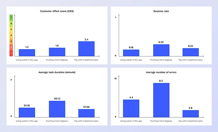
Image 2 — The result of the usability tests
We aimed to decrease the payment processing time to an average of 30 seconds. However, we fell far behind in achieving that goal. As seen in image 4, the low success rate, high number of errors, and low CES score all confirm what our interviewees had already pointed out — DigiPay’s services were not user-friendly and did not meet expectations.
How did we solve the problem?
One of the challenges we faced was simultaneously rebranding the company and redesigning its website. This meant incorporating the new brand elements into the design. Another team was working on creating a new design system, which meant that the UI had to be consistent with it. Consequently, we had to design the entire website from scratch!
We decided to focus on improving the user experience on the app’s home page, as most users left the app from there. The changes on the other pages were minor and involved updating them based on the new design system.
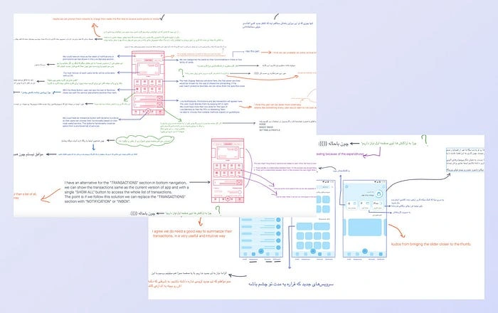
Image 3— A snapshot of the collaboration in the ideation phase to redesign the home page in Freehand.

Image 4— The finalized wireframe of the homepage
What was changed?
The application is in Persian, but I’ve translated the homepage to English in the image below to demonstrate the changes better.
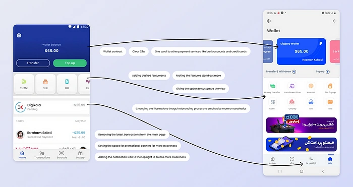
Image 5— The finalized UI of the homepage. The left screen is the old design, and the right one is the new
The outcome
- The weekly retention rate was increased by 40%. This resulted in an increase in the active user base by 500K
- The CSAT was increased by 20%
Like this project
Posted Sep 20, 2024
MyDigiPay is a mobile payment app that has more than 2 million users. Its primary purpose is to offer a comprehensive payment solution for users, including mon…


