No code syncing of multiple content repositories in one click!
No code syncing of multiple content repositories in one click!
Overview
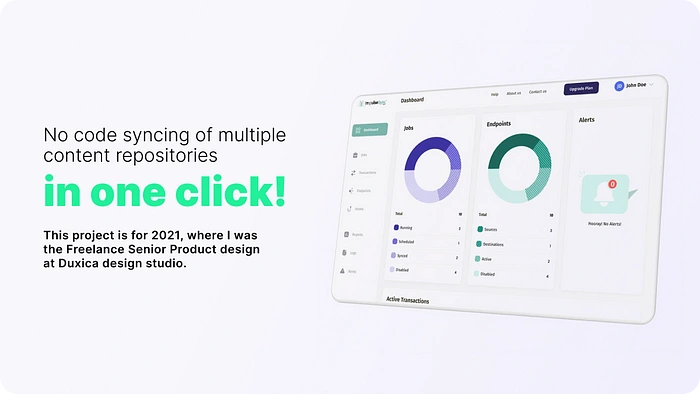
Impulse is a SaaS product. It is an integration platform designed to help businesses migrate, deliver, and keep their content in sync across an unlimited number of CMS systems. The primary users of the product are content managers and product managers.
Their main problem was partially using command lines and a dashboard as their user interface. They couldn’t scale since their product wasn’t easy to operate. Therefore, they had to assign an agent for each client to handle their tasks.
My role in this project was the Senior Product design alongside two other Product designers. The project was done remotely. I had weekly catchup calls with the Product manager. I also regularly met with the Customer Success lead, Tech lead, and Back-end and Front-end developers to enable cross-functional collaboration and involve diverse mindsets in product design.
We almost had no clue about the users.
Although I had worked on multiple SaaS projects and also had the experience of working with CMS myself, this project was novel to me. Their business was complicated, and we needed knowledge sharing regarding their solution, their target audience and current users, and the value they were bringing to the market.

Image 1 — The design thinking workshop on FigJam.
After having 1:1 with stakeholders in the company, I decided to hold a design thinking workshop to gather diverse thoughts and ideas and have a mutual alignment in understanding the problems, the users, and the solutions. The workshop was done remotely on FigJam.
Getting in the field
We needed to empathize with the users and see their journey while they synced content among different CMSs. The product wasn’t suitable for us to let people use it and watch their interactions. Therefore, we had to sit with them while they were doing their job and ask questions regarding their behavior and challenges.
As a result, we found out that there are two main challenges for the people:
1- There are diverse content repositories, and the users have their own Excel files to manage and track these. This flow had a significant load on their short memory, and they expressed that multiple errors are usually in each sync. When the sync process is automated, it’s not usually changed for a long time. So, it’s also probable for the users to forget the flow.
2- They needed situation awareness. Let’s say the sync is being conducted. They needed to know what was done successfully and what was not. Sometimes, they needed this report while the sync was in progress so that they could handle it sooner or fix the existing problem.
Dealing with the confusion in the ideation part
The ideation consisted of 3 steps:
1) Definition of existing features;
2) Brainstorming ideas and prioritizing them using impact-effort matrix and Moscow;
3) Grouping the final items based on their relations and mapping them into the product’s architecture.
Definitions

mage 2 — Definition of existing features and their descriptions.
As mentioned earlier, the concept of the solution was complicated. Especially when they had made up names, such as Motator, Job, and Hoock. Therefore, we created sticky notes and asked the product manager to describe each feature and its value. We always had an eye on these cards throughout the next steps.
We also suggested changing the names to be easier to understand, yet the business owners believed that the different names were their differentiators in the market.
It felt good to be on track finally!
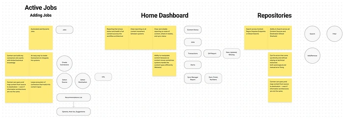
Image 3: Generating, prioritizing, and organizing ideas into three categories mapped into the product’s architecture.
The final ideation step was to group the unique, prioritized user stories. We used an affinity diagram for this purpose and finally had them in the product’s architecture.
Collaborative work
It was time to think about the journey after finalizing the list of ideas as user stories. As mentioned above, we categorized and sorted the ideas in the product’s architecture, depicted below. The green shapes are pages, the blues are sub-pages, the yellow is the main actions regarding the user stories, and the gray shapes are other needed data and actions.
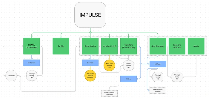
Image 4 — Impulse product architecture with the main flows.
Based on the architecture, we, the three designers, divided the tasks among ourselves. I worked on the dashboards and tables, while the other 2 took care of creating/editing jobs and repositories, sync flow, and the diff report.
We took a bottom-up, then top-down approach: We started with the main flows and features and had sync calls on daily stand-ups and weekly reviews to ensure a meaningful connection whenever there needed to be an interaction between these flows on a higher-level architecture.
We also involved the Tech people from the early stages of the design. We spent a 15-minute call with each user story to consider technical complexities and use their ideas early on. After all, this product was being used by technical people.

Image 5- A sample of the user flows.
Going through 4 iterations!
When it came to designing the solution, our approach was straightforward:
1) design;
2) internal team review;
3) usability testing;
4) revision;
5) repeat until we are confident enough about the wireframe.
We conducted remote, moderated usability testing.
That took us three rounds of revisions and four versions of the solution. As a result:
1- A wizard walkthrough was added for the 1st onboarding to the product to serve the self-service PLG objective
2- The same wizard approach was added for the main feature of the product: Creating jobs to remove the load of memorization of the flow. As mentioned in the discovery part, Customer Success aid was requested to perform this task since it wasn’t done so often, and the users tended to forget the flow. Meanwhile, the task was critical for them
3- The dashboard was redesigned to bring in more efficient situation awareness so that the users would have enough insight to take the necessary actions
4- The product’s architecture was redesigned to bring in seamless navigation and structure
To ensure the flow is as easy and understandable as possible, we added a page after creating the job to measure Customer Effort Score (CES) for first-time users.
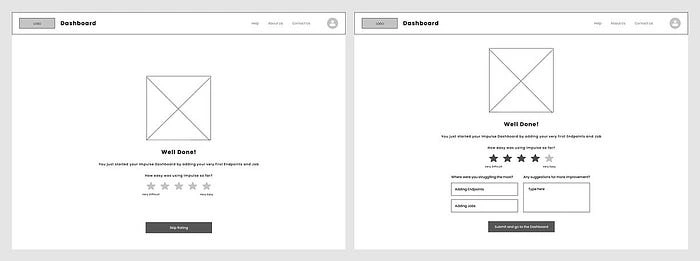
Image 6 — Asking for the user’s review after creating a job
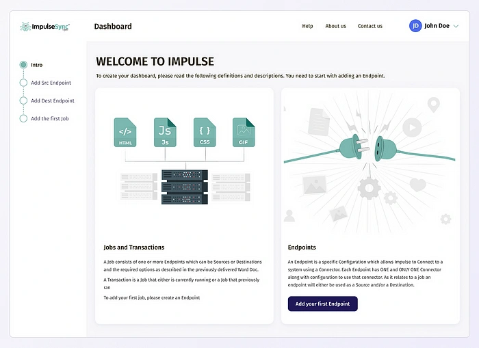
Image 7 — The onboarding wizard aiming to enable self-service use of the product
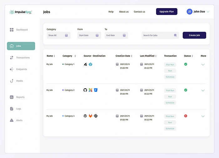
Image 8 — Creating a separate page for the Jobs. The layout of Transactions, Endpoints, and Hooks is similar due to maintaining consistency.
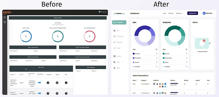
Image 9 — Impulse’s dashboard, before and after the redesign
Results
- Decreased the load for the Customer Success agents for onboarding and creating jobs by 70% by enabling a wizard approach, serving the goal of PLG
- Increased the speed of taking actions regarding ongoing sync tasks by 60% by bringing in situation awareness by information visualization in the dashboard
- Increasing product engagement by 40% through redesigning the product’s architecture and navigation
Duxica, while not a technical shop, was able to understand what our product does and built it accordingly. read full review
Jason TesserCTO at Motiv
Like this project
Posted Sep 20, 2024
Impulse is a SaaS product. It is an integration platform designed to help businesses migrate, deliver, and keep their content in sync across an unlimited numbe…


