Eliminating post-release UX issues
Eliminating post-release UX issues

Overview
Emlen.io is a software-as-a-service (SaaS) product focusing on B2B sales and buyer enablement. Its goal is to help sales teams close deals faster by providing insights into buyer behavior. The platform allows sellers to create collaborative “deal rooms” or “destinations” to add relevant content and invite prospects to engage. Emlen then analyzes the buyer behavior to help sales teams better understand the buying journey and provide the right content at the right time.
As the company's customer base grew in 2023, the product shipped new features starting from Q2. However, inconsistencies arose on different pages, such as margins, icons, buttons, and font sizes, due to the need for a front-end library and the expanding tech team.
The first assumption was that there needed to be more alignment between the design and tech teams. A data-driven approach was proposed to solve the issue. The head of product and I discussed having a beta release, but addressing most matters before the beta release was essential to reduce rework on development.
Quick start: a short checklist
As the Product Design Lead, I created a process that would provide valuable insights and be easily understandable by all stakeholders. This process aimed to expedite our product's release without compromising UX quality. After careful consideration, I developed a LEAN approach, which involved creating a list, testing it, and enhancing it. The first UX audit took place in July 2023, and since then, we have made three rounds of improvements to the process.
Taking the initiative
The original list was created using a simple Google sheet. As the bugs we were dealing with were primarily related to the user interface, with a few occurring in edge cases and user journeys, most of the list was focused on those areas. The domains that were covered included:
Alignment:
UI components’ horizontal and vertical alignment
Margins & paddings
Inter-component & external spacing
Text:
Font size, weight, and style
Typography hierarchy
Copywriting
Color:
Respecting primary/secondary, semantic colors
Background colors, illustrations, text, icons, buttons, shadows, etc
Affordance:
Component state check (normal, hovered, toggled, etc)
Micro-interactions (like drop-downs, pop-ups, dialogues, etc.)
Differentiation between links and standard text
Size check on different screen sizes
Media:
Size of icons, illustrations on different screens
Matching the icons and illustrations to the design
Scrolling behavior
Transition between pages
Adaptiveness:
A quick test on different browsers used by our customers
The responsiveness on different screen sizes
User journeys:
Testing different user journeys to make sure they have been fully implemented
Dependency/effect on other flows/features
Looking for edge cases
Validations:
Checking to see if the right messages are shown for success, error, warning, information states
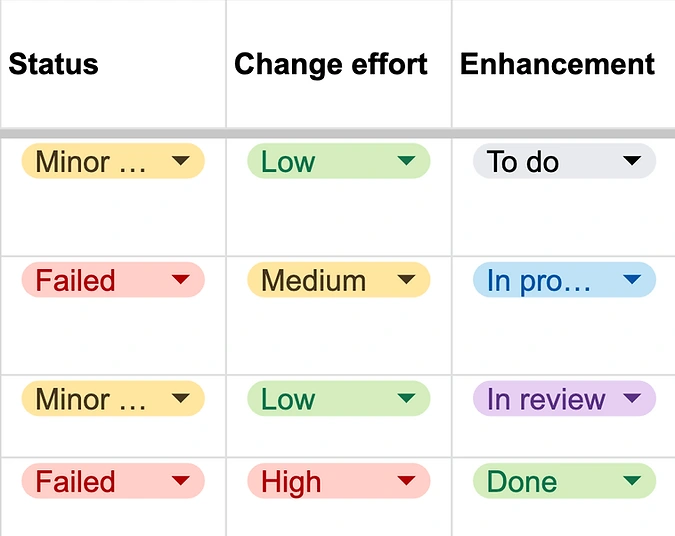
Image 1 — Issue tracking in each category
I have added three columns to the list to keep track of different categories:
1- Status (Passed, Minor, Failed): This column helps determine whether there are any relative UX bugs in each category. If the status is set to Failed, the issue is a release blocker and must be fixed before the release. However, if there are Minor issues, they don’t block the release but are added to the backlog to be fixed in the next two sprints. If there is no issue, the status is set to Passed. The status is determined by the Designer responsible for the feature.
2- Change effort (Low, Medium, High): This column helps prioritize the issues based on the front-end team’s capacity. For instance, the ones with Failed status and Low change effort are tackled first. The Front-end developer and the QA specialist responsible for the feature determine the change effort.
3- Enhancement (To do, In progress, In review, Done): For each issue, a ticket is created on the Jira board, and the status is reflected on the UX audit sheet by the Product Manager after each daily stand-up. When a ticket is set to In review, the designer confirms the resolution of the reported issue.
Was it good enough?!
After completing the initial round of the audit, all stakeholders gave feedback on the process and suggested ways to improve it. One of the main problems with the first version was its usability. The stakeholders found it time-consuming to go through the list and its descriptions. The designers also found it challenging to customize each row. For example, if three issues were related to a specific category, three new rows had to be added to the Google sheet.
To address these issues, I decided to add more visual aids to the process. I created a Figma file and organized the categories on the list into sections. You can find an overview of the template in image 2 below.

Image 2 — Figma file of the UX audit with the same categories on the Google sheet
The process was simple. Whenever a UX problem was encountered, a screenshot was taken, and a status label and description were added. An example of this is shown in image 3. Additionally, any improvement was highlighted on the same label, making it easier to monitor the issue. To review the resolved issue, you could compare it to the previous version on the Figma file.
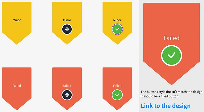
Image 3 — The enhancement status of the issues. The gear icon means it’s in progress, and the green mark means it’s resolved. On the right side is a sample describing the issue and a link to the design as a reference.
After implementing the changes, we removed usability blockers and enabled stakeholders to participate more smoothly. During the next UX audit, we identified the need for another improvement. Previously, designers had to create a separate tab for each category to record the number of issues, which caused unnecessary rework. After discussing the objective with the team, we decided to continue working on the Figma file and add the frequency of each category to the sheet. This allowed us to gain the insights we sought without additional tabs.
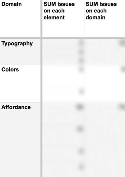
Image 4 — Using the frequency of issues on each domain (category) and the subdomains. The numbers are intentionally blurred.
Results
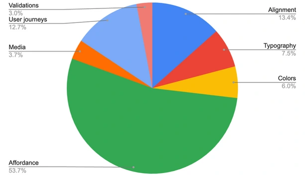
Image 5 — The pie-chart indicating the percentage of each category in 9 rounds of UX audits
On January 14th, 2024, my team and I conducted nine rounds of UX audits on emlen.io. Our efforts were successful, and we reduced the number of UX-related issues to less than two on average before the beta launch. As a result, we had a flawless product release with no UX-related matters reported.
The UX audit has proved to be very effective. However, according to our analysis, each issue takes approximately 1.5 hours to reveal, resolve, and review. Therefore, while there were no UX bugs in the releases, the process could be more scalable.
During the audit, we found that more than 75% of the issues were related to affordance, alignment, spacing, and typography. Therefore, we were improving the audit process while cleaning our codebase to build a reusable Front-end library that matches our existing UI library. We aimed to have less than 5% UX issues related to the mentioned categories.
Acknowledgment
I would like to express my gratitude to Leo, Valerie, and Julia at emlen.io for their invaluable contributions to this project's success.
Like this project
Posted Sep 20, 2024
Emlen.io is a software-as-a-service (SaaS) product focusing on B2B sales and buyer enablement. Its goal is to help sales teams close deals faster by providing …


