University of Bremen Website Redesign
Adedotun Fatokun
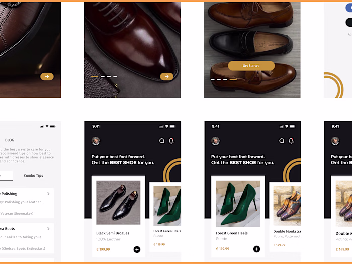
University of Bremen's Revamped Landing page
Heuristic's Review and Evaluation + Website Redesign
Overview
This project involved a heuristic redesign of a university website to improve usability, clarity, and user satisfaction. The existing site had functional information but suffered from a cluttered layout, inconsistent navigation, and poor accessibility—common issues identified during a heuristic evaluation. The goal was to enhance the overall user experience for prospective students, current students, faculty, and staff.
Problem
The original website failed to meet several key usability principles. Users struggled to locate essential information like course offerings, application procedures, and departmental contacts. Navigation was inconsistent across pages, the visual hierarchy lacked clarity, and important calls to action were buried or missing. These issues led to confusion, frustration, and high bounce rates, especially among first-time visitors.
Solution
Using Jakob Nielsen’s 10 Usability Heuristics as a framework, I conducted a thorough evaluation and identified key usability violations. I then created a redesigned website structure that focused on:
Consistent navigation patterns across all pages
Improved information architecture for easier discovery
Clear visual hierarchy and accessible design choices
Stronger CTAs for core tasks like admissions and student services
Responsive layouts for mobile and tablet use (in-view).
Prototypes and wireframes were validated through user testing to ensure improved functionality and engagement (in-view).
My role as the UI/UX Designer
I led the end-to-end redesign process, starting with a heuristic audit and stakeholder interviews. I mapped out user journeys for various personas (prospective students, faculty, current students), redesigned the site’s layout and navigation, and created high-fidelity mockups. I also conducted usability testing and iterated based on feedback. Accessibility, consistency, and clarity were my top priorities throughout the process.
Design Highlights
Making Essential and Key Info easily understandable to users.
Simplification of Info and Putting them in the correct hierachy
Complete Design
Complete Design
Complete Design
Conclusion
The redesign of the university website transformed it from an overwhelming information dump into a structured, user-centered platform. By applying heuristic principles and focusing on real user behavior, the site now supports easier navigation, faster access to key content, and a more modern, trustworthy impression. This project underscored the value of usability-first design in enhancing digital experiences for large, diverse audiences.
🎓 Is your university, educational, company or business website due for a redesign?
I recently led a heuristic-driven redesign of a university website, transforming it from a cluttered, confusing experience into a clean, user-friendly platform. By focusing on usability principles, intuitive navigation, and accessibility, I helped streamline access to key content for students, faculty, and applicants alike.
If you're looking to modernize your own's digital presence and make it easier for users to find what they need—let’s talk. I’d love to help you design a website that’s not just functional, but truly effective.
Like this project
Posted Jun 11, 2025
Heuristic redesign of University of Bremen's website for improved usability and user satisfaction.