Leenora — Beauty Brand Identity & Packaging

Adam Saadi


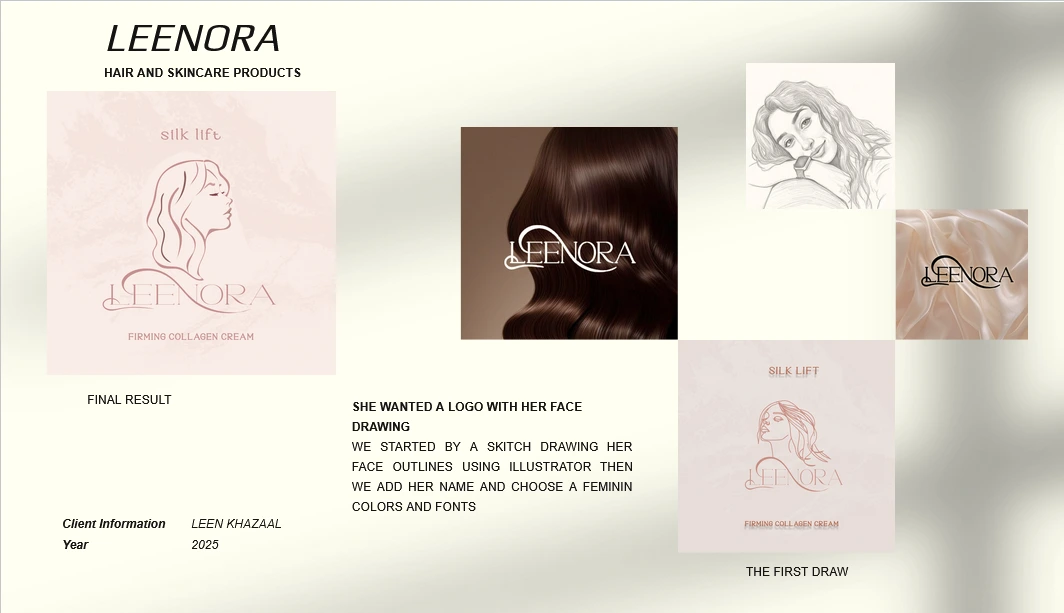
Leenora — A Feminine Beauty Brand Built from Scratch
Leenora is a beauty startup founded by a woman who wanted her brand to feel personal, elegant, and unmistakably feminine. She came to Vera Studio with a clear vision: build a full brand identity rooted in her own image, with soft feminine colors and refined typography throughout.
The Brief
The client needed a complete brand identity system for her beauty line — something that could carry across packaging, digital, and print. The brand had to feel premium but approachable, with a strong personal connection to the founder herself.
What I Delivered
Logo & Wordmark — A custom logotype with elegant, feminine letterforms that reflect the softness of the brand
Color Palette — A refined palette built around feminine tones, balancing warmth and sophistication
Typography System — Carefully selected fonts that pair editorial elegance with readability across all touchpoints
Brand Identity System — A cohesive visual language covering patterns, layouts, and brand guidelines
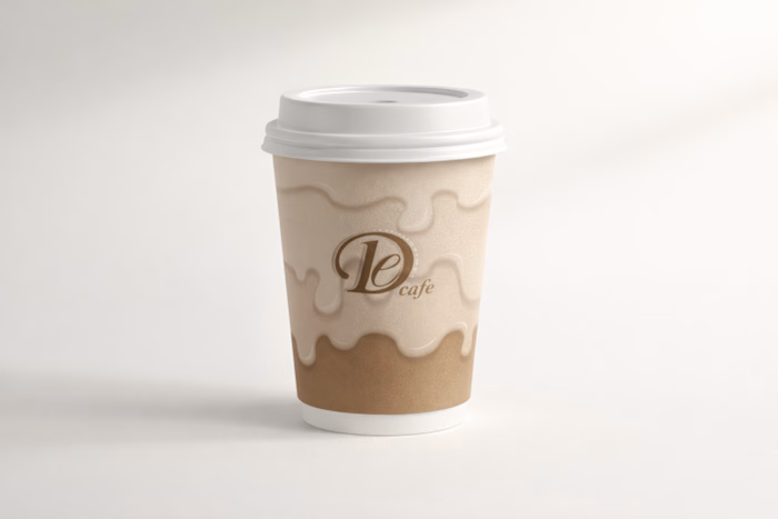
Package Design — Product packaging that translates the brand identity into a tactile, shelf-ready experience
The Approach
I started with the founder's story and personal aesthetic. Every design decision — from color to type to packaging structure — was filtered through her identity. The result is a brand that doesn't just look beautiful; it feels like her.
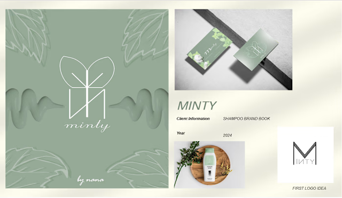
Brand identity for Leenora
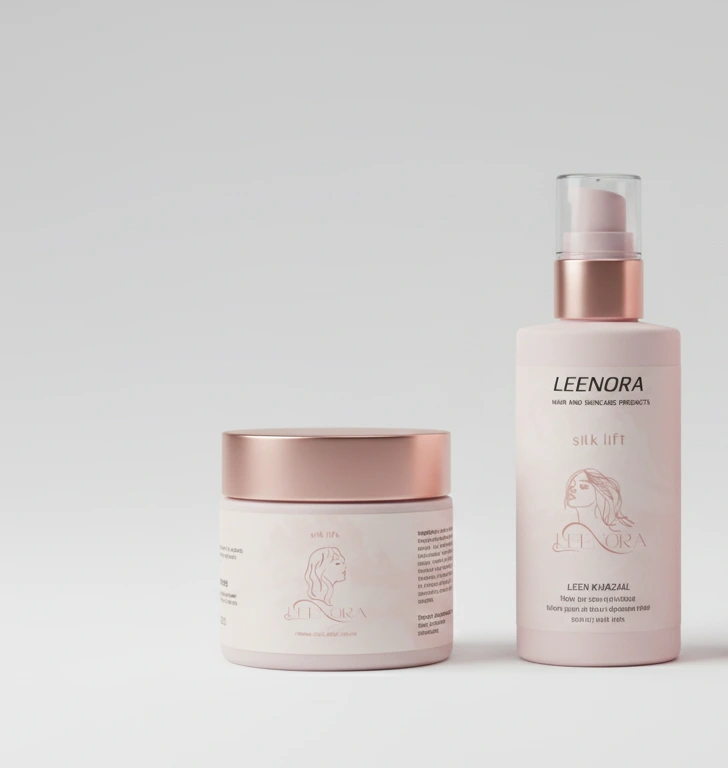
Package design for Leenora
The Result
A complete, launch-ready brand identity that gives Leenora a strong foundation to enter the beauty market with confidence and clarity.
Like this project
Posted Jul 16, 2026
Full brand identity and package design for Leenora, a feminine beauty startup — including logo, color palette, typography, brand system, and product packaging.
Likes
1
Views
18
Clients
Vera Studio