Hope Center Branding
Katie Kick
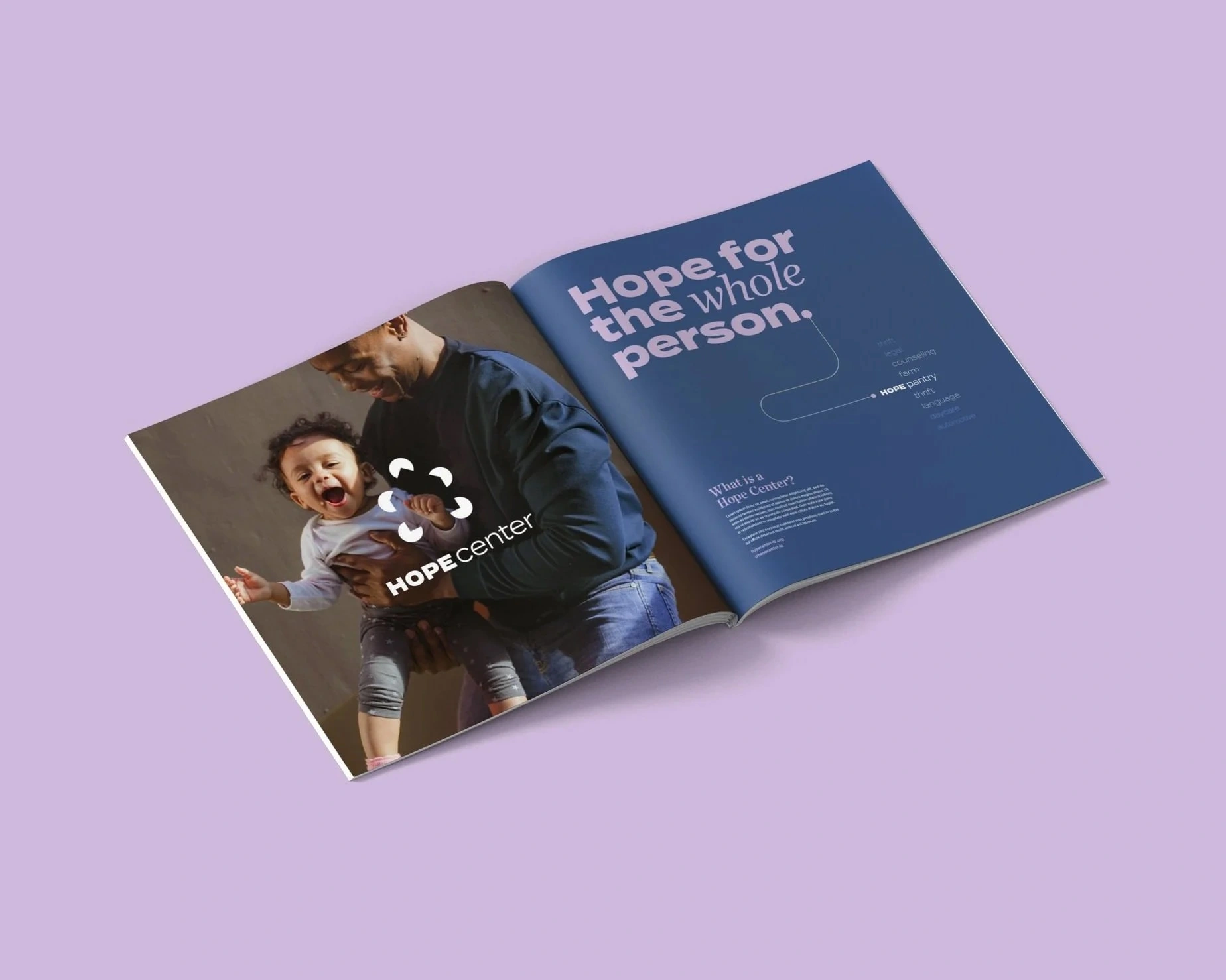
The Hope Center is a community hub offering services and resources to support individuals and families facing challenges.
The brand uses warm, approachable visuals to reflect a welcoming, non-judgmental space. Thin line connectors are used throughout the visual system to signify connection and moving toward a solution.

Collective Purpose
The logo is comprised of five dots uniting—representing people gathering around a shared mission.
The negative space in the center is an implied safe space / building — showing that Hope Centers can exist anywhere people come together to serve, regardless of any single physical space.
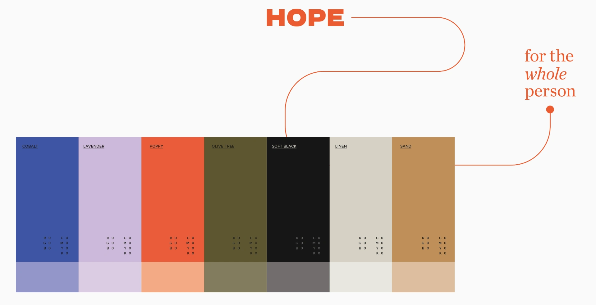
A warm, approachable palette was chosen to reflect Hope Center’s heart—balancing calm neutrals with uplifting tones that convey welcome and growth.
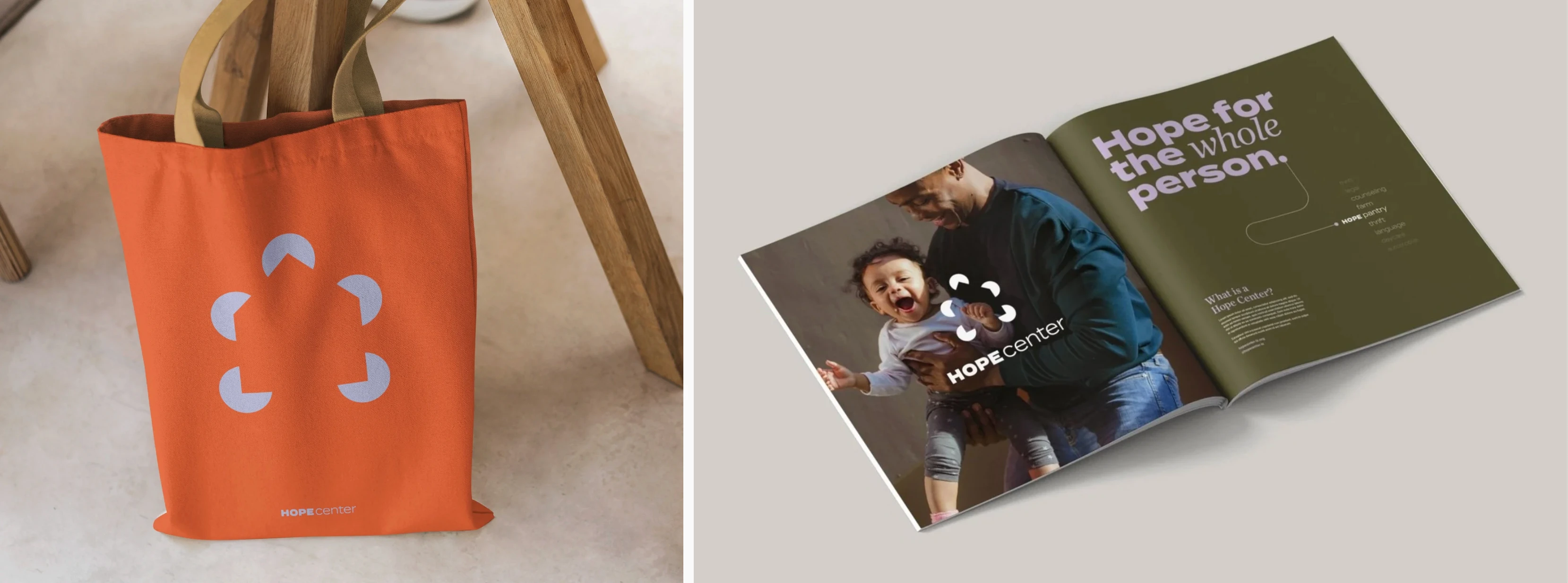
Practical pieces like tote bags and booklets extend the Hope Center brand beyond the walls, giving the community tangible reminders of welcome and care.
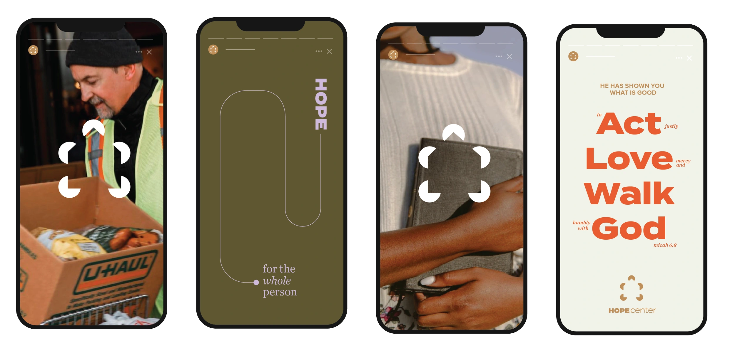
From print to digital, every touchpoint reinforces Hope Center’s mission—building a cohesive brand that welcomes, connects, and inspires.
Like this project
Posted Sep 14, 2025
Created Hope Center’s branding system, building a cohesive identity that reflects hospitality, care, and belonging for the community.
Likes
0
Views
5
Timeline
Jan 14, 2022 - Jun 14, 2022