Aspen Group
Katie Kick
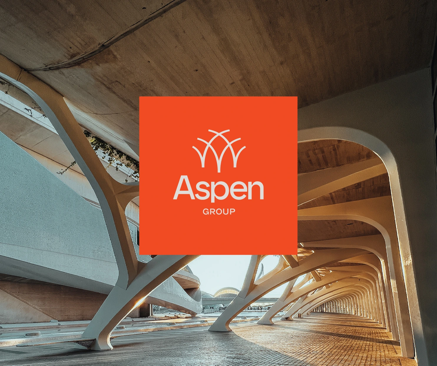
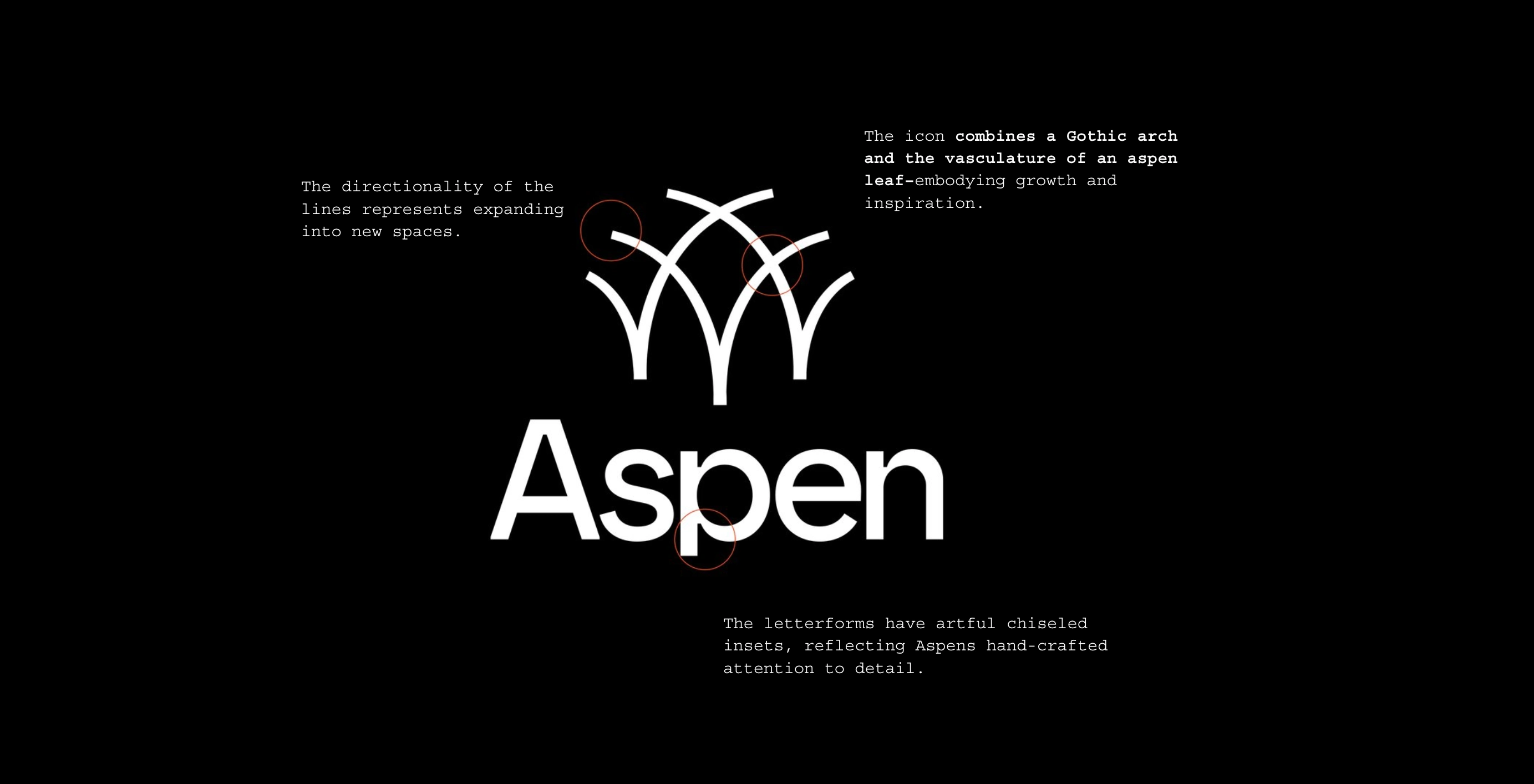
For Aspen Group's rebrand, the goal was to elevate the visual identity of an architecture company known for designing and constructing church spaces that transform communities. The new brand reflects their commitment to excellence, innovation, and faith, merging purpose-driven design with timeless craftsmanship.
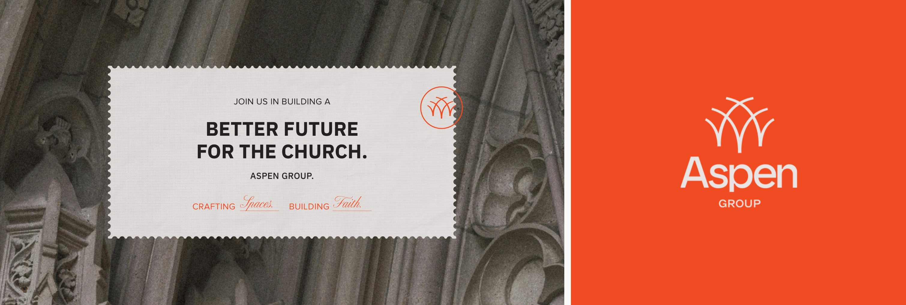
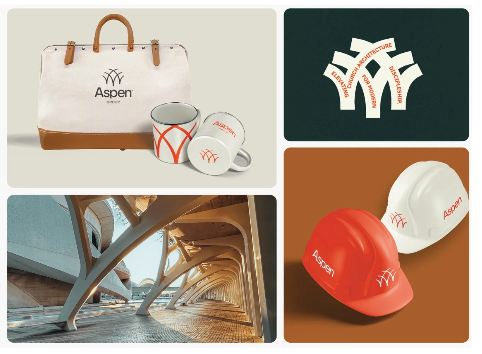
The visual approach for Aspen Group was centered around simplicity and boldness, with a focus on creating intentional space. Minimal design elements were employed to allow for imagination and creativity to take center stage.
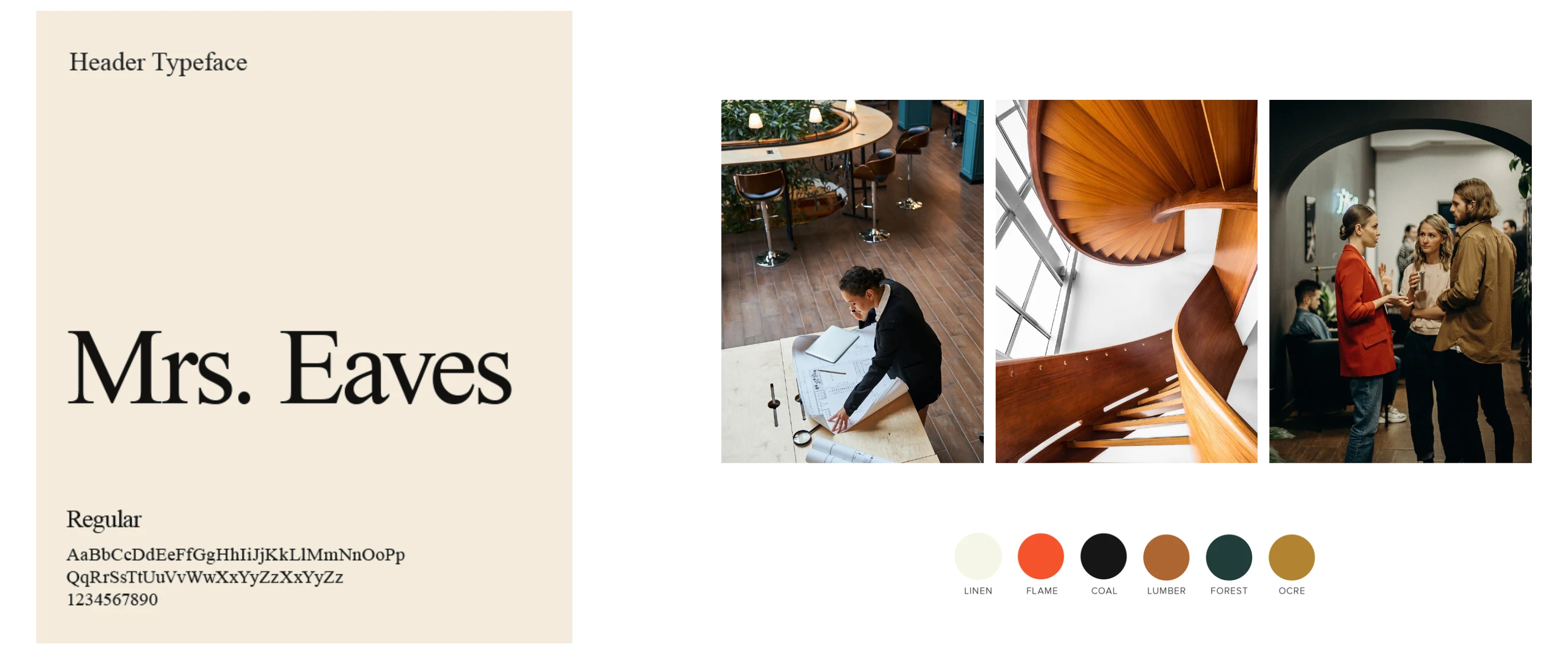
Together, type and color work together to create a refined, creative identity that reflects Aspen Group’s commitment to purposeful design. A strategic combination of typefaces ensures clear, modern typography, with a touch of elegance and craftsmanship. In the palette, Linen and Lumber offer timeless neutrality, while Flame, Ocre, and Forest inject nature-based energy.
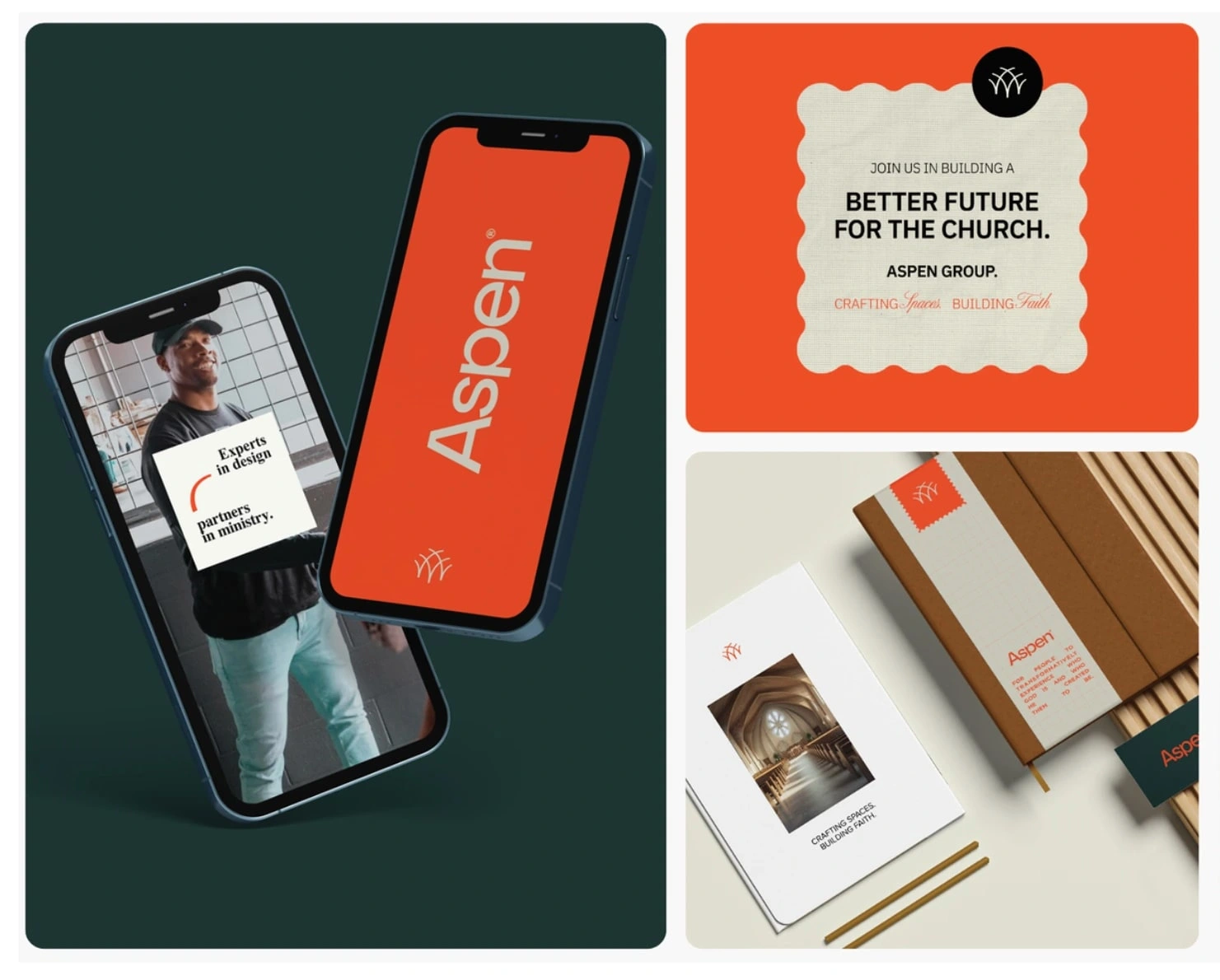
Strategic use of white space, along with refined graphics and timeless accents, highlighted Aspen’s dedication to excellence and craftsmanship, while also fostering an environment for creative playfulness and reimagining spaces.
Like this project
Posted Jul 20, 2025
Aspen Group's rebrand reflects their commitment to architectural excellence and innovation, merging purpose-driven design with timeless craftsmanship.