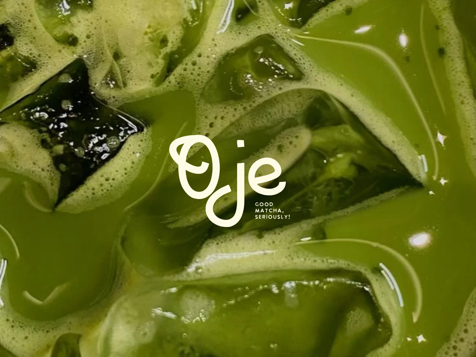
Oje - A Bold, Gen Z Matcha Brand
Bidipta Chatterjee
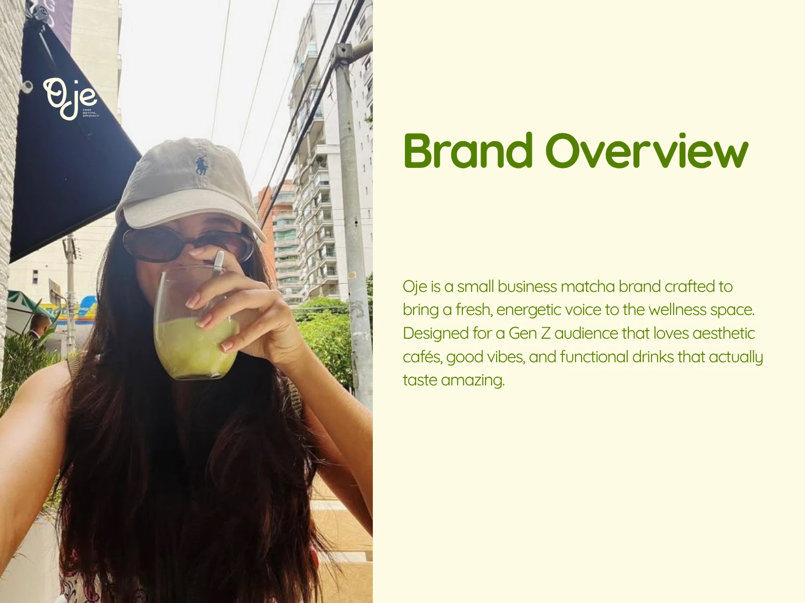
Brand Overview:
Oje is a small business matcha brand crafted to bring a fresh, energetic voice to the wellness space. Designed for a Gen Z audience that loves aesthetic cafés, good vibes, and functional drinks that actually taste amazing.
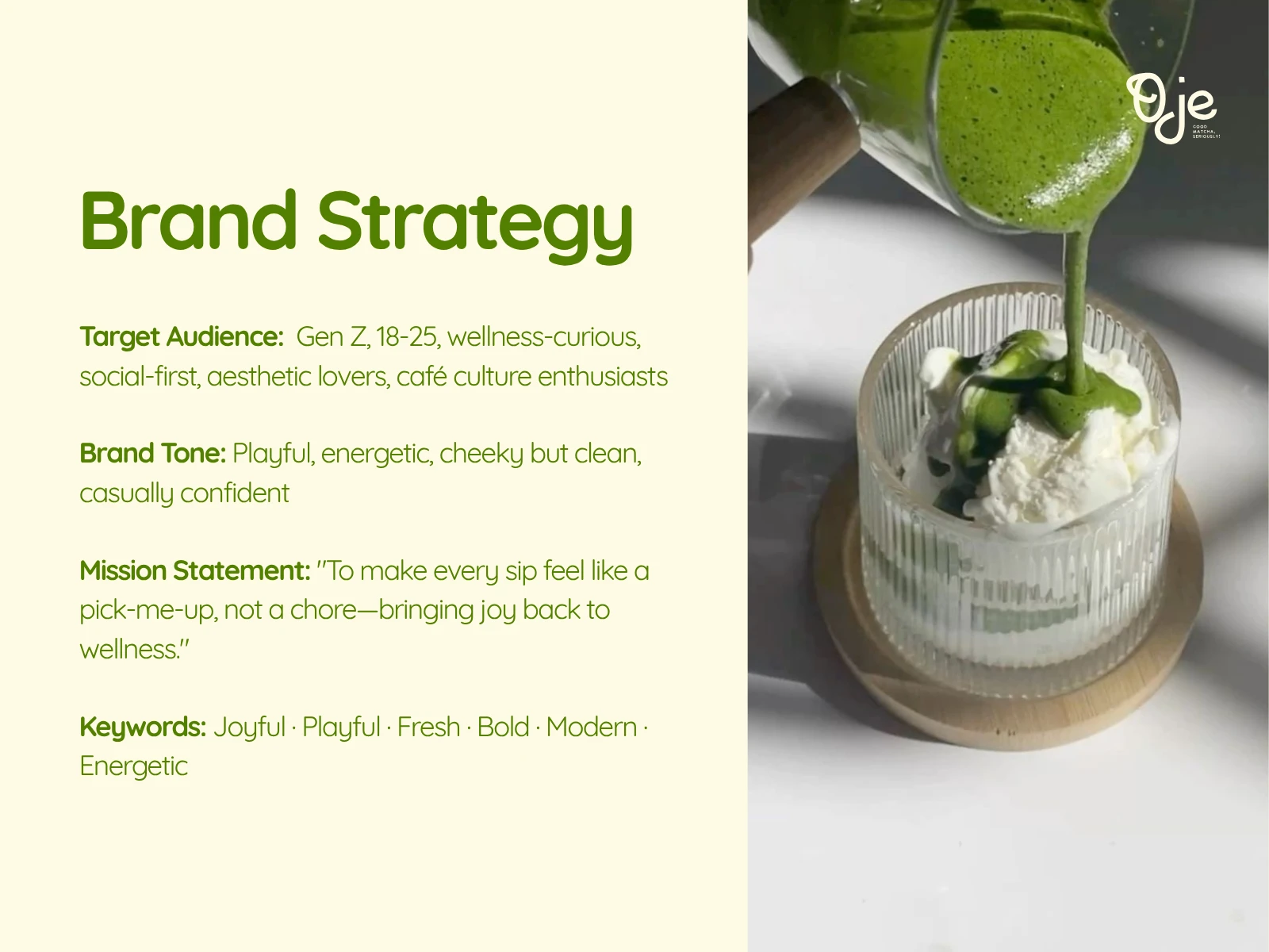
Brand Strategy:
Target Audience:
Gen Z, 18–25, wellness-curious, social-first, aesthetic lovers, café culture enthusiasts
Brand Tone:
Playful, energetic, cheeky but clean, casually confident
Mission Statement:
"To make every sip feel like a pick-me-up, not a chore—bringing joy back to wellness."
Keywords:
Joyful · Playful · Fresh · Bold · Modern · Energetic
Brand Typography:
Oje’s typography is crafted to say:
“We’re bold, energetic, and full of good vibes — but we’re also serious about quality.”
It blends playfulness with clarity, perfectly aligning with the brand’s mission to make wellness feel joyful rather than clinical.

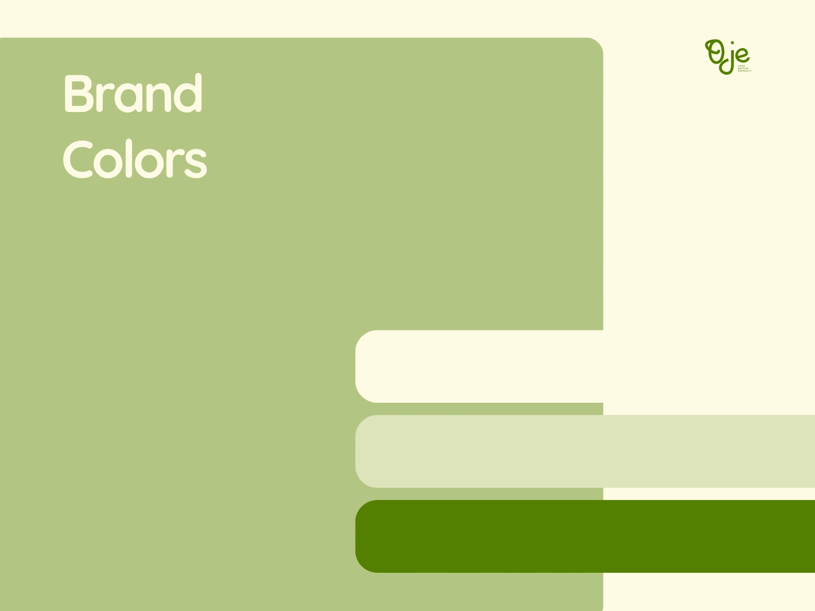
Brand Colors:
Oje’s brand colors reflect its mission to make wellness joyful, not clinical. The palette balances:
Fresh + friendly
Natural + modern
Cheeky energy + calming clarity
This color system helps the brand visually stand out in a crowded wellness market while still feeling honest, feel-good, and Gen Z-ready.
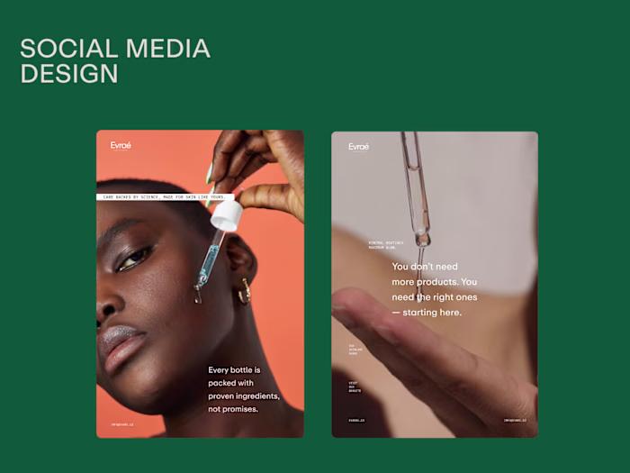
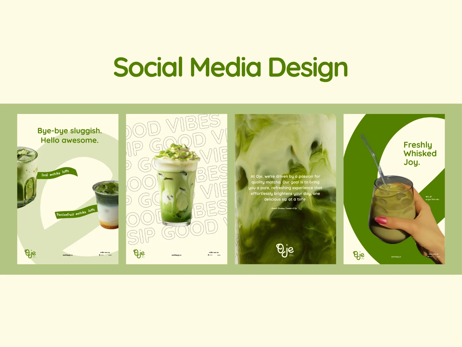
Social Media Design:
To bring Oje’s playful, feel-good brand identity to life across digital touchpoints, I created a series of social media posts that are bold, clear, and Gen Z-friendly.
Each design reflects Oje’s mission to make wellness joyful, not clinical. I used:
Vibrant product photography and creamy matcha textures to evoke freshness and flavor
Catchy, feel-good copywriting like “Bye-bye sluggish. Hello awesome.” and “Freshly Whisked Joy.” to maintain an uplifting brand voice
A strong balance of graphic shapes and white space, inspired by café culture aesthetics and retro-modern layouts
A repeating “GOOD VIBES” backdrop for brand recall and motion-friendly content adaptation
These posts are designed to spark engagement, communicate Oje’s values instantly, and build visual consistency across the feed while keeping things fresh, cheeky, and scroll-stopping.
Like this project
Posted Jul 1, 2025
Oje is a small-batch matcha brand with a bold, feel-good vibe made for Gen Zs who love aesthetic cafés, good energy, and drinks that actually taste amazing.