dr.Robbin - Brand Identity Design
Jinny Y.

Brand Identity Design
BI
Key Visual
Package&Application
System Guide
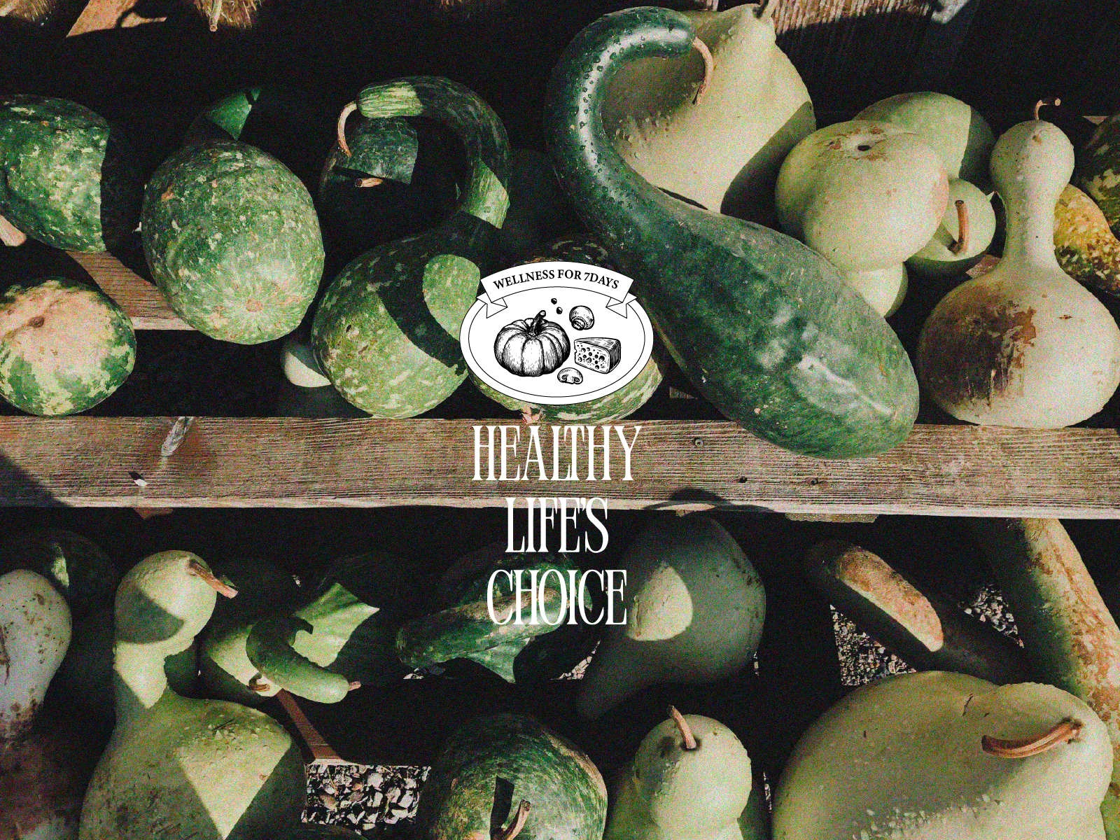
Located in Seoul, Dr. Robin is a wellness-focused food and beverage brand that promotes healthy eating habits. Based on medical insight, the brand offers trustworthy menus made without refined sugar or artificial additives. Its recipes are developed in collaboration with experts, emphasizing honest cooking that preserves the integrity of ingredients, while creating dishes that naturally support a healthier daily routine.
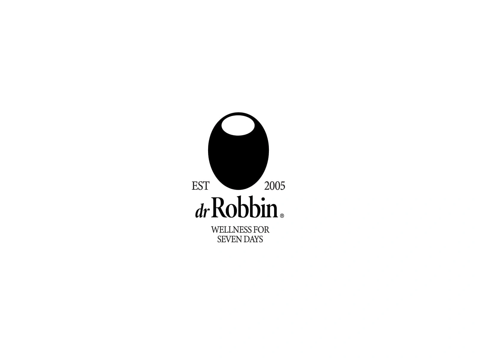
Primary Logo
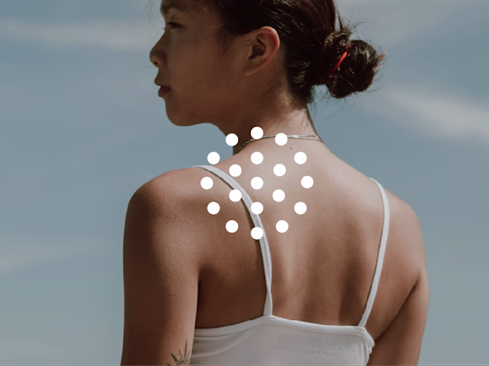
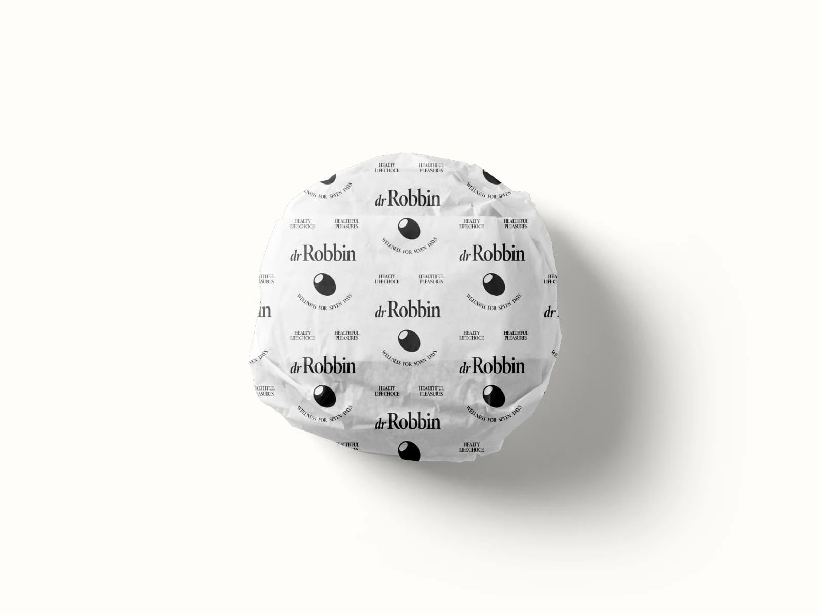
The carefully refined typography highlights the brand’s sophistication and professionalism. It reflects Dr. Robin’s deeper intention—not merely to serve food, but to promote the values of a healthy lifestyle. The olive, a symbol of peace and prosperity, is used as a graphic motif throughout the brand to visually communicate Dr. Robin’s commitment to wellness and mindful living.
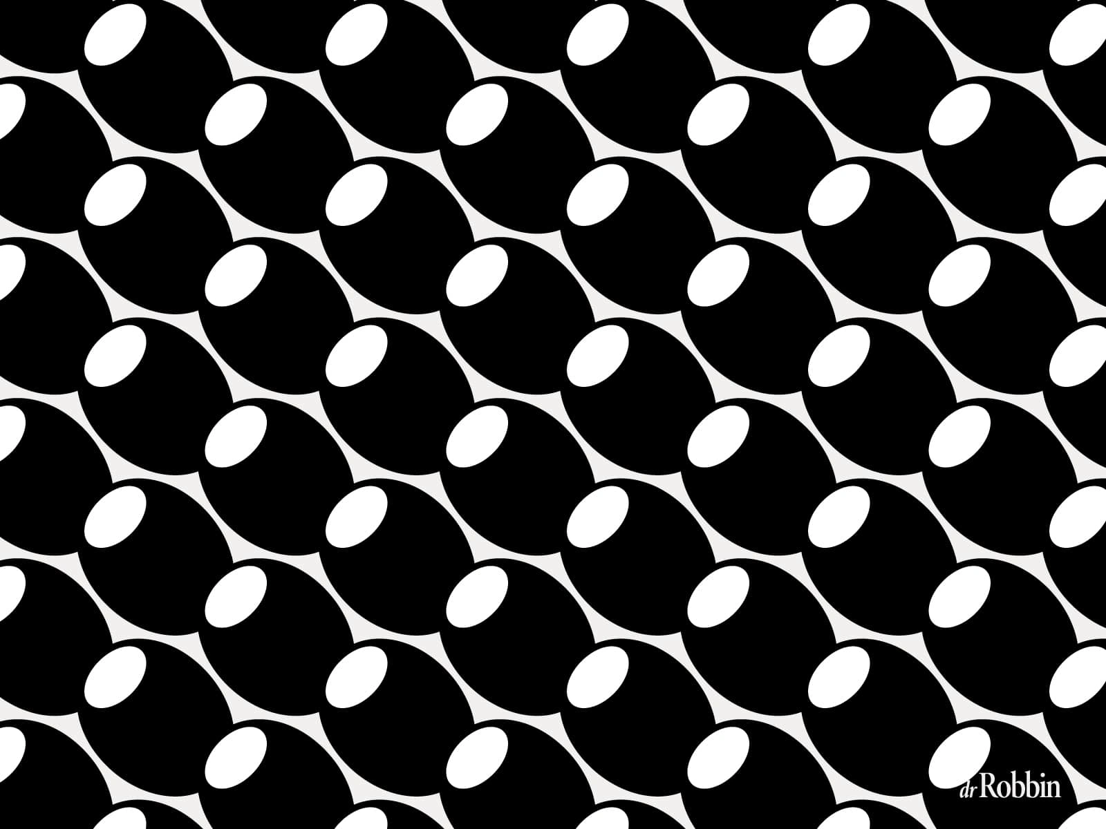
Brand Simbol Pattern
Secondary Logo
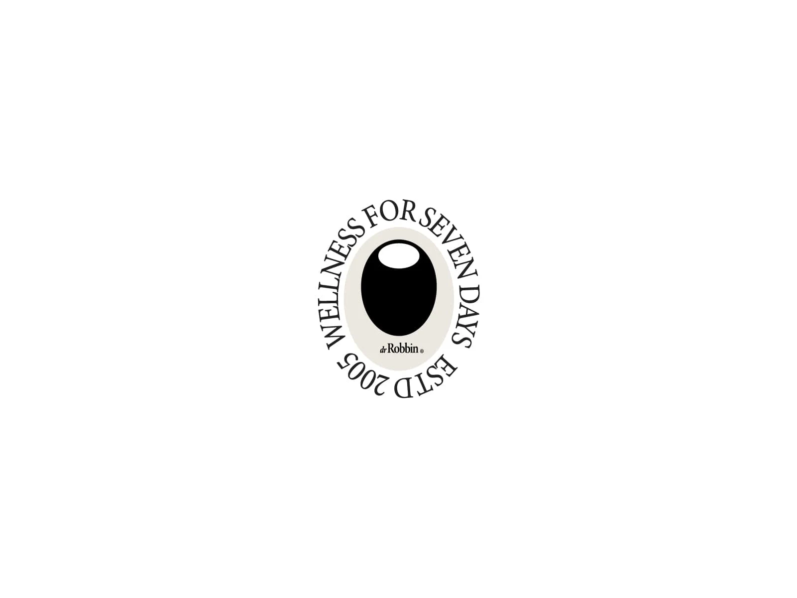
Secondary Logo
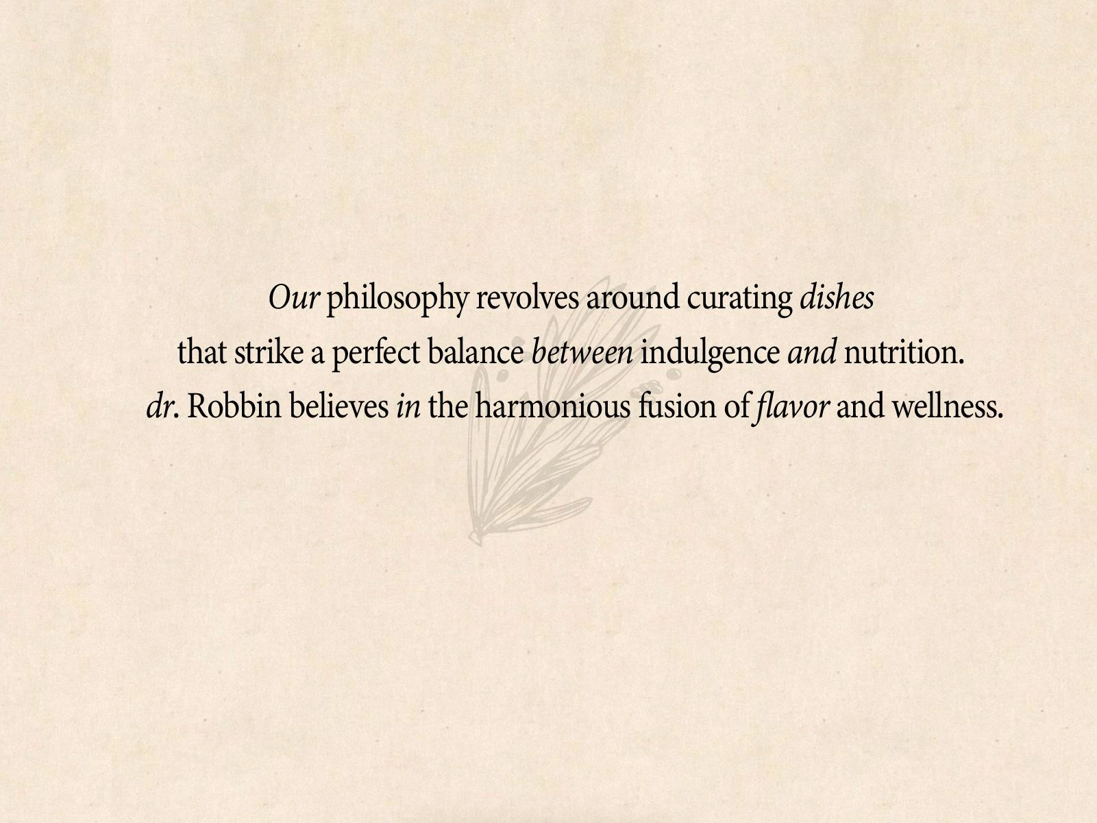
Brand Philosophy
Brand Message Visual

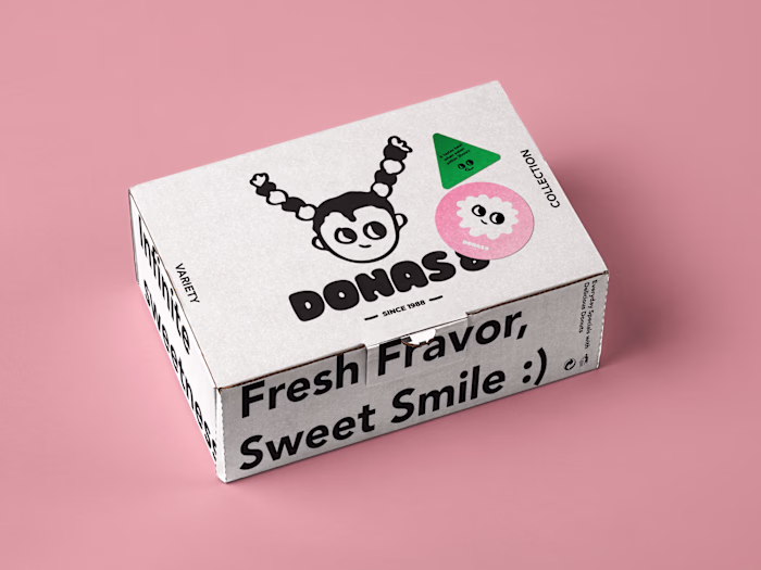
Brand MealKit Package
Brand Package Application
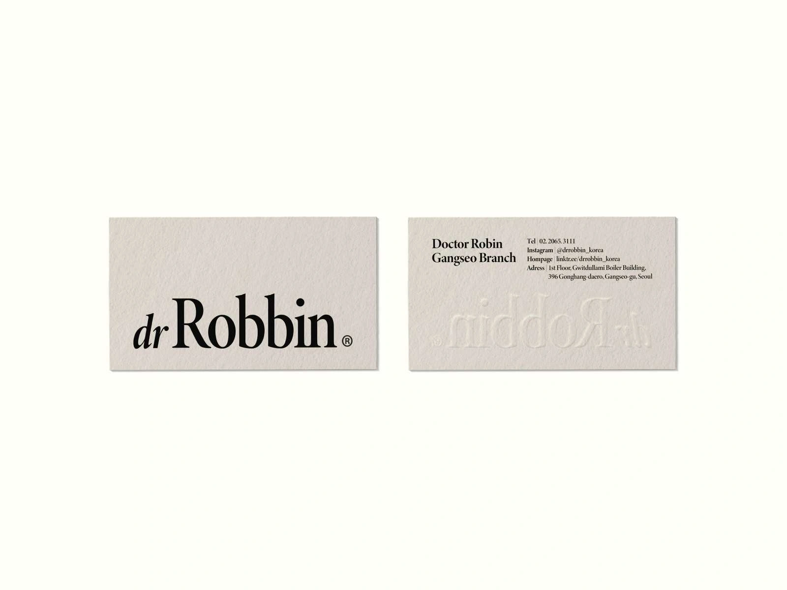
Brand Store Card
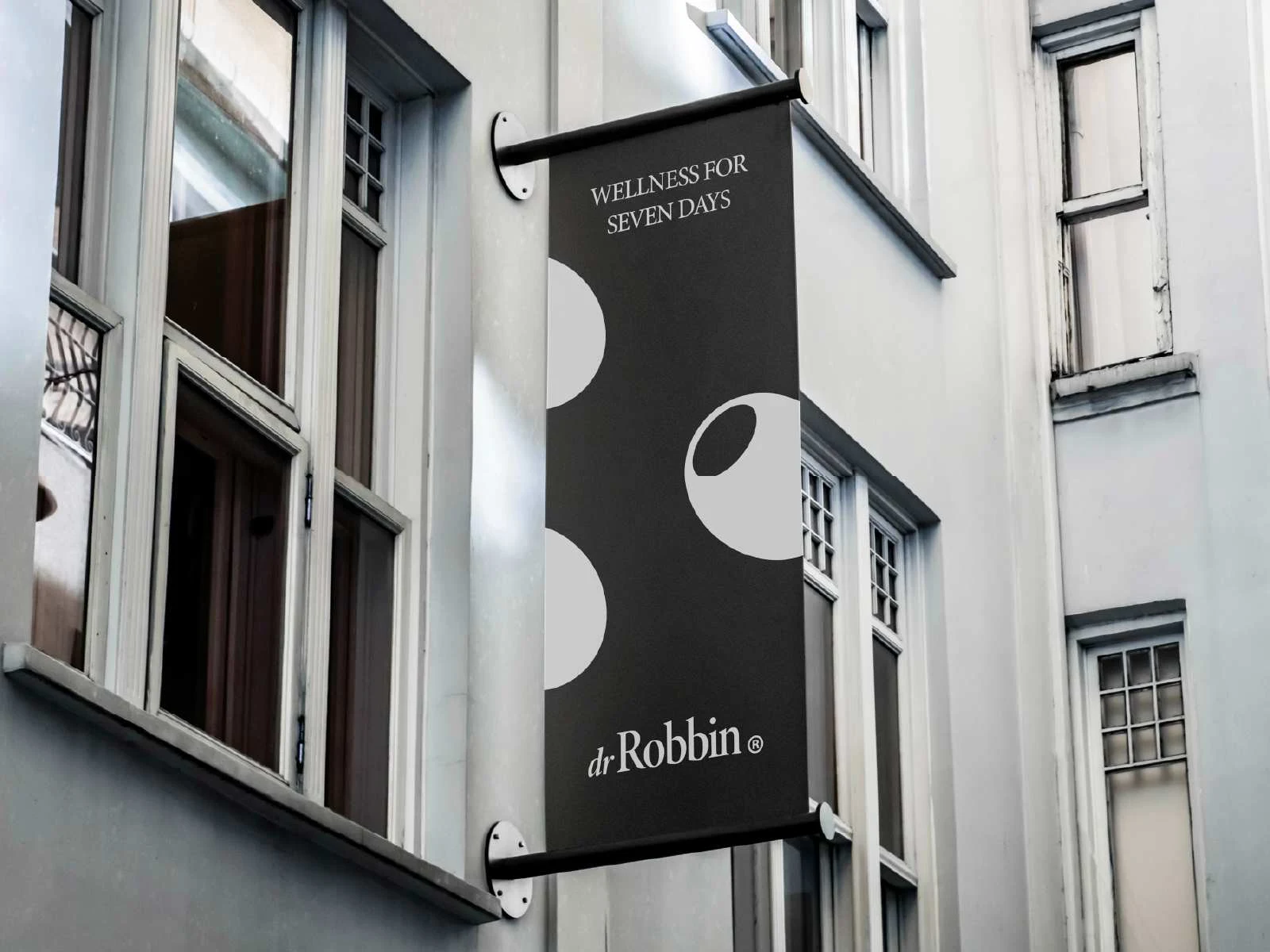
Brand Store Signage
Like this project
Posted Jun 17, 2025
Enhancing dr.Robbin’s wellness philosophy with a renewed strategy and visual identity to clearly deliver its trusted, health-driven F&B values.