Chinhwaryeok - Brand Identity Design
Jinny Y.

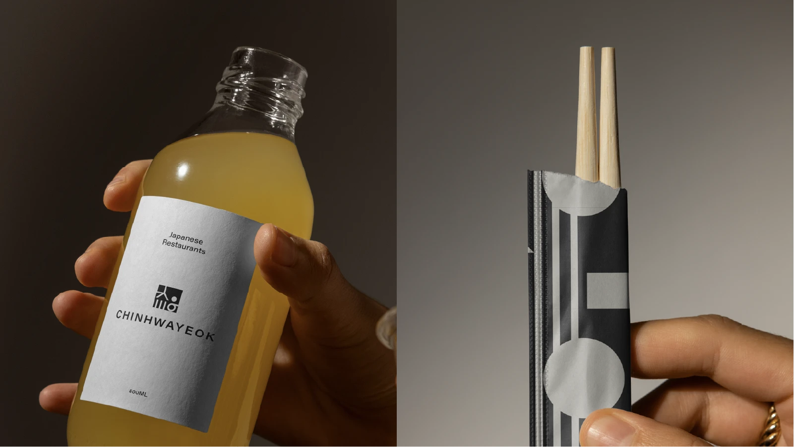
CHINHWAYEOK - Brand Identity Design
CHINHWAYEOK is more than just a restaurant it is a space designed to foster warmth, human connection, and a sense of balance. The name itself is derived from a Korean expression that evokes the subtle yet powerful pull of intimacy and harmony between people.
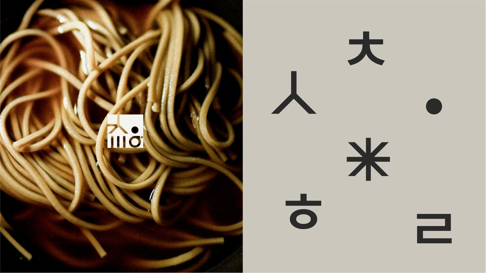
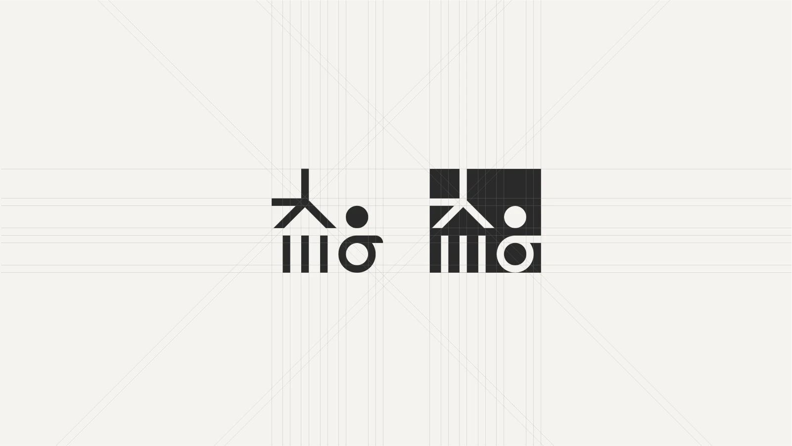
The logo system deconstructs and reinterprets the Korean word ‘친화력’ (meaning “attractiveness” or “affinity”) into a modular typographic form. By blurring the lines between text and symbol, it creates a striking and memorable visual identity that feels both structured and poetic.
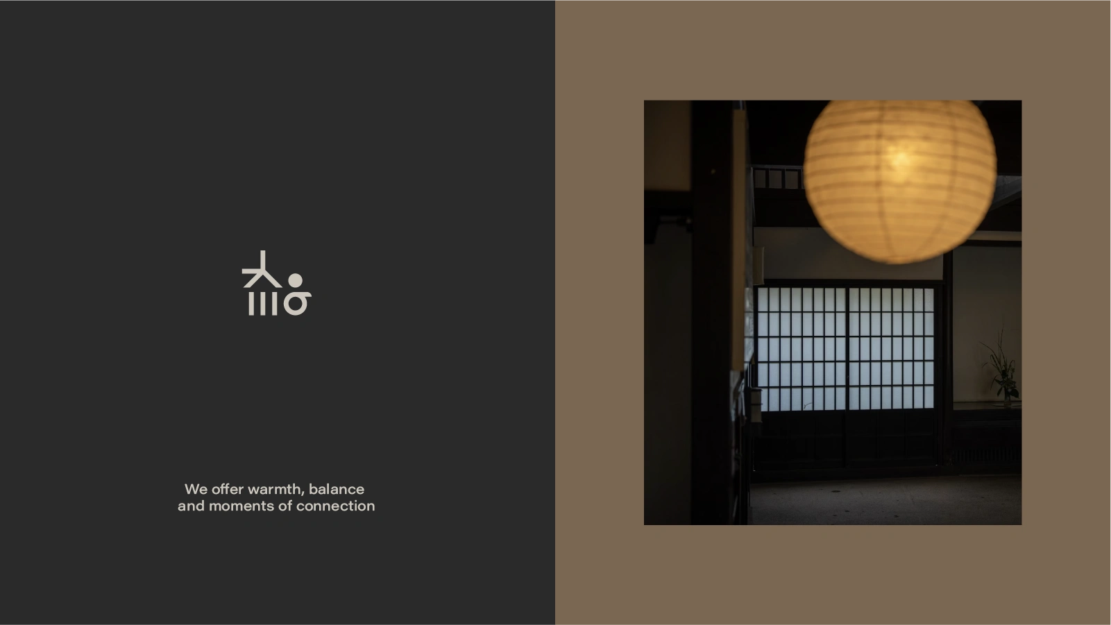
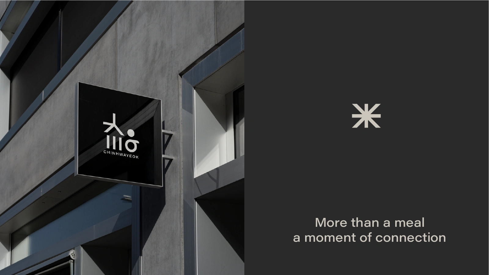
Primary Simbol logo
Built upon a straight-edge design system, the identity is characterized by its clean, minimal lines that reflect the brand’s calm and balanced personality. At the center, a circular dot symbolizes warmth, openness, and human connection a soft touch that balances the overall geometric composition.
Through the careful interplay of tension and space, structure and softness, this visual identity embodies the brand’s core philosophy: reviving intimacy through stillness, and celebrating quiet moments of togetherness.
The result is a design that functions not only as a symbol but also as a sign a visual anchor that is simple, yet resonant and lasting.

Like this project
Posted Jun 19, 2025
The modular typographic logo symbolizes the relationship between people and space, visually expressing the brand’s relaxed and open attitude toward connection.