Invites iOS App Design

Aashray Iyer


The event management landscape is polarized. On one side, system apps like Apple Calendar are functional but sterile, they kill the party mood before it starts. On the other, social platforms like Partiful are high energy but often feel cluttered and web based.
The Goal: To build a native iOS app that sits in the "Goldilocks Zone" blending the trustworthiness of a utility tool with the social hype of a party platform.
The Magic Loop Architecture
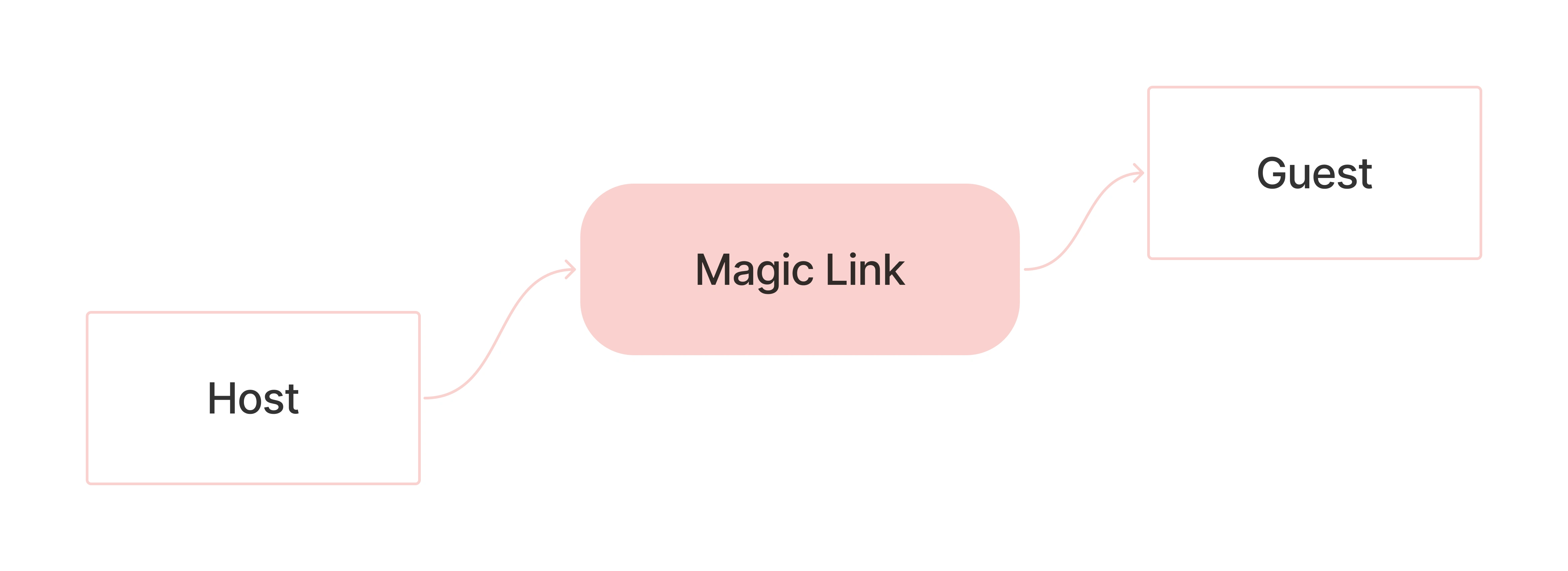
I avoided jumping straight into pixels. Instead, I mapped the skeleton of the experience to prioritize speed. I defined the core user journey as a Magic Loop: Create (Host) → Magic Link Share → Instant RSVP (Guest)
To support this, I established a stable 5 point navigation system (Dashboard, Calendar, Create, Alerts, Profile) that gives the user a reliable Mission Control while keeping the primary Create flow accessible via a modal slide up.
Finding the Soul
During low fidelity wireframing, I hit a wall. My initial designs didn't rely on a list view, but instead used cards without specific order or design hierarchy. They looked plain and often lacked the depth and soul required for a social experience. It felt like a work meeting, not a birthday bash.
The Solution: I pivoted to a Modular Dashboard. By introducing bubbly 32px rounded widgets and a horizontal Discover section, the UI shifted from a dull utility tool to a vibrant social object. It instantly felt modern, tactile, and engaging.
The Super Ellipse DNA
To ensure the app could scale, I built a rigorous design system based on functional minimalism, softened with a friendly aesthetic.
The 32px Super Ellipse became the signature trait, applied to cards and buttons to evoke approachability.
I utilised Smart Components in Figma with extensive variants (Pressed, Disabled, Active) to accelerate the high fidelity assembly phase.
Predictive Navigation
I designed the interface to anticipate the user's intent rather than forcing them to scan for controls. The prototype demonstrates the Contextual Footer, which dynamically updates the primary action area based on the user's context:
Swiping to the "Wall" triggers a state change, replacing the button with a Chat Input field.
The Impact.
The final prototype successfully occupies that Goldilocks Zone, blending system level utility with social gamification (Badges, Photo Dumps). The introduction of Progressive Disclosure in the creation flow significantly reduced perceived cognitive load compared to traditional long form inputs.
Like this project
Posted May 18, 2026
Designed an iOS app prototype blending calendar utility with social platform elements.