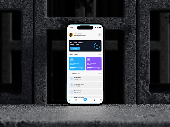
Here’s a quick look of SwiftMeal mobile experience. From the...
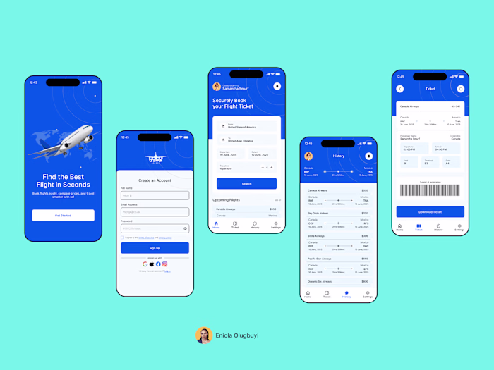
Eniola Olugbuyi
Here’s a quick look of SwiftMeal mobile experience. From the splash screen, to the main dashboard, and down to the meal details.
The goal for this flow was to keep everything familiar and visually clear.
From discovering new meals to checking the full details of your favorites, the app is designed to feel smooth and effortless.
This is just a sneak peek of the workflow.
I’ll be dropping the full design tomorrow, including more screens and interactions.
I’d love to hear your thoughts.🚀
Like this project
Posted Nov 24, 2025
Here’s a quick look of SwiftMeal mobile experience. From the splash screen, to the main dashboard, and down to the meal details. The goal for this flow was ...
Likes
0
Views
2