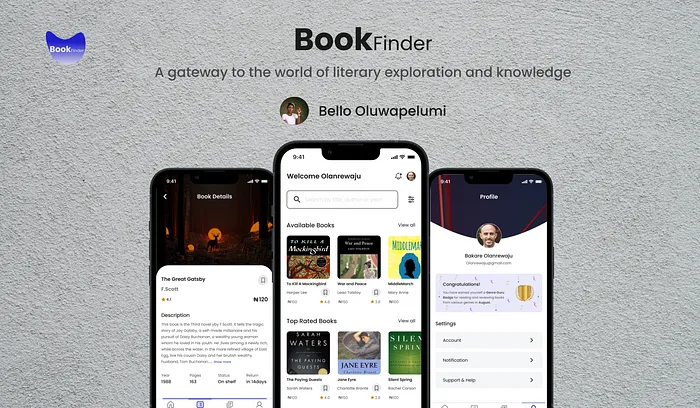
A gateway to the world of literary exploration and knowledge – …
Oluwapelumi Bello
A gateway to the world of literary exploration and knowledge – UX Case Study

·
8 min read
·
Oct 17, 2023
--
Cover Page
Role: UI/UX Designer
Tools: Figma, Figjam by Figma, Google Doc
Methodology: User Research, Wireframes, UI Design, Prototyping
Result: High Fidelity, Interactive Prototype, Key Takeaways.
Overview
I am a passionate book lover who wants to make the joy of reading more accessible to all patrons and avid readers. I believe in the power of technology to bridge the gap between avid readers and a vast collection of valuable books and resources available in the physical library. This is what “BookFinder” is about and it would change the way people experience the world of books.
BookFinder is more than just an app; it is a gateway to the world of literature. Users can reserve books they desire with just a tap, they can track their reading list effectively. With the “Top Rated Books” section, users can explore a curated list of books while the “Popular Authors” section allows users to delve deeper into the worlds of their beloved writer and a lot more. BookFinder aims to create a world where books are cherished and authors are celebrated for their efforts.
Why this Project?
As a UI/UX Designer, I was driven by a question which is “How can I make the world of books more accessible to all patrons and avid readers?”.
My quest for an answer led me to embark on the research of this project. During the Research Phase, I discovered that patrons are dissatisfied with the current state of the library’s outdated manual process of getting books which has to do with physically visiting the library to search for books which is time-consuming and frustrating part is not eventually seeing the book on the shelf. Also, reservation of books involves lengthy procedures and sometimes bad services from the librarians which result in patrons not wanting to use the library resources.
From my research, my target audience are the individuals who are avid readers, library patrons or those seeking for efficient and effective way of using library resources.
Research Deliverables
The research birthed some deliverables such as the proposed solution and research recommendations.
Our Solution: The app will enable users to search for books, reserve them, get to know the popular authors, rate books, write reviews, read reviews, and offers the choice whether users want to physically pick up their reserved books or have it delivered to their doorsteps.
Research Recommendations:
Enhancing the app user experience based on the pain points of the users.
Expanding the app features.
Enhancing communication to inform users about the status of the books, and due dates.
Introducing gamification such as badge.
Allowing users to rate and write reviews about the book they reserved.
From the proposed solution and research recommendations, I further carried out research to gain deeper understanding of the user’s pain points and to aid the proposed solution and recommendations, after which I came up with the empathy map, user persona, and user journey Map, which will be discussed below.
Understanding the User
Empathy Map
The importance of an empathy map can not be underestimated in creating a User-Centered Design(UCD), so, I used the map to analyze the responses during the research phase from users into 4 quadrants which are; “What the user says”, “What they feel”, “What they think” and “What they do”.
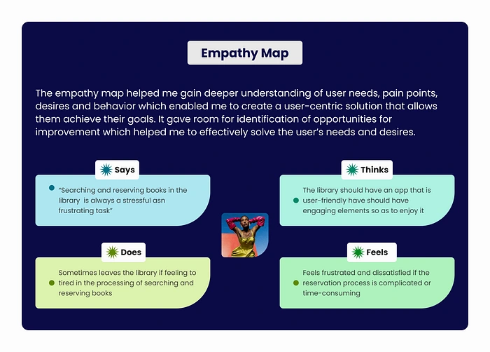
Empathy Map
User Persona
I created a representation of the real research data that shows the goals, and frustrations of users. This was created so as to cater for the needs, preferences and behaviors of users through design.
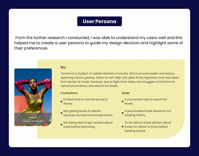
User Persona
User Journey Map
I further visualized the user’s experiences, actions, and emotions throughout their entire interaction with the app from the initial discovery to the outcome.
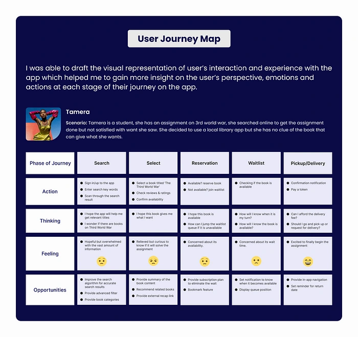
User Journey Map
User Experience
Information Architecture
As we know a good Information Architecture is essential for website designs and mobile app designs, so I went ahead to organize information so that users can have access to it. The main goal I created is so that users can easily navigate and access information on the app.
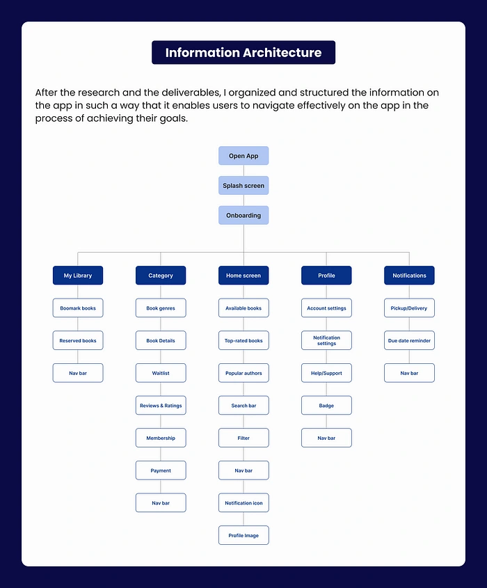
Information Architecture
User Flow
Optimizing the user experience and identifying areas where improvement can be made in digital products is essential because it helps ensure that users can navigate and complete tasks efficiently and intuitively, hence, I created the flow and it includes Entry points, Steps, Decision points, and End points.
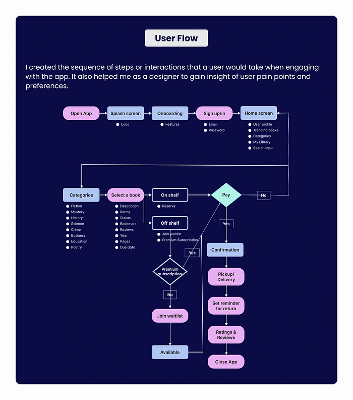
User Flow
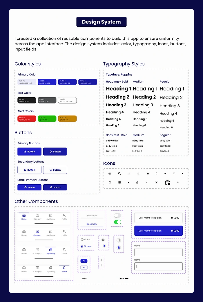
Design System
To keep the visual elements of the app appealing and consistent, I decided to create a collection of assets and reusable components that helped maintain and ensure this design consistency across the screen of the app. This includes Typography, Color palette, and reusable components like Buttons, Icons, and Input fields.
Design Solution
The design started with visualizing my ideas using paper wireframes which were created with paper and pencil. I started with it because it is inexpensive and it allowed me to quickly draft my design ideas and make quick iterations and modifications.
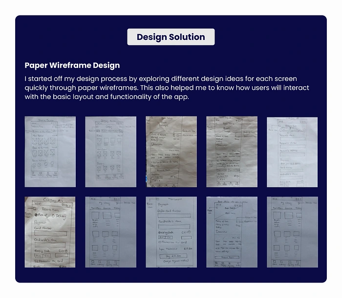
Paper Wireframes
I took a step further to create a Medium Fidelity Design to strike a balance between providing a realistic representation of the final product and allowing for efficient design iteration.
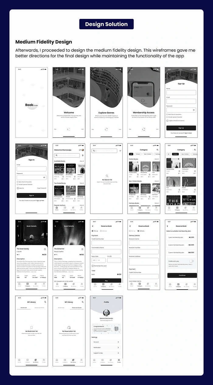
Medium Fidelity Design
Usability Testing
After designing the Medium fidelity design, I created a usability study to ensure that the interface is designed with the user’s interest at hand. I got these feedbacks from users;
“I was able to easily reserve books and the app is user-friendly
“I love the fact that if the book is unavailable, I can either join the waitlist or subscribe to the membership plan to get the book”
“It saved my time, effort and it is all organized”
“I quickly understood the design at a glance and I love every feature on it”.
Based on the feedback, I knew the Medium fidelity design was ready to be created with a high level of detail. The High fidelity design aligns with the intended user experience and design vision. Each of the screens will be further discussed below.
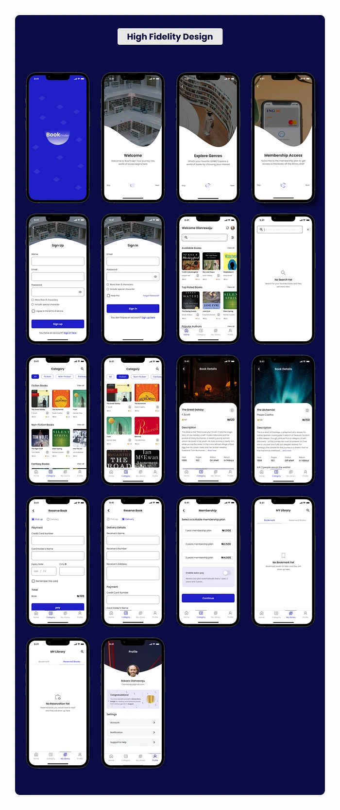
Onboarding Screens
The onboarding screen introduces the users to what the BookFinder app is all about and helps users get started with the app.
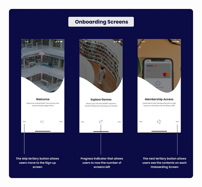
Onboarding Screen
Sign up Screen
The screen allows users to provide their information to create an account on the BookFinder app. The screen is designed in a simple and intuitive way with clear instructions.
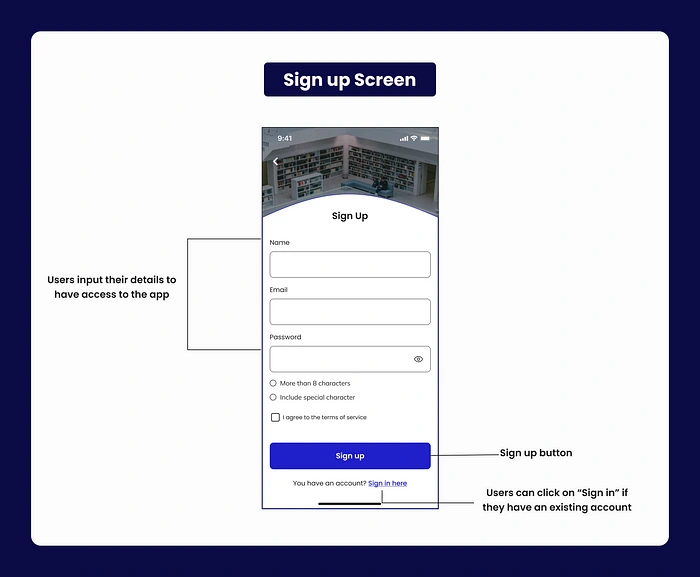
Sign up Screen
Sign in Screen
It allows old users to gain access to their account again. It also has a “Keep me” and “Forgot Password” features which make the signing-in process easier.
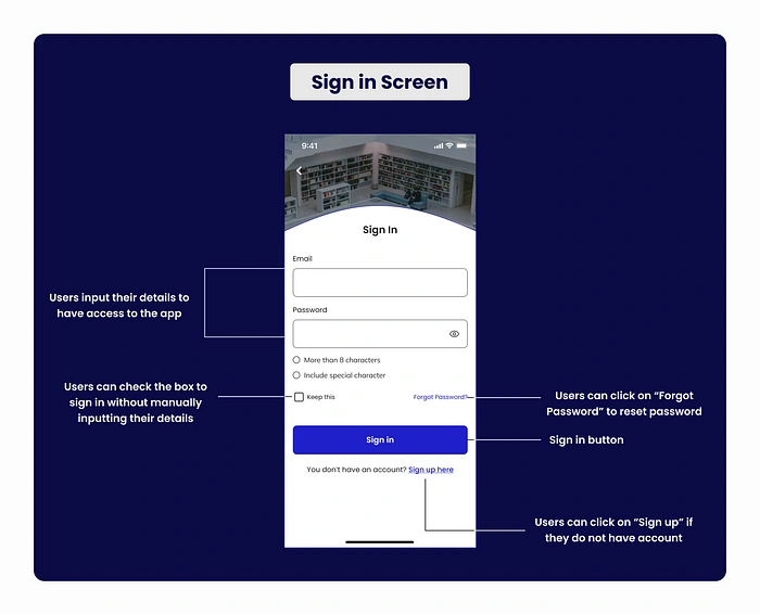
Sign in Design
Home Screen
The home screen emphasizes the app’s core contents which are clean, easy to navigate, and visually appealing.
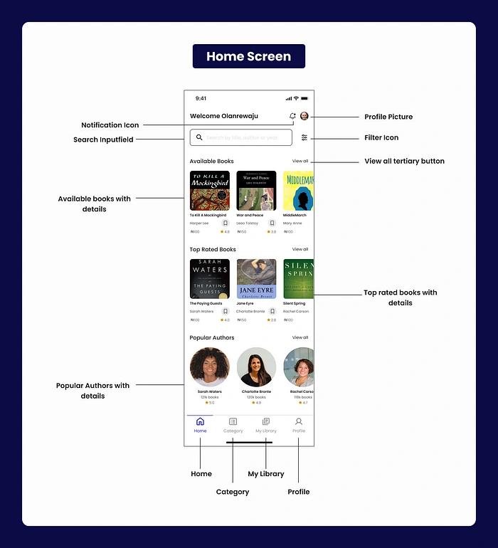
Home Screen
Category Screen
The screen shows different genres of books such as fiction, non-fiction, fantasy, and lots more.
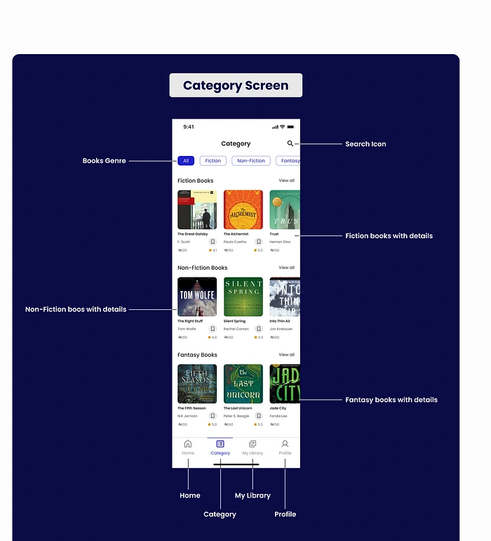
Category Design
Book Details Screen
It shows the in-depth information about a book. it is visually appealing which makes it easy for users to explore the book information. The below picture shows both when the book is On the shelf and when it is Off the shelf.
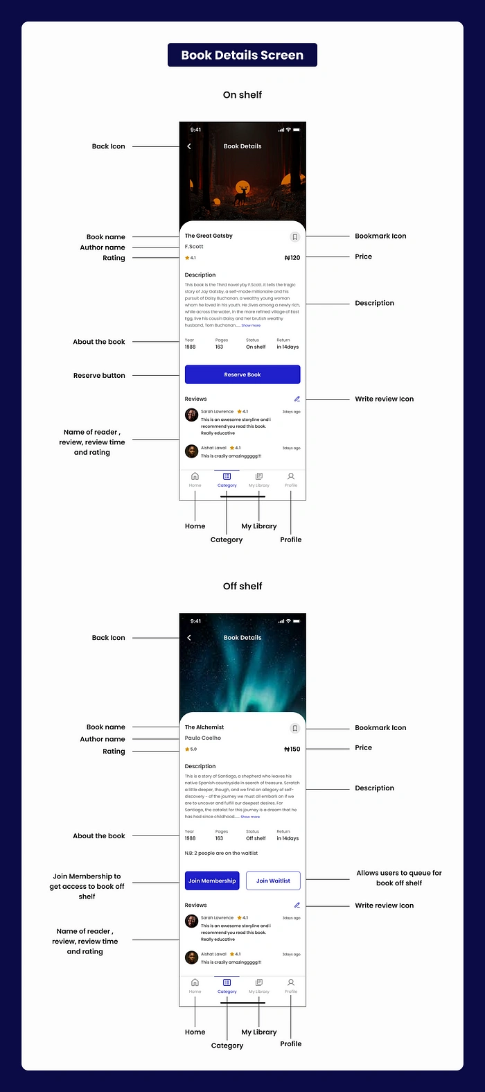
Book Details Screen
Reserve Book Screen
The screen allows users to make payments to reserve the book of their choice. The screen is clear and simple to ensure a smooth user experience. The picture below shows both pickup and delivery.
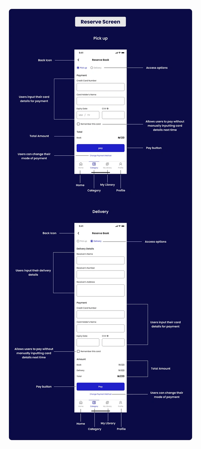
Reserve Screen
Membership Screen
It shows the user information about he different membership plans available. It focuses on clarity and allows users to make informed decisions. The payment process is also user friendly.
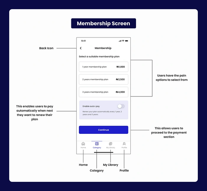
Membership Screen
My Library Screen
It allows users to manage their bookmarked book of choice and also see the list of the books they have previously reserved on the app.
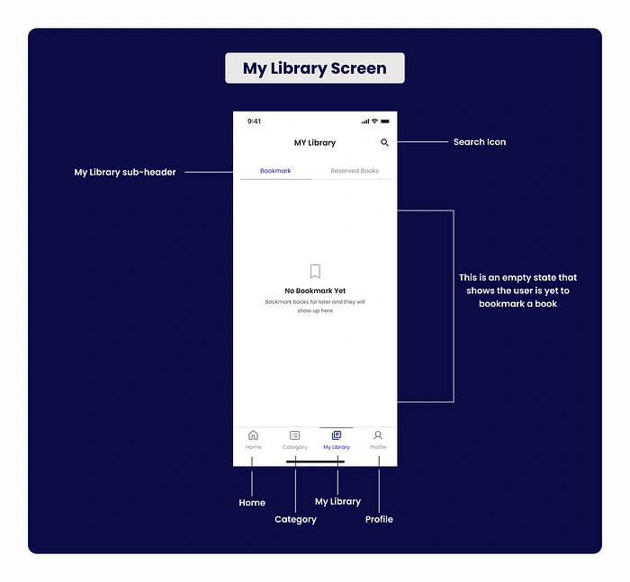
My Library Screen
Profile Screen
It allows users to view, edit, and manage their personal information and preferences on the app.
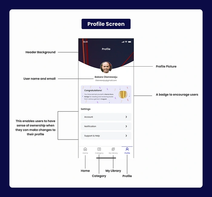
Profile Screen
High Fidelity Mockup
Interactive Prototype
Check out my interactive prototype I made on Figma. Kindly click the below link to run the prototype. Please View on a laptop or desktop.
Key Takeaways
I learnt a lot on this project due to the fact that I want to make the experience easy and smooth for users. I saw the effective use of visual hierarchy in guiding users to find and reserve books efficiently.
Realizing that all user’s problems can not be solved at once, it involves an iterative process and continuous improvement is very important for a successful app.
Thank you for taking time to read my case study.
Contact
Email: Fola.pelumi18@gmail.com
Phone number: +234 816 934 8627
WhatsApp: https://bitly.ws/WQDM
Behance: https://bitly.ws/WQEn
Like this project
Posted Dec 31, 2024
I am a passionate book lover who wants to make the joy of reading more accessible to all patrons and avid readers. I believe in the power of technology to brid…
Likes
0
Views
6