Spark App: fueling passionate connection in the world of dating…
Oluwapelumi Bello
Spark App: fueling passionate connection in the world of dating – UI/UX Case Study

·
6 min read
·
Jan 24, 2024
--
Cover Page
My Role
I worked as the UI/UX Designer on this project. I focused on creating an intuitive and engaging user experience with the use of Figma. I designed the user interface to ensure easy navigation and aesthetically pleasing visuals to create a seamless and enjoyable experience for users.
Overview
Spark is a beacon of genuine connection and where love takes center stage. This app is an immersive experience designed to ignite meaningful relationships in the digital age with easy-to-use features and a user friendly interface.
Spark brings together cutting-edge technology and thoughtful design to create an unparalleled user experience. Whether you are searching for a lasting connection or a delightful rendezvous, SPARK is your go-to destination for sparking new flames of companionship in the digital realm.
Design Process
The design process of our dating app Spark, seamlessly blended user experience with aesthetic appeal. My goal was to create an engaging platform that fosters meaningful connection.
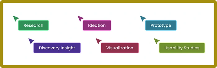
Design Process
Product Research
The first step I took in the product research was to understand the landscape, I examined the popular dating apps, studied their features, and identified emerging trends which gave me a valuable benchmark. I scrutinized their strengths and weaknesses, paying attention to features that resonated with users.
This competitive analysis not only informed my design decisions but also helped to identify opportunities for differentiation.
I further conducted user surveys and interviews to gain insights and pain points. The question asked was about what users valued in dating apps, the challenges they faced, and their expectations from the platforms.
Discovery Insight
Competitive Analysis: From understanding the landscape, I was able to identify opportunities that will make the Spark App have a greater edge over the existing dating app. Here is the summary;
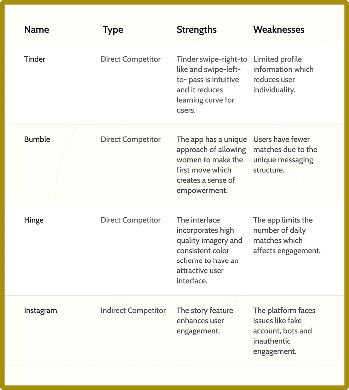
Competitive Analysis
Survey and Interviews: Through the survey and interviews, some pain points were gathered from different participants during the research which are:
Limited profile information
Fake profiles
Matching algorithm frustration
Overwhelming choices
Spark App Solutions;
Allow flexibility when users are creating their profiles
Introduce a robust profile verification system to increase trust
Algorithm transparency and customization
Implement a more refined matching algorithm that takes into account user preferences and interest.
Spark Goals
The primary goal of creating this app is to enable users to find compatible matches by fostering genuine connections based on shared interests, and personality traits. The app intends to build a community where everyone feels represented and has the opportunity to find their ideal match irrespective of their backgrounds.
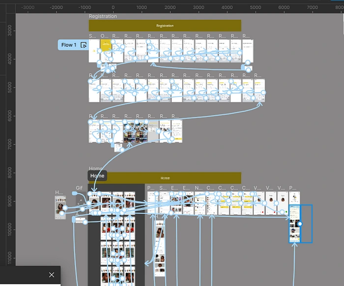
User Flow
I created a sequence of steps that a user will take it accomplish the task of “Getting a match”. This outlines the journey the user will follow from the initial stage to the completion of the desired action.
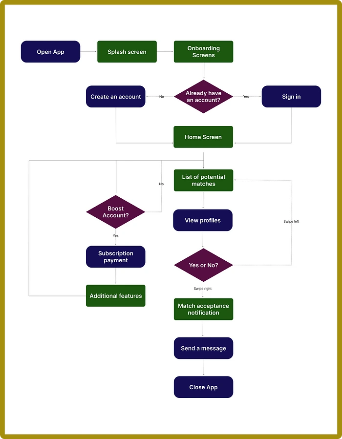
User Flow
Visualization
After my ideation, I visualized the sequence steps of my user flow showing the user interface of all steps that would help users achieve their main goal on the app.
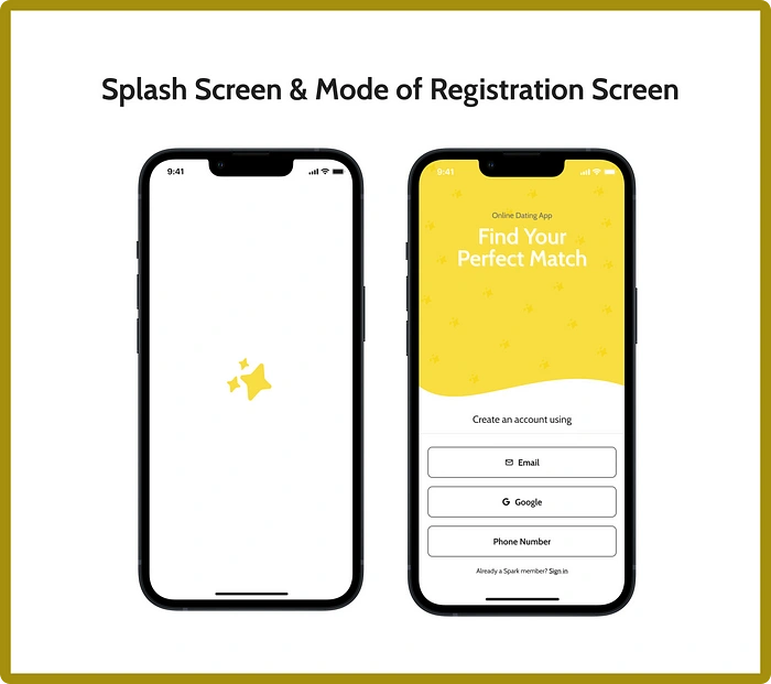
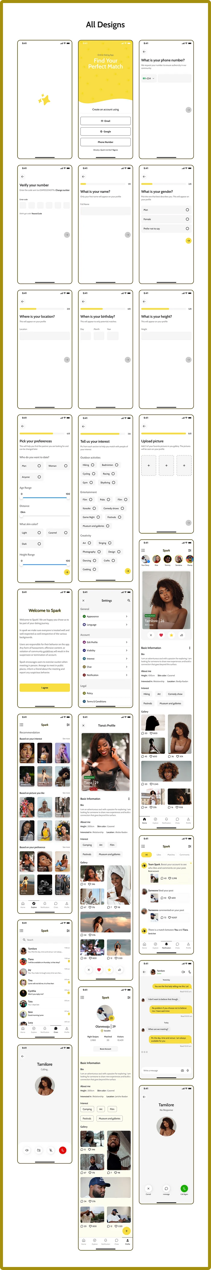
Onboarding Screens
When users open the app, they will see the visual appealing splash screen which contains the logo to familiarize users with the app. On the Mode of registration screen, users are prompted to use their Email addresses, Gmail account or Phone number to be member
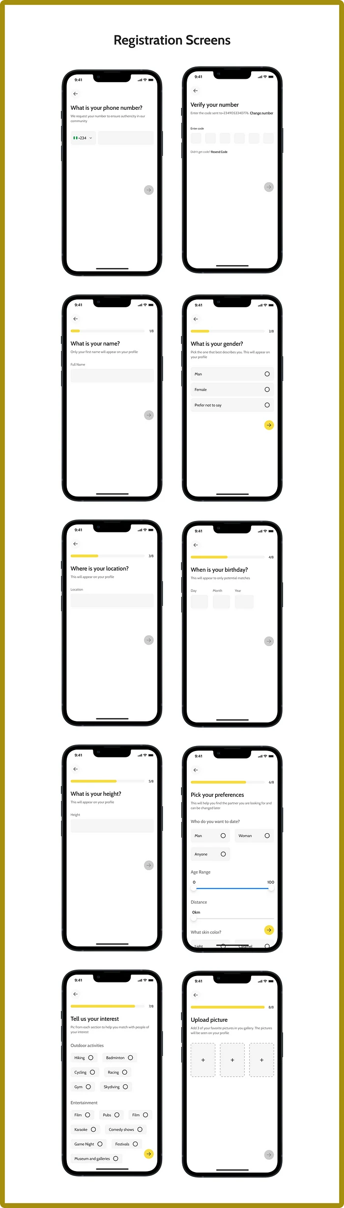
Registration Screens
The screens provide users with a seamless and engaging onboarding experience. The interface guides users through a simple yet comprehensive registration process. Users are prompted to input essential details depending on their mode of registration. The common inputs to the 3 modes of registration are; Verification number, Name, Gender, Location, Date of birth, Height, Preferences, Interests, and Pictures, ensuring the app can tailor its suggestion effectively. The visually appealing design and intuitive flow set the tone for a positive user experience laying the foundation for meaningful connections.
Home Screen
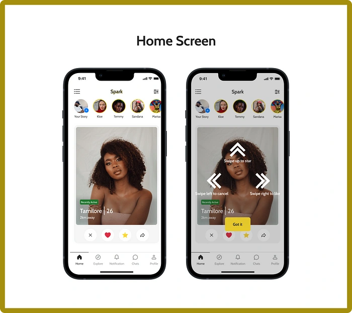
The interface showcases carefully curated user profiles selected based on individual preferences and interests. Users can navigate through profiles with a simple swipe gesture interface. A right swipe expresses like which indicates a potential match, a left swipe means not interested which dismisses the profile, and the up swipe allows users to show a higher level of interest or admiration. The interaction swipe gestures add a playful and interactive element to the process of connecting with others on the Spark app.
Home Screen
Explore Screen
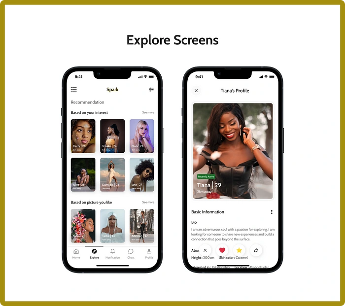
The screen provides users with a diverse array of profiles beyond their preferences and interests. It allows users to step out of their comfort zones and discover potential matches they might not have encountered through filters. This screen emphasizes the app’s dedication to facilitate meaningful and unexpected connections.
Explore Screen
Notification Screen
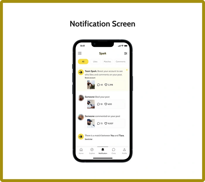
The screen keeps users informed and engages them with their various activities including new matches, messages, likes, comments, and swipe gestures on the app.
Chat screens
The screen facilitates seamless and meaningful communication between matched users. Beyond text-based communication, there is an inclusion of video and audio calls to elevate the chatting experience, allowing users to connect more intimately and authentically. Users have control over their messaging space with the ability to snooze, delete, and pin chats. Also, there is an unmatched feature that gives users the flexibility to discontinue connections that no longer align with their interests. The chat screen provides a versatile and user-centric platform for fostering meaningful connections.
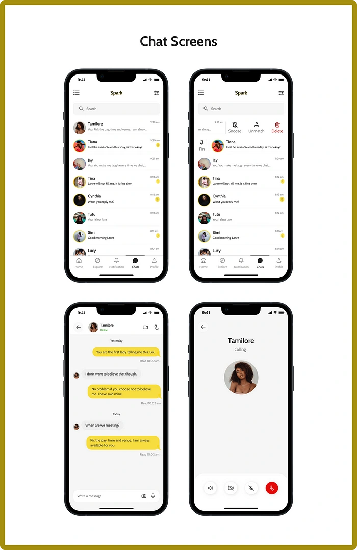
Chat Screens
Profile
The screen allows users to track their engagement metrics such as number of matches, right swipes, and visitors that checked their profiles. Users also can upload pictures seamlessly so that they can showcase their personality through visuals. It shows the user’s badge which represents their level of activity across the platform and this adds a layer of authenticity to profiles. The screen offers a space for self-expression which allows users to present the best version of themselves within the community.
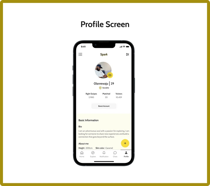
Profile Screen
Prototype
The prototype considers the user experience at every stage, from onboarding to interaction features ensuring a seamless and enjoyable experience for users.
Prototype
Style Guide
Spark Style Guide is a set of design principles that represents the key visual elements, maintains a consistent visual language and overall aesthetic that defines the brand and user experience.
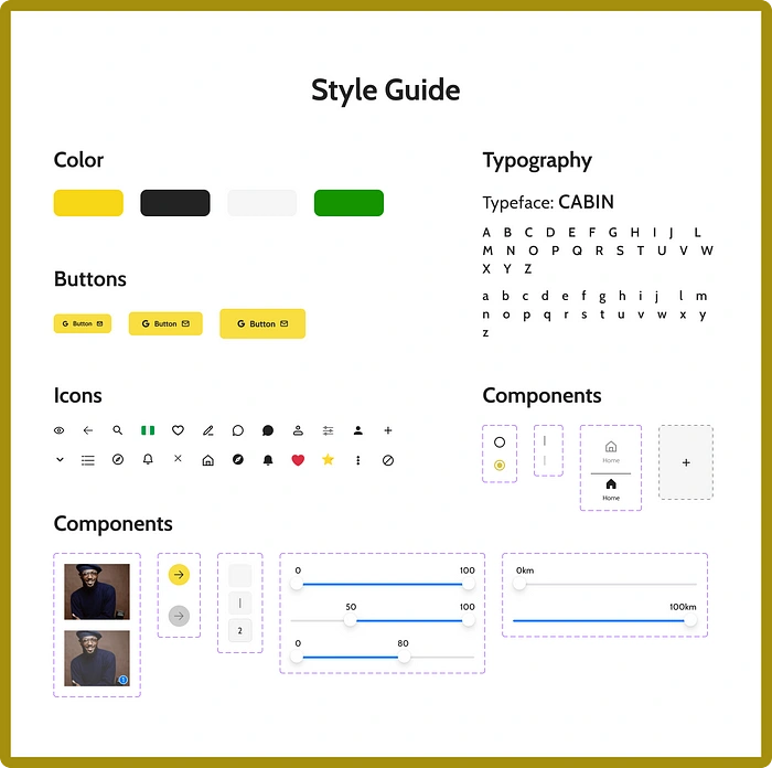
Style Guide
Design
User Interface Designs
Landing Page
Spark’s landing page is designed to captivate potential users with compelling narrative and valuable information. The landing page has sections highlighting the unique features and benefits that set the app apart in the dating landscape. It combines user guidance, social proof and transparency, creating an engaging entry point for individuals exploring the app.
The landing page is a responsive design aiming at making users have seamless experience on both mobile and desktop platforms.
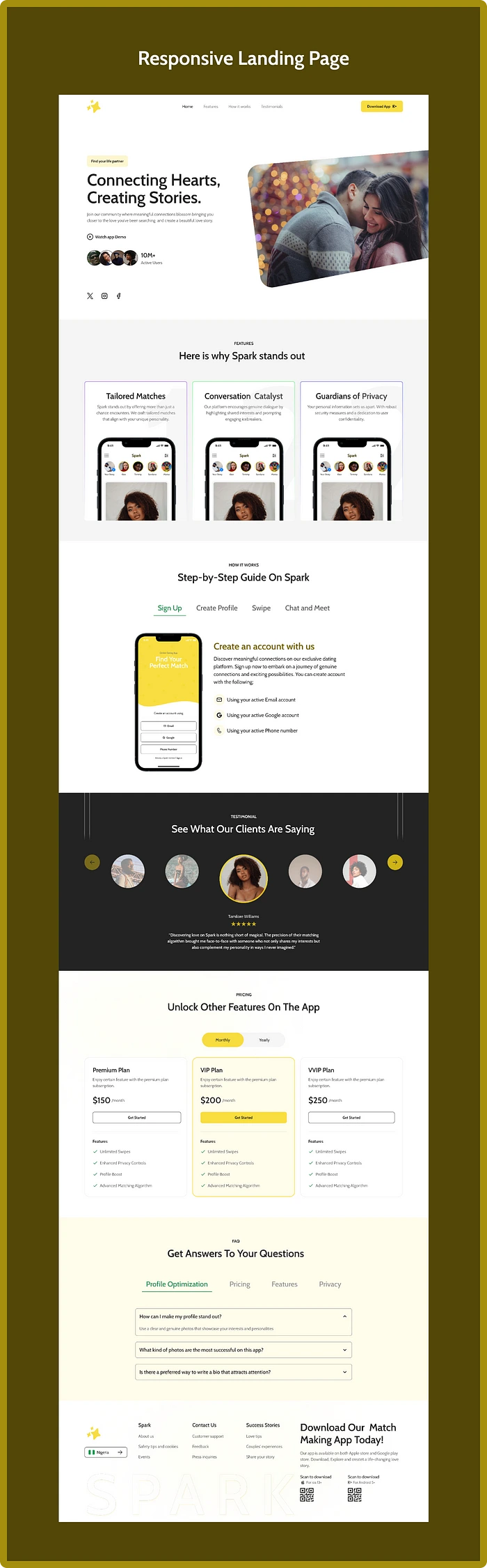
Desktop Web Design
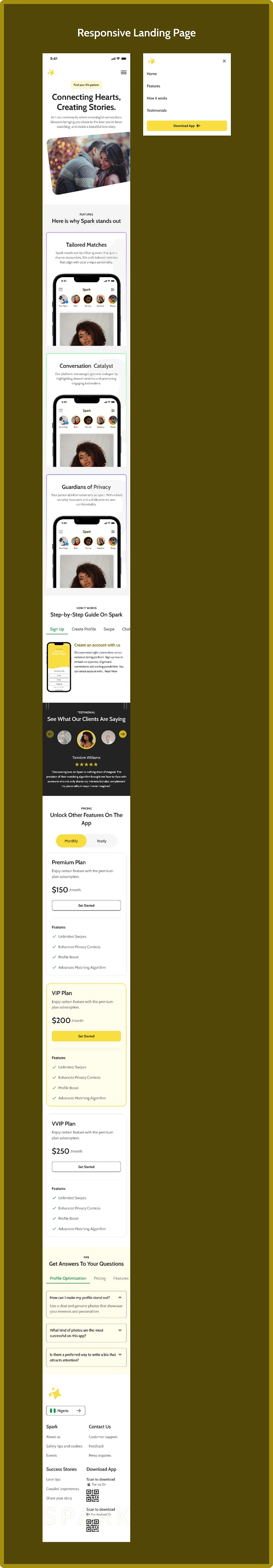
Mobile Web Design
Takeaway
While I was designing the Spark app, I learnt that there is no bad or good ideation and at every stage of the design process I should prioritize the user experience, ensuring seamless and enjoyable journey for individuals seeking meaningful connections.
Contact
Email: Fola.pelumi18@gmail.com
Phone number: +234 816 934 8627
WhatsApp: https://bitly.ws/WQDM
Behance: https://bitly.ws/WQEn
THANK YOU!!!
Like this project
Posted Dec 31, 2024
I worked as the UI/UX Designer on this project. I focused on creating an intuitive and engaging user experience with the use of Figma. I designed the user inte…
Likes
0
Views
6