DataOrbit (Self-Initiated) — Scientific Data on a Globe

Dmitri Atrash


Self-initiated project
DataOrbit is a solo design and build project informed by scientific data workflows. It was not a client commission or a NOAA product.
The problem
A quick look at atmospheric model output often requires a Python notebook just to answer a simple question: Is the field present, in the right place, and worth deeper analysis? That path is too heavy for a disposable check. It also creates a trust problem if a visualization hides how much data it omitted.
What I built
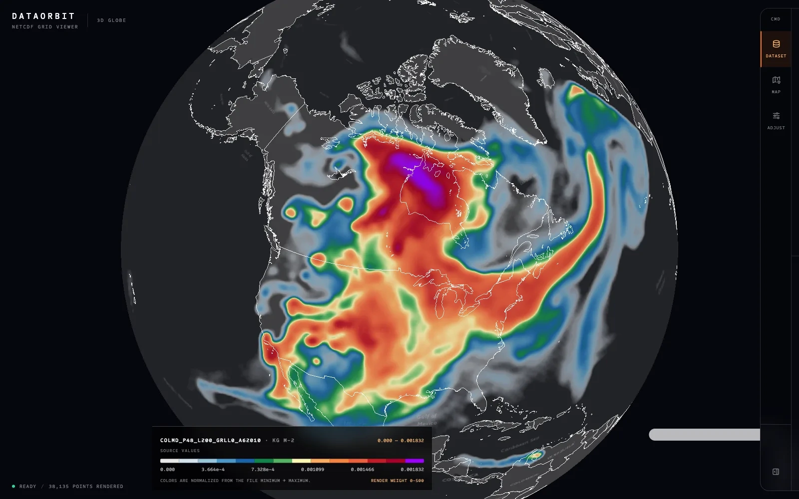
DataOrbit opens NetCDF files in the browser and renders a selected field on an interactive globe. The file stays local. A 220 MB RRFS forecast grid reached first paint in 980 ms in the measured build. The interface puts the visualization first, with a collapsible command rail for Dataset, Map, and Adjust.
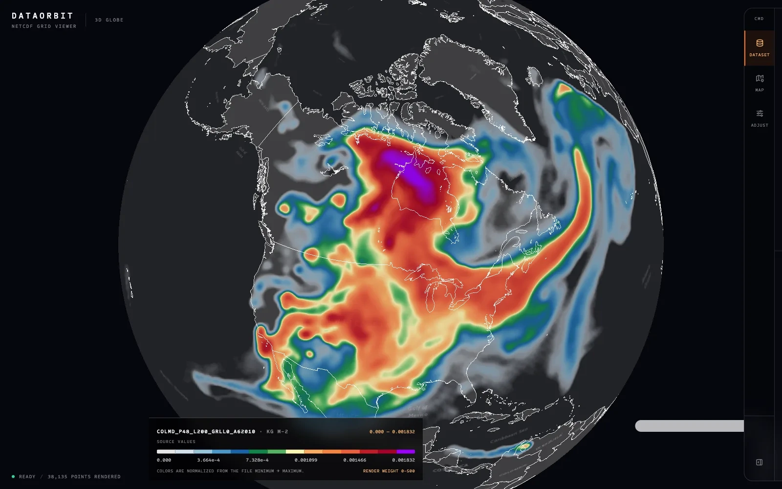
DataOrbit showing forecast smoke density on a 3D globe
Design decisions
The dataset panel discloses the point budget and sampling stride, so a partial rendering cannot be mistaken for the full grid.
The map persists as the user changes basemap, projection, variable, and render settings.
Rendering uses points for curvilinear model grids to avoid artifacts from warping a raster onto four corners.
Controls report their state even when collapsed; failure messages name the actual problem and a useful next step.
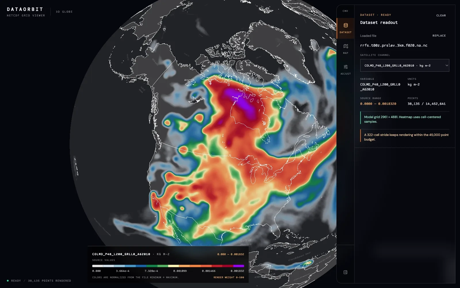
DataOrbit dataset readout showing the sampling disclosure
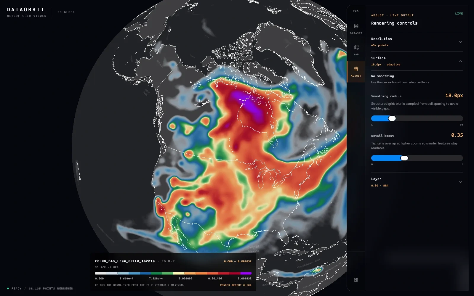
DataOrbit rendering controls
Why it matters
The project shows how I approach a dense technical interface: preserve scientific honesty, make the important tradeoffs visible, and keep the shortest path to an answer short. The live app and full case study include the implementation details, constraints, and remaining limitations.
Like this project
Posted Oct 7, 2026
A browser-only NetCDF viewer that turns a large forecast grid into an interactive globe while keeping the file on the user’s machine.