AWARE — Decision Support for NWS Forecasters

Dmitri Atrash


The challenge
A National Weather Service forecaster has to understand the weather, compare it with a partner’s thresholds, and prepare language people can act on. Those steps often happen across separate tools. Each switch risks losing the map view and the reasoning behind a decision.
My role
I led UX design and user research on a four-person core team and built a substantial share of the front end. I observed routine shifts and a live high-wind event, tested the information architecture with forecasters, and worked with utility partners to understand how forecast terms become operational decisions.
The design
The research pointed to one rule: the map is working memory. AWARE keeps a single live map while the forecaster moves through Overview, Analysis, Alerting, and Briefing. Position, zoom, layers, and time stay put.
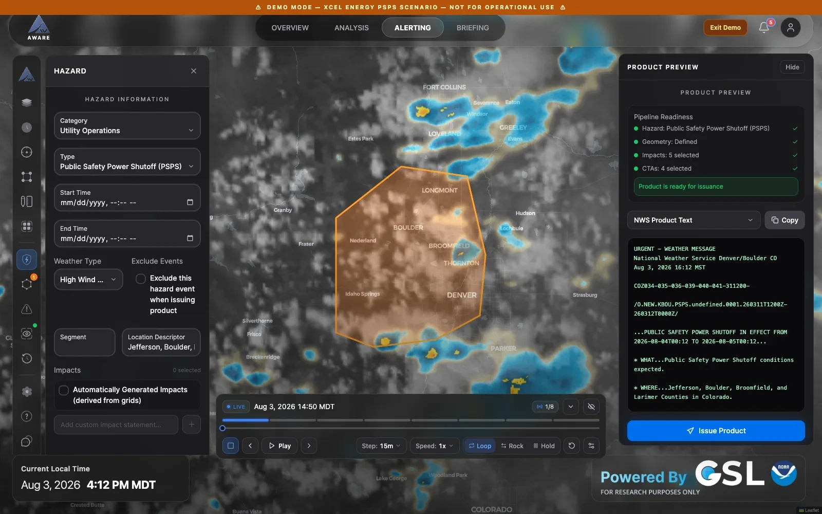
I replaced an early modal hazard wizard with one editable hazard object. A forecaster can draw an area, adjust impacts, inspect the generated National Weather Service product text, and revise any part without leaving the map. A visible readiness checklist explains what is complete before issuance. Time controls persist across map views, so playback survives a move to another task.

AWARE alerting workspace with authoring, map, and product preview
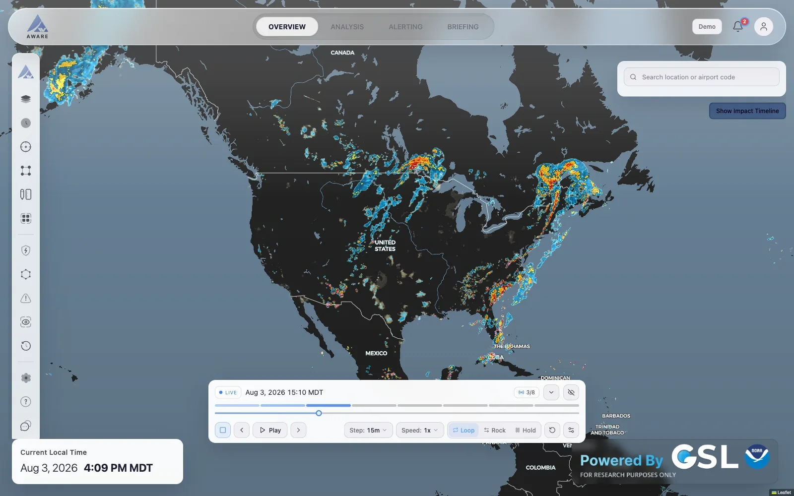
AWARE overview with weather layers and persistent time controls
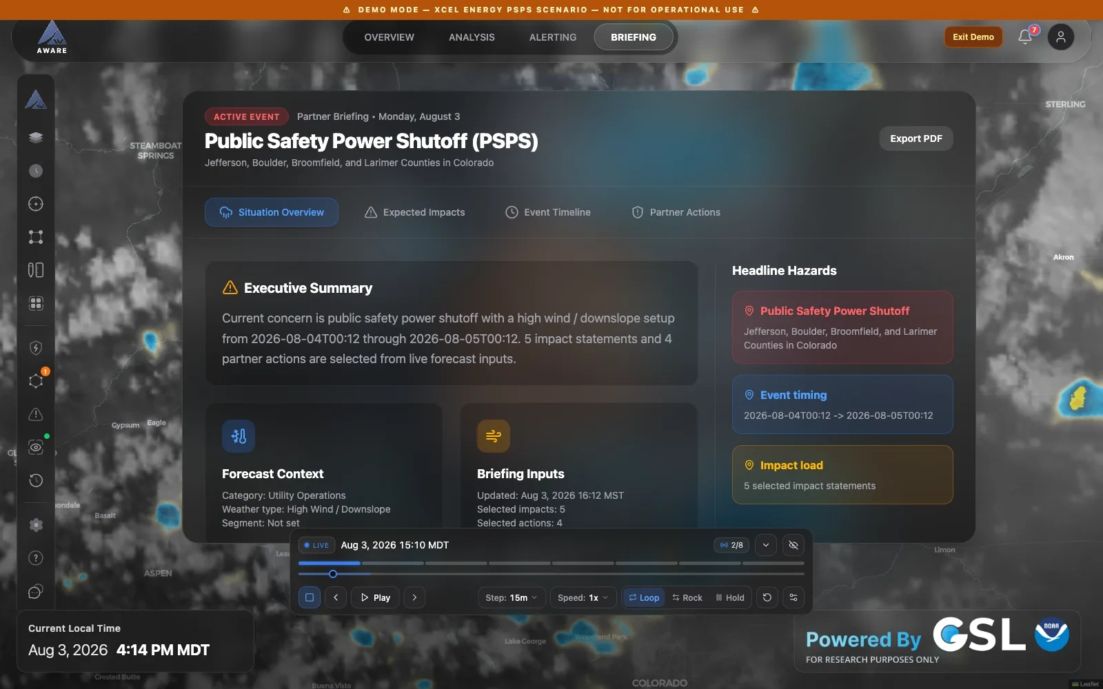
AWARE partner briefing view
Outcome and limits
The public research build shipped 10 releases in 14 weeks. It demonstrates a continuous path from weather analysis to hazard authoring and partner briefing. This is a research demo hosted by NOAA GSL, not an operational NWS product. The full case study covers the research, rejected concepts, shipped states, and lessons from building the interface.
Like this project
Posted Oct 7, 2026
A research workspace that helps forecasters move from live weather data to a hazard product and partner briefing without losing their place on the map.