Packaging Design: FYFTH Coco Popsicle
Objective: To create a one-style packaging design that can be used for multiple flavors of popsicles for FYFTHCoco, a local Cambodian ice cream brand.
Client's Preference: in the brief, the client specifically mentioned that the design of the packaging has to be kept in a minimal style, they do not prefer the usual popsicle packaging design that is filled with flashy design and filled with texts and elements.
Concept: In order to maintain the brand identity of the brand which is golden yellow with a slight hint of the characteristic of Khmer traditional curving (as shown in the logo of the brand) that reflects Angkor Wat, Siem Reap, the province that the ice cream originated from, the packaging was designed to showcase elements that can be found in Siem Reap province such as plumeria, and sphaerocoryne affinis, and aromatic coconut which is the main ingredient used to make the ice cream.
Mood boards, and concepts inspirations

First Version
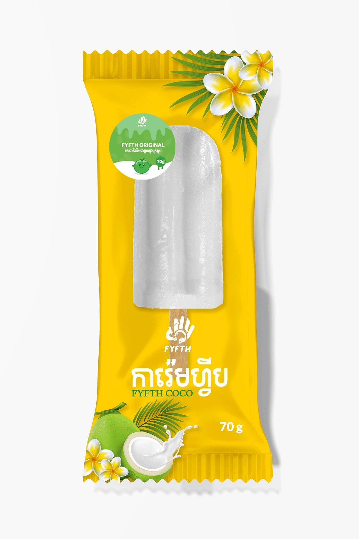

This is the first version of the packaging design. The style of the packaging was kept to be as minimal as possible, highlighting the ice cream inside the packaging. Elements such as the coconut, the official mascot of the brand (a coconut cartoon), the plumeria flower, and the official golden color and logo of the brand were used in the design. The sticker on top of the packaging was an additional add-on to help the customer identify what flavor is in the packaging.
Client's feedback:
Upon viewing the packaging design, the client wanted something more to help the customers and the sellers identify the flavor within the packaging as the sticker is too small and unnoticeable.
Furthermore, the client also suggested a change in the flower used in the packaging from plumeria to sphaerocoryne affinis/romdual flower as it is the national flower of Cambodia instead.
Second Version

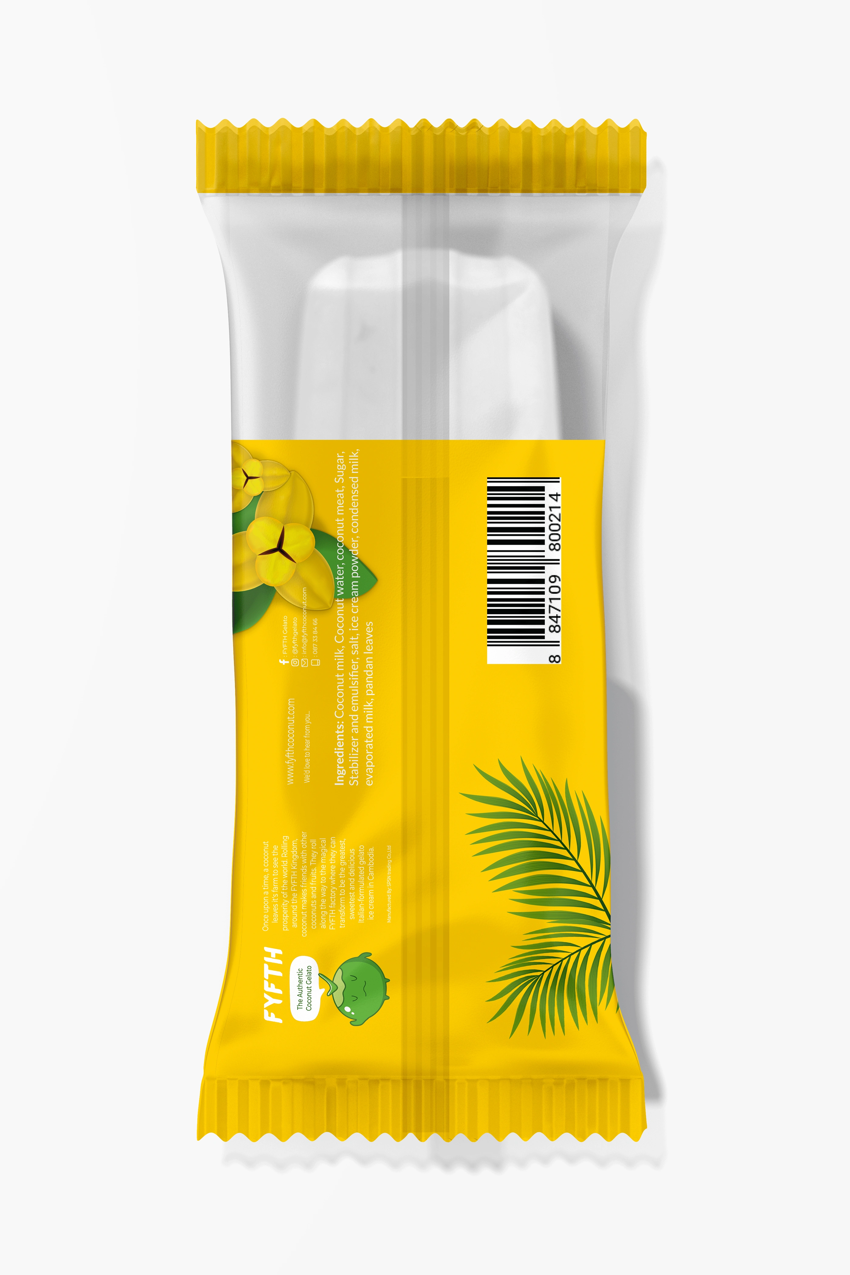
This is the finalized version of the design, the concept of the packaging was changed to a 30% see-through instead as well as expanding the size of the sticker on the packaging in order to help the customers distinguish the flavor of the popsicle inside the packaging easier. The flowers were also replaced with Rumdoul Flower, the national flower of Cambodia to signify the brand is a local Cambodian ice cream brand.
Like this project
Posted May 12, 2023
Ice cream stick packaging design for a local Cambodian brand.

