Rebranding for a Business Coach
Alyani Fadzil
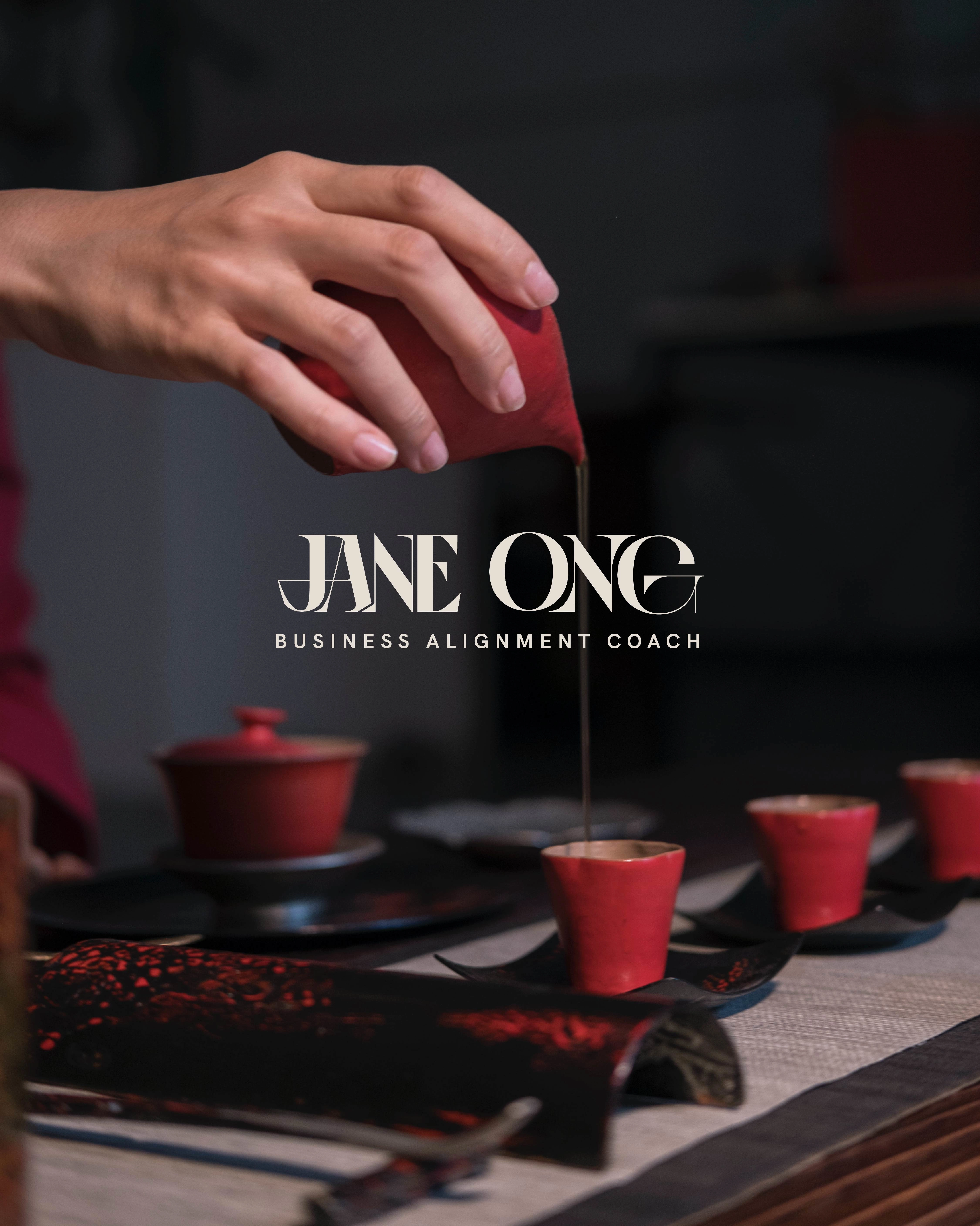
Wordmark Logo
Jane Ong is a transformational business coach specialising in mindset & energetics. When Jane came to me, she was going back and forth between two conflicting art directions for her brand which is between the pastel galaxy look & red fiery look which both evoke the different ends of the emotion spectrum. One is light & airy while the other is grounded & empowering. We dove deep into the brand strategy workshop to uncover her brand's essence. After analyzing her brand's values, ideal clients, positioning, etc., it became clear to us which art direction we were leaning toward.
Not forgetting Jane's Chinese roots, the Chinese brush stroke was translated into her logo as well as mystical elements of sacred geometry such as the gene key which is her main work incorporated into her social media posts.
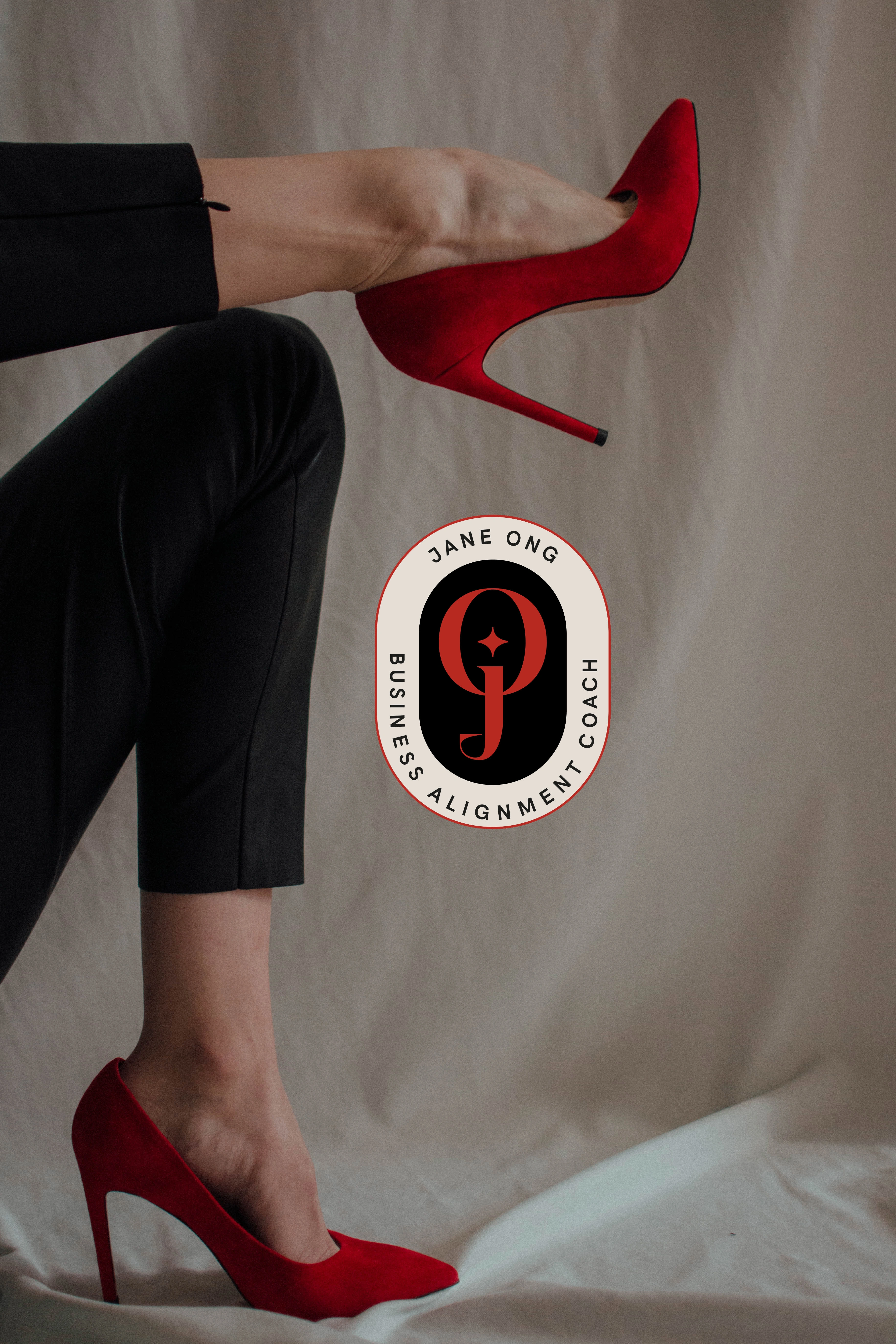
Lettermark Logo
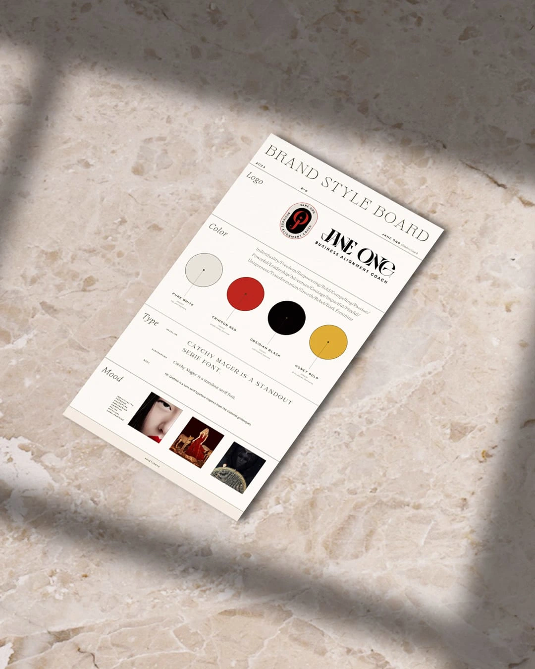
Brand Style Board
Mystical elements
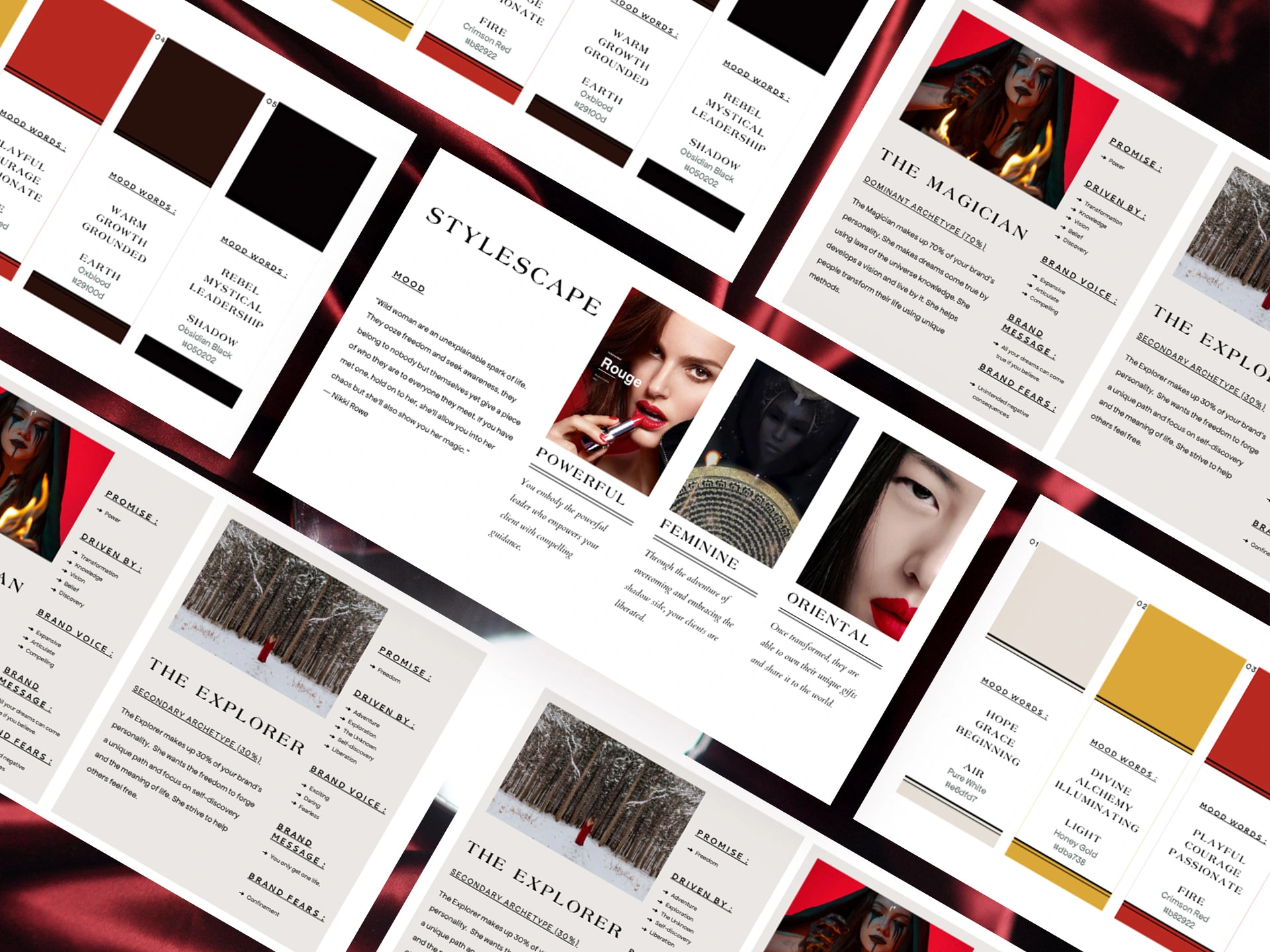
Brand Strategy
The magician archetype was strongly felt in her brand as Jane is a transformational energetics & mindset business coach. The explorer was her brand's secondary archetype which is shown in how she guides her clients to journey through the fire of transmutation to release past conditionings and embrace their true authentic selves towards liberation.
The dark divine feminine spirit redefines the femme fatale in a new light where it was infused in the choice of the brand's color palette; crimson fiery red, obsidian black & alchemy honey gold.
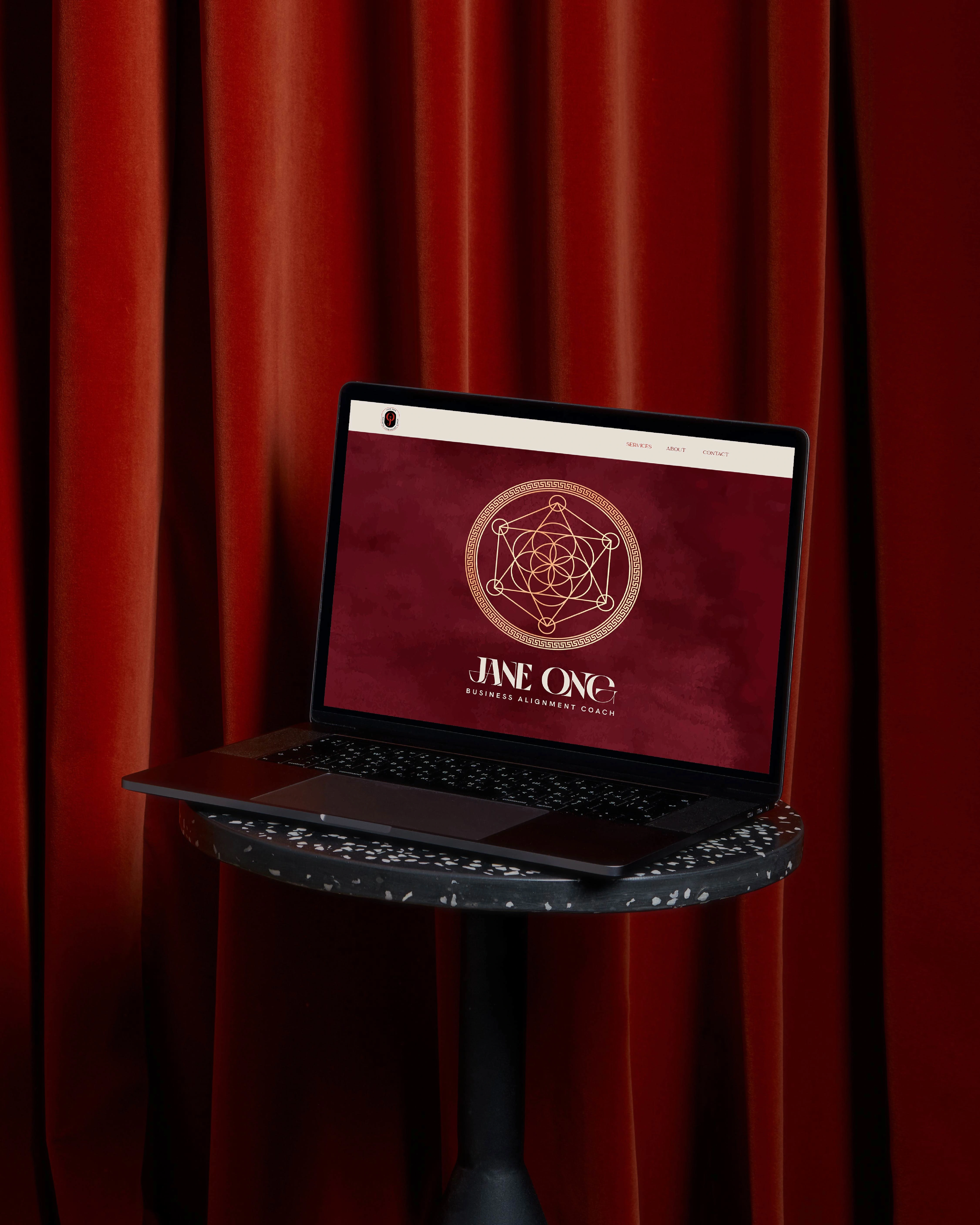
Website Banner (homepage above the fold)
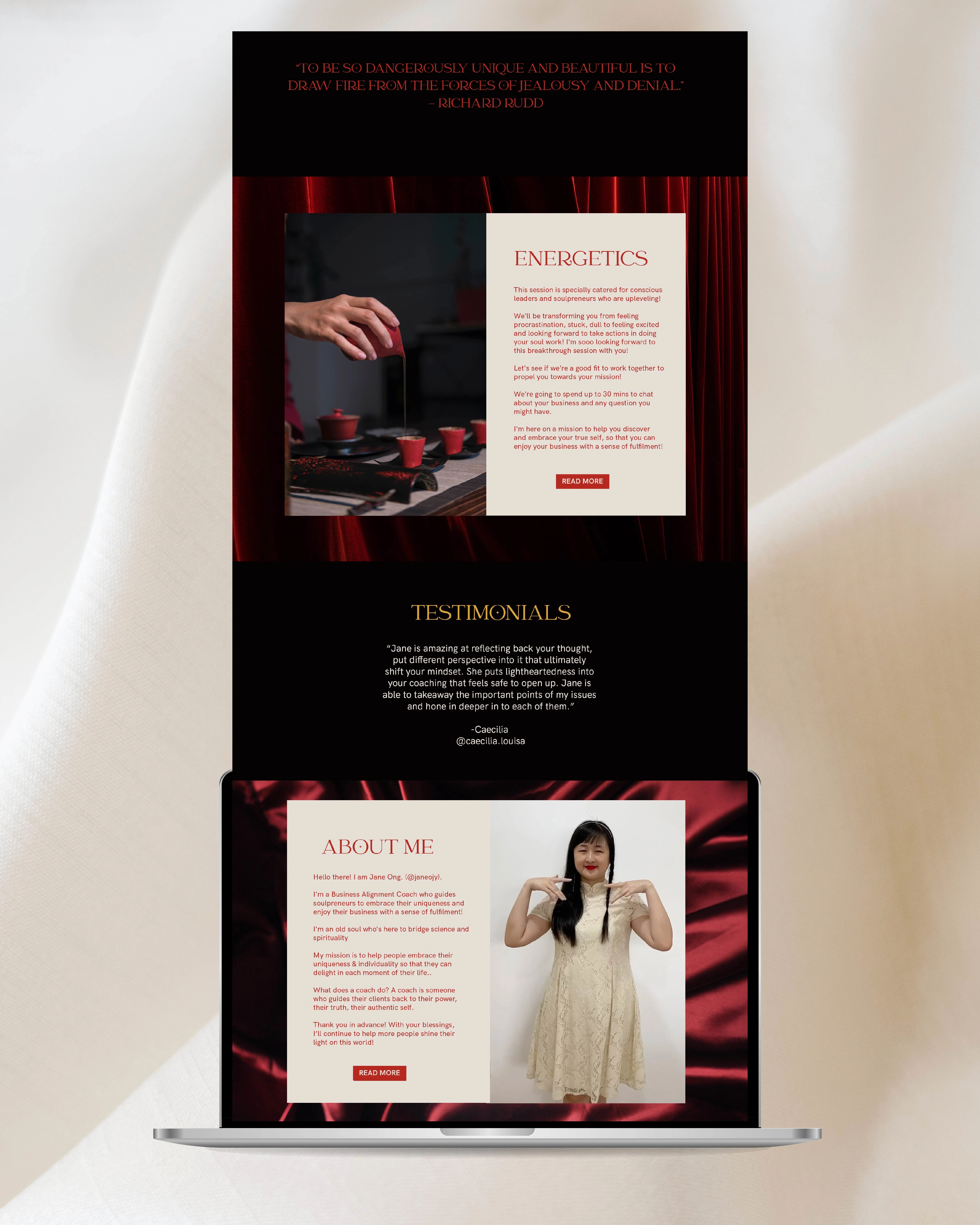
Website design art direction for homepage (part 1)
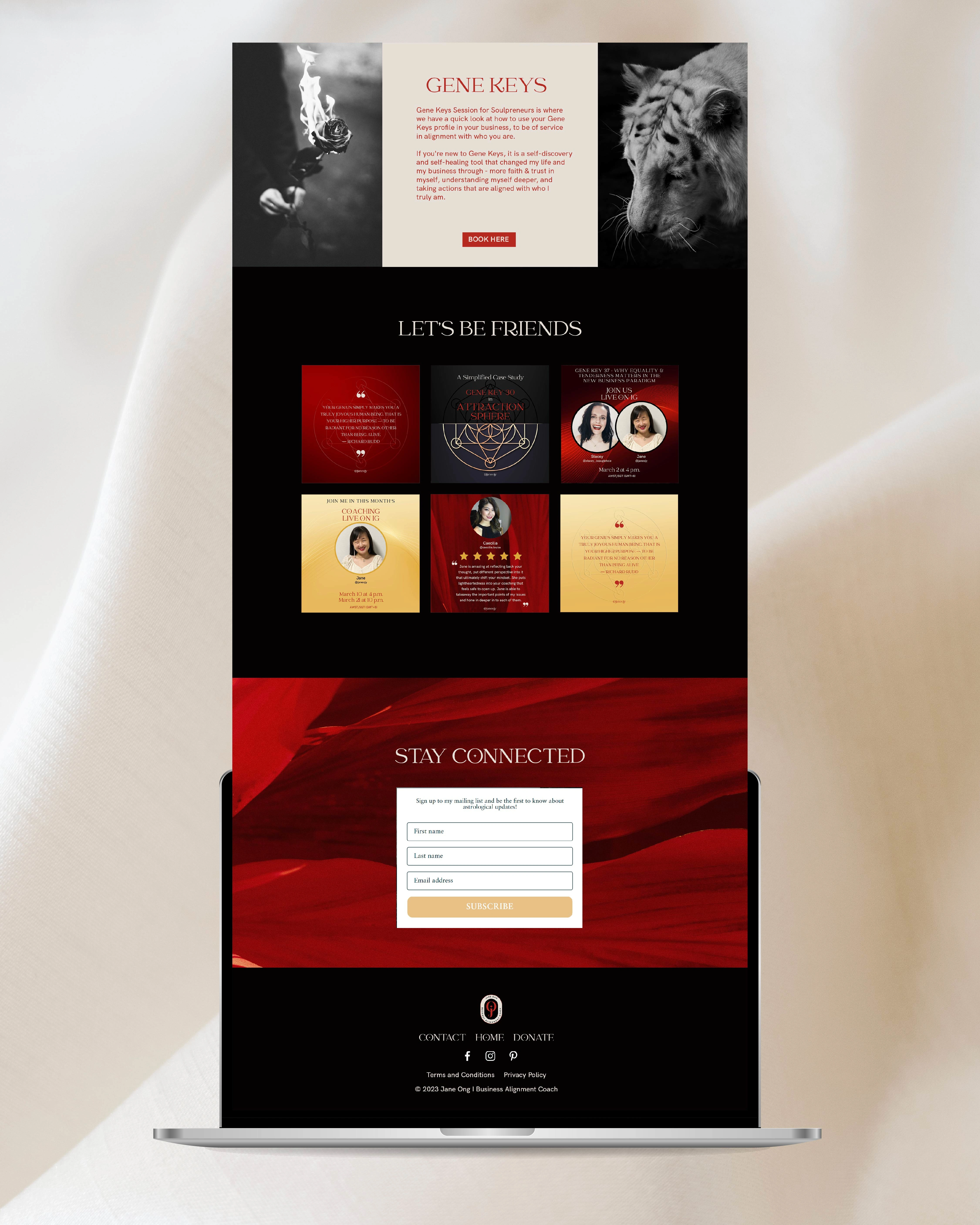
Website design art direction for homepage (part 2)
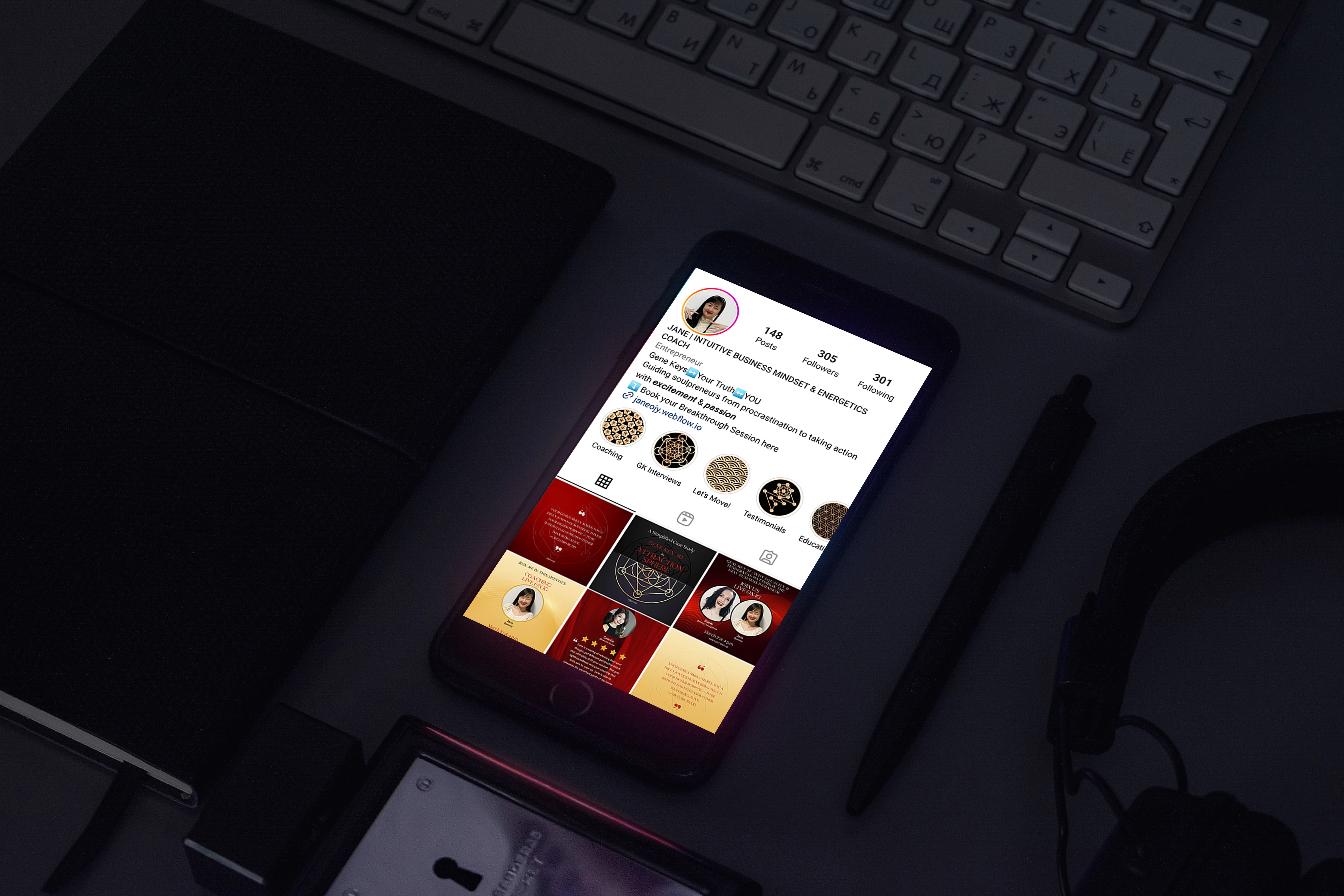
Instagram Profile
Before After Instagram Account
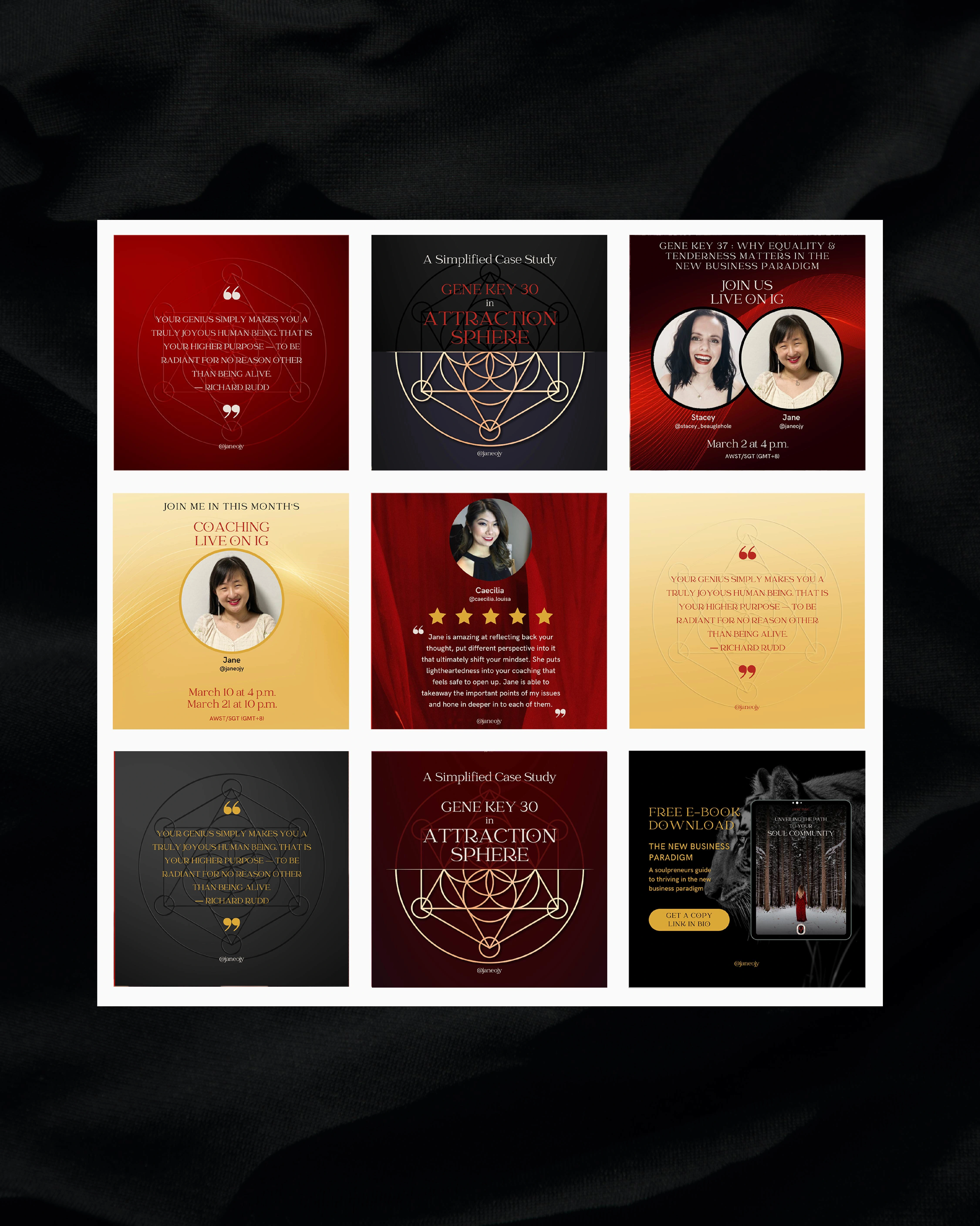
Social Media Post Template Design
Like this project
Posted Apr 9, 2023
Rebranded a personal brand of a business mindset & energetics coach who empowers women to step into their power.