Loan System Redesign
Iacob Barcari
Cardinal Financial Company is modernizing the way home loans are obtained with unrivalled transparency, simplicity, and value.
Context
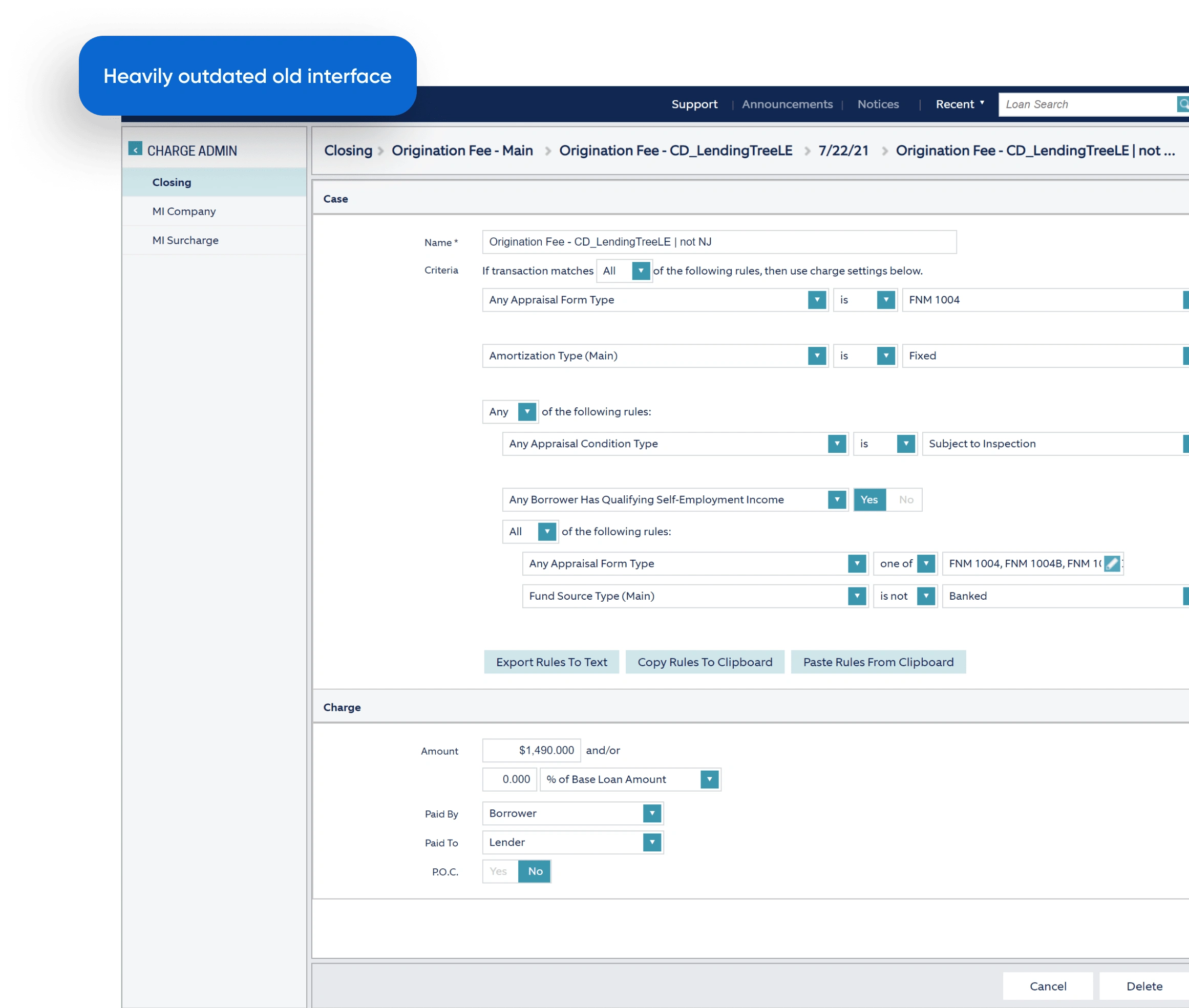
Cardinal Financial approached us to redesign their products due to an outdated design that created workflow issues and lacked user-friendliness, especially for customers.
Ask
Make a complete reskin of the products
Cardinal Financial has three web applications: a Loan Originator System, a Smart Application, and a Borrower Dashboard.
Keep the structure of the main flows.
Due to the conservative nature of the product, they wanted to keep the main structure the same while simplifying the behavior of certain components.
Problem
Main problems identified during the stakeholders interview
Slow loan application processing
The outdated and cumbersome interface leads to low productivity for loan officers.
High drop-off rates on the client side
The client-facing interface is not user-friendly, causing many customers to abandon their loan applications.
Interface inconsistencies
Different teams designed the applications, leading to inconsistencies that hindered the implementation of new features.
Approach
Mapping flows and scenarios
Mapping all the flows and scenarios for LOS, Smart Application and the
Borrower Dashboard.
Extracting access levels
Taking into consideration 10+ different access levels in LOS and including them into the main flows.
Establishing the foundation
Building a scalable design system starting from the foundation and tokens.
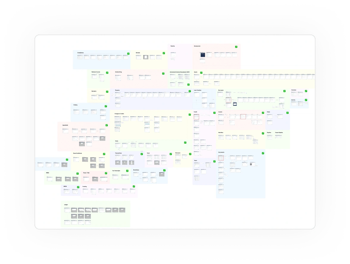
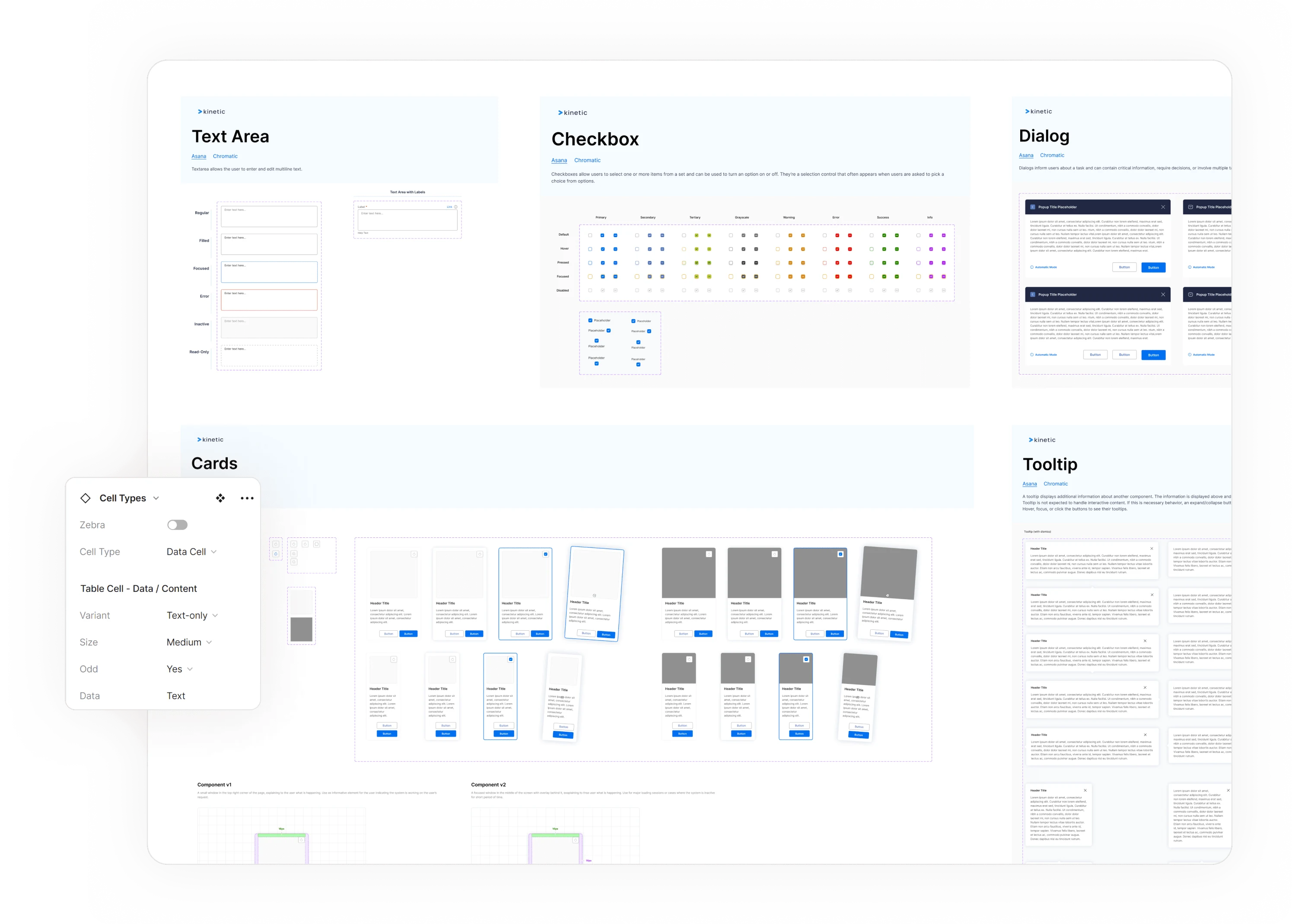
Scalable design system
I created an extensive, scalable design system with 2k+ variants, serving as the foundation for all current and future products. The system was refined through weekly iterations with the client, utilizing 10+ Figma branches. Each component leveraged the latest Figma features, covering all possible cases to ensure consistency and easy reproduction of scenarios.
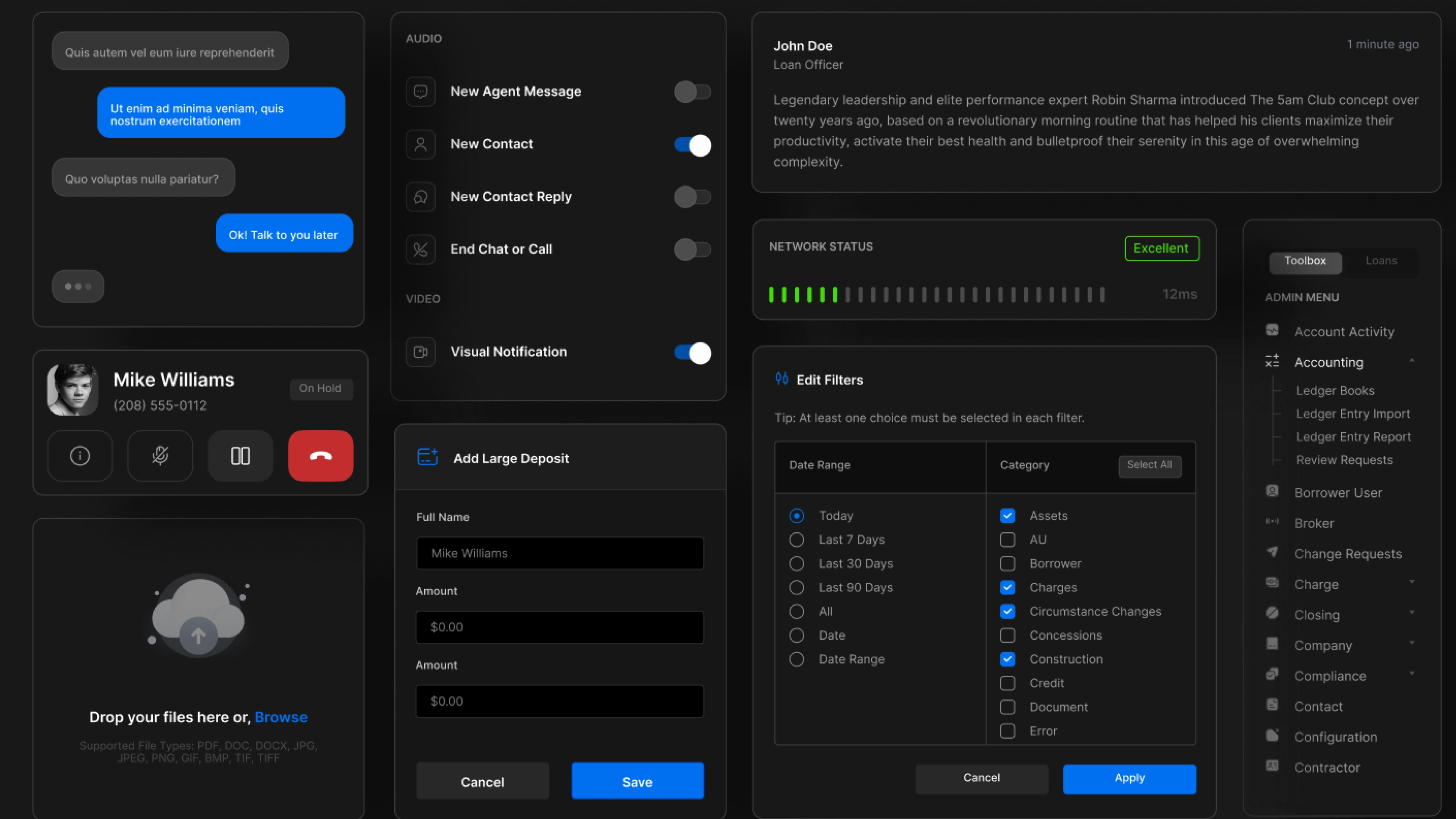
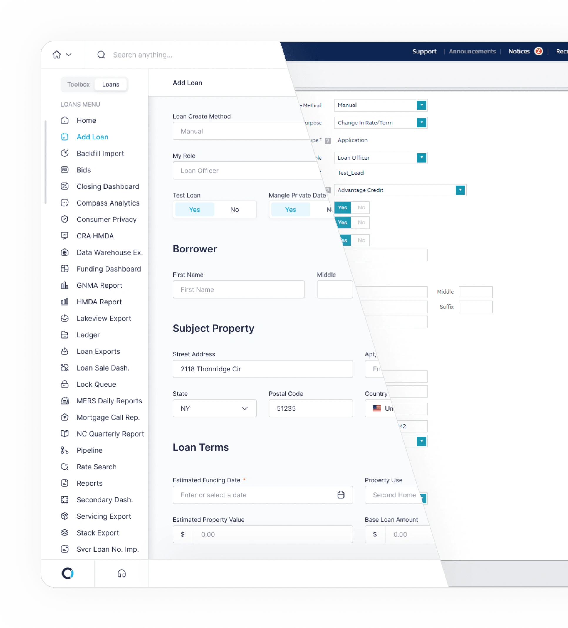
Loan Originator System
The Loan Originator System (LOS) is the largest part of the platform, with hundreds of data-heavy screens and multiple access levels. While core user flows remained unchanged, we significantly improved interactions with components and introduced new patterns to make loan processing faster and easier.
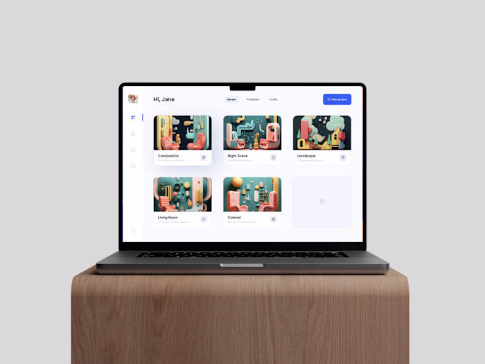
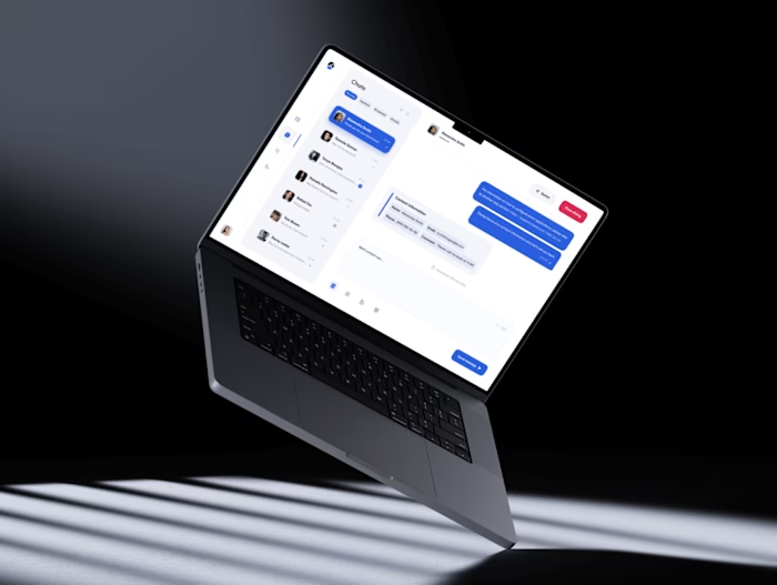
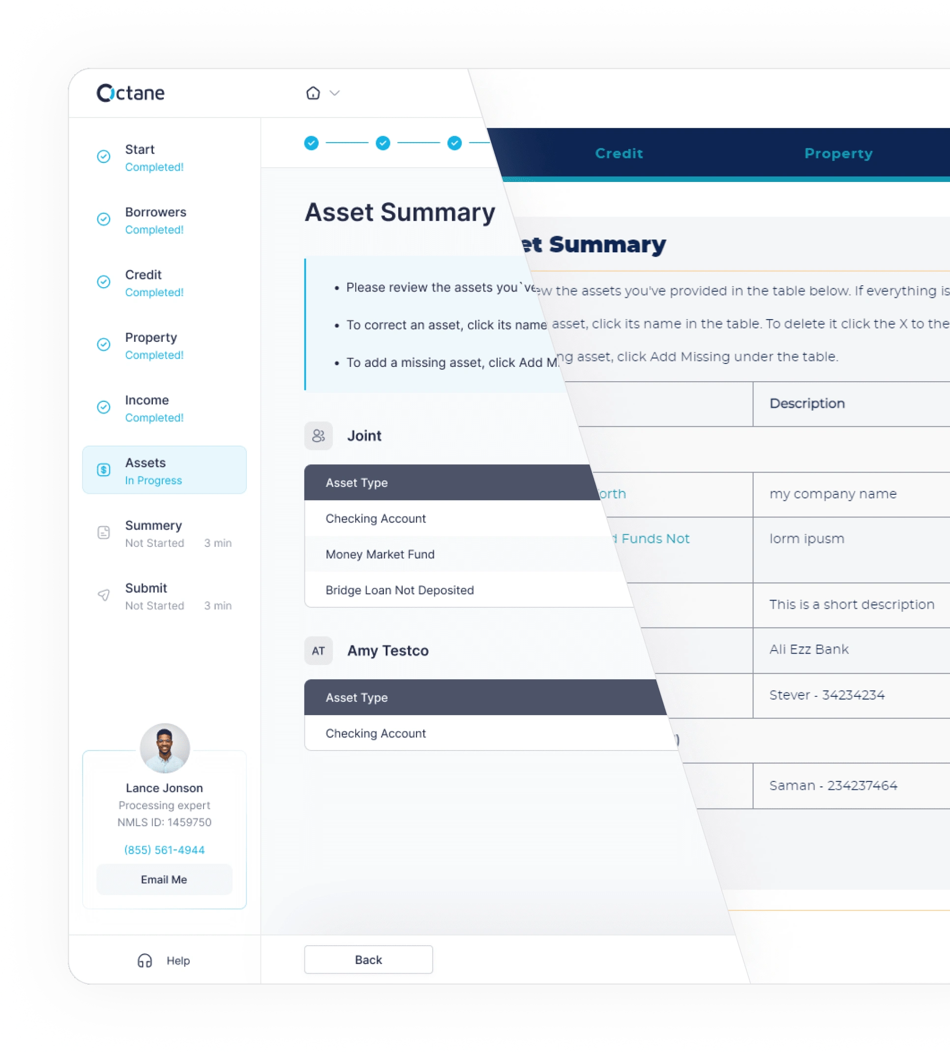
Smart application
The Smart Application, a client-side product of Cardinal Financial, was redesigned to be simple and user-friendly for inexperienced customers. The updated version features a clean interface that guides applicants through the process, with improved navigation and a new data structure to help users stay oriented and prevent data loss.
Outcome
The client was highly satisfied with the final redesign, which will streamline internal processes and improve client-side metrics.
Lessons learned
I learned how to manage a multi-access level system. Initially, I planned to create flows for different account types as I went, but I realized it’s crucial to first map all possible scenarios for each account before starting the design.
Although I had worked with large design systems before, this was my first time incorporating one into multiple products with different purposes. I learned that the foundation should be based on the largest product, then expanded to fit other apps.
I initially aimed to optimize the UX in the main flows, such as reducing the four primary buttons in the action bar, which contradicted best practices. However, working with loan managers revealed that sticking to the current patterns for key operations was more intuitive for them. “Best practices” don’t always apply in conservative industries or large companies.
Like this project
Posted Nov 21, 2024
I redesigned the Loan System and other applications of Cardinal Financial.
Likes
0
Views
25
Clients
Cardinal Financial Company