Kickr Brand Identity
Hello Everyone!
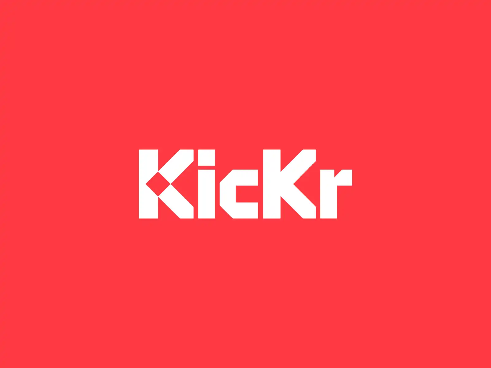
I am excited to share the final logo for Kickr — Online Casino. With this custom wordmark we wanted to convey the message of a fun, exciting and strong brand.
The wordmark evokes a feeling of simplicity and minimalism as a result of the geometric approach that was used to construct the logo.
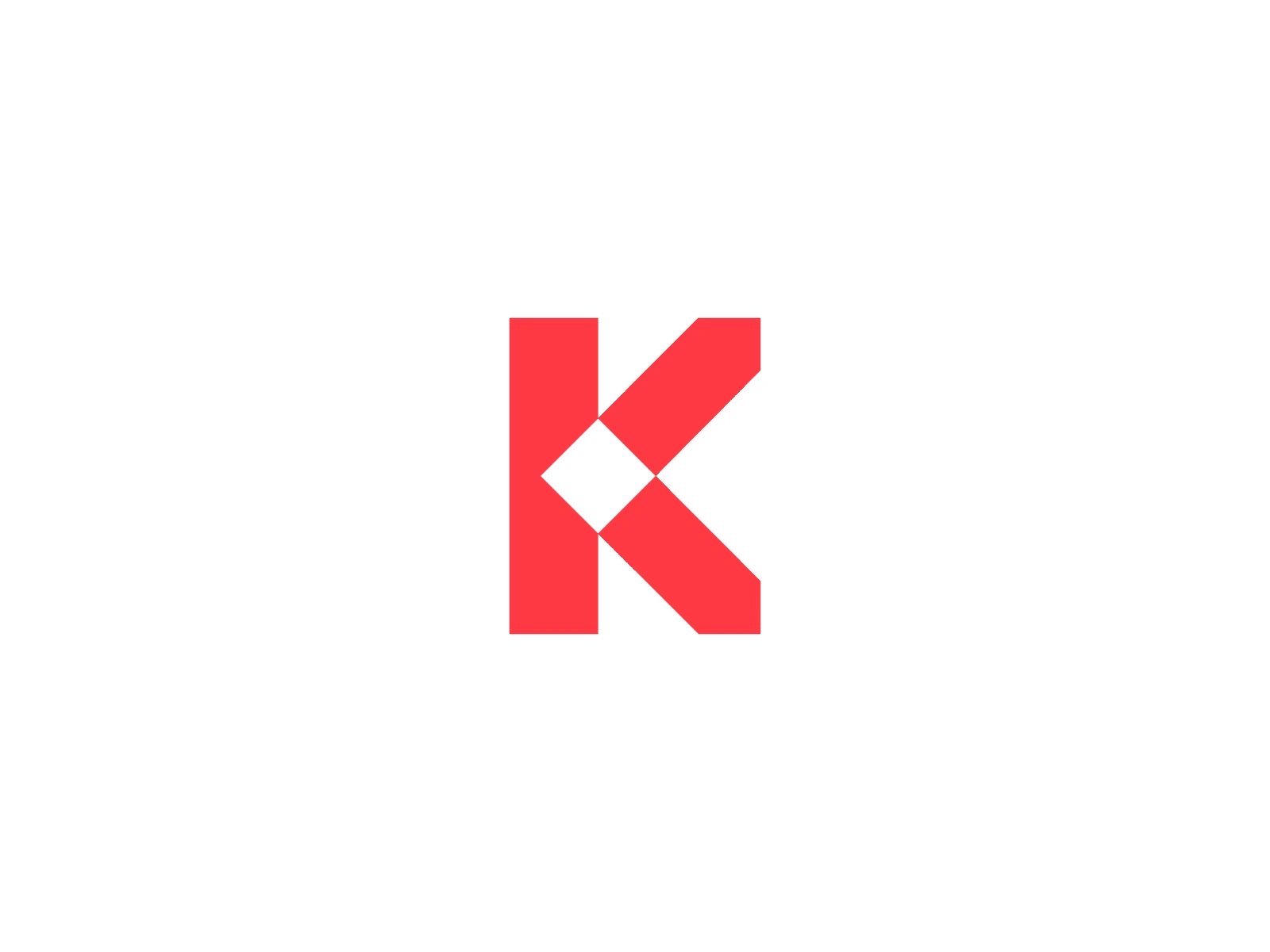
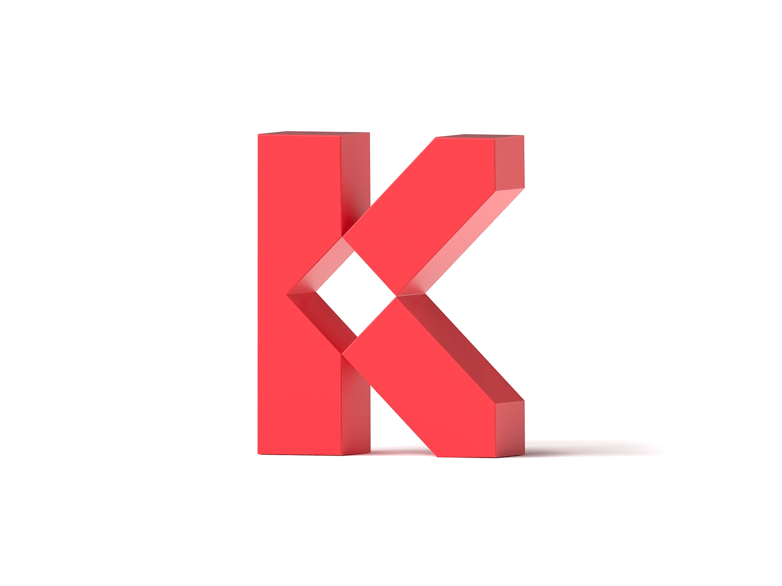
The Diamond Square seen in the initial K is the point of focus and a strong distinctive element which helps with the logo’s recognition and uniqueness.
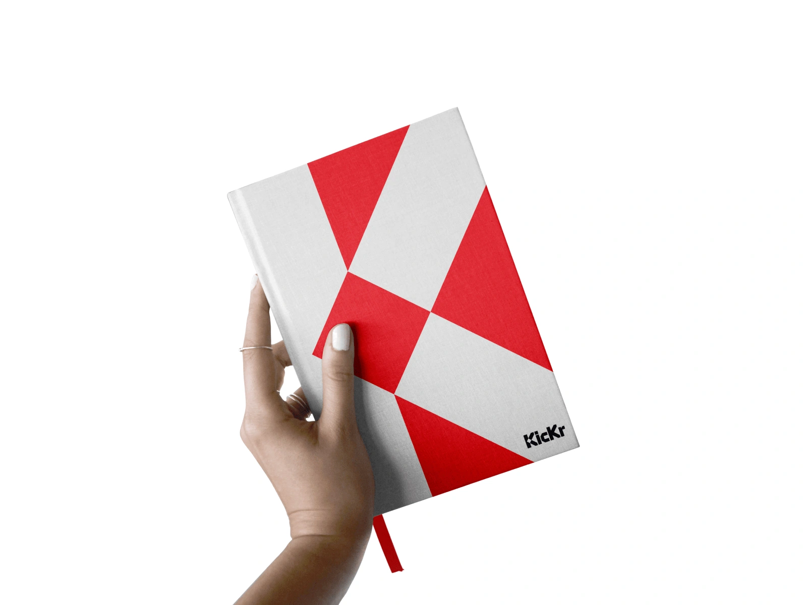
It also serves as the starting point of the Visual Identity of the Kickr Brand.
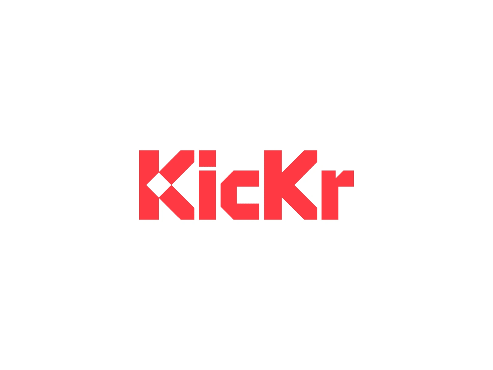
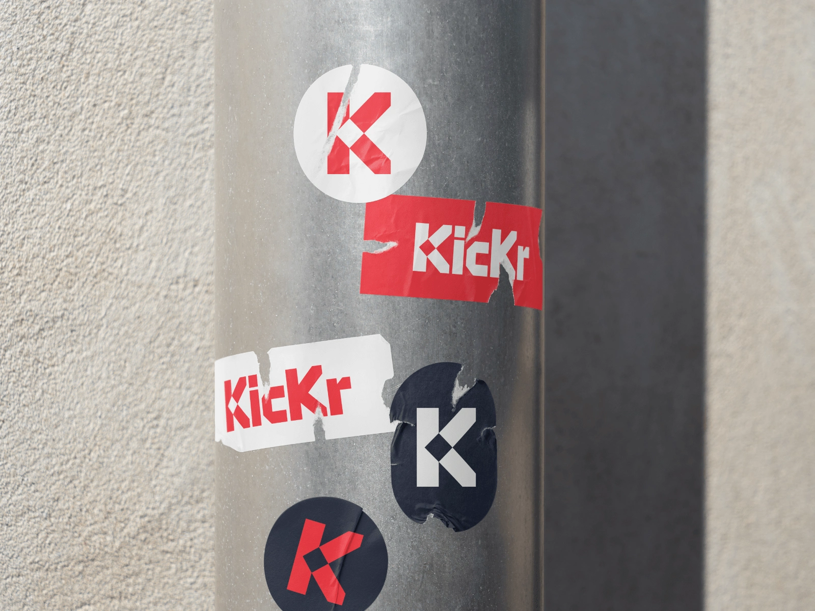
The Kickr Wordmark can also be simplified and used as a standalone icon in scenarios where the space is limited, such as an avatar for social media channels. The recognizability is still kept thanks to the strong and bold design.

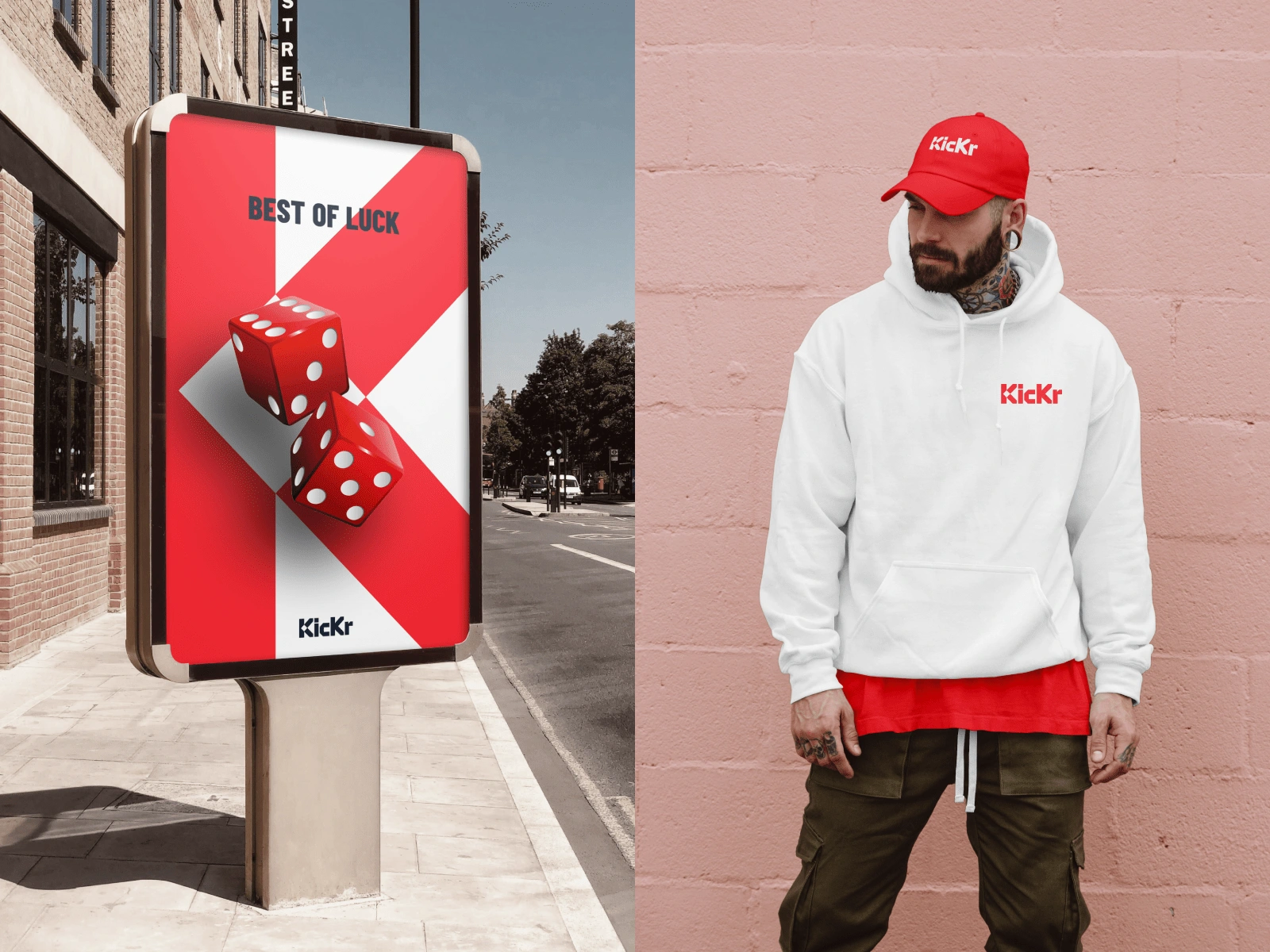
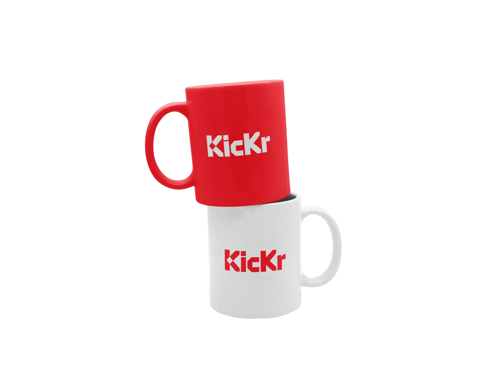
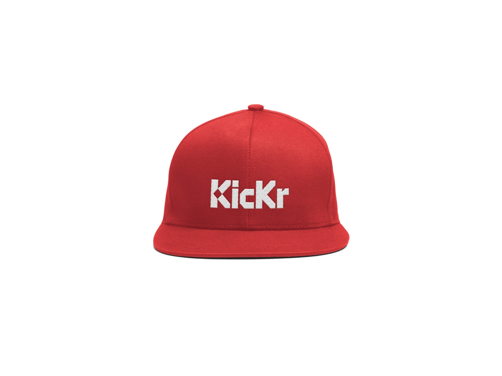
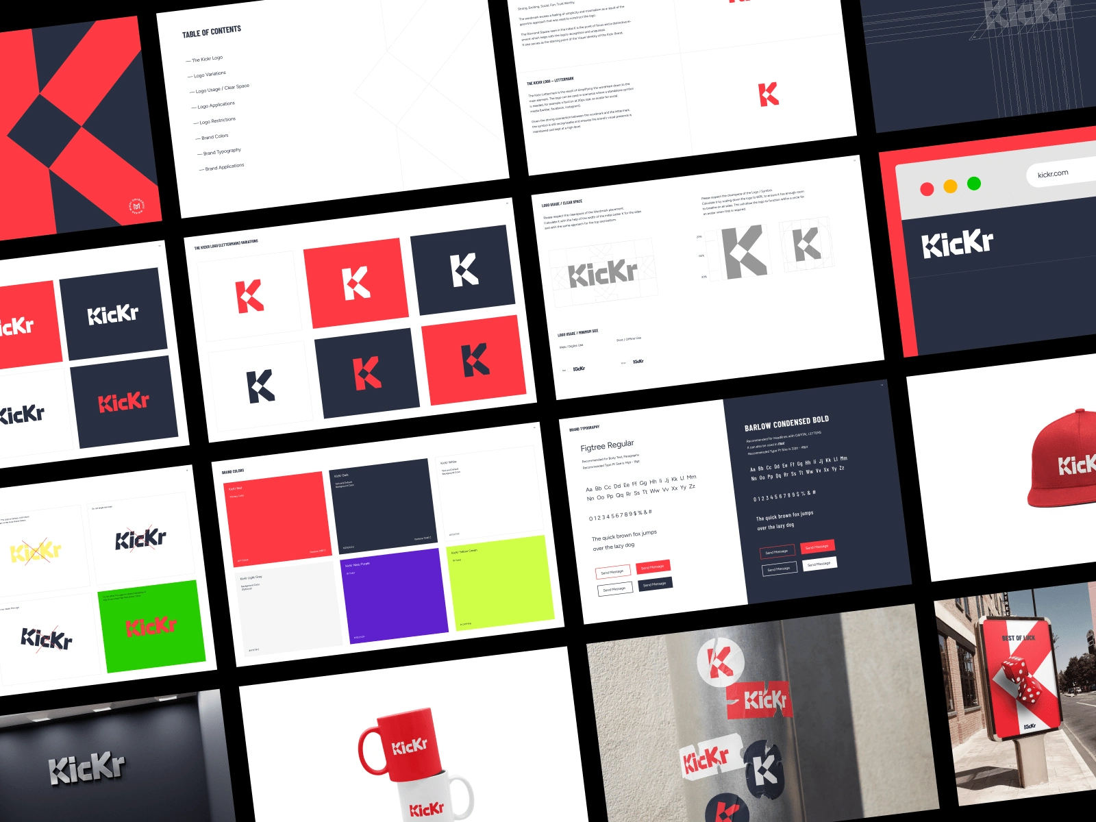
Here are some logo and brand applications
When finalising the logo for Kickr, I started working on the Brand Kit,
that included several important chapters:
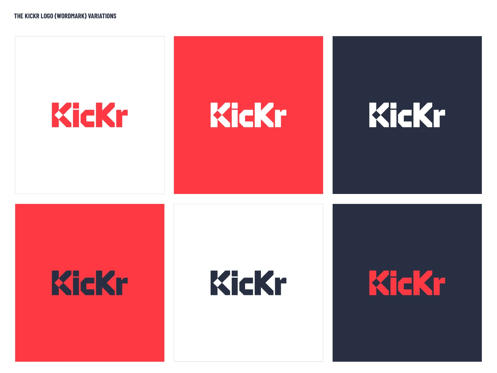
— Logo (Wordmark and Lettermark Variations)
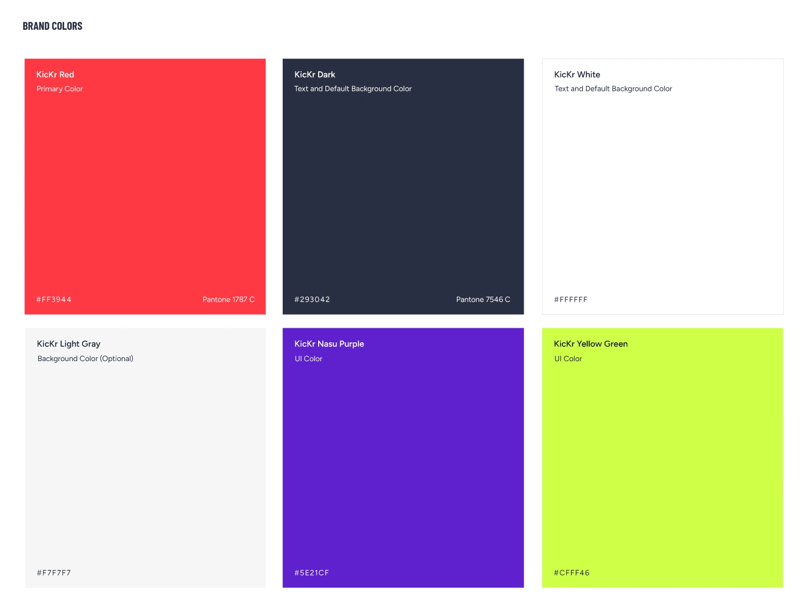
— Brand Colors
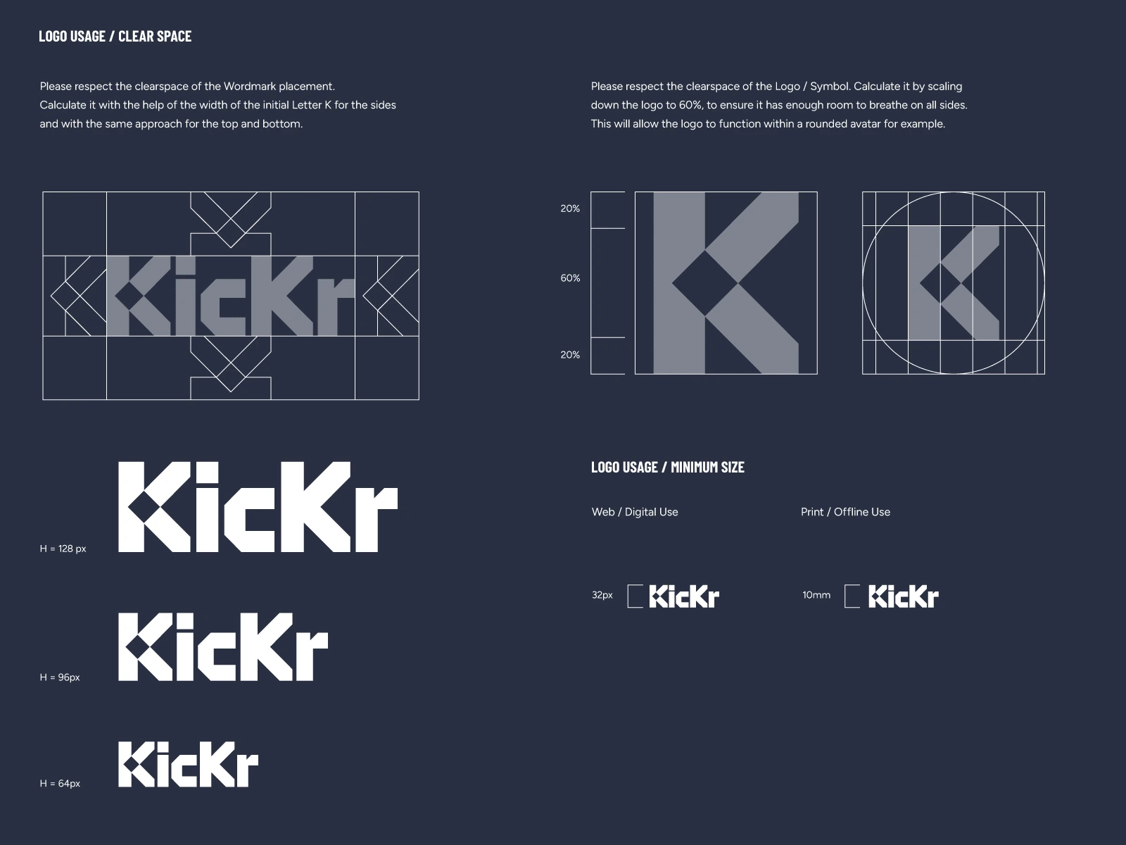
— Logo Minimum Size and Clear Space
— Logo Restrictions
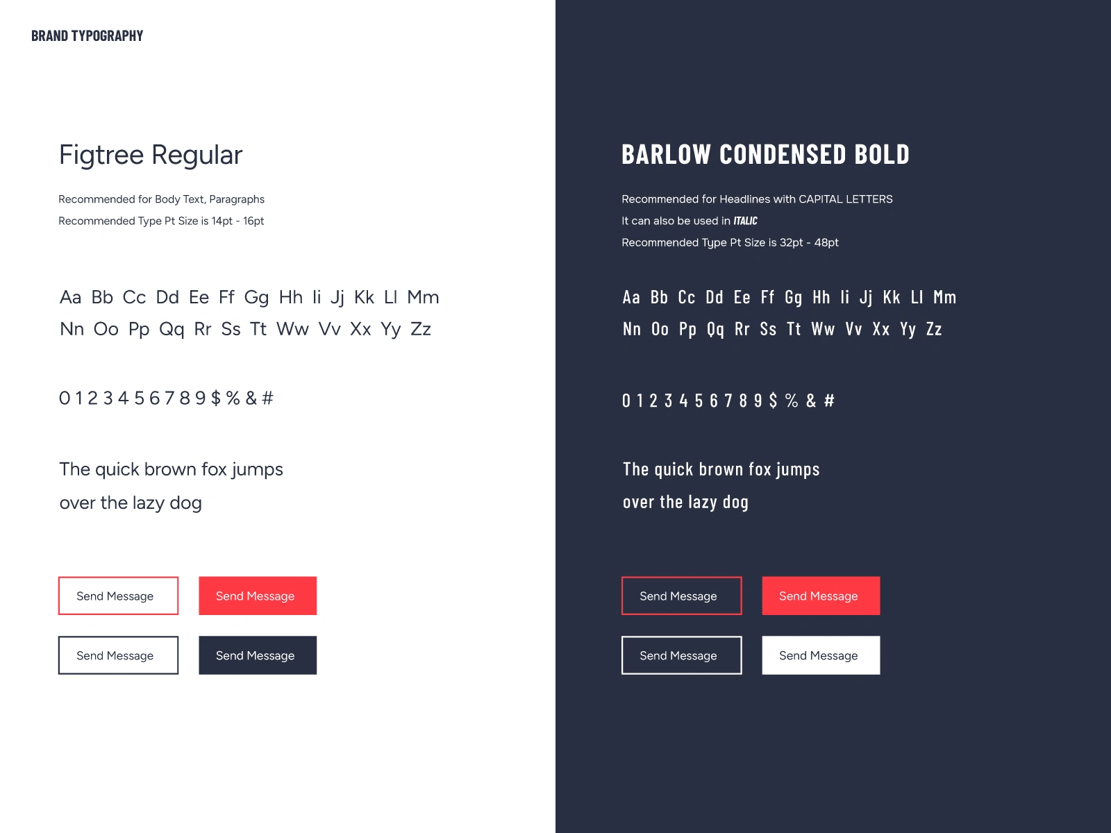
— Brand Typography and Font Pairings
— Logo and Brand Applications
All this was packed in a manually crafted and designed PDF document, that will serve as guidance to those who will interact with the Kickr brand.
Like this project
Posted Jul 19, 2023
Logo, Brand Identity & Brand Guidelines for Kickr — Online Casino.

