Acre Knock - Logo & Identity
Rahul Kumar

Scope of Project
Brand Identity Design
About the Company:
Acre Knock, a dynamic real estate firm, stands at the intersection of innovation and
client-focused excellence. With a commitment to versatile property solutions, they navigate clients through diverse real estate transactions, from compact residences to expansive commercial spaces.
Reason to get a Brand Identity:
Acre Knock recognizes the pivotal role a visual identity plays in conveying their essence – a symbol that encapsulates their professionalism, market acumen, and dedication to client success. In a visually-driven industry, a thoughtfully crafted visual identity becomes the cornerstone, communicating trust, reliability, and the promise of a rewarding real estate journey. Acre Knock's pursuit of a distinctive visual identity aligns with their mission to leave an indelible mark in the real estate landscape, reinforcing their position as a trusted partner in the pursuit of property aspirations.
Objective:
Craft a distinct visual identity for Acre Knock, aligning with their commitment to innovation and client-focused excellence in real estate. Create a memorable brand presence that conveys trust and professionalism, setting them apart in the competitive market.


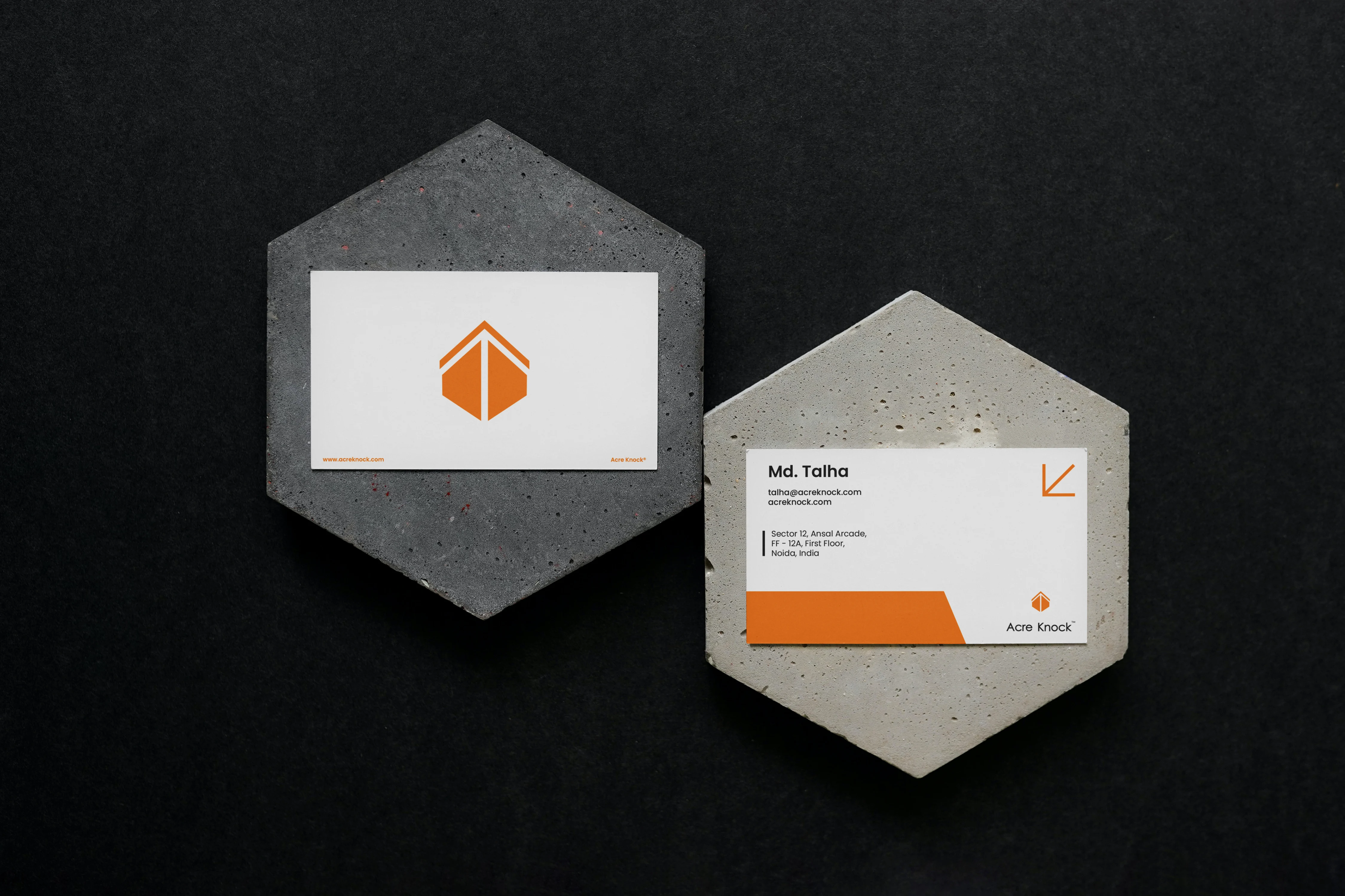
I crafted an abstract logo intertwining a gable roof for stability, a door for opportunity, and an upward arrow for growth – all in one seamless design. This reflects Acre Knock's core values of providing a secure foundation, opening doors to possibilities, and propelling clients towards real estate success. The logo serves as a powerful visual representation of the firm's commitment and stands out in the competitive real estate landscape.
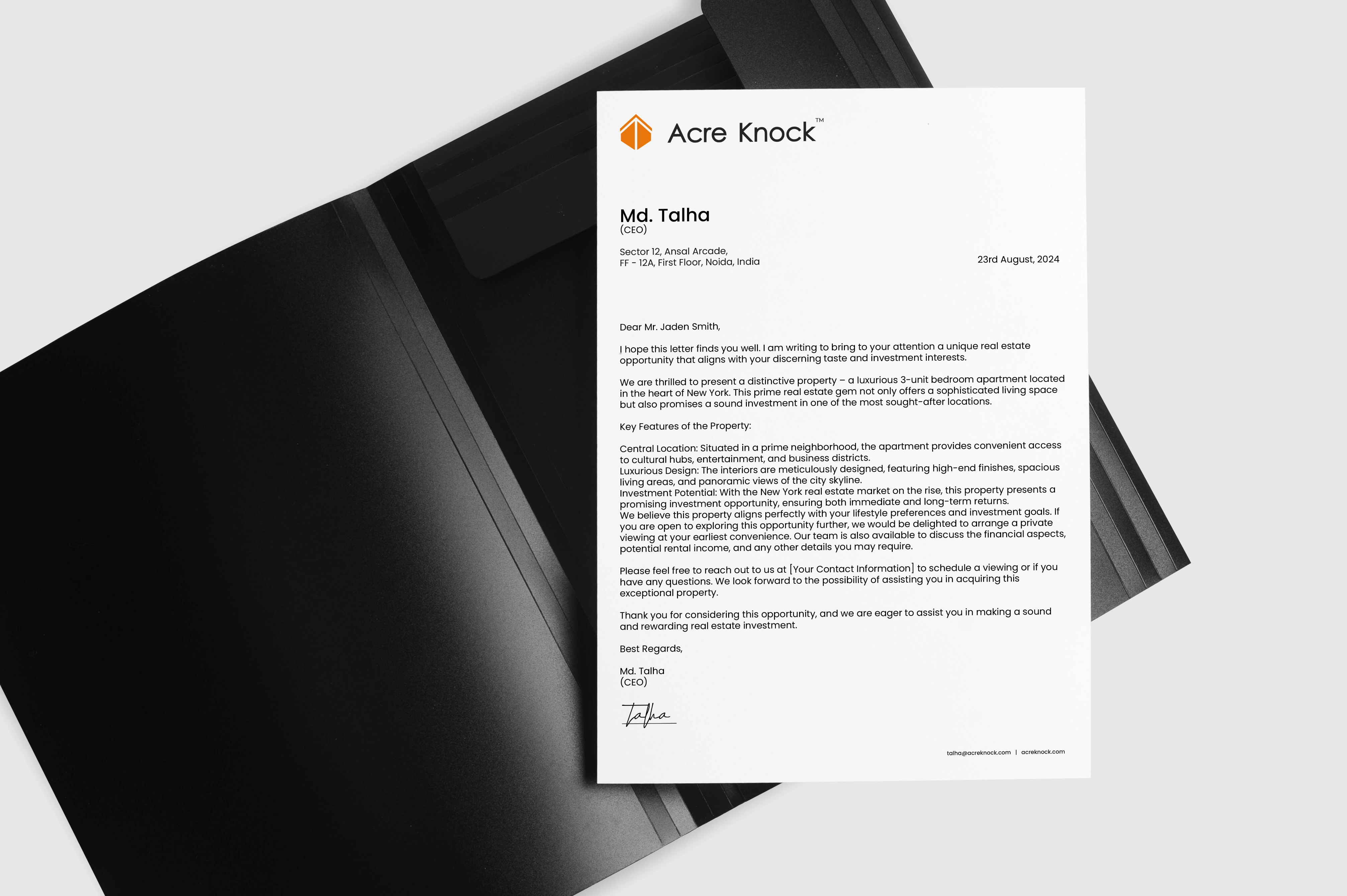
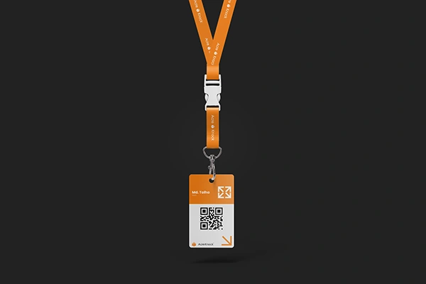
Business cards and letterheads are essential tools in Acre Knock's daily operations. They create lasting first impressions, reinforce brand identity, and facilitate easy contact during networking. These tangible representations of professionalism enhance recognition, contribute to cohesive communication, and instill confidence in clients and partners. In the dynamic real estate industry, business cards and letterheads play a crucial role in shaping Acre Knock's success by fostering connections and maintaining a consistent brand image.


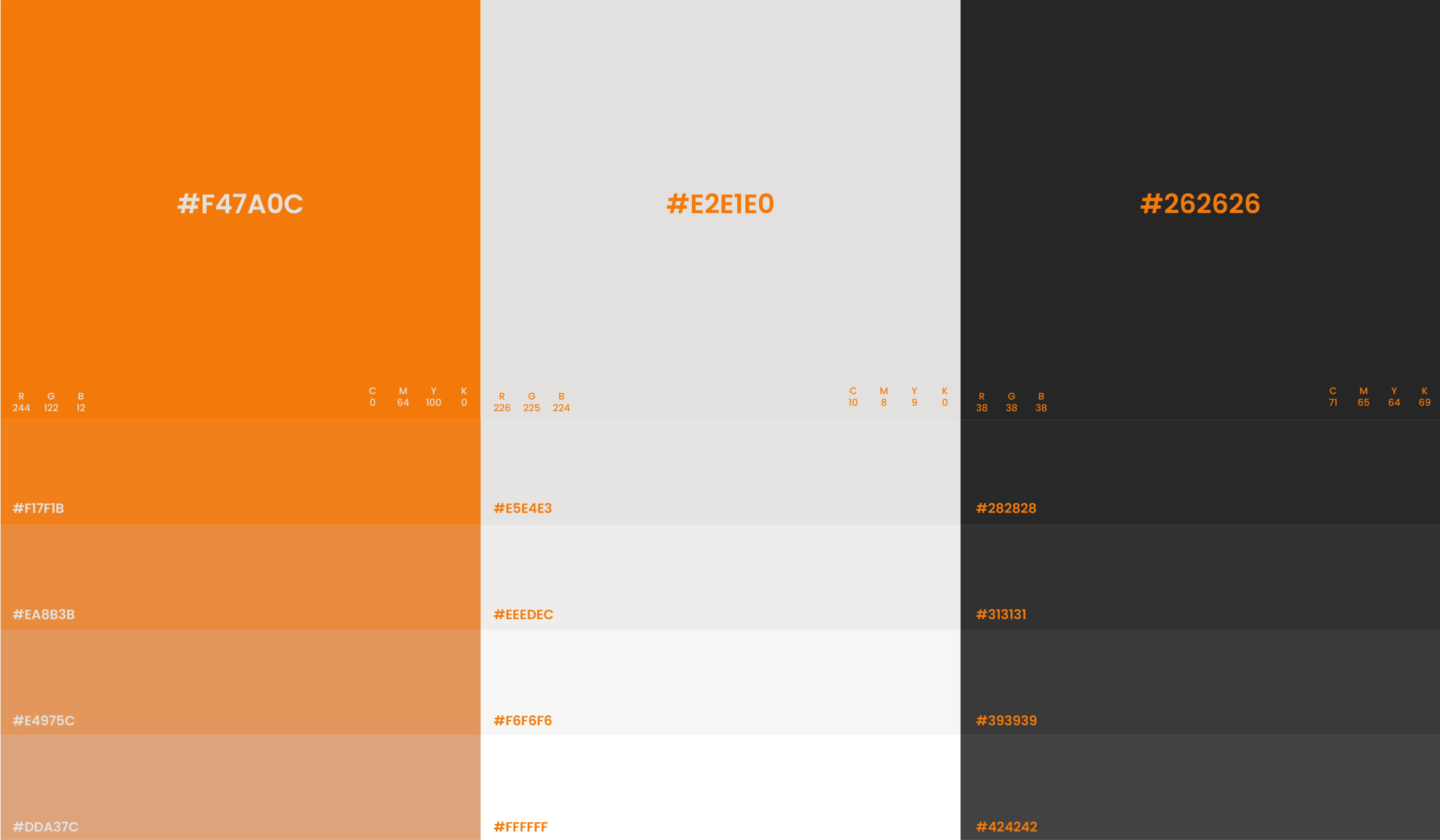
Color Palette Selection:
The selection of orange, black, and white as Acre Knock's primary colors is a deliberate and strategic choice, aligning with the firm's values, aspirations, and the nature of the real estate industry.
Orange - Energetic and Inviting:
- Orange embodies energy, enthusiasm, and warmth, reflecting Acre Knock's dynamic approach to real estate.
- It conveys a sense of approachability, inviting clients to engage in a positive and vibrant real estate experience.
Black - Timeless Elegance and Sophistication:
Black signifies sophistication, elegance, and professionalism, embodying Acre Knock's commitment to delivering high-quality services.
It conveys a sense of authority, instilling confidence in clients and partners, and creating a timeless and enduring brand image.
White - Purity and Transparency:
White serves as a canvas for the vibrant orange and bold black, signifying transparency and clarity in all dealings.
It reflects Acre Knock's commitment to open communication, honesty, and integrity in every aspect of its operations.

Font Selection:
Poppins emerged as the primary font for Acre Knock due to its modern design, versatile 9 weights, and clean aesthetics. This font ensures consistency, readability, and distinctive character across various platforms, aligning perfectly with the firm's professional and contemporary brand image in the diverse landscape of real estate communications.
Design Implementation


Like this project