Bread & Butter: User Centered AI Newsletter
With a user-centered approach, my goal was to redesign and create an intuitive interface and brand for the Bread & Butter team in order to educate their audience on how to properly utilize and monetize AI in their everyday lives.
Industry
B2C Organization
My Role
Web and Brand Designer
Tools Used
Figma
Framer
Miro
You.com AI
Duration
2 months
Challenge
The client requested extensive user research on their ideal audience due to their website's inability to convert visitors into returning users who sign up for their newsletter. This information will dictate the messaging on the website.
Additionally, they are seeking guidance on how to incorporate a community with their audience to foster a sense of inclusion.
Results
The redesigned app features a clean, clutter-free interface, making it easier for users to navigate and access essential features.
The improved onboarding process resulted in a 35% increase in new user adoption rates.
The addition of users being able to view and engage with their community on their website enhanced user engagement, leading to a 25% increase in user retention rates.
Process
Empathize: I conducted user interviews, surveys, and explored the problems space to gain insights into user frustrations
Research: Based on the user research and interviews, I defined what the reocurring issue was. Then I conducted a Competetive Analysis to research what our comepetetors were doing that answered the requests of users, or left room of oppertunities for me to improve upon.
Ideate: Based on the research findings, I restructured the website's navigation and content, prioritizing features and information according to user needs.
Wireframing & Prototyping: I designed low-fidelity wireframes to visualize the new layout and navigation, iteratively refining them based on user feedback. Afterward, I built a high-fidelity, interactive prototype to test the design.
Usability Testing: I conducted usability tests with a diverse group of users to validate the design and identify areas for improvement. Based on the feedback, we made necessary adjustments to the design.
Visual Design & Style Guide: We developed a cohesive visual language, including color schemes, typography, and iconography, ensuring consistency throughout the app. We also created a style guide to maintain design consistency in future updates.
Empathize
The first step in the UX design process was to conduct a UX Audit of the current websites. What were the pain points that users were currently experiencing and how many we improve opon them?
The original website was built with a program called Beehiive. The founders reasoning for it was so that they could get information up and to their audience as quick and as cheap as possible. Although it served its purpose to have a digital space to house their articles, the result was a bulky website that had slow, cumbersome, and limited UX.
Original Website
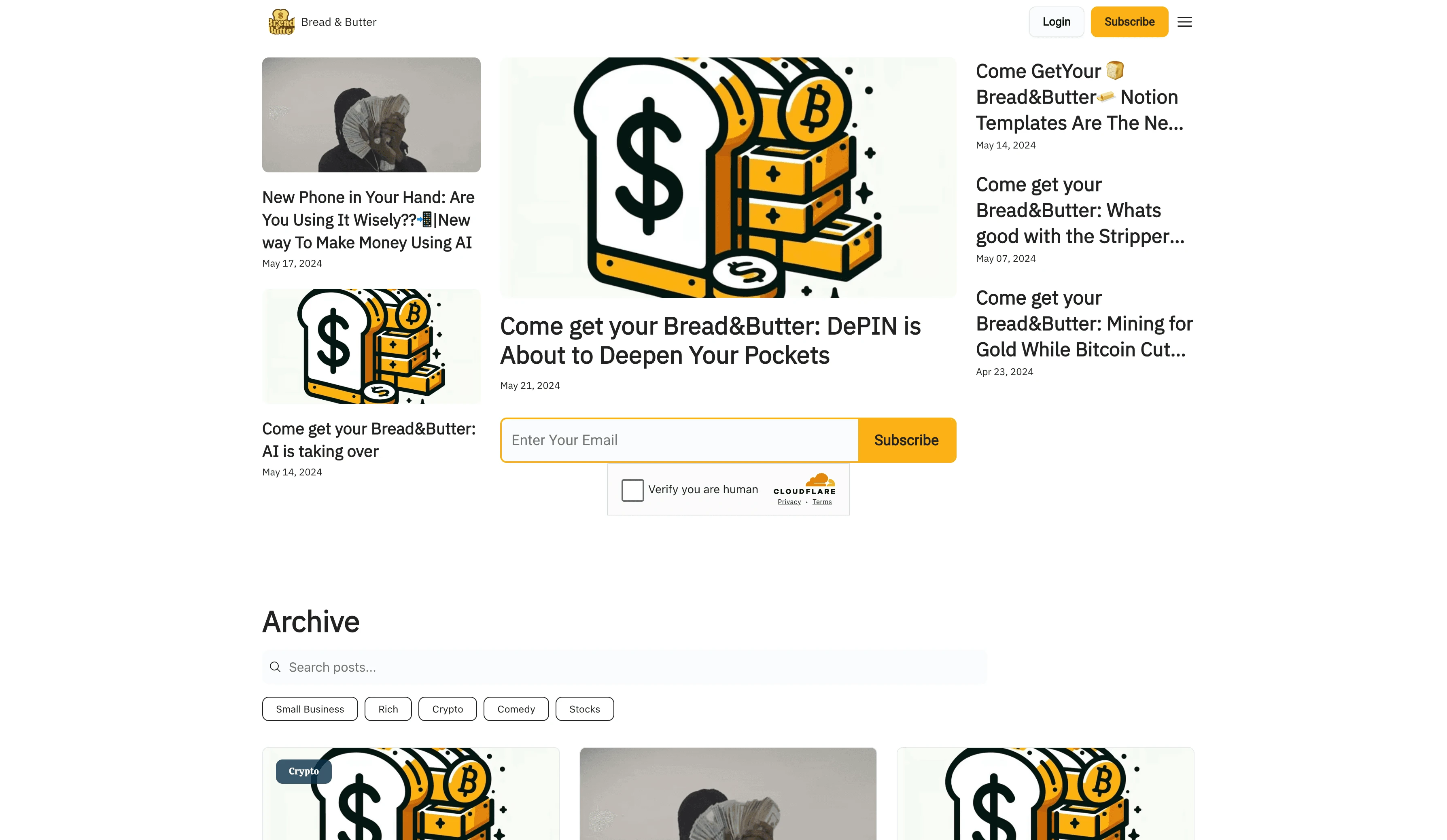
Following the UX Audit was the user research. This involved in-depth user interviews, surveys, and usability testing to gain insights into the preferences, pain points, and aspirations of the target audience. By empathizing with the audience and understanding their journey, I was able to identify the content and features that would resonate most with the subscribers.

Tanya, 26
Go-getter
About: Tanya is an aspiring entrepreneur with a passion for exploring new ways to make money. She is focused on stock, crypto, and side hustles and is drawn to a casual and humorous approach to finance.
Goals: Tanya is seeking inspiration and practical advice that resonates with her lifestyle and financial goals. She aspires to break out of the traditional 9 to 5 mold and is eager to learn from people who share similar experiences and backgrounds.
Pain Points: Tanya feels disconnected from the traditional financial industry talk and seeks content that speaks to her in a relatable, engaging, and humorous way. She is looking for a community that understands her journey and aspirations.and practical advice that resonates with her lifestyle and financial goals. She aspires to break out of the traditional 9 to 5 mold and is eager to learn from people who share similar experiences and backgrounds.

Malik, 30
Looking for new Opportunities
About: Malik is a low-income worker earning between 35k to 65k per year, seeking a change and a new path in life. He is tired of the conventional lifestyle and is eager to learn from others who have successfully navigated similar challenges.
Goals: Malik is looking for new opportunities and fresh perspectives to improve his financial situation and lifestyle. He seeks relatable content that humanizes finances, incorporates humor, and provides actionable advice to help him transition into a more fulfilling and financially secure future.
Pain Points: Malik struggles to find content that resonates with his experiences and aspirations. He desires a community of accomplished entrepreneurs who can act as mentors and provide guidance on his journey to success.

Thomas, 38
Trailblazer
About: Thomas is a professional looking for a fresh perspective on making money and improving his lifestyle. He seeks inspiration and practical insights that break away from traditional industry talk and resonate with his aspirations.
Goals: Thomas is eager to explore new possibilities outside the normal 9 to 5 and is attracted to the idea of a different lifestyle. He is looking for a community that understands his journey and can provide valuable mentorship and guidance.
Pain Points: Thomas struggles to find content that speaks to his ambitions and experiences. He seeks a platform that offers a casual, humorous, and engaging approach to finance, as well as a community of entrepreneurs who can inspire him.
What did I learn from the Interviews?
Insight 1
Users prioritize educational, up-to-date content that assists them in generating income and making informed financial decisions.
Insight 2
Users of Bread & Butter seek entrepreneurial content that resonates with their unique experiences and challenges, fostering a sense of community and empowerment among Black, Brown, and other people of color; they crave resources and insights that reflect their diverse perspectives and support their journeys in entrepreneurship.
Insight 3
Users are interested in enhancing their sense of connection within the vibrant entrepreneurial community, underscoring the importance of fostering meaningful interactions.
How might we design an experience that empowers users to access timely, educational content that contributes to their financial success, while fostering a vibrant community of entrepreneurs?
Research
I then conducted a comprehensive competitive analysis of similar newsletters in the finance and lifestyle domains to evaluate their content, user experience, and engagement strategies. This process revealed areas for improvement and innovation that could benefit Bread & Butter, allowing us to refine our content strategy, enhance the user experience, and position our newsletter as a distinctive and compelling voice in the finance space.
Axios Newsletters
Offers a wide range of newsletters covering business, tech, and current events, targeting a broad audience interested in concise, informative, and well-curated news content.
Audience: Appeals to a diverse audience interested in concise, informative newsletters covering a broad range of topics.
Content: Provides concise, informative newsletters covering a diverse array of topics, appealing to a broad audience.
Monetization: Offers a wide range of newsletters covering business, tech, and current events, targeting a broad audience interested in concise, informative news content.
Homebrew
Homebrew focuses on early-stage venture capital and investing in mission-driven founders at the earliest stages.
Audience: It caters to entrepreneurs and investors interested in startup investments and innovation.
Content: Provides insights and resources for entrepreneurs and investors, targeting a niche audience interested in startup investments.
Monetization: The website focuses on early-stage venture capital and provides insights and resources for entrepreneurs and investors.
Milk Road
Provides a daily crypto newsletter and website that offers tools, analysis, and news to help individuals become more knowledgeable about cryptocurrency.
Audience: Targets crypto enthusiasts and investors seeking valuable insights and updates in the rapidly evolving crypto space.
Content: Focuses specifically on cryptocurrency-related news and analysis, catering to crypto enthusiasts and investors.
Monetization: Provides a daily crypto newsletter and website that offers tools, analysis, and news to help individuals become more knowledgeable about cryptocurrency.
What did I learn from the Competetive Analysis?
Each of the analyzed newsletters has a distinct focus and audience. Homebrew specifically targets early-stage venture capital and mission-driven founders, emphasizing a hands-on, founder-friendly approach to seed-stage funding and operational expertise. Axios Newsletters, on the other hand, caters to a broad audience interested in concise, informative content covering various topics such as business, tech, and current events. Milk Road focuses solely on cryptocurrency-related news and analysis, targeting crypto enthusiasts and investors.
The competitive analysis underscores the potential for Bread & Butter to carve out a unique space by providing educational, niche-specific content, fostering an active and supportive community, and potentially exploring specialized content areas to cater to the interests and needs of entrepreneurs and investors as well as folks learning about this industry.
Ideate
Now that we have the knowledge from our valuable user insights and competeitve analysis, the I embarked on an iterative design process. Low-fidelity prototypes were created and tested with a select group of subscribers to gather feedback on the proposed changes. This feedback loop allowed for rapid refinement of the user interface and content strategy, ensuring that the design decisions were aligned with the audience's needs and expectations.
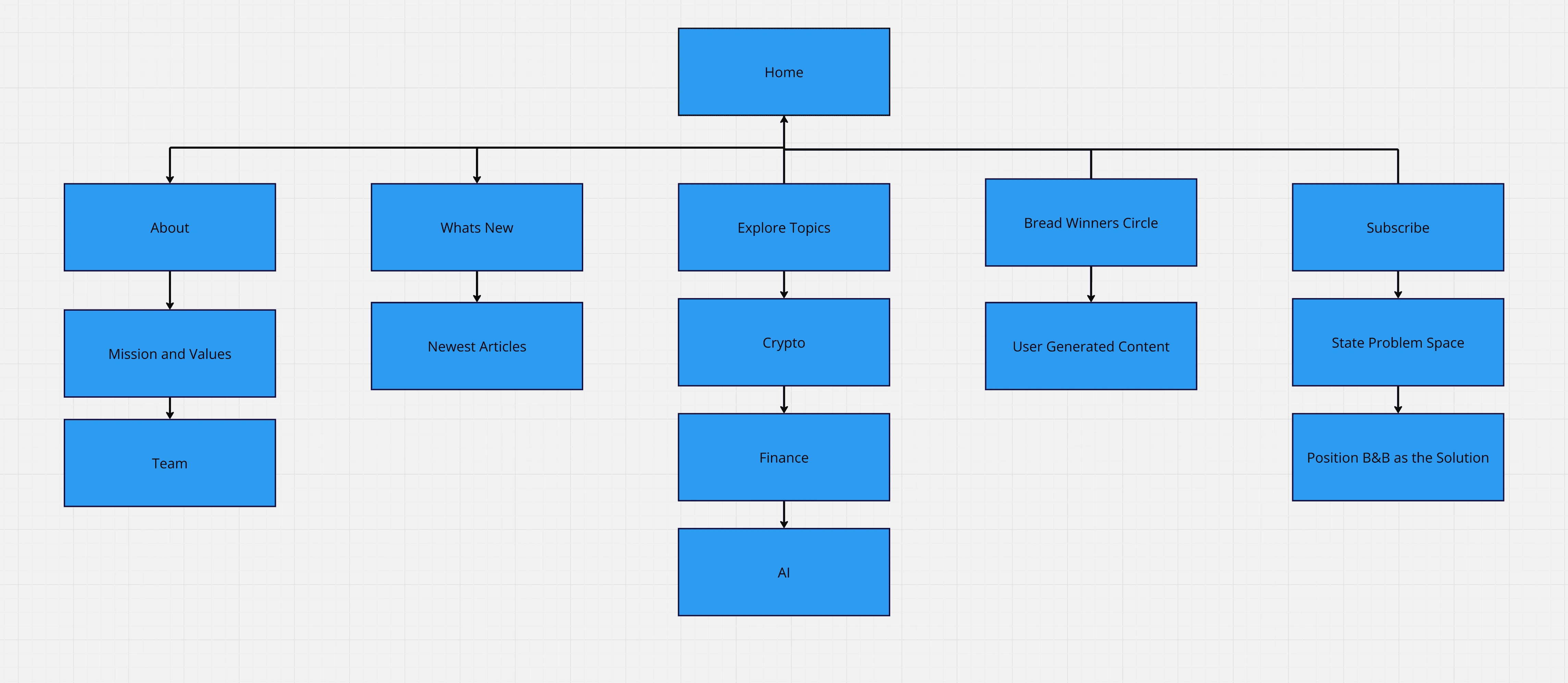
Site mapping
Wireframe & Prototype
One of the key challenges was to create content that not only informed but also inspired and engaged the subscribers. The user research insights enabled the team to tailor the newsletter's content to address the specific interests and aspirations of the audience. By incorporating humor and fresh insights on stocks, crypto, and side hustles, Bread & Butter aimed to humanize finances and inspire a new lifestyle for its readers.
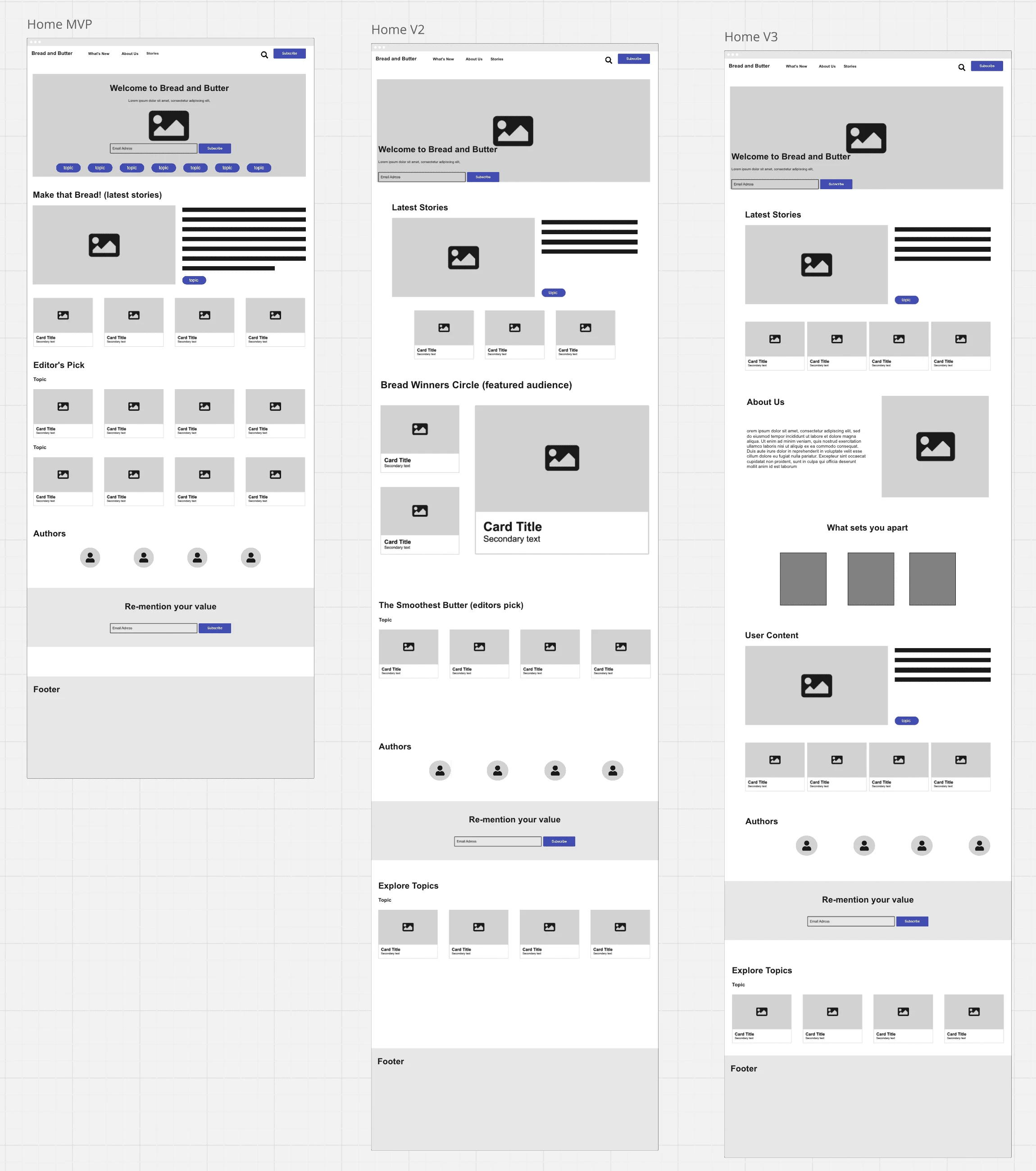
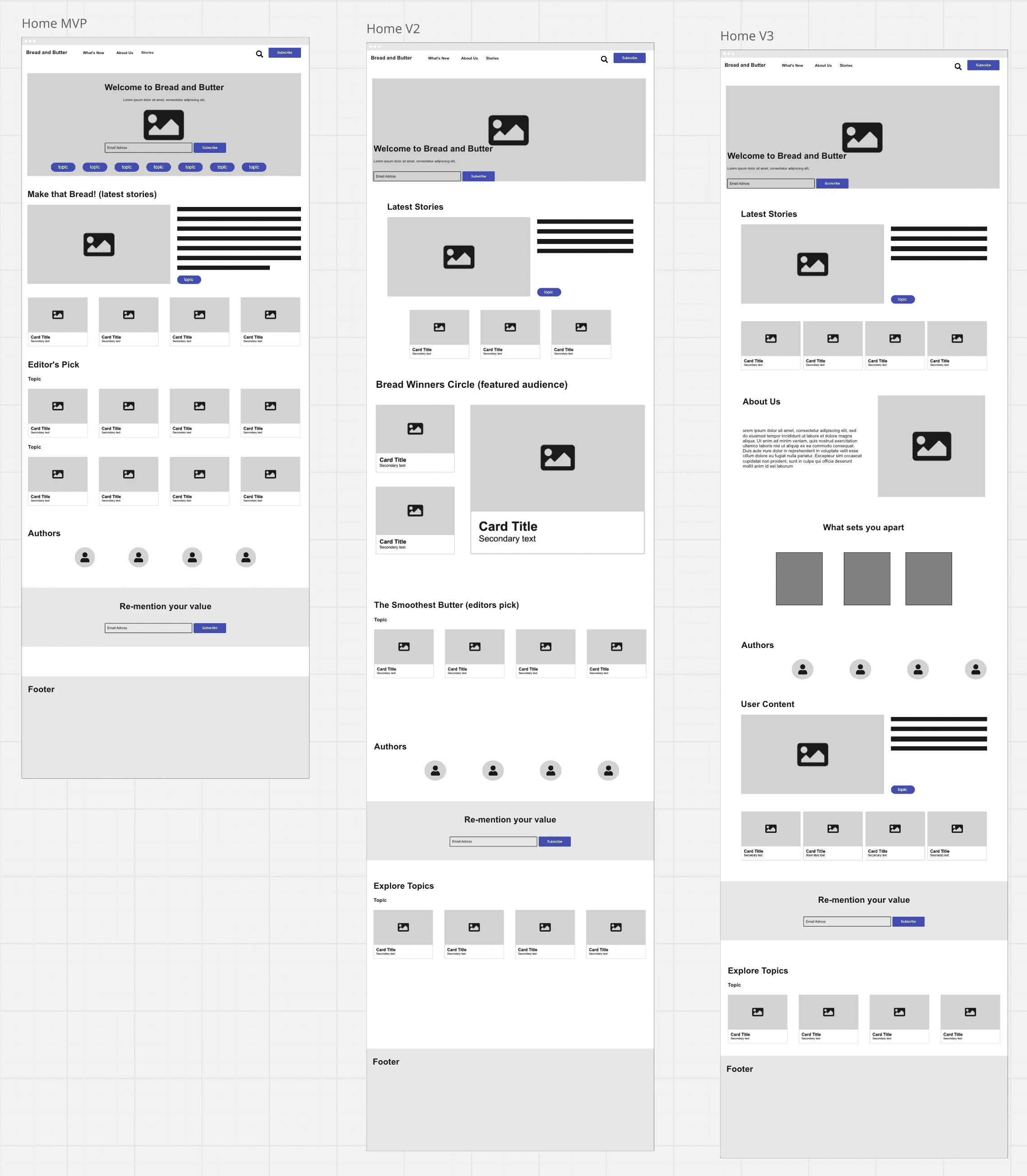
Wireframe of Homepage and Article Detail Page
The home page had to change a few times based off of feedback from users and the client.
We chose to change the placement of the subscribe CTA due to users expressing it being centered removed the purpose of the hero image. It was "too cluttered" alongside the tags of topics.
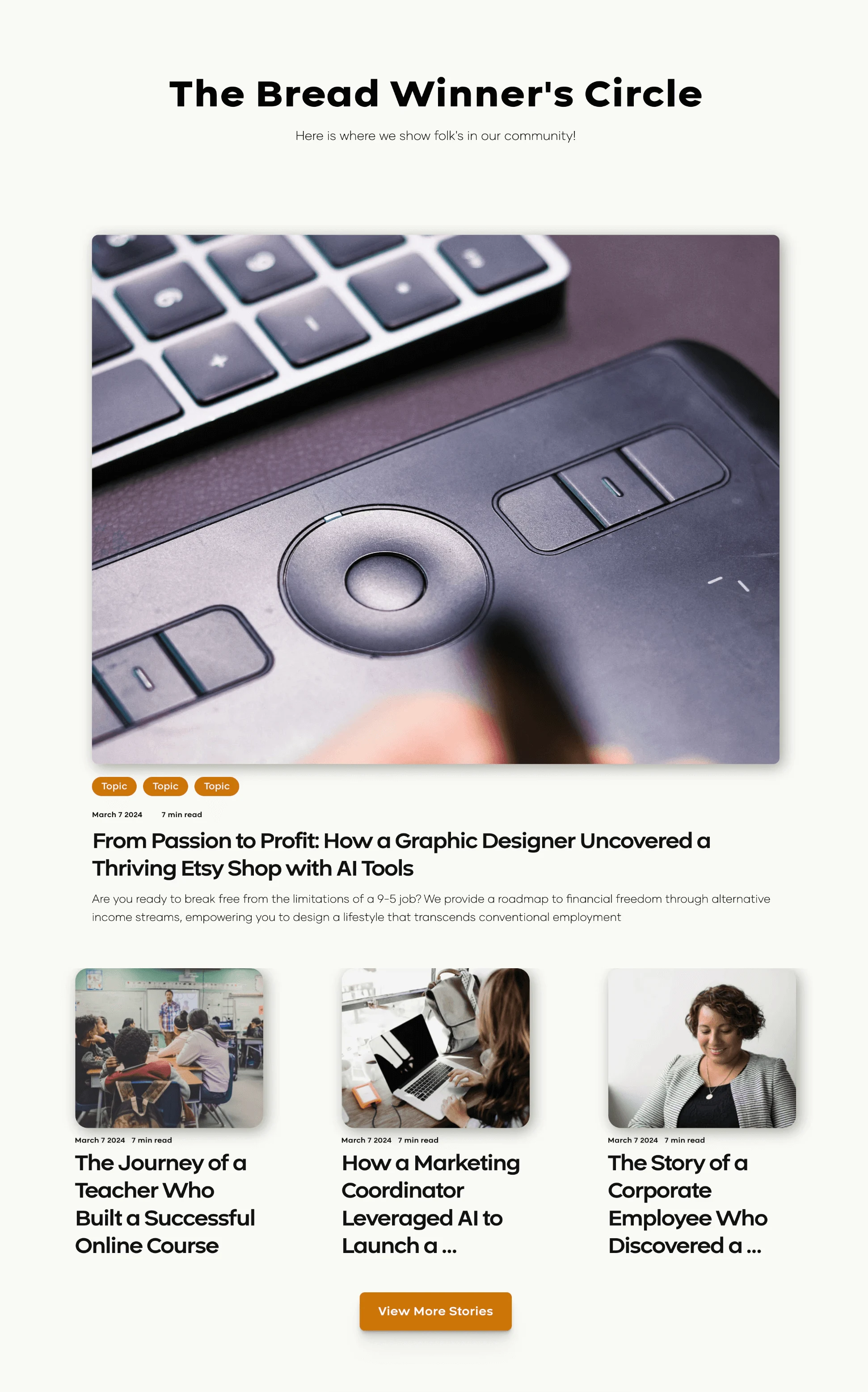
Additionally we chose to incorporate a "Bread Winners" circle so that users could feel more connected to the community we were building. They would be able to view their own as well as their peers accomplishments.
Ultimately, the team at Bread & Butter aimed to elevate their connection beyond a simple newsletter. I recognized the need for a dedicated section that showcased their identity and clearly articulated what their audience could expect from them. This approach not only strengthened their brand presence but also ensured that users felt a genuine connection, and keep them wondering what they might encounter each time they return to the website, reinforcing the value they deliver.
Usability Testing and Measuring Succsess
With each iteration, it was put to the test up against our user base. The goal was to strengthen user engagment and user retention. From the insights discovered, these are the changes made:
Educational and Up to Date Content
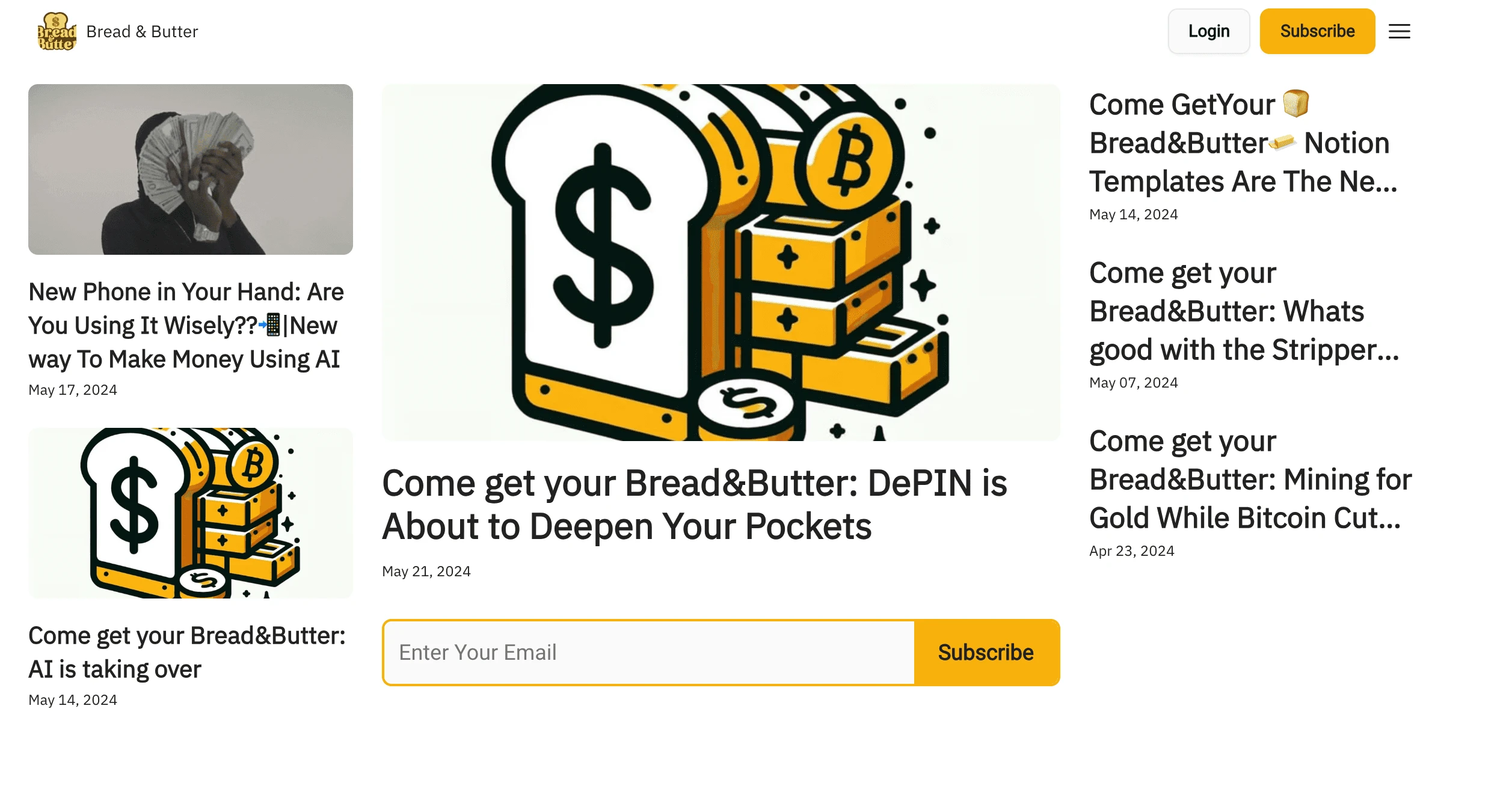
Before
To ensure users feel confident in the most recent information provided, my client initially made all articles visible as soon as visitors arrived on the site in the hero section. Unfortunately, this led to significant visual clutter, which discouraged users from browsing through the content to find topics that interested them personally. Additionally, they hadn't really explained who they are or what sort of content they are providing. So there is no visual interest to entice the user to click.
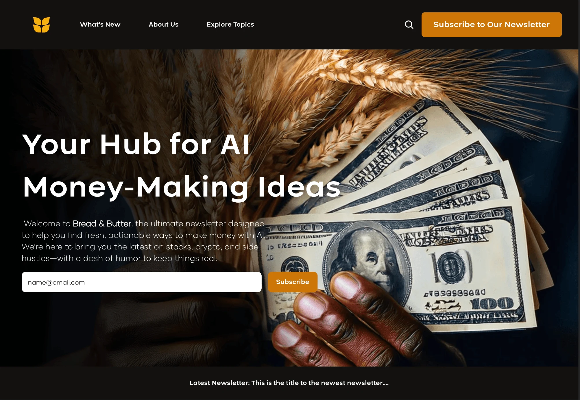
After
This redesign of the hero section effectively introduces the brand and clarifies its intentions to the user. It also clearly highlights the intended call to action (CTA) and articulates the benefits for users, making it evident why they would want to engage. This method is more strategic in increasing subscribers because it creates an immediate connection between the brand's mission and the needs of the audience, fostering a sense of belonging and urgency that encourages users to take action and subscribe for more valuable content.
Resonates With Their Unique Experiences
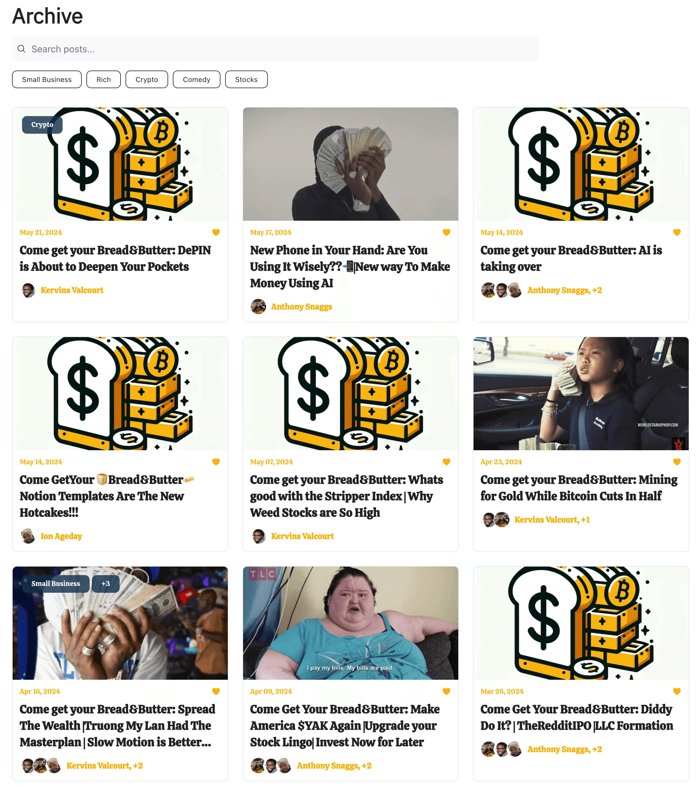
Before
Previously, my client believed that showcasing all their engaging articles at once would be the best way to connect with users. While there were some categories available, the limited options often left users scrolling through content in search of something that resonated with their specific needs.
After
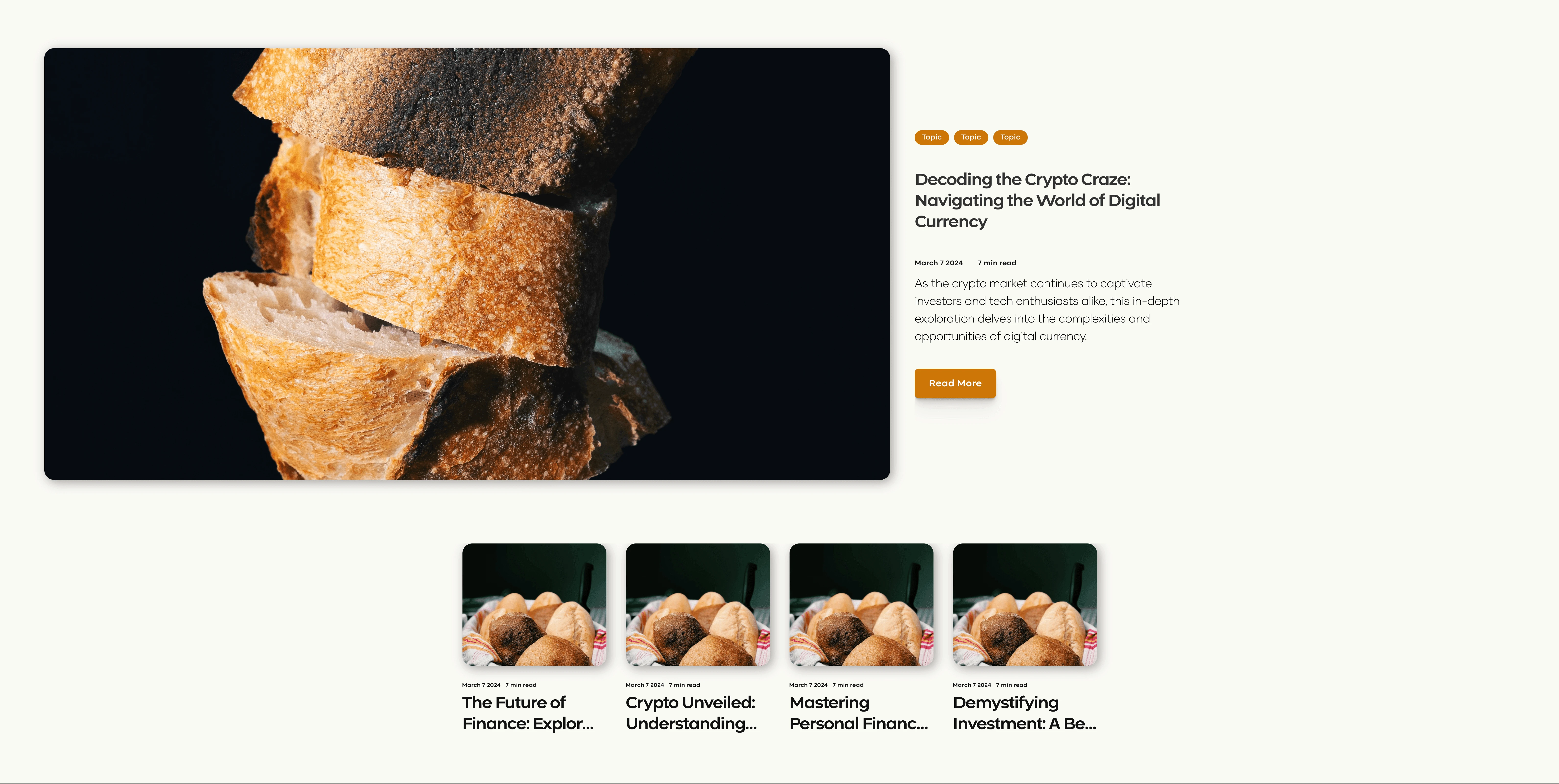
In this redesign, there is a clear hierarchy highlighting a featured article, accompanied by tags that indicate the topics it covers, removing the stress of too many choices. This allows users to easily identify content that aligns with their specific interests. Additionally, the section includes various options for previously posted articles, providing users with more choices to explore.
Enhances Their Sense of Connection
Before
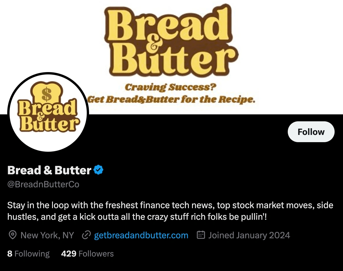
Previously, users lacked a genuine sense of connection with their audience. My client created accounts on third-party social media platforms like Twitter or Linkedin, but struggled to maintain consistency in posting and gauge the overall sentiment of their user base.
After
With the "Bread Winner's Circle," everyone in the Bread & Butter user base has the opportunity to witness inspiring achievements from members of their community. This initiative not only motivates them to strive for greater accomplishments but also encourages them to aspire for a feature on the website themselves. As a result, this fosters a strong sense of connection among users, driving their collective ambition to grow and cultivate wealth.
Visual Design & Style Guide
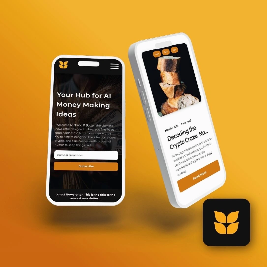
The logo is inspires by a laurel of wheat. Wheat embodies abundance, sustenance, financial security, highlighting the interconnectedness between humans and nature.
The deep black selected for the color palette evokes a sense of financial comfort and tradition. The vibrancy of the warm colors signifies energy, optimism, and an entrepreneurial spirit. Bread & Butter aims for their audience to feel that they have chosen a timeless brand that not only addresses their need for financial security, structure, and education, but also acknowledges their humanity and provides humor so that they feel included in this often segregated space.


Conclusion & Impact
Following the implementation of the user-centered design approach, Bread & Butter witnessed a significant increase in subscriber engagement and retention. The tailored content and improved user experience resonated with the target audience, leading to a 30% increase in subscriber growth within their first quarter. The newsletter also received positive feedback from the audience, indicating a stronger connection and resonance with their needs and interests.
60%. 25%
User engagement Increase in user retention
"Working with them has been a true pleasure, and their contributions have been invaluable in shaping the visual identity of Bread and Butter"
Anthony Snagg
CEO, Co-founder | Bread & Butter
Like this project
Posted Sep 25, 2024
Discover a talented UX Designer, Brand Designer, and Product Designer committed to crafting exceptional user experiences and innovative branding solutions that…


