Enhancing User Experience for Automic Gold
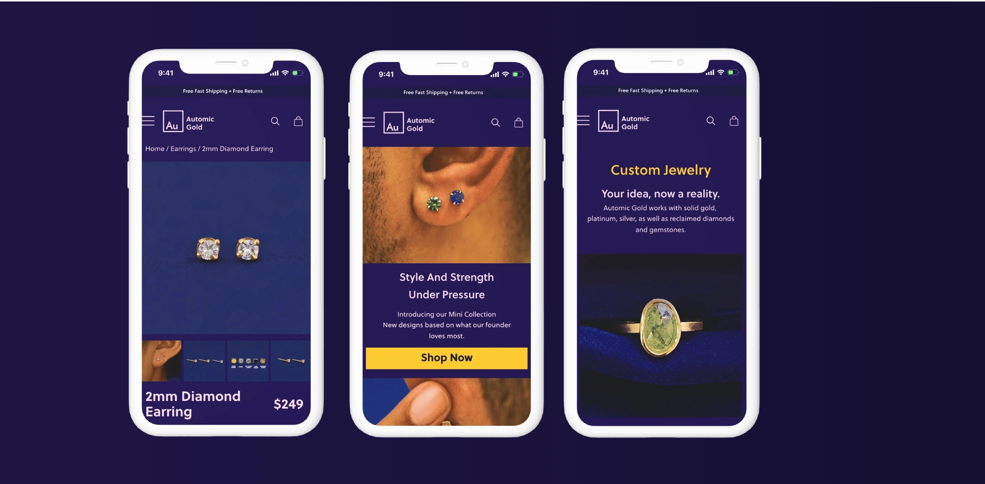
Automic Gold, a prominent e-commerce platform specializing in jewelry, sought to address challenges related to low conversion rates on their website. The client engaged my services to conduct a comprehensive audit of their website and to provide a heuristic analysis aimed at identifying and resolving user experience (UX) issues.
Industry
E-commerce
Company size
10+
Tools Used
Figma
Miro
Dovetail. AI
Duration
2 months
Challenge
The website had an out of date interface, making it difficult for users to navigate and find essential features. The primary objective was to pinpoint specific areas of friction and inefficiency that hindered the conversion of website visitors into customers. Additionally, the heuristic analysis aimed to provide actionable insights and potential solutions to enhance the overall UX and drive improved conversion rates.
Results
By leveraging a user-centric approach and industry best practices, the project curated a roadmap for enhancing Automic Gold's website UX. The proposed solutions designed aligned with the client's business objectives and empowered the brand to create a more compelling and conversion-friendly online shopping experience for their audience.
The improved inventory and search process resulted in increasing conversion rate by 40% and a 25% increase in user retention rates.
Process
Research: Gathered and analyzed relevant information to gain insights into user behaviors, preferences, and needs. This may include conducting user interviews, surveys, and competitive analysis to inform design decisions and ensure that the resulting solutions are tailored to meet user requirements and expectations
Prototyping: Validate design ideas, gather feedback, and iterate on the design before the final implementation. Prototyping can range from low-fi sketches to high-fi interactive simulations, providing a tangible representation of the proposed design for evaluation and refinement.
Usability Testing: Conducted usability tests with a diverse group of users to validate the design and identify areas for improvement. Based on the feedback, we made necessary adjustments to the design.
Synthesize: Integrated research findings and data into actionable insights. It involved organizing, interpreting, and extracting meaningful patterns and themes from the collected information to inform the design direction and decision-making process.
Deliver: Curated a methodical evaluation used to identify usability issues within a digital product by comparing its design to established principles. It aims to uncover and address potential usability problems to enhance the overall user experience and satisfaction.
Research
To commence, my initial focus was to grasp the perspectives of their existing users regarding the functionalities, preferences, and challenges they currently face on the website. I dove into the UX Audit to see what can immediatly be done to fix the UX Issues.
What specific challenges are Automic Gold users facing, and how can we enhance services to address and overcome these frustrations?
Heuristic Analysis / UX Audit
Heuristic analysis, within the context of the design process, refers to a methodical evaluation technique used to identify and assess usability issues within a digital product, such as a website, portal, or application. This evaluation is typically conducted by experts who compare the design of the digital product to a set of predefined design principles, commonly referred to as heuristics. The process involves systematically reviewing the product to uncover potential usability and experience problems, with the goal of improving user satisfaction and experience, ultimately enhancing the product's chances of success.
AG had quite a few initial UX issues pointed out by the analysis. Each one I marked on a separate document to be assessed based on its severity level and the capacity of the team to absolve the problem based on time and capacity.
Learning from Existing Users
There were some cosmetic inconsistencies within the website such as allignment issues, accesability violations due to misuse of color, and certain features being hidden behind clicks. However a consistant complaint experienced from users was in navigation. Users found it difficult to navigate through the immense library of jewlery.
The new adjustments are strategic, intended to enhance engagement and guide users seamlessly through the platform, ultimately optimizing their interaction with the site. I developed a prototype that closely resembled their existing design but incorporated specific modifications aimed at enhancing legibility and overall user experience based on the Heuristic Analysis I had conducted. The goal is to compare the experience of their users working through this prototype to the current design of the website and find the specific points on friction without the distraction of obvious ux issues.
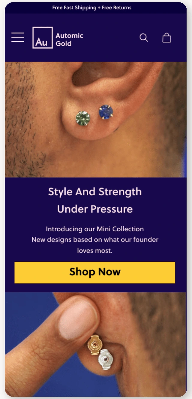
Home Page
Prototype
This prototype was poised to be a pivotal element in AG's redesign, serving as a crucial tool to explore beyond the immediate resolution of glaring UX issues. Its primary purpose was to uncover any remaining pain points and potential areas for improvement, offering valuable insights into the overall user experience beyond the initial focus on addressing evident usability concerns.
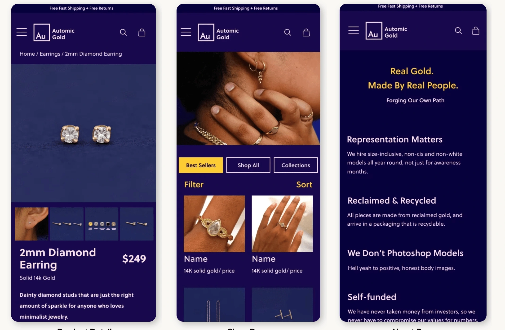
Detail Page, Shop Page, About Us Page
Usability Testing
Presented here is the prototype for the Search Engine, identified as the primary pain point based on testing. Users expressed concerns regarding the abundance of options, prompting the need for a more streamlined and intuitive approach.
User Interview Questions
How would you describe the brand based on what you see on the home page?
What values or qualities do you associate with Automic Gold?
Do you think the navigation and categorization of items are user-friendly?
What do you think of the range of customization options available on the Custom questionnaire?
Do you typically read full blog posts or just skim through them?
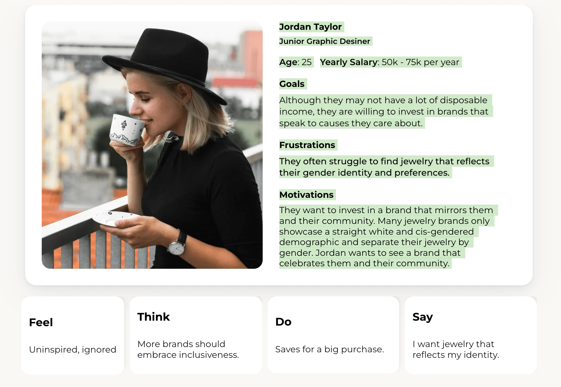
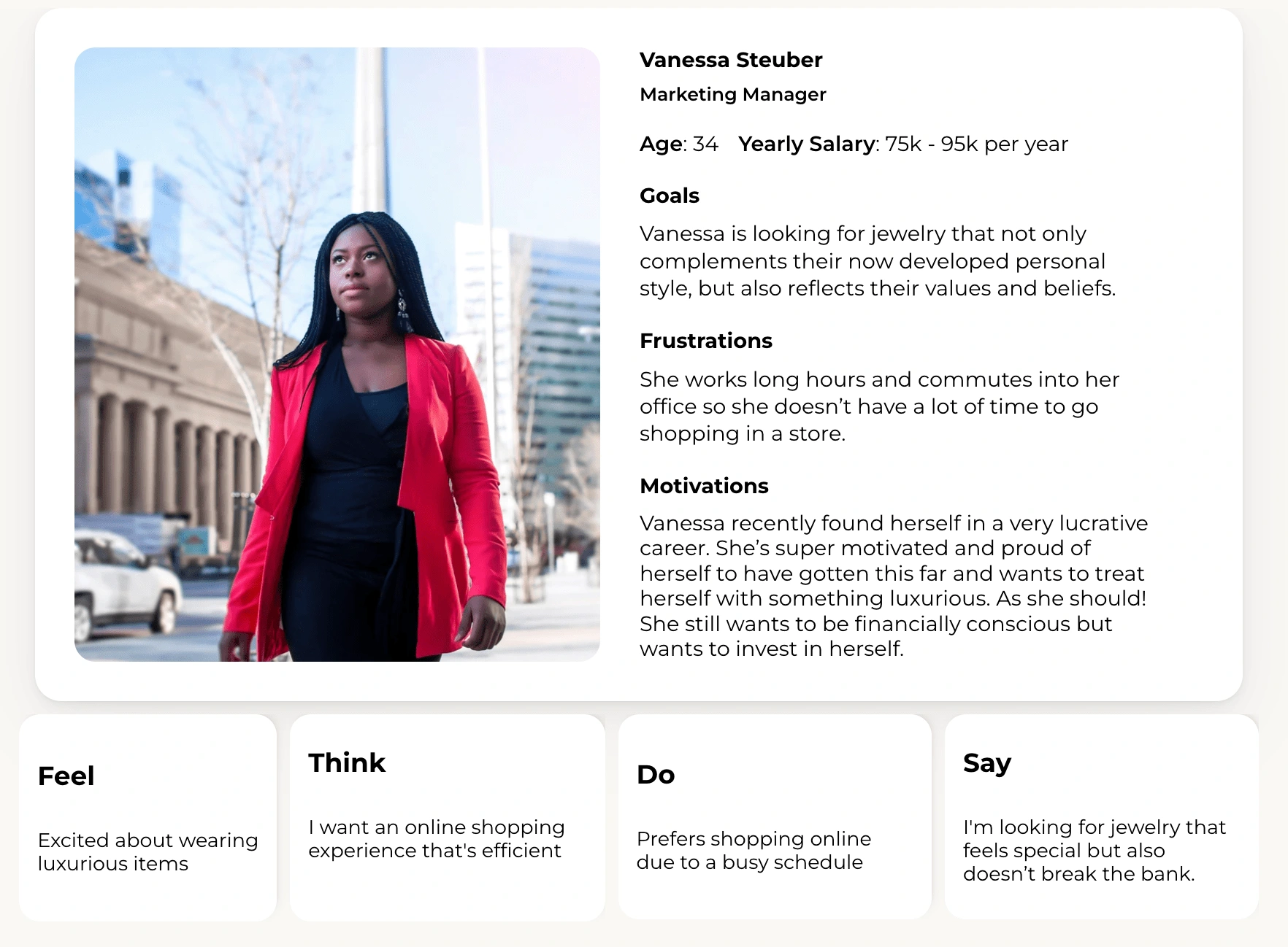
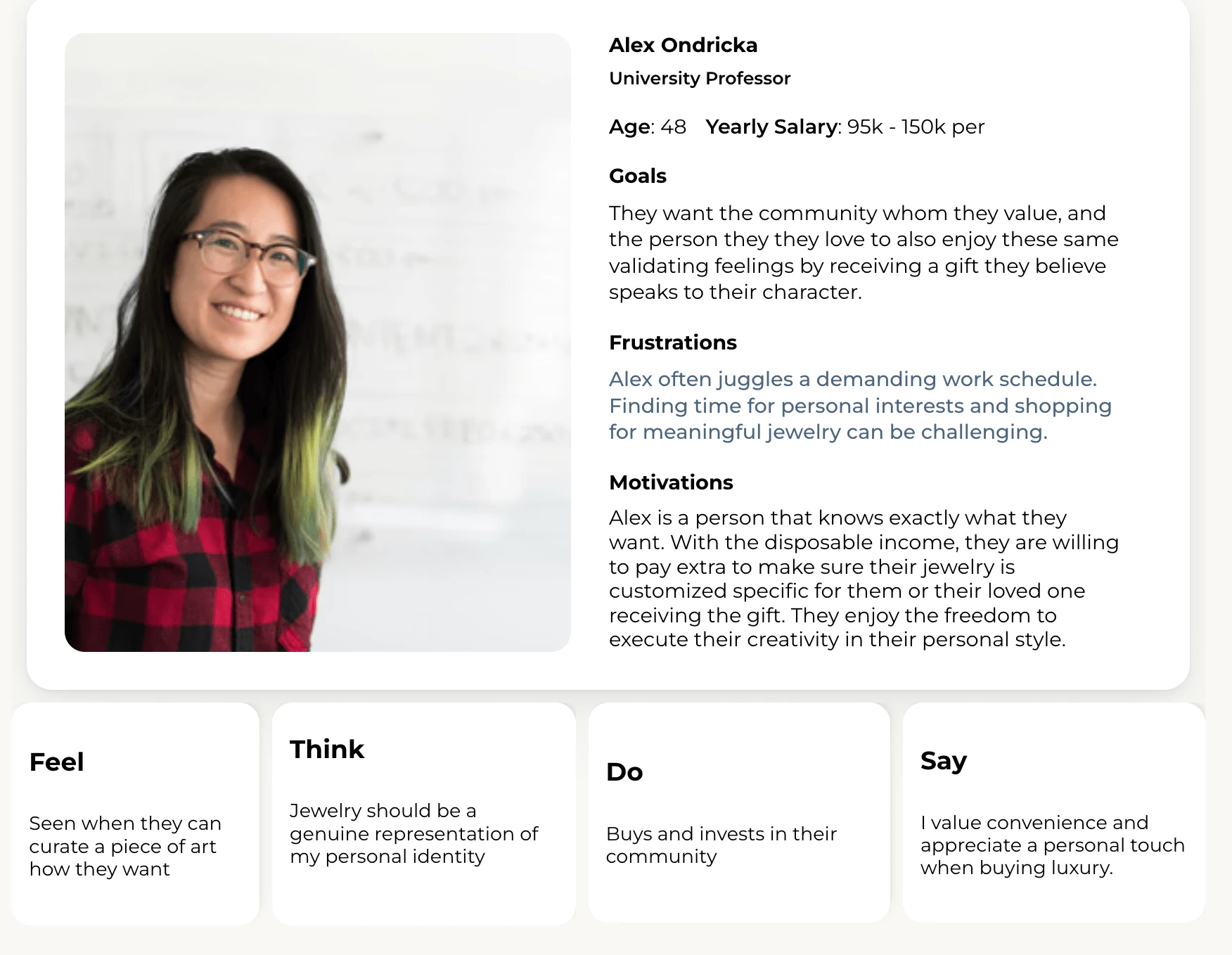
User Persona
Once the exsisting and potential users navigated through the prototype, they then answered a survey of their experience. The questions ranged from asking about their initial thoughts and feelings of the brand, their understanding of their brand value, as well as their experience navigating and completing certain tasks.
In order to organize all of the insights, I used Dovetail, an AI software meant for user research to help me find the re-ocurring issues and pain points. After looking through the answers of the 14 participants, I curated the following user personas.
What did I learn from the Usability Testing?
Insight 1
Most respondents found the website user-friendly and had an easy time finding specific products with the new search feature. However, some users suggested improvements such as a more streamlined navigation, quicker image loading, and more consistent categorization.
Insight 2
Automic Gold is perceived as a quality jewelry brand that values inclusivity and sustainability. Respondents associated the brand with qualities such as being queer-owned, offering unique products, and being a small business. The brand's commitment to ethical sourcing and inclusivity was also highlighted.
Insight 3
The company's product offering is well-received, with users appreciating the range of jewelry available. The option for custom jewelry was also noted, However, some users suggested expanding the product range to include more types of jewelry, such as anklets or ear cuffs.
Synthesize
User Mapping
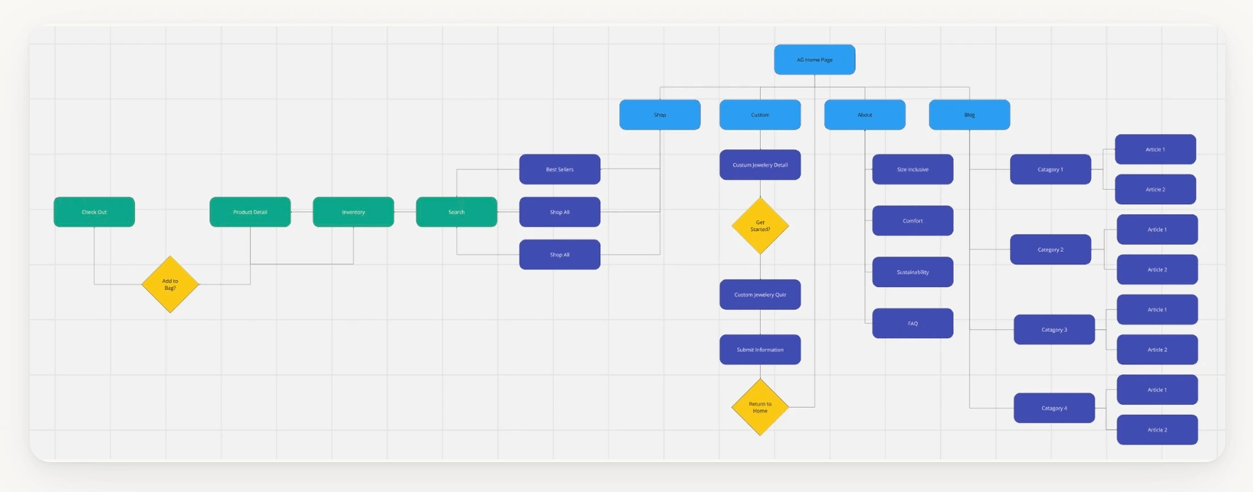
Using data from the prototype and user survey, I created a User Journey Map to provide the AG team with accessible insights and guide them in determining the most user-friendly solution.
Delivery
Completed UX Audit and Execution
Based on the insights gathered from interviews, prototyping, and heuristic analysis, the following list outlines the pain points provided to the design team at AG. After addressing these friction points and implementing redesigns based on my prototype, the team observed an increase in both conversion rates and user retention on the website.
Shop
Problem
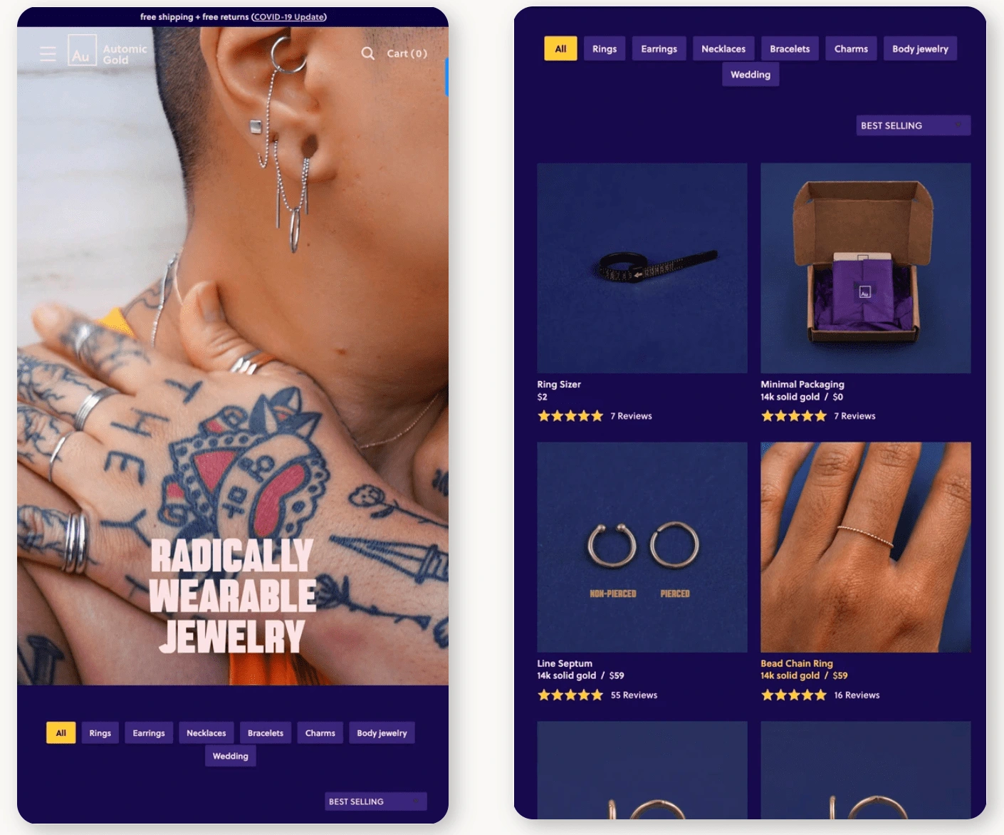
Users struggled to locate specific items because of AG's vast inventory. Every catagorey brought them to a use list, making it impossible to specifiy what they may be looking for.
Solution
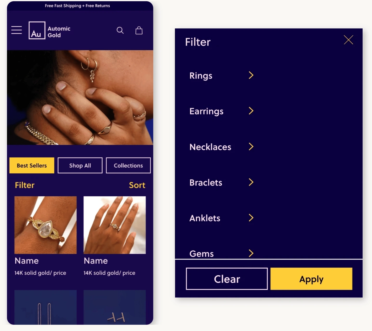
During testing, users were more inclined to tap the hamburger menu to start their search instead of selecting "Shop Now." This insight indicated that incorporating the filter menu both within the hamburger menu and on the shop page provided users with greater flexibility in locating their desired items.
About Us
Problem
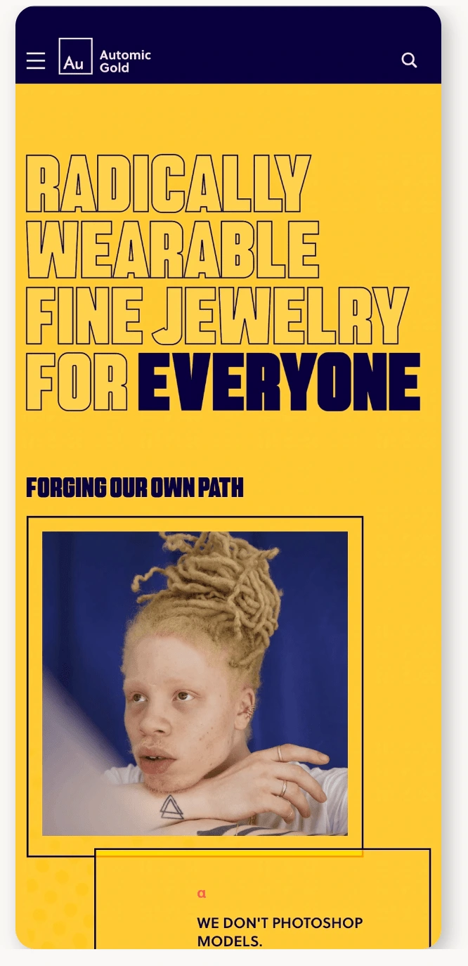
Titles and headers were not left-aligned, leading to poor legibility and excessive shifting indentations that strain users' eyes.
Users couldn't easily see the faces behind the brand, which prevents them from forming a personal connection and learning more about the individuals and products.
The current CTA color scheme fails to guide user actions effectively, and there is no visual separation from other content, which may reduce user engagement.
Solution
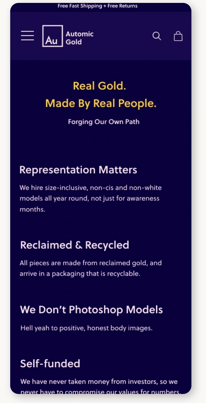
Helping to ensure alignment while educating AG on the importance of branding, proper CTA color use, accessibility, and how connecting with the audience fosters trust and encourages repeat users and buyers. This not only builds trust and credibility, but also encourages users and buyers to engage with the brand on an ongoing basis. Through thoughtful content creation and community engagement, AG can foster a deeper connection with their audience, inspiring loyalty and repeat business. Ultimately, a well-executed branding and audience engagement approach will be crucial in driving long-term success for AG.
Custom
Problem
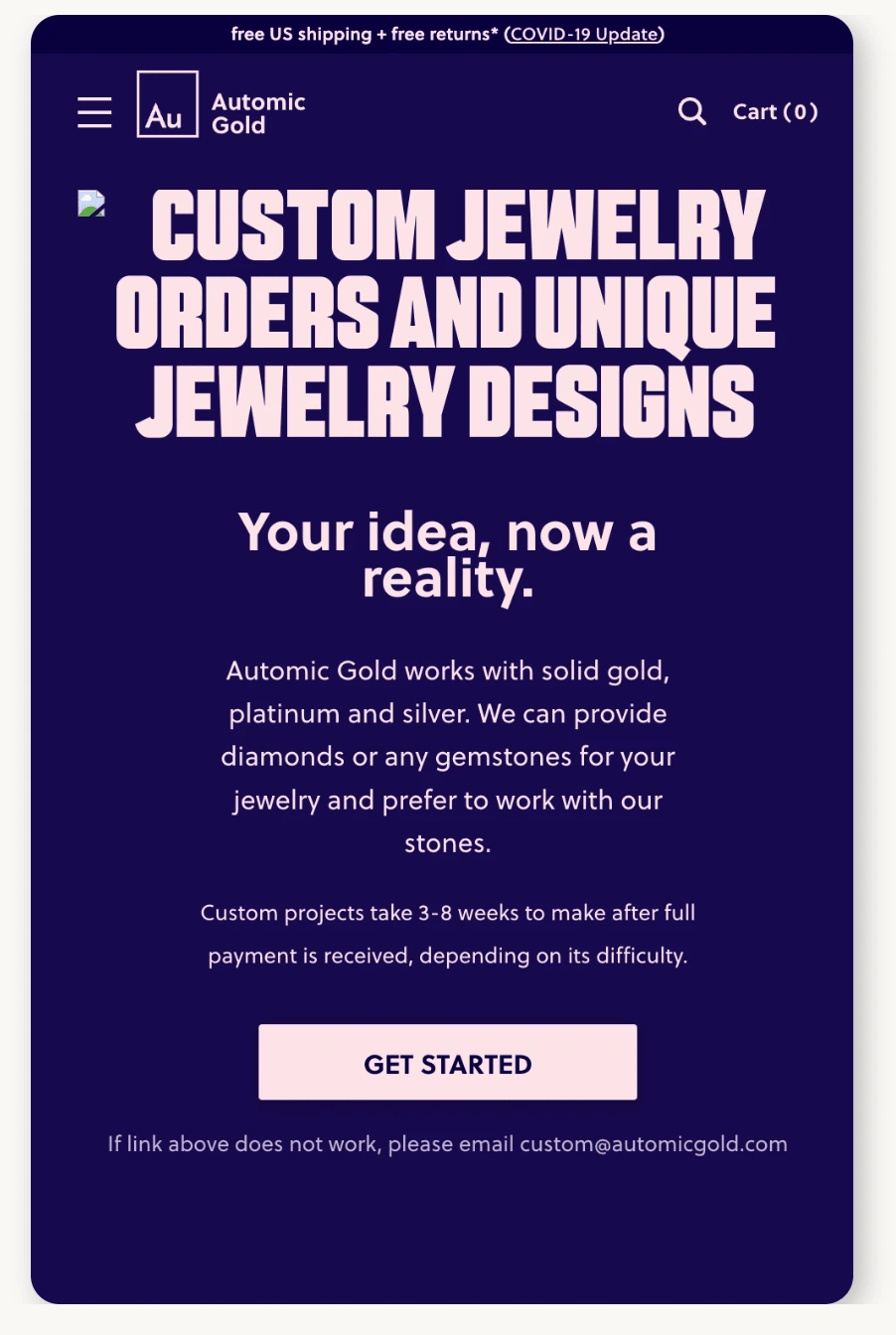
This page is not effectively linked to the main landing page, preventing users from accessing important information about custom orders and the jewelry-making process. Additionally, crucial details are placed at the bottom of the page, where users rarely scroll, rendering this information largely hidden and inaccessible.
Solution
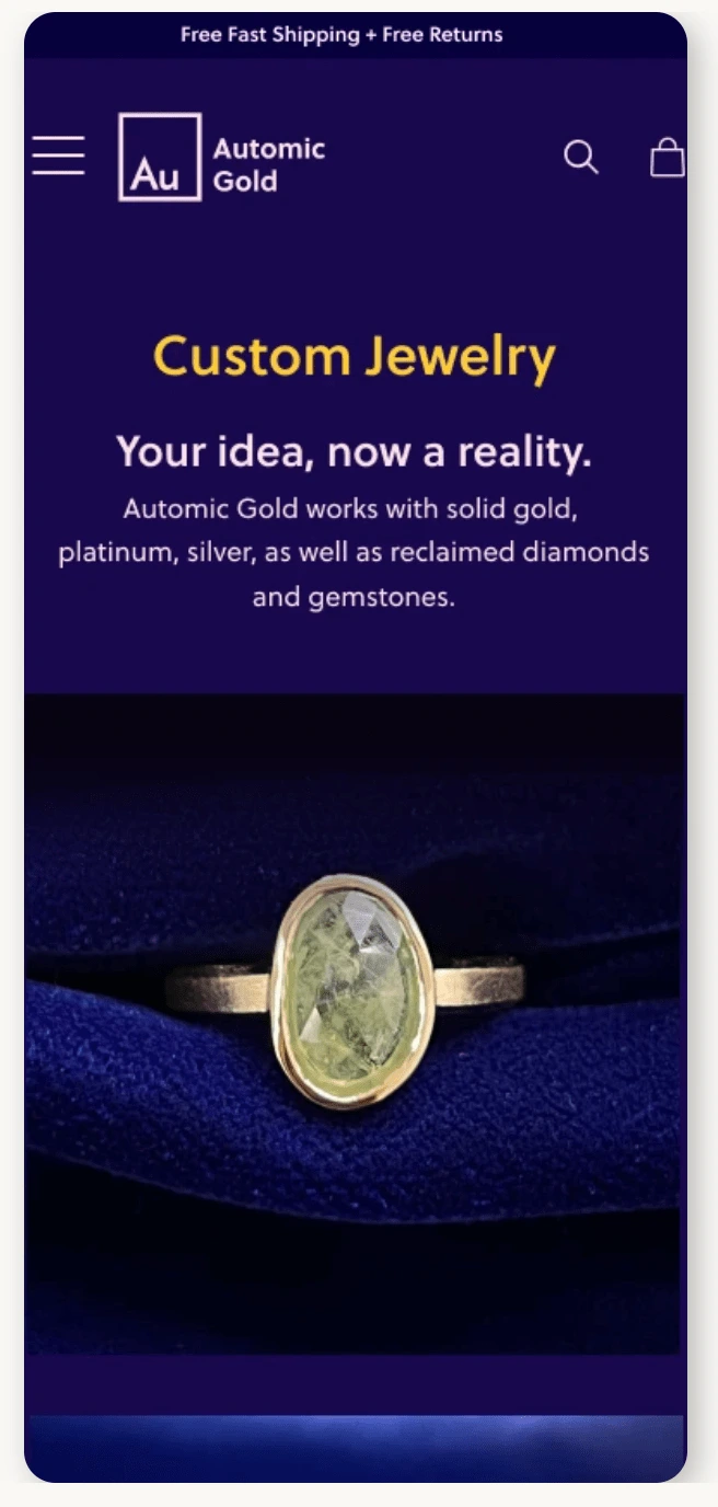
To encourage users to take action and design their custom piece, place clear and compelling calls-to-action (CTAs) that prompt them to "customize now" or "create your own." Use persuasive language to motivate users to engage with the custom product process. Strategically positioning CTAs at both the top and bottom of the page gives users multiple opportunities to interact with the custom product offering.Additionally, this is an excellent chance to link to your blog page, which can educate users and better explain the custom order process, including what happens behind the scenes as their custom jewelry is being made. However, it's important to note that users often don't scroll to the very bottom of the page, so this information may be hidden from sight.To showcase your collection of custom products and provide a dynamic, engaging browsing experience, utilize interactive galleries or carousels. Allow users to effortlessly swipe through images, which frees up valuable real estate on the page.
Impact
In conclusion, implementing these recommendations will significantly impact Automic Gold in a positive direction. The proposed visual refinements, improved accessibility, enhanced transparency, streamlined navigation, and strategic content utilization will collectively enrich the user experience, strengthen user engagement, and likely result in increased conversions and a deeper sense of community involvement.
I presented these findings to my client in a comprehensive document showcasing not only the user insights but a heuristic analysis of each page of their mobile website evaluating the interface based on established usability principles and standards.
40% 25%
Improved conversion rate Increase in user retention
“Through her research, she provided us with amazing findings as well as tips that will help us build a better website. I highly recommend working with her!”
Alexus Parker
Creative Director | Automic Gold
Like this project
Posted Sep 26, 2024
Automic Gold, a prominent e-commerce platform specializing in jewelry, sought to address challenges related to low conversion rates on their website.


