Nest Journals: Presentation Deck Design

Marvis Ighedosa


Like this project
Posted May 20, 2025
Designed a compelling slide deck for Nest Journals, enhancing partnerships and investor interest.
Likes
3
Views
33
Timeline
Jan 13, 2025 - Jan 21, 2025


Project Overview
Client Name: Nest Journals
Industry: Health and Wellness
Role: Creative director and Presentation Design
Duration: 1 week.
My Approach
I followed a simple, focused process to understand the product, shape the story, and design a deck that connects emotionally and communicates clearly.
1. Understand the Product
Started with a short discovery session to learn the product’s goals, audience, and features.
• Who is it for?
• What does it solve?
• Why now?
2. Structure the Story
I outlined a clear slide flow to keep things simple and engaging.
• Start with the problem
• Show how the product helps
• Highlight features, feedback, and value
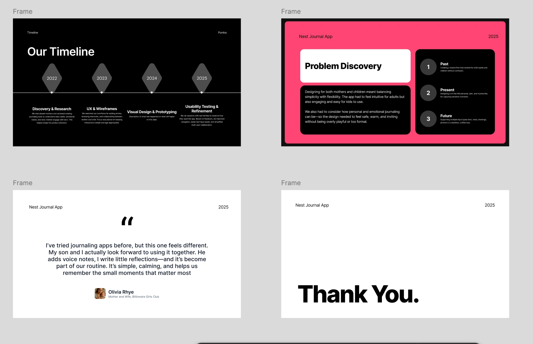
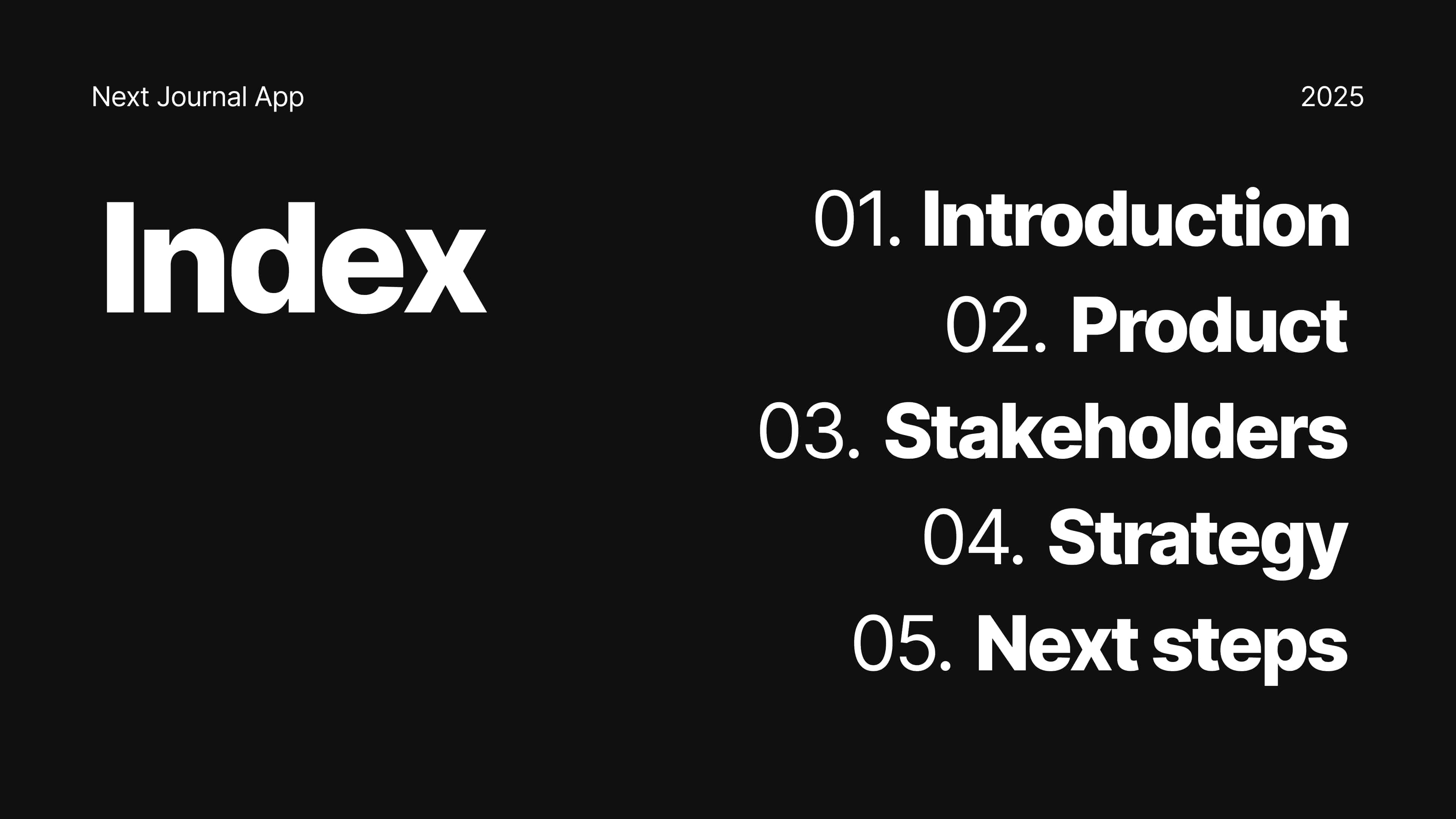
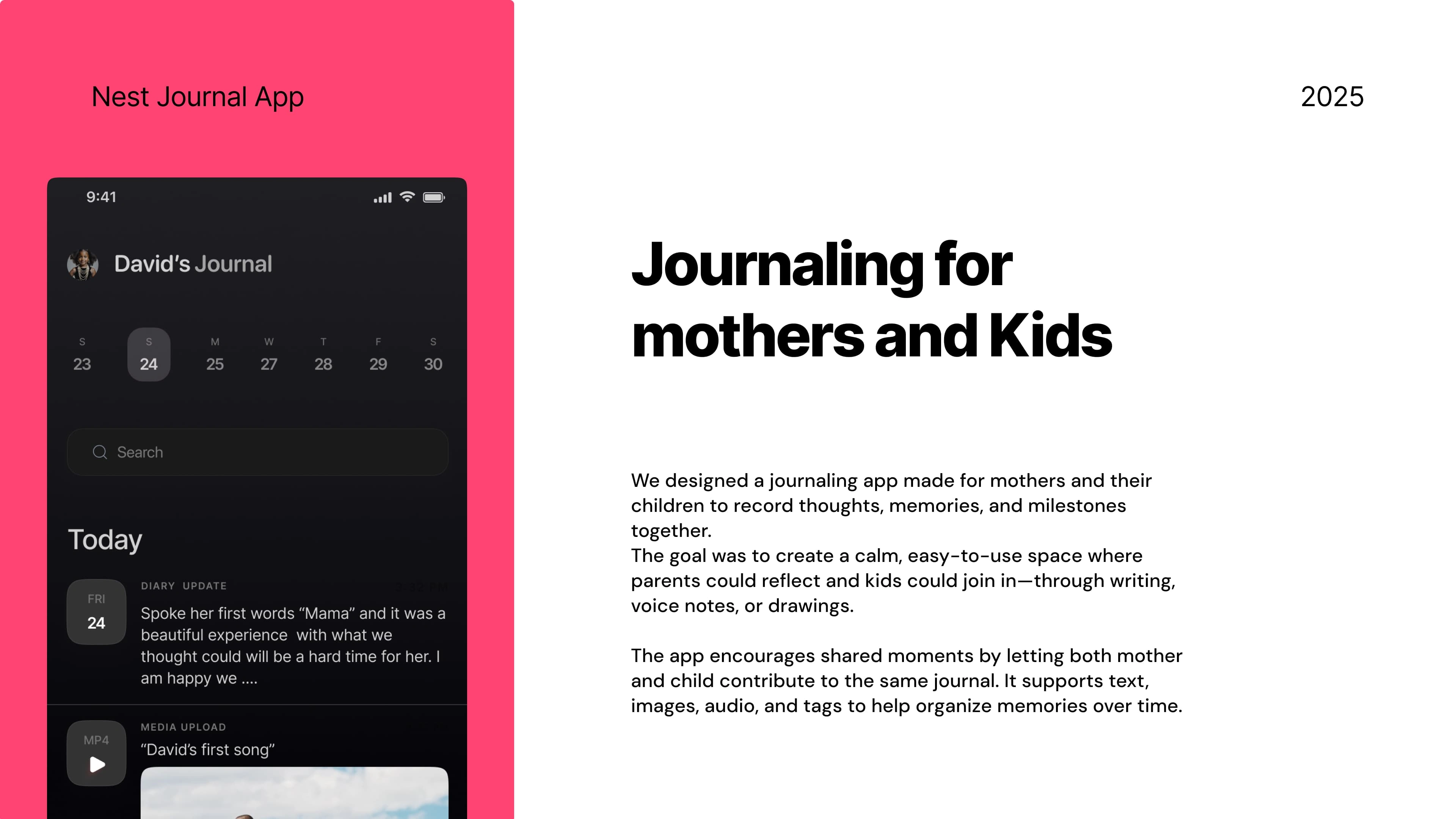
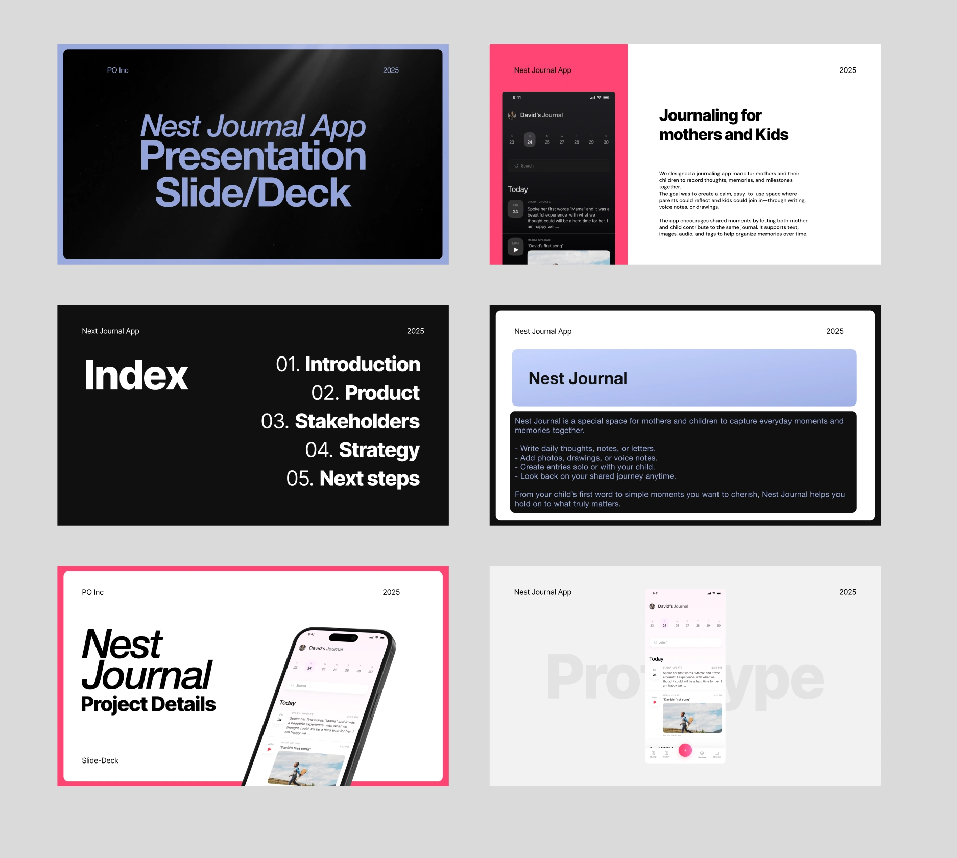
Pages from the Nest Journal Slide Deck
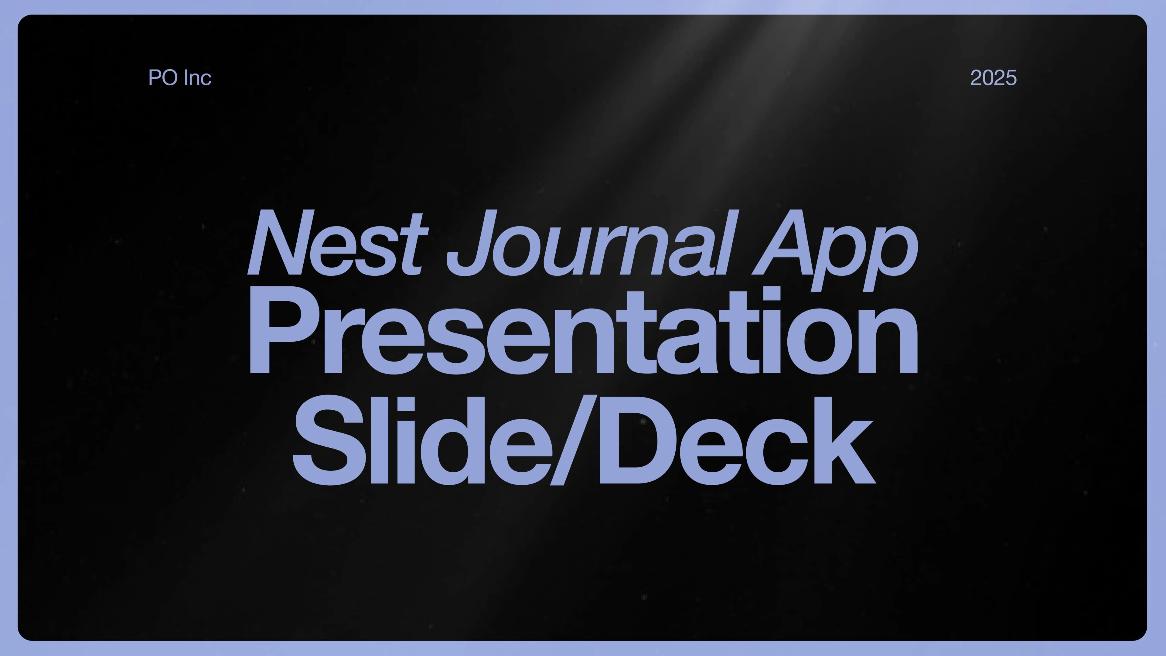
Cover Page of the Nest Journal App Slide Deck
3. Diving Deep into the Visuals
I designed a clean, soft visual style to reflect the emotional tone of the app.
• Calm colors, clear text, friendly layout
• Consistent use of icons, imagery, and spacing
• Designed for both mobile and desktop viewing
4. Refine and Deliver
We reviewed the full deck for clarity and flow, then shared the final export.
• Final files in Figma and PDF
• Editable, shareable, and pitch-ready
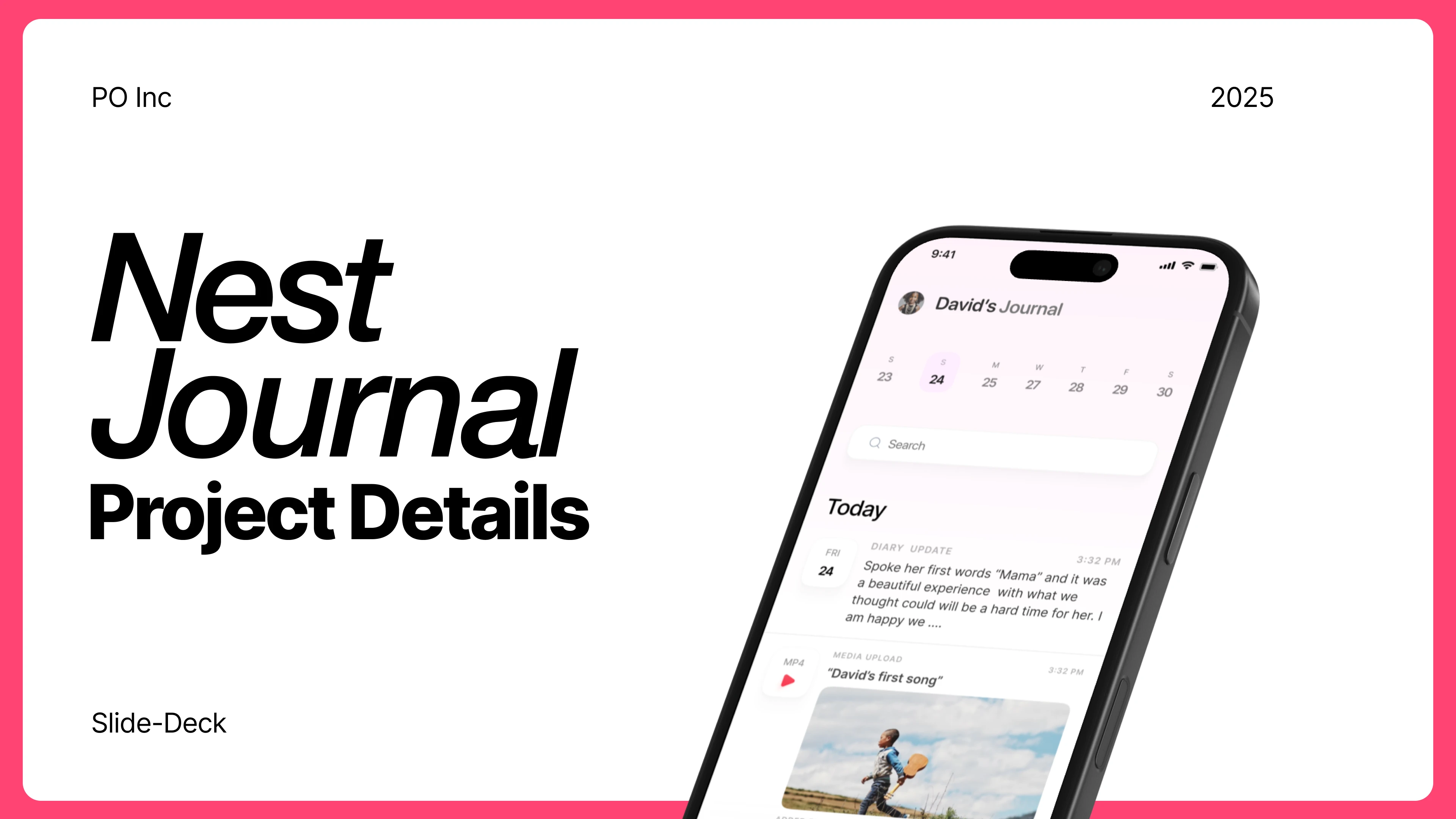
One Page from the slide deck
Results
The new slide deck didn’t just tell the story—it opened doors.
Secured 5+ Strategic Partners
After presenting with the new deck, the team landed 3 key partnerships with parenting communities and early education groups.
Boosted Early Signups
The deck helped drive over 1,200 pre-launch downloads in just 3 weeks by making the product easy to understand and share.
Sparked Investor Interest
The clarity and emotional tone of the deck helped the team land 2 investor meetings one of which moved into early-stage talks.
Confidence in Every Pitch
The founders reported feeling more confident and clear during every presentation, knowing their visuals matched their mission.