Efficien - Field Service Management Software

Rizki Arsyad

The Problem
Field service companies manage chaos for a living. Technicians are scattered across job sites, schedules change by the hour, and managers need to know who's where, what's overdue, and where the bottlenecks are. Most existing tools either drown users in data or oversimplify to the point of being useless.
Efficien needed a dashboard that makes complex operational data feel manageable. The interface had to serve two very different users: managers who need a bird's-eye view of operations, and dispatchers who need to make minute-by-minute scheduling decisions.
My Role
Designed the complete SaaS dashboard UI/UX in Figma
Created wireframes and information architecture
Built the component library for data-heavy interfaces
Produced high-fidelity screens and device mockups
Delivered production-ready files for developer handoff
The Design Challenge
Data-heavy dashboards have a specific failure mode: they show everything and communicate nothing. The user opens the dashboard, sees 47 numbers and 12 charts, and has no idea what to do next.
I approached this with a principle: every element on the screen should answer a question the user is actually asking. If it doesn't answer a question, it's decoration.
The three questions field service managers ask most:
"What needs my attention right now?" (overdue jobs, unassigned technicians, escalations)
"How is today going overall?" (completion rate, active jobs, team utilization)
"Are we on track this week/month?" (trends, revenue, SLA compliance)
The dashboard is organized around these three questions, in that priority order.
Wireframes & Information Architecture
I started with wireframes to nail the layout logic before adding visual polish. Two key decisions came out of this phase:
Decision 1: Priority-based card ordering. The top row shows "needs attention" items (overdue jobs, unassigned work). The middle section shows today's operational metrics. The bottom section shows trend data. This mirrors how managers actually scan information: urgent first, then status, then trends.
Decision 2: Contextual drill-down instead of separate pages. Clicking a metric card expands it inline with detailed data, rather than navigating to a new page. This keeps managers in flow. They can check a detail and return to the overview without losing their place.

The Three Core Views
Overview Dashboard: Card-based layout showing active jobs, technician availability, completion rates, and revenue. Color-coded status indicators (green/amber/red) let managers scan the state of operations in seconds. Each card is interactive and links to filtered detail views.
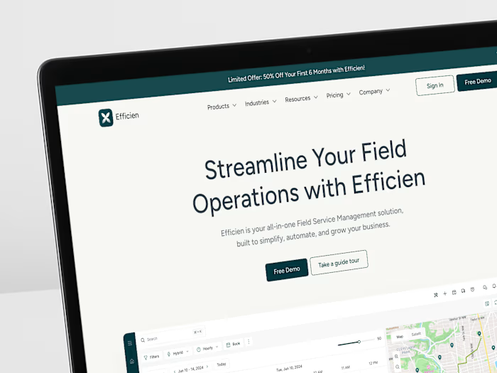
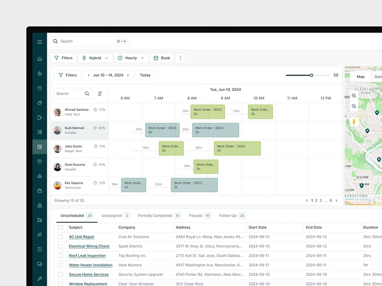
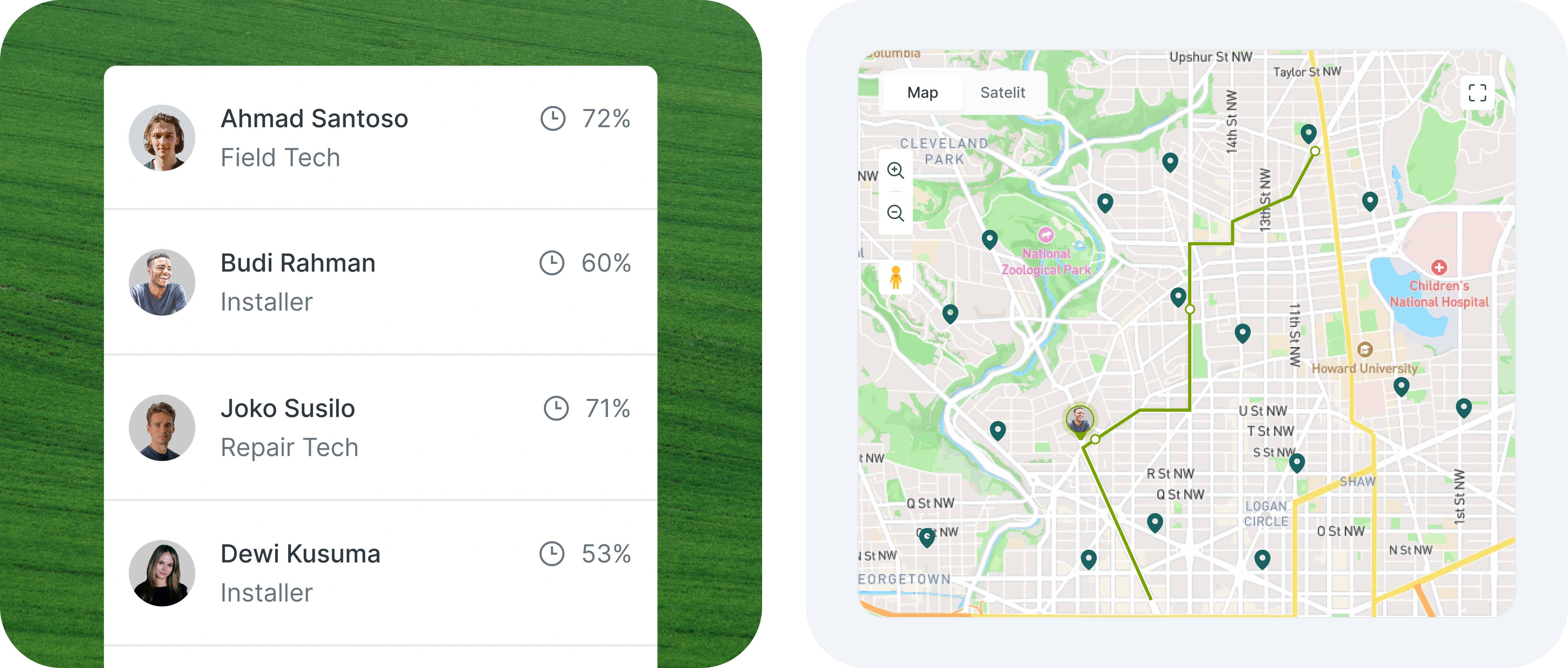
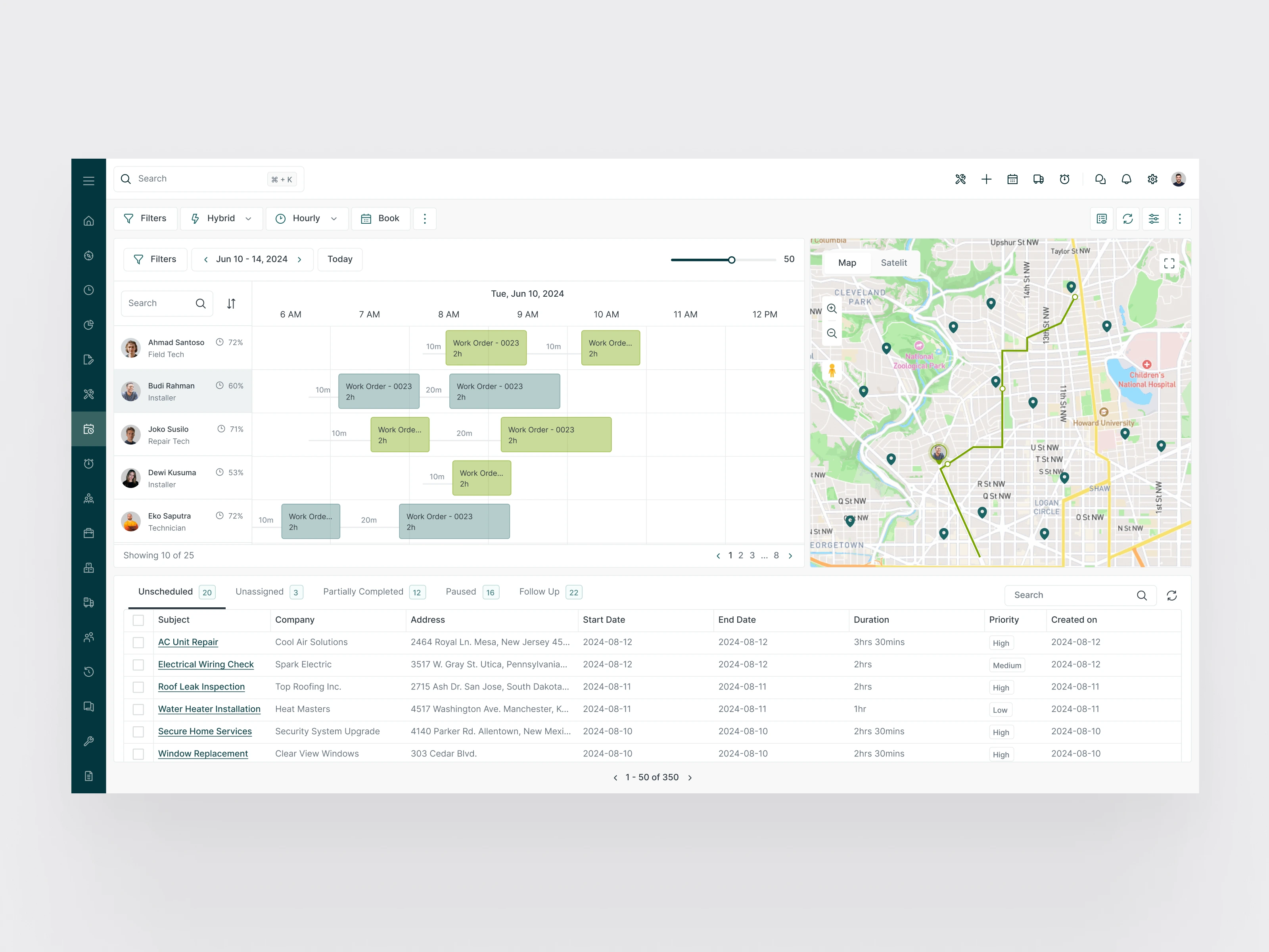
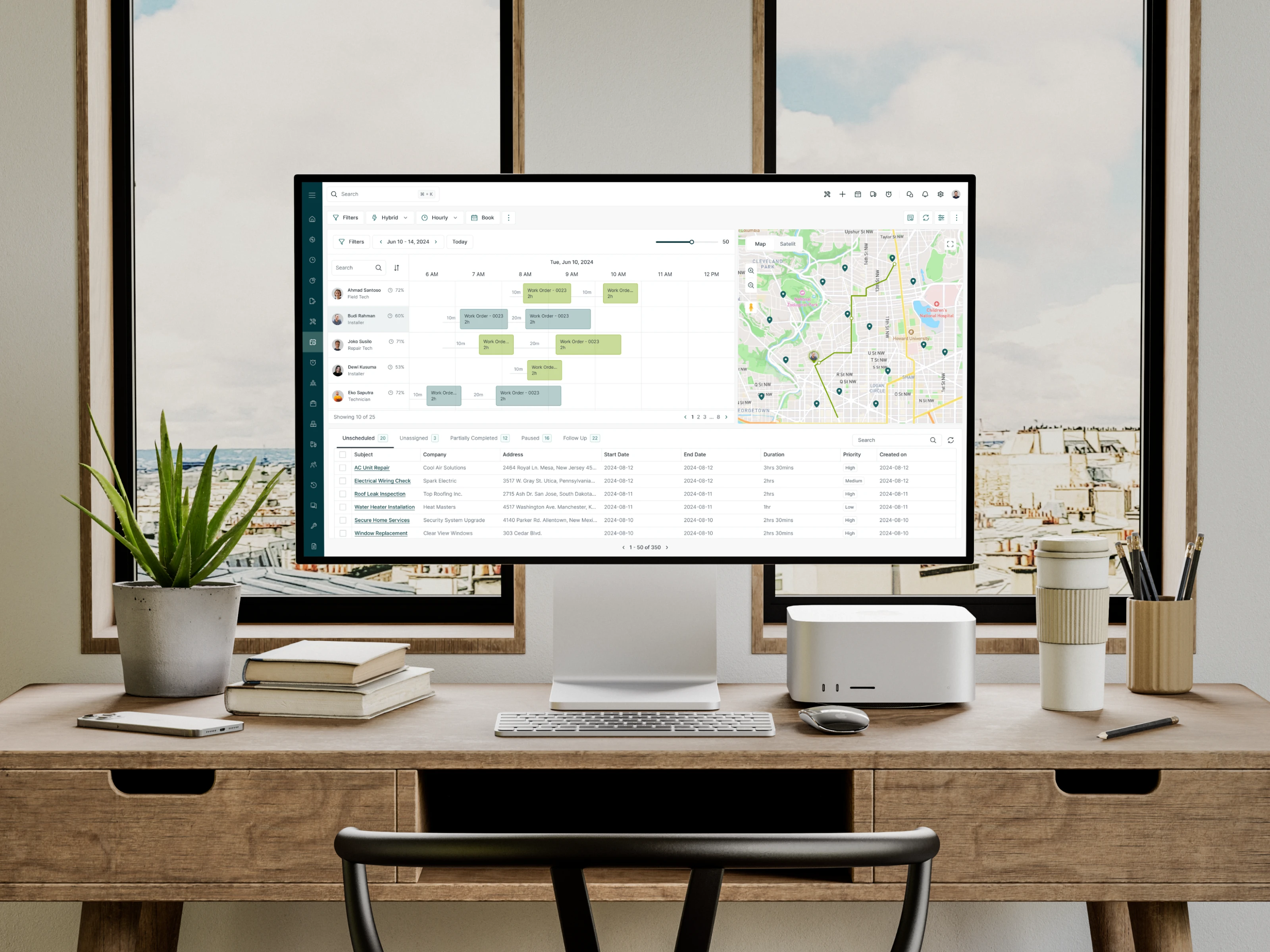
Scheduling & Dispatch: A split-screen interface with a calendar on the left and a map on the right. Dispatchers can see technician locations, drag-and-drop to reassign jobs, and filter by priority, skill type, or availability. Each job card shows the essential info (priority, location, assigned tech, estimated duration) without requiring a click to expand.
Reporting: Clean data visualizations for tracking team performance over time. Line charts for trends, bar charts for comparisons, and data tables for detailed breakdowns. Every chart has a clear title and axis labels; no ambiguous visualizations.
Component Library
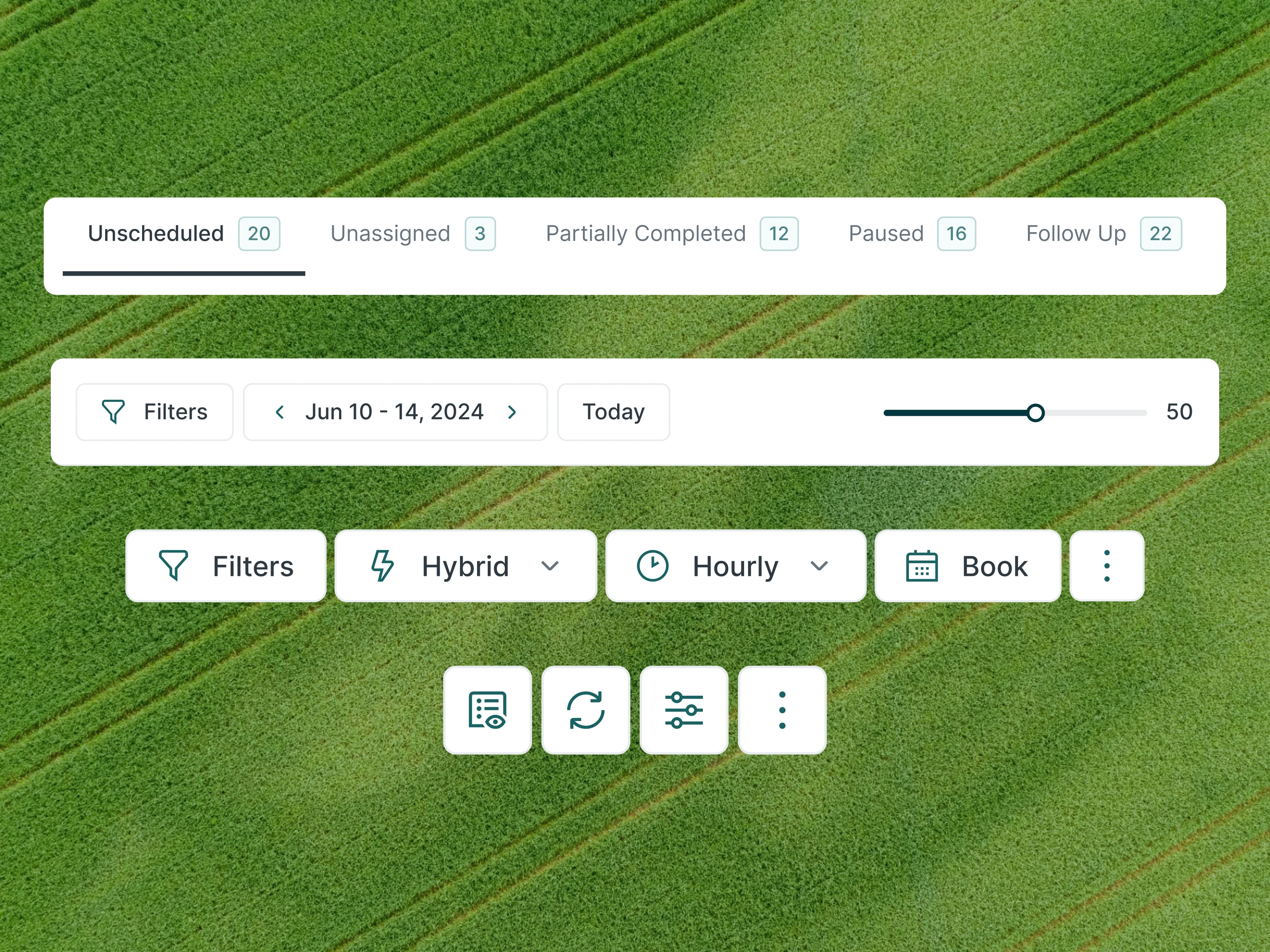
The dashboard components are designed specifically for data-dense interfaces:
Stat cards with sparkline trends (so you see direction, not just a number)
Data tables with inline sorting, filtering, and row-level actions
Calendar components with drag-and-drop support
Map overlays showing technician pins with status colors
Form inputs optimized for quick data entry (dispatchers work fast)
Status badges using the same color system across all views
All components use auto layout in Figma for responsive behavior across screen sizes.
Mockups
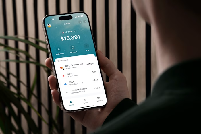
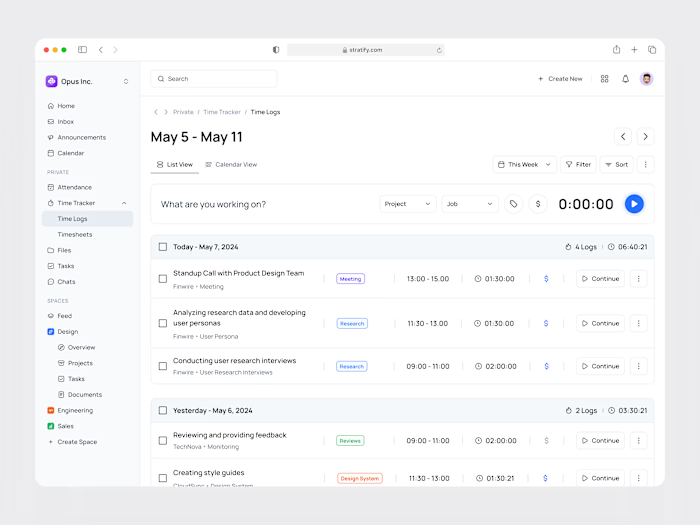
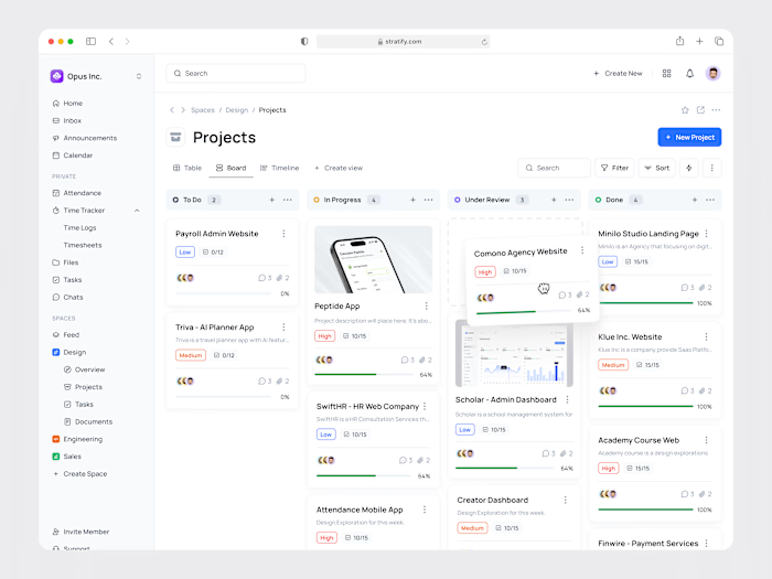
Device mockups show the dashboard in real-world context, demonstrating how the dense information design holds up on actual screens.

What I Delivered
Complete SaaS dashboard design (overview, scheduling, reporting) in Figma
Wireframes and information architecture documentation
Component library for data-heavy interfaces (30+ components)
High-fidelity screens for all core views
Device mockups for marketing and pitch use
Structured Figma files with auto layout and developer annotations
The design turns complex field operations into a clear, scannable interface where every element earns its place on the screen.
Like this project
Posted Apr 28, 2025
Designed the SaaS dashboard for Efficien, a field service management platform. Turned dense operational data (scheduling, dispatch, tracking, reporting) into a scannable interface that supports both high-level oversight and granular task management.
Likes
1
Views
10