Stratify - Project Management Dashboard

Rizki Arsyad

The Problem
The dashboard is the most important screen in any project management tool. It's the first thing users see when they log in, and it shapes their entire perception of the product. Get it right, and the tool feels like a productivity multiplier. Get it wrong, and it feels like another thing to manage.
Stratify needed a dashboard that works for two very different mindsets:
Individual contributors who think in tasks: "What do I need to do today? What's overdue? What's blocked?"
Managers who think in projects: "Is the team on track? Who's overloaded? Where are the risks?"
Serving both without making the interface feel like a compromise was the central design challenge.
My Role
Designed the complete dashboard UI/UX in Figma
Created the information architecture and view system (board, list, calendar)
Built the component library for task and project management interfaces
Produced high-fidelity screens and interactive prototype
Delivered production-ready files for developer handoff
The Design Principle
I worked with one guiding principle: progressive disclosure based on intent.
The dashboard defaults to a personal view (your tasks, your deadlines, your projects). One click switches to a team view (everyone's tasks, project health, workload distribution). This means individual contributors never see management complexity they don't need, and managers can access team data without navigating away from the dashboard.
This sounds simple, but it required careful information architecture. Every widget, card, and data point needed to exist in both a personal and team context without duplicating the interface.
Task Management: Three Views, One System
Users think about tasks differently depending on context. Some people are visual (Kanban boards). Some are linear (lists). Some are time-oriented (calendars). Forcing everyone into one view is a common mistake in project management tools.
Stratify supports three views, all powered by the same underlying data:
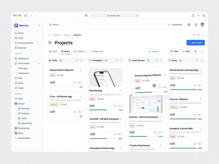
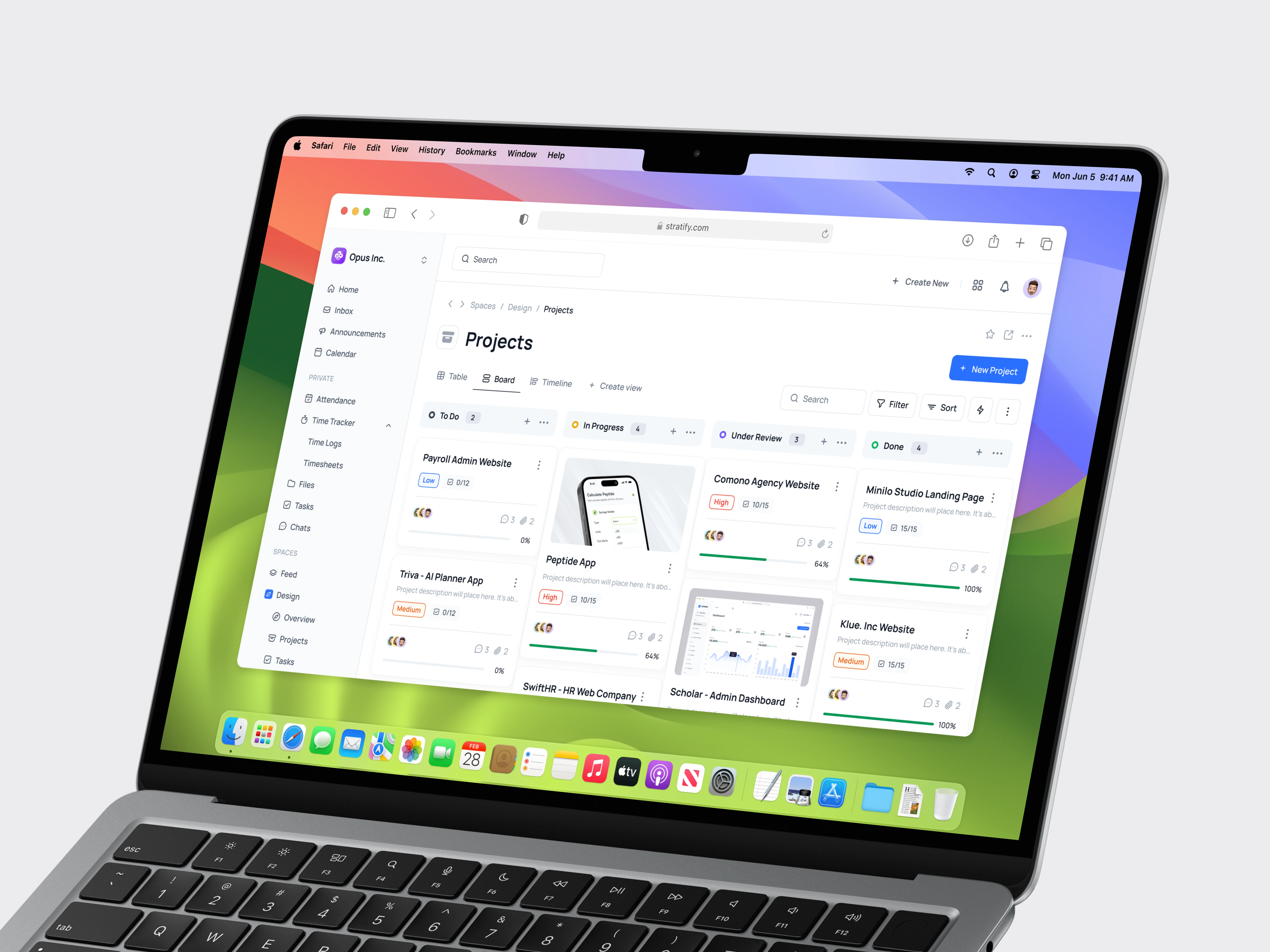
Board view (Kanban): Columns represent task status (To Do, In Progress, Review, Done). Cards show task title, assignee, priority, and due date. Drag-and-drop moves tasks between columns. This view works best for teams running sprints or managing workflows with clear stages.
List view: A compact, sortable table showing all tasks with inline editing. Users can sort by due date, priority, assignee, or project. This view works best for individual contributors who want to see everything at once and triage quickly.
Calendar view: Tasks plotted on a weekly or monthly calendar by due date. This view works best for managers tracking deadlines and identifying scheduling conflicts.
All three views share the same filter system, so switching between them preserves the user's current context (filtered project, date range, assignee).
Visual Design Decisions
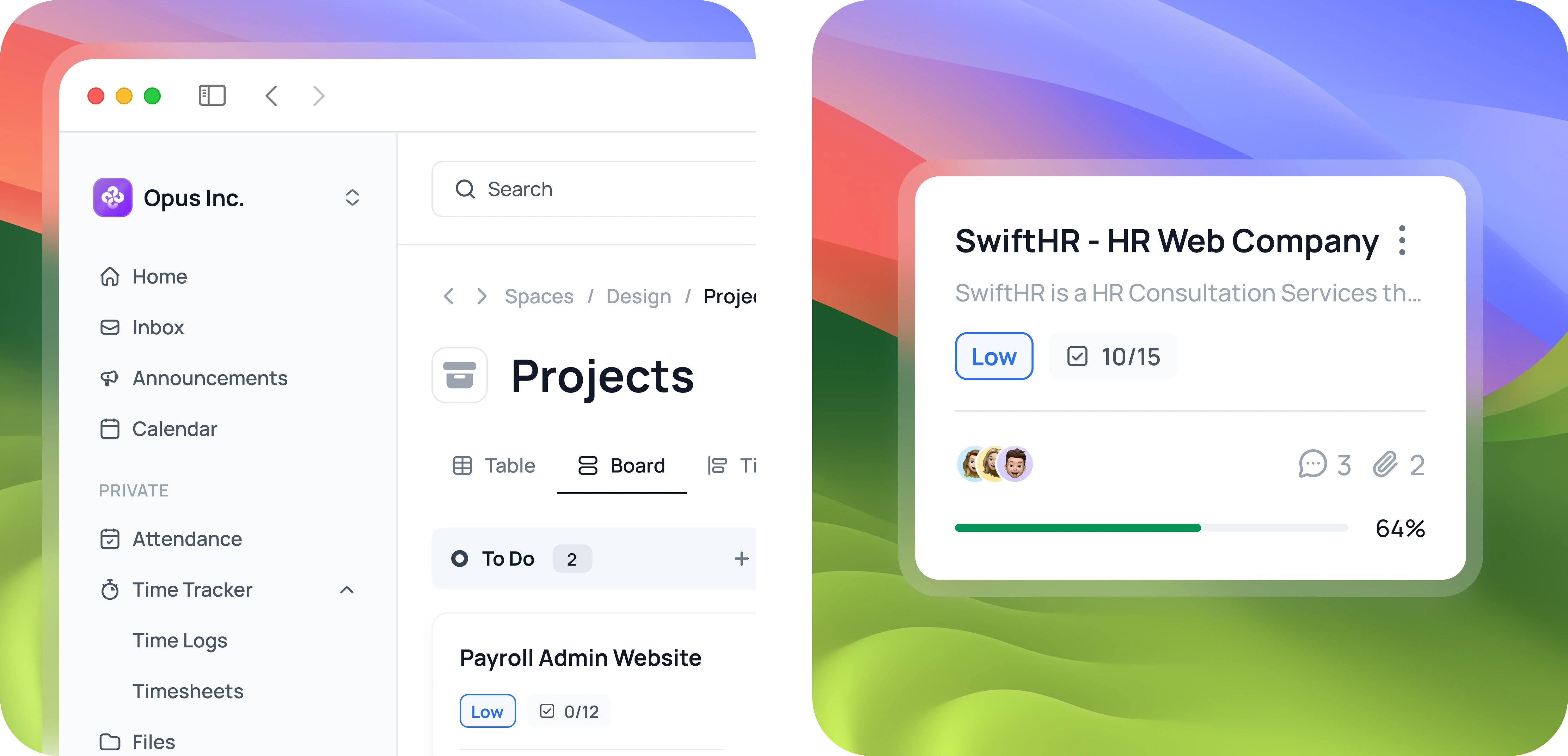
Purple-accented color system: Stratify's brand uses purple as the primary accent, which differentiates it from the blue-dominated project management market (Asana, Monday, Jira). Purple is used for primary actions, active states, and navigation highlights. The rest of the interface uses neutral grays to keep the focus on content.
Subtle depth for hierarchy: Cards float slightly above the background using soft shadows. This creates a clear visual distinction between interactive elements (cards, buttons) and static elements (backgrounds, dividers) without making the interface feel heavy.
Inline editing everywhere: Double-clicking a task title, due date, or assignee opens an inline editor. Users can update task details without opening a modal or navigating to a detail page. This reduces friction for the most common action (updating task status and details).
Dense but readable: The dashboard shows a lot of information, but every element has enough padding and clear typography to remain readable. I used a consistent 8px spacing grid and limited the color palette to prevent visual noise.
Component System
The component library is built for project management interfaces:
Task cards with 4 variants (compact, standard, expanded, mini) and states (default, hover, selected, dragging)
Project cards showing progress bars, team avatars, and status indicators
Data tables with inline editing, sorting, and bulk actions
Navigation (sidebar with collapsible sections, top bar with search and notifications)
Form elements optimized for quick data entry (date pickers, assignee selectors, priority dropdowns)
Modal dialogs for task detail views and project settings
Charts (progress bars, burndown charts, workload distribution)
All components use auto layout and variants in Figma for responsive behavior.
What I Delivered
Complete SaaS dashboard design (board, list, calendar views) in Figma
Information architecture supporting personal and team contexts
Component library for project management interfaces (40+ components)
High-fidelity screens for all core views and states
Interactive Figma prototype for user testing
Structured Figma files with auto layout and developer annotations
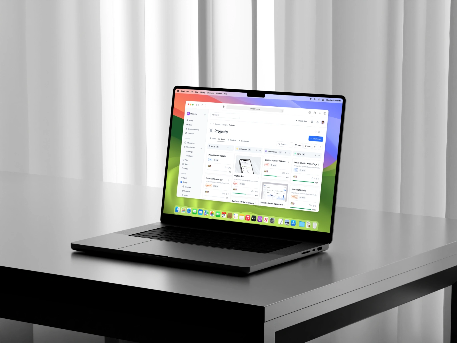
The design makes Stratify's dashboard feel organized and intuitive whether you're an individual contributor checking your to-do list or a manager reviewing team progress across multiple projects.
Like this project
Posted May 27, 2025
Designed the core SaaS dashboard for Stratify, a project management platform. Balanced information density with usability across board, list, and calendar views for both individual contributors and team managers.
Likes
1
Views
20