Efficien - Field Service Management Software Landing Page

Rizki Arsyad

The Problem
B2B SaaS landing pages have a specific job: explain a complex product simply, build trust quickly, and convert visitors into trial users or demo requests. The audience is usually a busy operations manager with 3 competing tabs open.
Efficien's challenge was compounded by feature breadth. The platform handles scheduling, dispatch, tracking, and reporting. Trying to explain all of that on one page risks overwhelming visitors. Explaining too little risks underselling the product.
My Role
Designed the full landing page (desktop and mobile) in Figma
Developed the page narrative and content hierarchy
Created responsive layouts and the component system
Produced device mockups and full-page previews
The Core Insight
I reviewed landing pages from 5 competing field service management tools. Most of them use abstract illustrations (cartoon technicians, generic dashboard mockups) and feature-dump layouts where every capability gets equal visual weight.
The problem with this approach: operations managers are skeptical buyers. They've been burned by software that looks nothing like the marketing page. They want to see the actual product.
The design strategy: use real product screenshots as the primary visual element. Every feature section shows the actual Efficien UI, not an illustration of what it might look like. This builds trust faster than any testimonial or badge.
Page Structure
The page follows a narrative arc designed for the B2B buying journey:
1. Hero: A bold headline ("Manage your field teams from one dashboard") paired with a full product screenshot showing the Efficien dashboard. Visitors see the product within 2 seconds of landing. The CTA ("Start free trial") sits above the fold.
2. Pain point validation: A short section acknowledging the problems the visitor is dealing with (missed appointments, scheduling conflicts, no visibility into field operations). This creates recognition: "Yes, that's exactly my problem."
3. Feature deep-dives: Three sections, each focused on one core capability:
Scheduling & dispatch: Product screenshot showing the calendar and map view, with copy explaining how drag-and-drop assignment works
Real-time tracking: Screenshot of the technician map with live status indicators
Reporting & analytics: Screenshot of the reporting dashboard with performance charts
Each section alternates image placement (left, right, left) to create visual rhythm and prevent the page from feeling monotonous.
4. Integration section: Shows how Efficien connects with existing tools (CRMs, accounting software, communication platforms). Important for B2B buyers who need to fit new software into an existing stack.
5. Social proof and CTA: Testimonial section followed by a clear, repeated CTA.
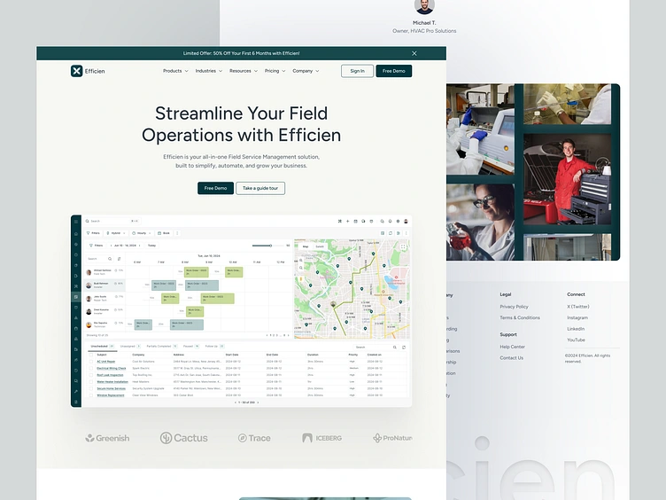
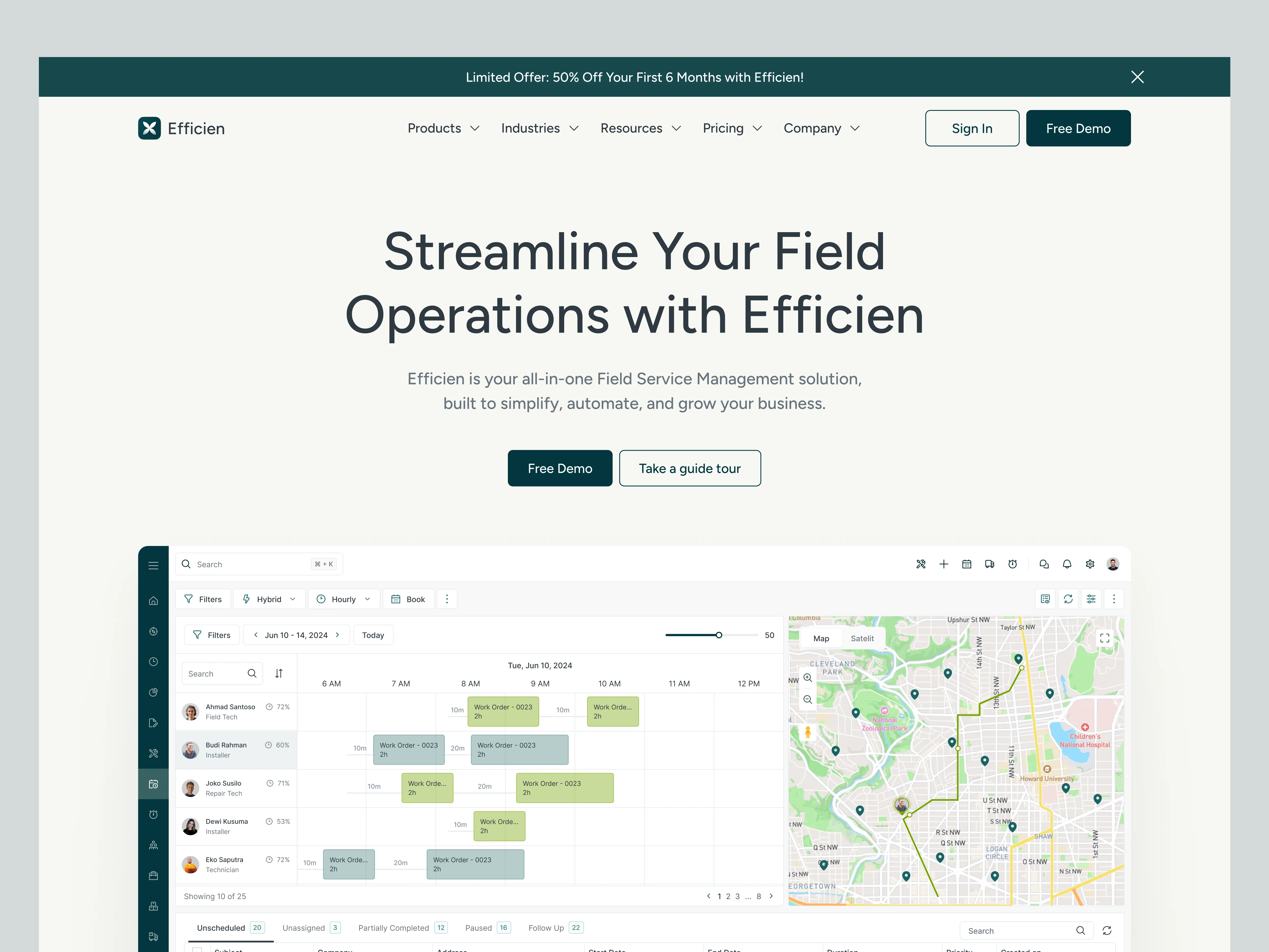
Visual Design Decisions
Green color palette: Matches the Efficien brand and signals productivity and growth. The green is used sparingly for CTAs and key highlights; the rest of the page uses neutral backgrounds to keep the product screenshots as the focal point.
Generous whitespace: B2B pages tend to be dense. I used wide margins and tall section padding to give each feature room to breathe. The page feels calm and professional, not desperate to cram in every feature.
Typography hierarchy: Large, bold section headlines create clear entry points for scanners. Supporting copy is concise (2-3 sentences max per section). Operations managers don't read landing pages; they scan them.
Mobile-first responsive design: On mobile, the alternating image layouts stack vertically. The hero adapts to a single-column format. Every section maintains its readability and visual impact on smaller screens.
Full Page Preview
The complete landing page design covers hero, pain points, features, integrations, testimonials, pricing preview, and footer. The full-length preview below shows the complete scroll experience.

What I Delivered
Full landing page design (desktop + mobile) in Figma
Page narrative and content hierarchy
Responsive layouts for all breakpoints
Component system for future page variations
Device mockups for marketing use
Structured Figma files with auto layout and developer annotations
The design positions Efficien as a credible, product-forward B2B tool by showing the actual product instead of hiding behind illustrations.
Like this project
Posted Apr 28, 2025
Designed the B2B SaaS landing page for Efficien, a field service management platform. Used product screenshots as the primary visual element to build trust with operations managers evaluating the tool.
Likes
1
Views
8