Nike app "SNKRS" community case study
Hello and welcome to a concept for the Nike app "SNKRS" to help build a more devoted audience and a place for people to share what they love!
Summary👟
My role: in the project was UX Researcher, UI Designer, and Prototyping
Methods: Competitive analysis, journey maps, personas, user flows
Project length: 2 Weeks
Tools: Figma, Figjam
Take-Away
Focus on the User: The community tab should be designed with the user in mind. It should provide a platform for users to connect and engage with one another around their shared passion for shoes.
Foster Engagement: Encourage users to engage with the community tab by creating opportunities for users to share their experiences, opinions, and content related to shoes.
Moderation: It's essential to have moderation in place to ensure that the community remains positive, welcoming, and respectful. In addition to insuring that bots are kept out of the community.
Personalization: Users should be able to personalize their experience within the community tab, such as customizing their profiles, joining groups, and following other users.
Purpose
Having a community within the Nike SNKRS app is beneficial for several reasons. Firstly, it allows users to connect with like-minded individuals who share the same interest in sneakers. This creates a sense of belonging and encourages users to engage with the app more frequently, as they can discuss and share their thoughts and opinions on different sneakers.
Secondly, a community within the Nike SNKRS app can help to create a sense of excitement and anticipation around upcoming releases. Users can discuss and speculate about upcoming drops, and this can create a buzz around the release, leading to higher engagement and interest from the community.
Thirdly, having a community can provide valuable feedback to Nike. Users can give feedback on the app, on specific releases, or on the overall user experience. This feedback can be used to improve the app and the release process, leading to better engagement and increased customer satisfaction.
Research📓
To achieve the goal of the project and design a useable community for the SNKRS app it was very important to try and find what exactly the user base was looking forward to. Making a good environment for the day one sneaker heads and newbies just getting their first pair of Nikes was crucial. So I took to Reddit, friends , co-workers, and anyone that I could find that I knew used the app and asked them what kinds of things they wanted directly and what were the biggest pain points. If you have used the app before it would be no surprise that the biggest pain point was how limited certain pairs of shoes were.
User Feedback
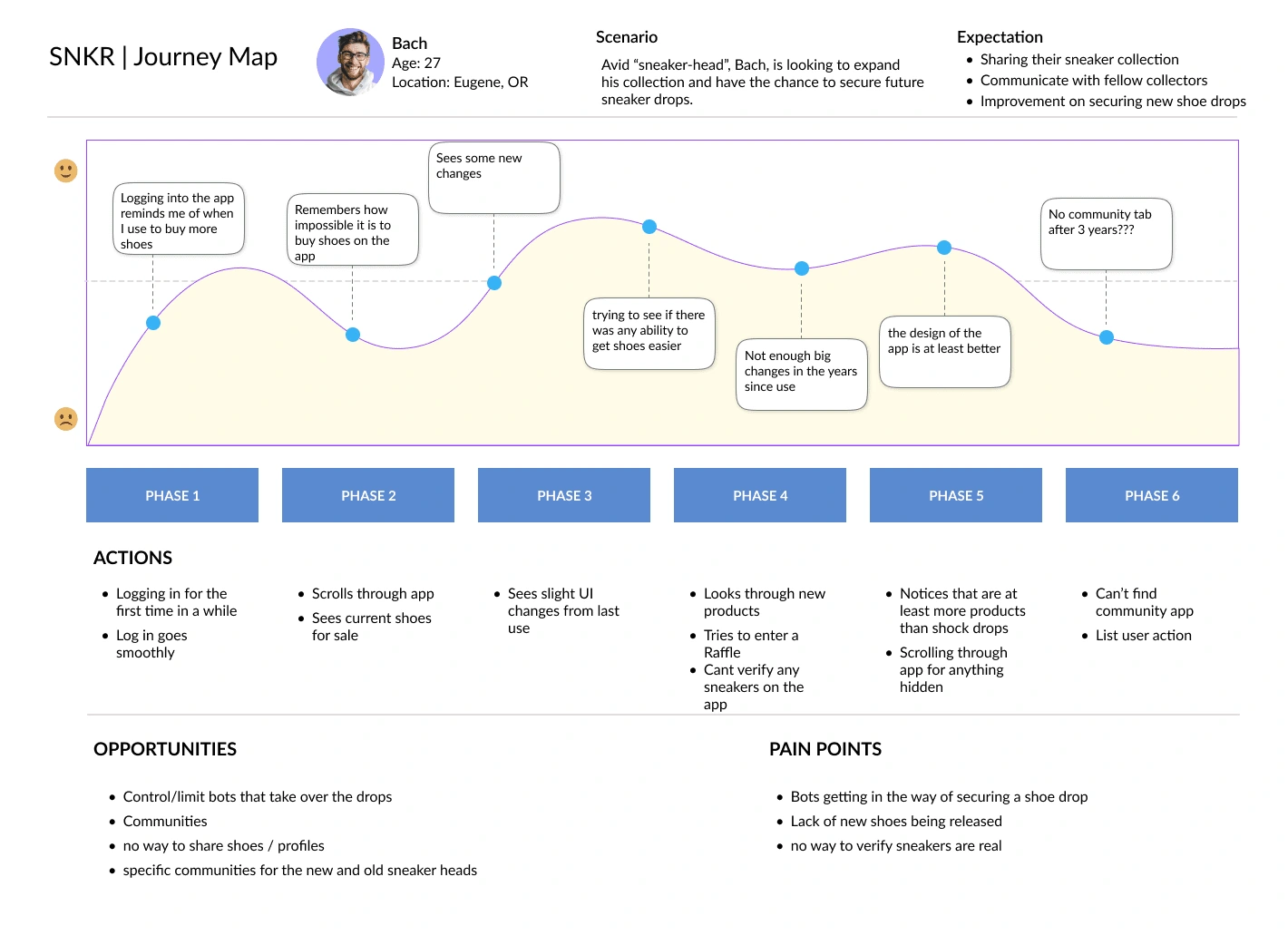
Using the journey map above to understand what the challenges will be for making the user happy was important; I used the feedback that was given to try and give a tailored experience to the user so they would be interested in participating and growing the app
Design Process🧑🏻💻
The design process had to be quite simple on this project because there wasn't too much time. This lead me to do very little wireframing and moving straight to low and mid-fidelity designs to figure out how to add what was needed to achieve the goal of a community tab. Through out the low-mid fidelity. I used what what I believed the user would love and kept good assets in a style guide.
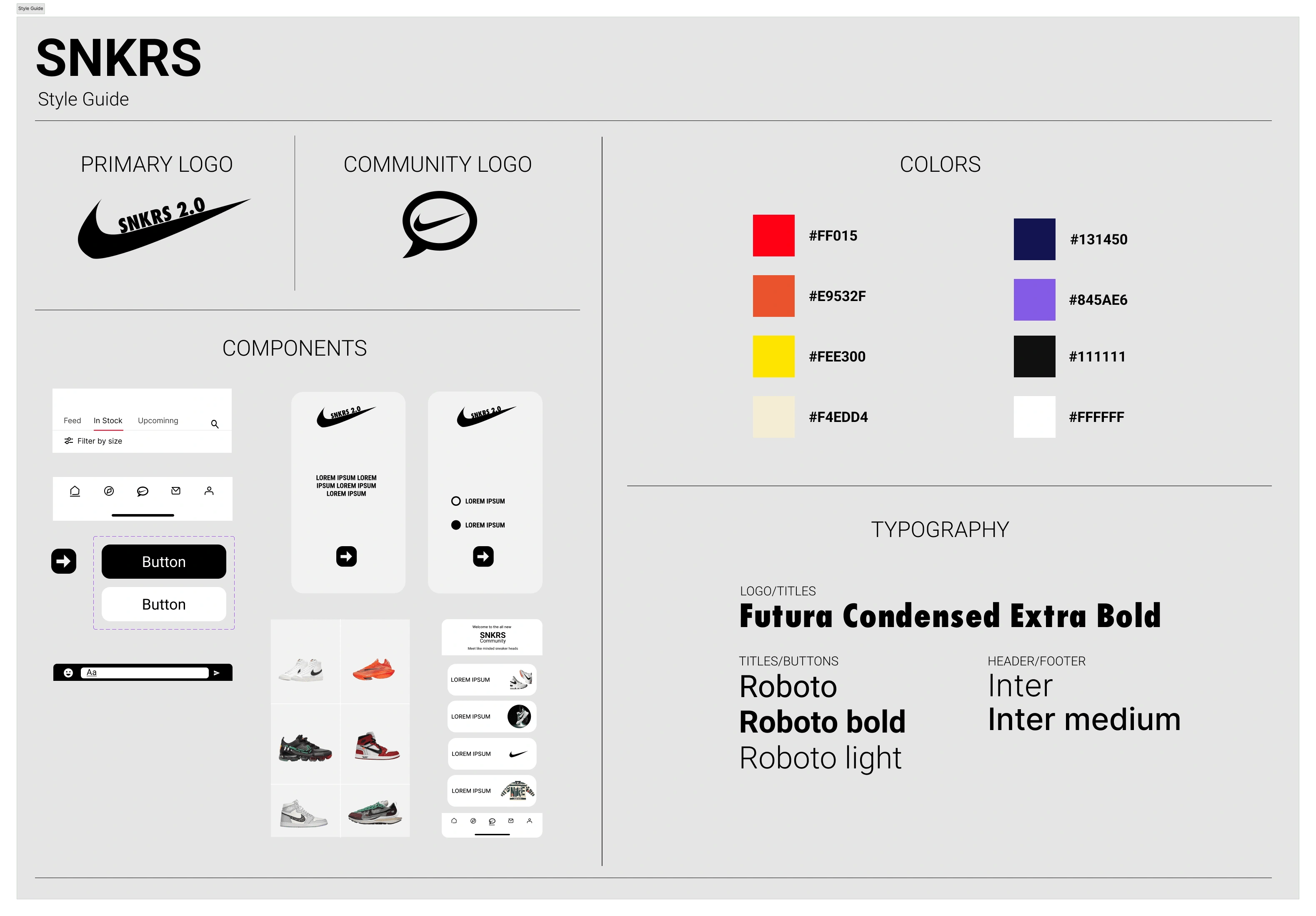
Low-Mid Fidelity
The Low-Mid fidelity was instrumental to the final designs I was able to ideate and validate my designs based on what screens the user would have an easy time using and using that to try and actively avoid pain points and make a well rounded user-experience.
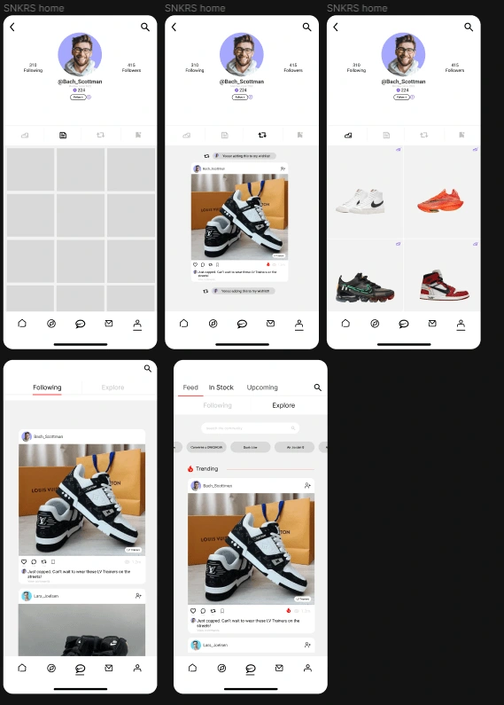
High Fidelity Designs
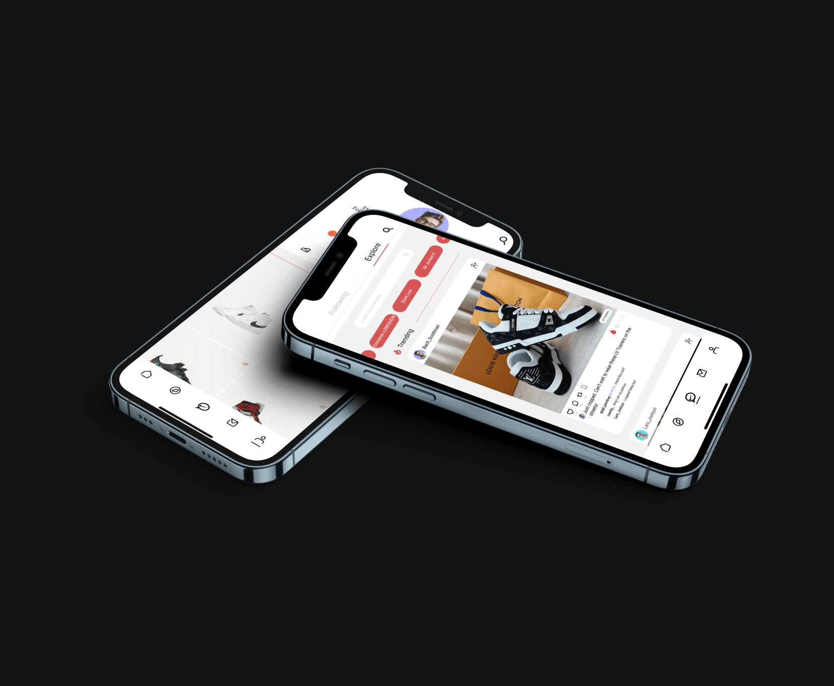
When I reached this portion of the design process took what was working and ran with it. I focused on improving the home feed (image on right below) making it user friendly and recognizable to other apps to eliminate the learning curve. The far left screen is how your profile would look including you favorite color ways and pairs of shoes currently. last but not least in the middle I had made a settings screen to customize your profile to your liking.
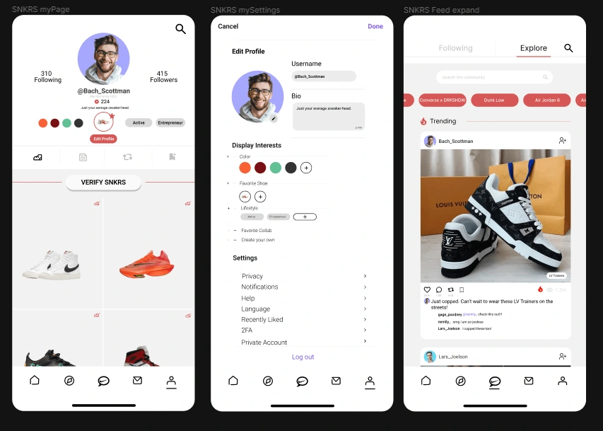
Next Steps
Continuously Gather User Feedback: Collecting ongoing user feedback can help identify areas of improvement and ensure that the app meets the needs and preferences of its users. The feedback can be gathered through surveys, user testing, and other methods.
Improve Personalization: Enhancing personalization features within the app, such as product recommendations based on user interests and previous purchases, can improve the user experience and increase engagement.
Enhance Social Features: Continuously improving the social features of the community tab to make it more engaging, interactive, and seamless can further increase user engagement.
Improve Navigation: Optimizing the navigation and information architecture of the app can improve the user experience and make it easier for users to find what they are looking for within the app.
Implement Gamification: Gamifying certain aspects of the app, such as rewards for completing certain tasks or achieving specific milestones, can motivate users to engage with the app more frequently and for longer periods.
Figma File
Like this project
Posted Feb 23, 2023
A concept for Nike "SNKRS" app Comunity for like minded sneaker heads!

