Madison Gas & Electric UI rebrand
Scott Bachmann
Summary:
Case Study Background: This Project was done in Bootcamp to see how we can revamp an old Site for web, mobile web, and mobile app.
Goals: To revamp and improve a current platforms user experience.
Role: UI Designer
Tools: Figma, Miro, Adobe Creative Suite
Timeline: 2 weeks
Take-Away (important things I learned)
Site structure is key: Creating a clear site structure that makes it easy for users to find what they're looking for can significantly improve the user experience.
Visual design matters: A visually appealing design that is on-brand can help create a positive first impression and improve engagement.
Content is important: Developing content that supports the goals of the website and resonates with your target audience is critical to keeping users engaged and encouraging them to take action.
Usability testing is essential: Testing the website with real users is important to identify any usability issues or areas for improvement.
Challenge
When redesigning Madison Gas & Electric, the most significant hurdle was ensuring that both existing and new users could easily navigate the new website without feeling disoriented, while also creating an aesthetically pleasing design.
Design Process 🎨
Analysis: I started by analyzing the current website's performance, looking at metrics such as traffic, bounce rate, and engagement. I Identified any pain points or usability issues users are experiencing.
Research: I conducted user research to understand the needs, goals, and behaviors of your target audience. This could involve user surveys, user interviews, and usability testing.
Define goals: I based on your analysis and research, set clear goals and objectives for the website revamp. What do you want to achieve with the redesign? What metrics will you use to measure success?
Information architecture: I used the information gathered in the analysis and research stages to create a new site structure that will make it easy for users to find what they're looking for.
Wire-framing: I created wireframes to visualize the layout and structure of the new website. This step could help me quickly iterate on different design concepts and get feedback from stakeholders.
Visual design: Once the wireframes were approved, I moved onto the visual design phase. Created a design that is visually appealing, on-brand, and easy to navigate. Considered the use of color, typography, and imagery.
Content creation: I developed content that supports the goals of the website and resonates with your target audience. This could include copywriting, and photography.
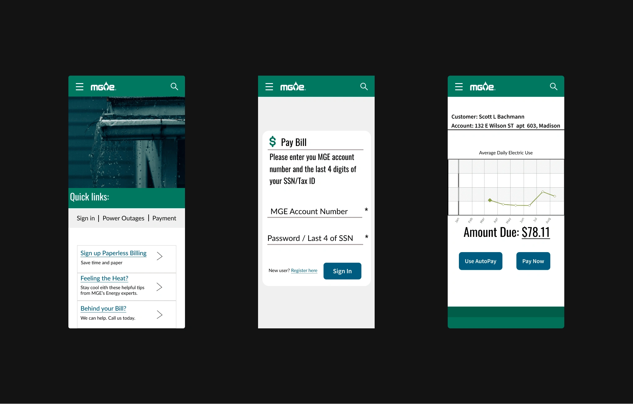
Low-Fidelity/ Wire-Frame
Mobile Web:
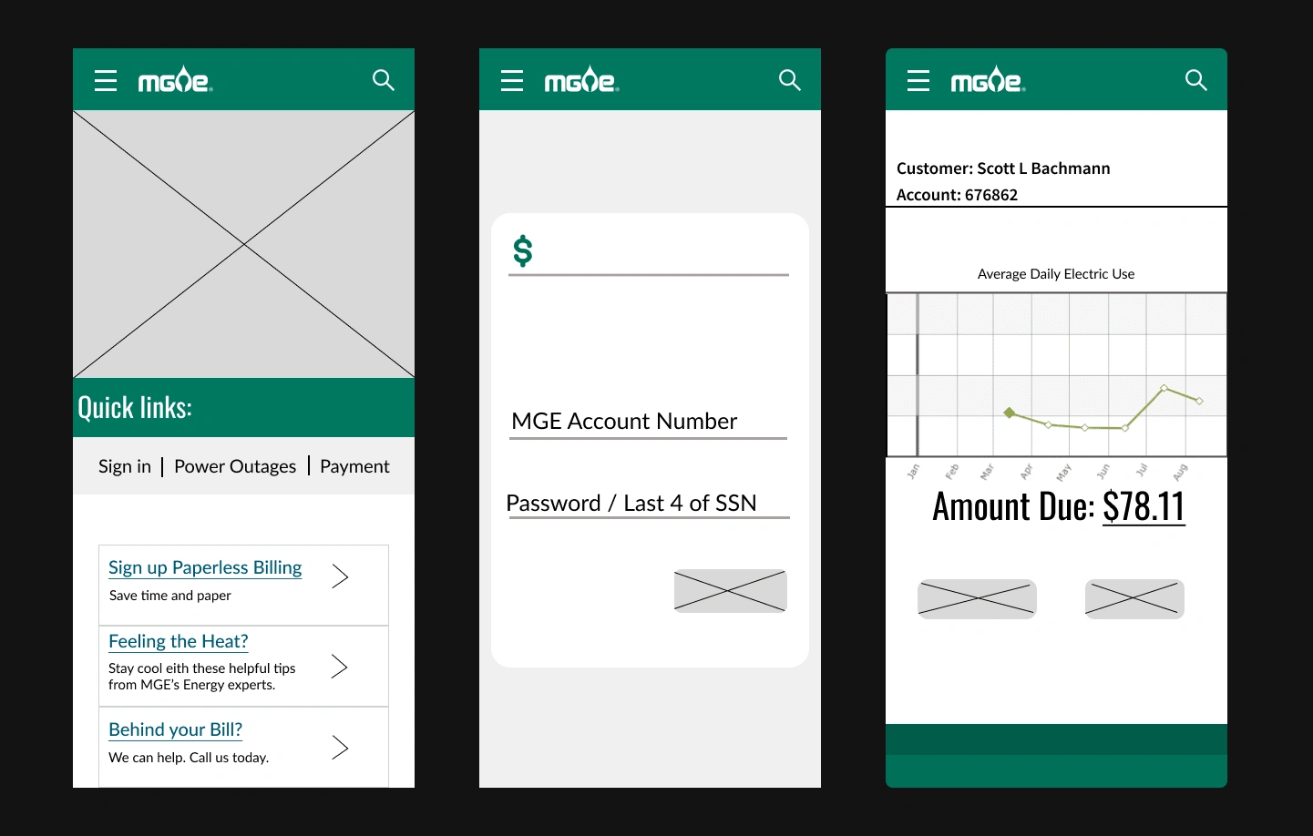
Kept the design simple and easy to navigate with limited screen space.
Used large buttons and fonts for easy touch interaction.
Focused on optimizing the design for portrait orientation.
Avoided using heavy graphics or animation that could slow down the page load time.
Mobile App:
Used platform-specific design patterns and guidelines to ensure consistency with the operating system.
Prioritized the most important features and place them prominently on the screen.
Used simple gestures for navigation to enhance the user experience.
Considered the limitations of the mobile device, such as screen size and processing power.
Desktop:
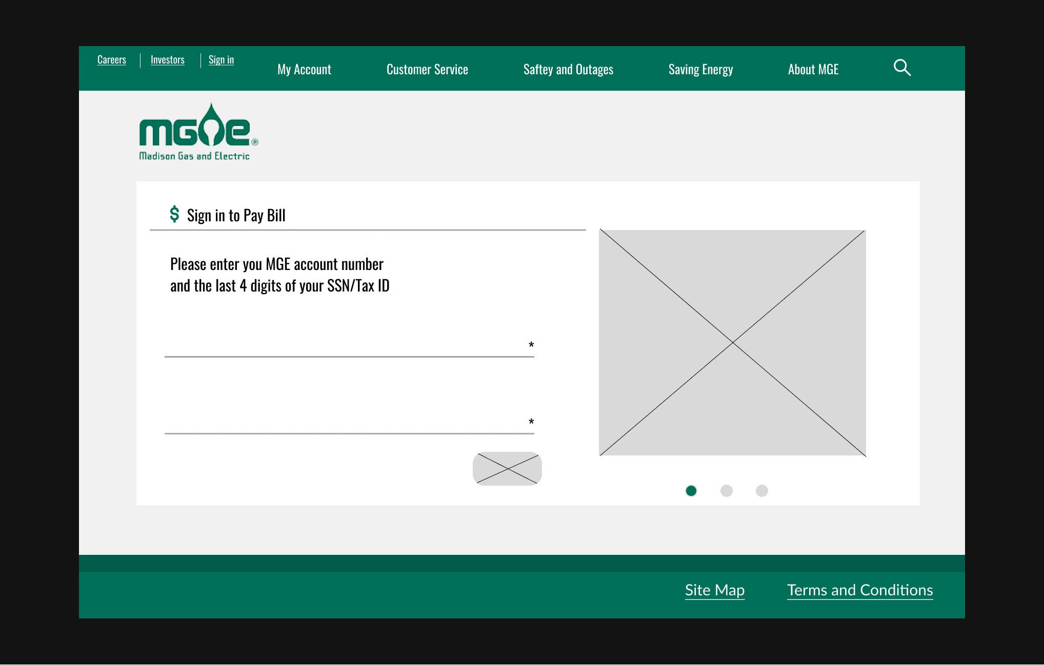
Used a grid system to organize content and maintain consistency throughout the design.
Considered the user's screen resolution and adjust the design accordingly.
Used clear labels and visual cues to guide the user's navigation.
Provided ample negative space to avoid clutter and improve readability.
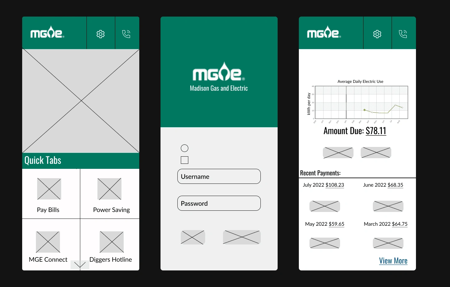
High-Fidelity
Web:
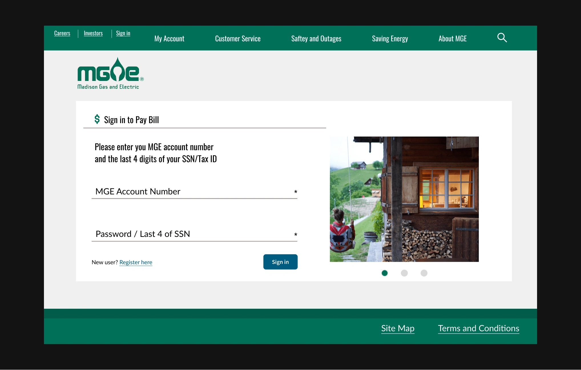
My focus during the high fidelity design for the MGE's website redesign was to create a visually appealing, user-friendly, and functional user interface that aligns with the brand's identity and meets the user's needs.
Mobile Web:
When designing for mobile web, my focus was on creating a responsive design that is optimized for small screens and touch-based interactions. This means taking into consideration the user's context, their device, and the environment in which they are using the app.
Mobile:
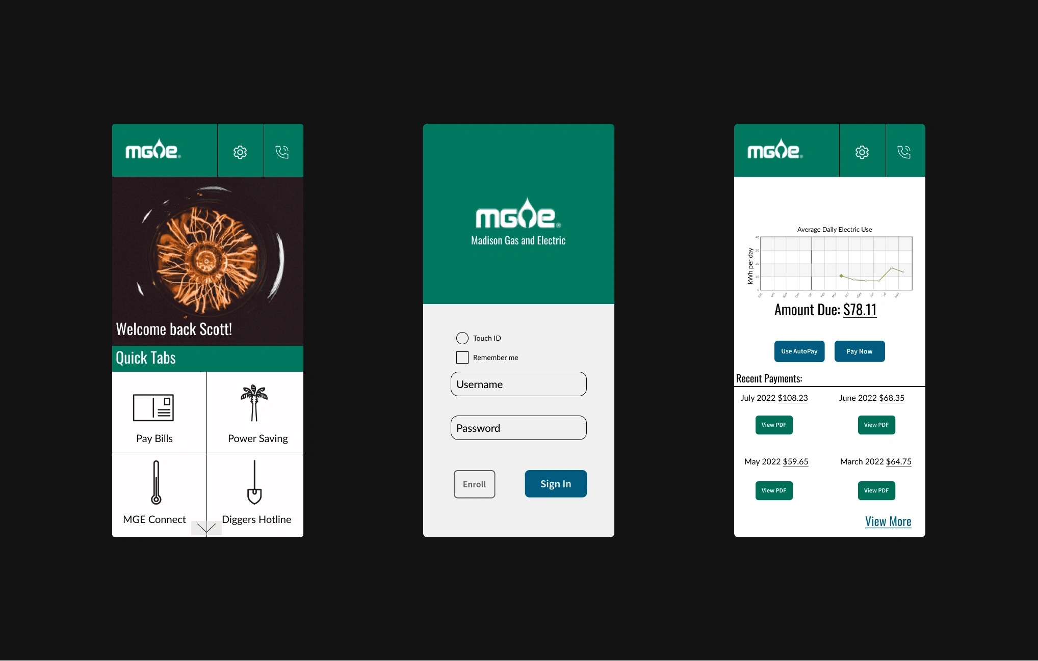
In the high fidelity design for a mobile app, my primary focus was on creating a polished, visually appealing, and functional user interface that reflects the needs and expectations of the target audience. This involves paying close attention to the details of the app's layout, typography, color palette, and visual elements to create a cohesive and intuitive user experience.
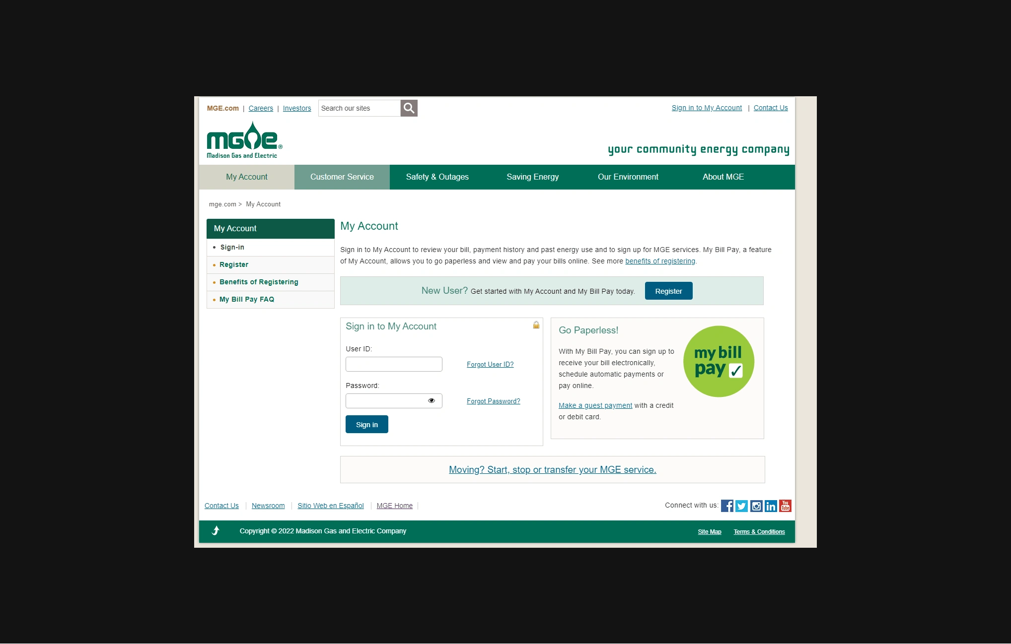
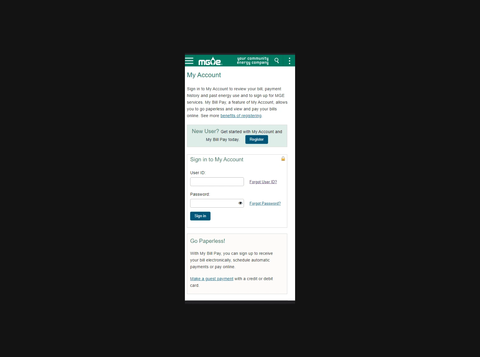
Original Pages
These are some of the pages I took inspiration from.
Web:
Mobile Web:
Next steps
Conduct usability testing: Once the redesigned website is live, it's important to test it with real users to see if they can easily navigate and use the site as intended. This could involve setting up a series of tasks for users to complete and observing their interactions with the site. Based on the results of the testing, the senior UX designer could identify areas of the site that need improvement and make additional design tweaks.
Monitor user feedback: Along with conducting usability testing, it's important to monitor user feedback on an ongoing basis. This could involve setting up a feedback form on the site or monitoring social media channels for mentions of the company and its website. Based on user feedback, the senior UX designer could identify areas of the site that are causing confusion or frustration for users and make adjustments accordingly.
Optimize for SEO: To ensure the redesigned website is reaching its intended audience, the senior UX designer may work with a team of SEO specialists to optimize the site's content for search engines. This could involve conducting keyword research, optimizing meta descriptions and titles, and ensuring the site is structured in a way that is easy for search engines to crawl.
Continue to iterate and improve: A website is never truly "finished," and there will always be opportunities to iterate and improve on the design. The senior UX designer may continue to work closely with the development team to make incremental improvements over time, based on ongoing user feedback and analytics data.
Communicate the success of the redesign: Finally, it's important to communicate the success of the redesign to stakeholders within the electric company. This could involve preparing a report on the key metrics that have improved as a result of the redesign, such as increased traffic or conversions. By demonstrating the tangible benefits of the redesign, the senior UX designer can help ensure that future design projects receive the necessary support and resources.
Figma File
Like this project
Posted Mar 23, 2023
A revamp to Madison Gas & Electric's website (PC, Mobile web, and App concept)