Flax clothing case study
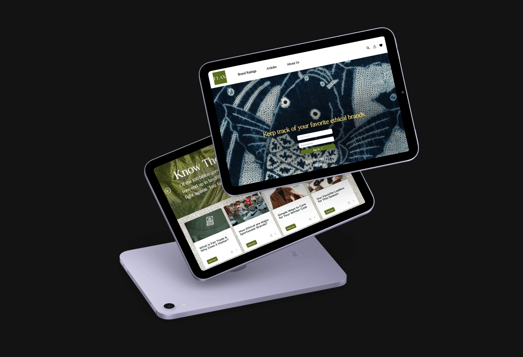
Summary
Goals: To create a platform that holds brands accountable for their sustainability and effects on the environment
Role: Product Designer and Researcher
Tools: Figma, Figjam, Adobe suite
Timeline: 2 Months
Take-aways
User research: It is essential for understanding user needs and pain points. In this project, I conducted user interviews and surveys to identify key issues with the existing platforms like Flax and gained insights into users' goals and behaviors.
Iteration and continuous improvement: Is key to successful UX design. We used feedback from usability testing and user interviews to refine our designs and make iterative improvements to the app over time.
Consistency and clarity: These two are essential for creating a cohesive user interface. I established a clear visual hierarchy, used consistent typography and color schemes, and adhered to established design patterns to create a unified experience for users.
A user-centered design: approach results in a better user experience. By prioritizing user needs and feedback throughout the design process, we were able to create a sustainable rating system that met the needs of our target users.
Challenges
Meeting user needs: One of the biggest challenges in UX design is understanding the needs and expectations of the users. It is important to gather user feedback and data to ensure that the design meets their needs and provides a seamless user experience.
Balancing aesthetics with usability: It is important to create designs that not only look good but are also easy to use. Balancing aesthetics with usability can be a challenge, as a design that looks good may not always be the most functional.
Accessibility: Designing for accessibility is important to ensure that everyone can use the product or service. It can be challenging to design for users with different abilities, but it is necessary to create an inclusive user experience.
UX Deliverables and Research
When I started the deliverables I made some personas and a Journey map to get a better understanding of the target audience and to figure out the question: who is the user?
Research
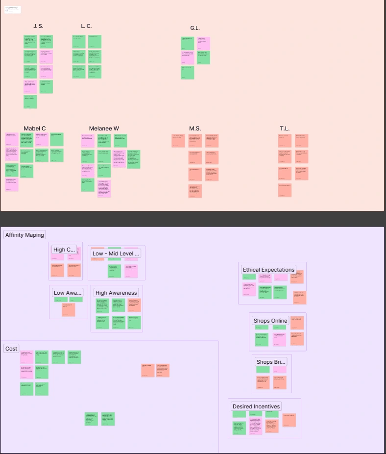
When it came time to do research and finding out what the consumer needed I took notes and interviewed people who where interested in the platform. I took the key notes and started to affinity map to mesh together what the interviewees said and used that to help design for a enjoyable user experience.
Personas
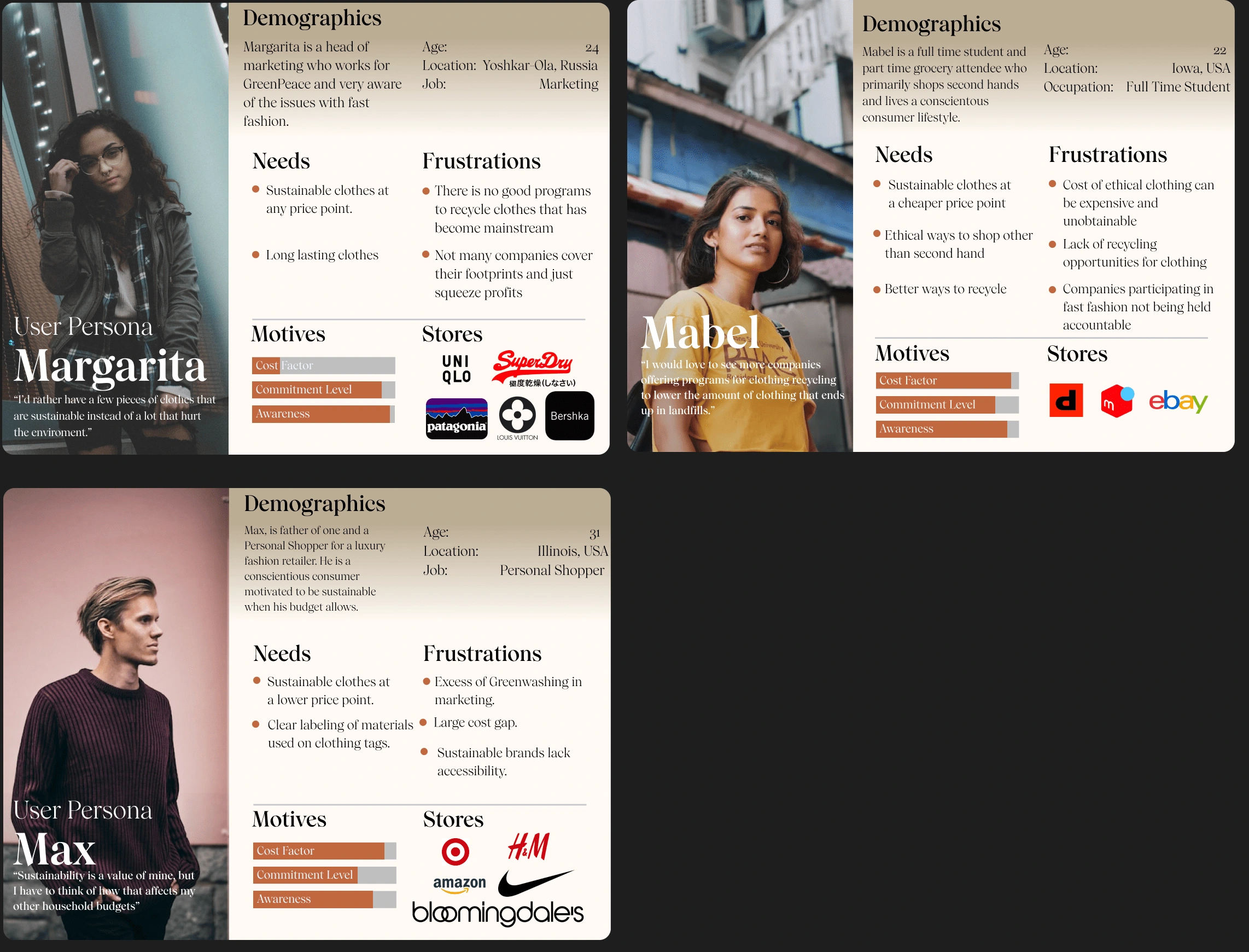
after the research I was able to take the info I had gotten and used it to make personas to have a condensed version of what the platform's use base would look like.
Journey Map
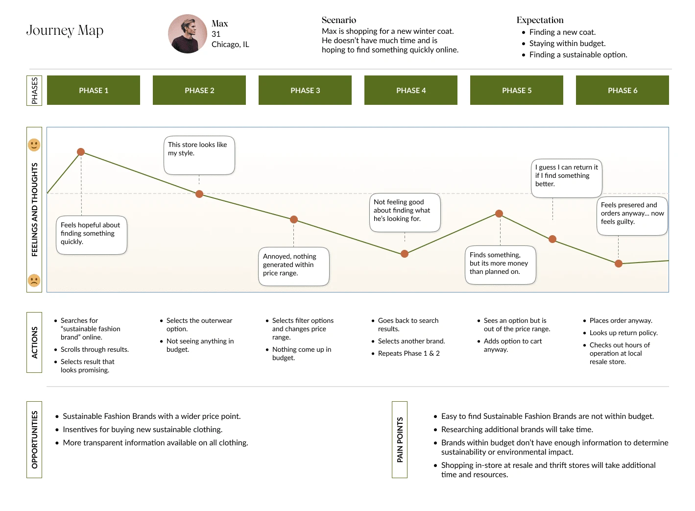
The journey map shows how the current users feel on their path way while trying to buy new clothes and help us later on when we focus on user-centered design.
Design Process
Research: I conduct user research to understand the target audience, their needs, goals, and pain points. I may use methods like surveys, interviews, focus groups, or analytics data to gather information.
Analysis: I analyze the research data to identify patterns and insights that will inform the design direction.
Ideation: Based on the research findings, I generate ideas and explore different design solutions to address the user needs and pain points.
Prototyping: I create low-fidelity and high-fidelity prototypes to test the design ideas and gather feedback from users.
Testing: I conduct usability testing to evaluate the prototypes and ensure that they meet the user needs and goals. The testing phase helps identify areas for improvement and informs the next iteration of the design.
Iteration: Based on the feedback and testing results, I make changes to the design and refine it until it meets the user needs and business goals.
Style Guide
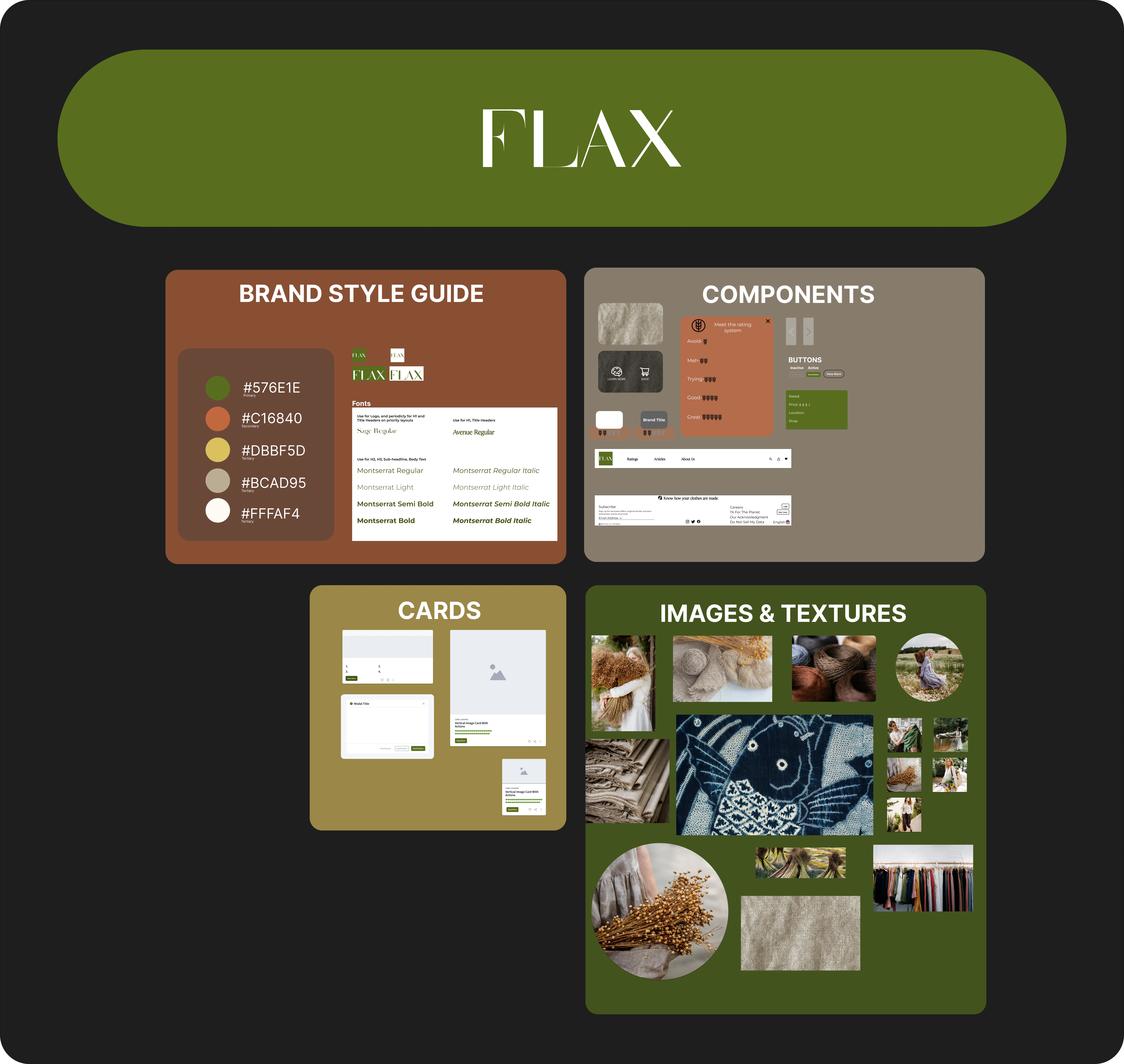
To harbor design consistency I made a style guide that helps bring the site together; this being said it also allows for creation of pages to be easier and aids developers once pushed farther in the project.
Wire-Framing
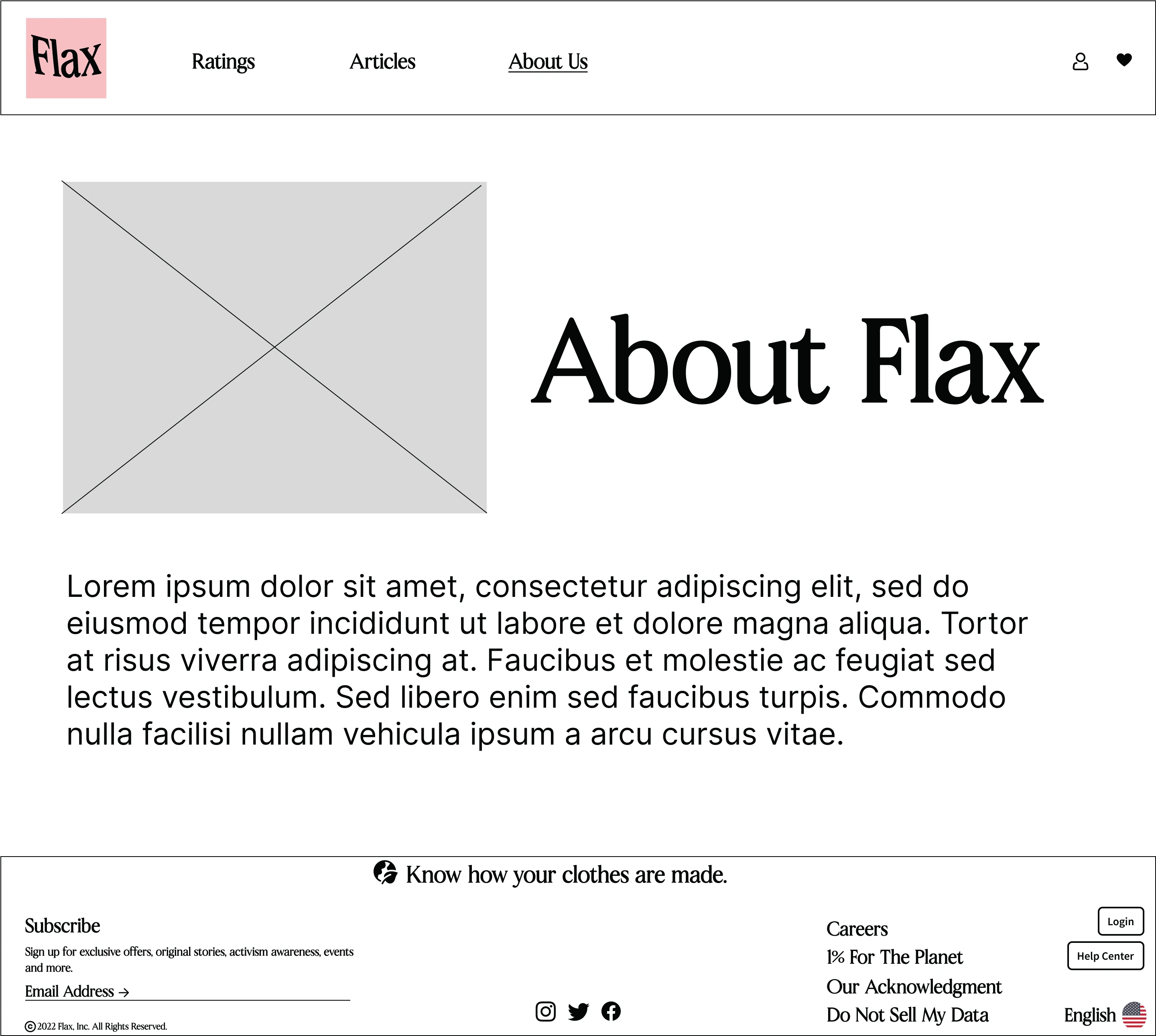
Once I had a clear vision of the website's layout and structure, I created low-fidelity wireframes using software such as Sketch or Figma. These wireframes helped me to define the page layout, content placement, and user interface elements such as buttons, forms, and menus. The wireframes were black and white with no visual design, focusing on the layout and structure of the website.
Low-Mid Fidelity
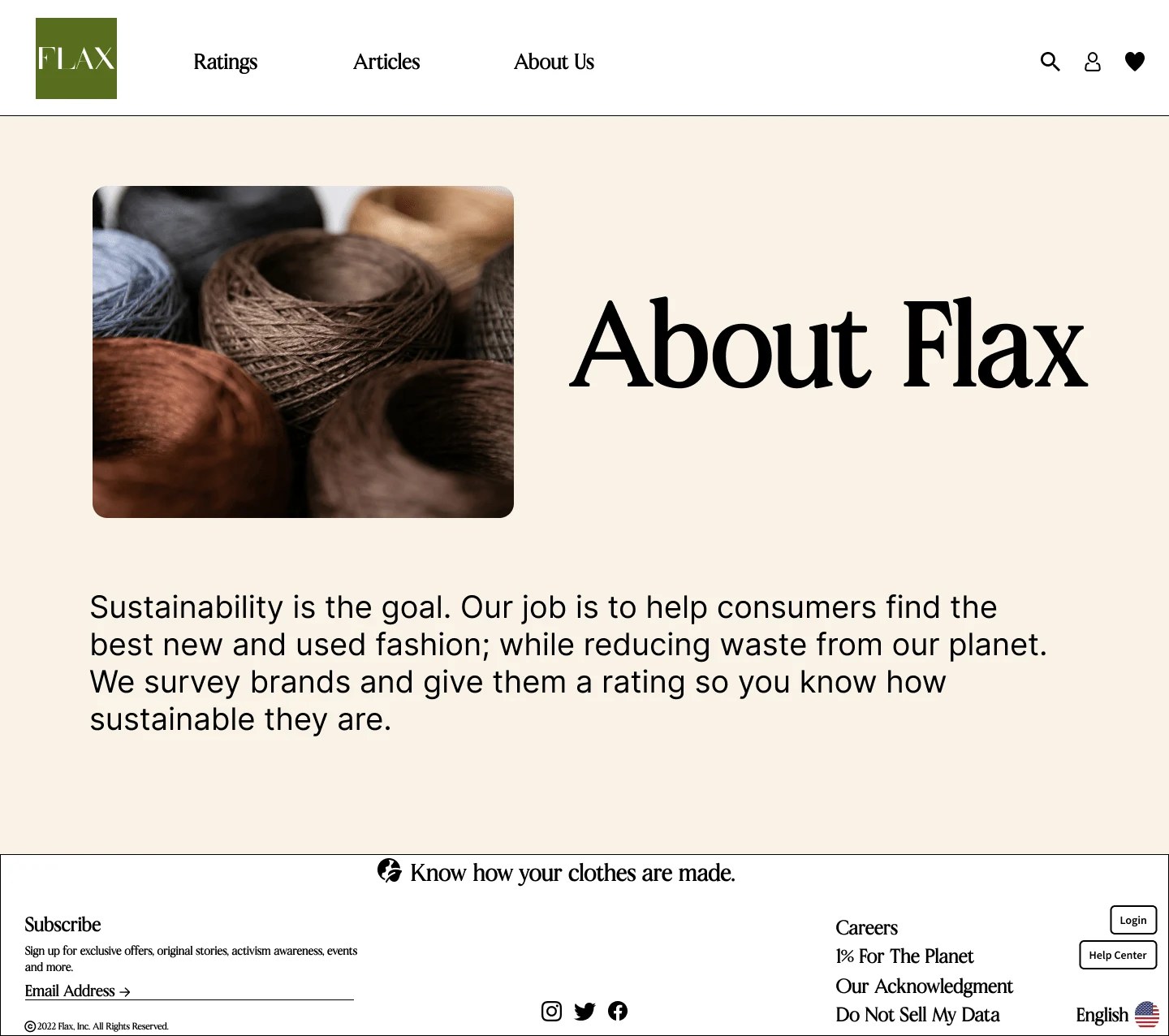
I focused on establishing the layout, structure, and visual consistency of the design, while ensuring that the content is clear and representative of the final product. I test the design with users to ensure that it meets their needs and adheres to usability standards, while also maintaining a balance between fidelity and usability. Ultimately, my goal is to create a design that aligns with the product goals and reflects the needs of the user.
High Fidelity
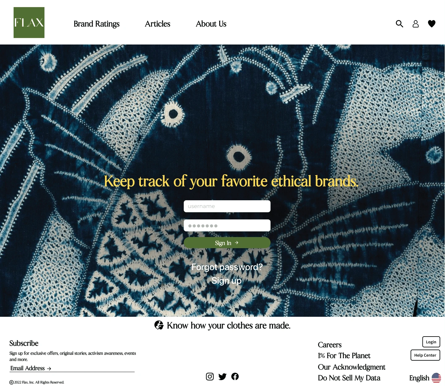
When creating high fidelity designs, I would look for consistency, clarity, accessibility, functionality, feedback, and aesthetics. This means ensuring that all design elements are consistent, the hierarchy of information is clear, the design is accessible to all users, interactive elements are functional and easy to use, feedback is clear, and the design is visually appealing. By considering these factors, I can create effective, user-friendly, and visually engaging high fidelity designs.
Usability Testing
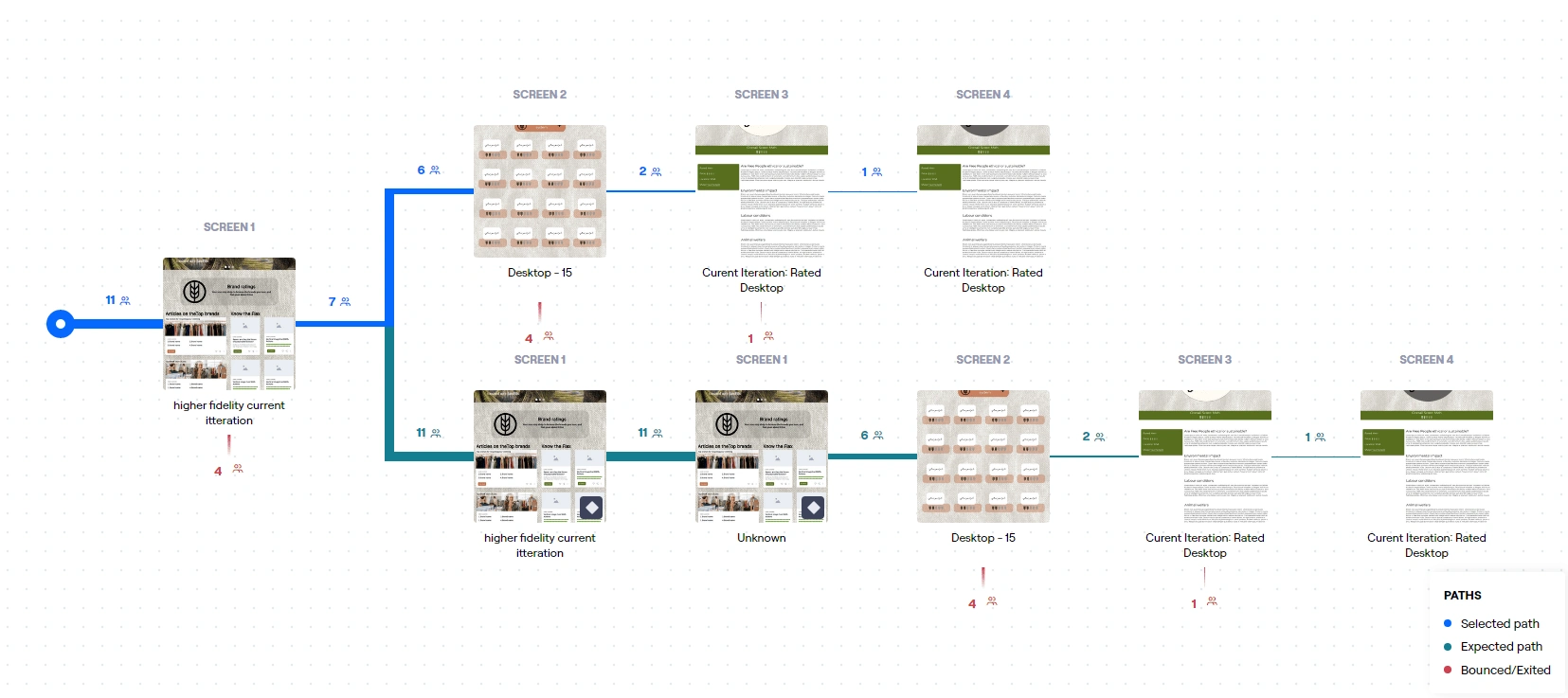
Testing Map
Defining Goals: Before conducting usability testing, I defined the goals of the testing. In this case, the goal is to evaluate the usability of the Flax website and identify any usability issues that may affect the user experience. I also defined the user tasks that participants will perform during the testing.
Recruiting Participants: I recruited participants who represent the target audience for the Flax website. These participants were conscious shoppers who are interested in sustainable clothing and want to make informed purchasing decisions.
Preparing Test Materials: I prepared the test materials, including the scenarios, tasks, and questions that participants will be asked during the testing. I also prepared consent forms and any necessary equipment, such as computers or mobile devices.
Conducting the Test: During the test, I asked participants to perform a series of tasks on the Flax website while I observed their behavior and asked questions about their experience. I recorded their actions and comments for later analysis.
Analyzing Results: After the testing, I analyzed the results, looking for common usability issues that affected the user experience. I categorized the issues based on severity and frequency and made recommendations for improvement.
Sharing Results: Finally, I shared the results of the usability testing with the stakeholders, such as product managers, developers, and designers. I presented the findings and recommendations and discussed how they could be addressed in future design iterations.
Next Steps
Content Development: Expand the content on the site to include additional information about sustainability in the fashion industry, such as guides on how to shop sustainably, tips for extending the life of clothing items, and case studies of brands that are leading the way in sustainable fashion.
E-commerce Functionality: Consider adding e-commerce functionality to the site, allowing users to purchase sustainable clothing items directly from Flax. This could involve working with a third-party platform to integrate shopping cart functionality and payment processing.
Social Media Integration: Integrate social media into the site to encourage user engagement and promote the Flax brand. This could include embedding Instagram feeds or enabling users to share content from the site on their own social media channels.
Figma File
Like this project
Posted Mar 7, 2023
designed a website to find how sustainable brands are and hold them accountable for their standards
Likes
0
Views
64

