Redesigning a Fantasy Sports Football Application
Tobiloba Mustapha
Introduction:
FanBants is a fantasy football game where you pick a team of 11 players and earn points based on how your players perform in real life. The better your player performs in real life, the higher your fantasy points. This case study explains the process and outcomes of redesigning the match selection page, contest entry pages, and re-framing wallet funding notifications to create a positive user experience. The existing MVP of the application can be accessed at https://sports.fanbants.com/home. Let's dive into the details.
Objective:
The goal is to create a more beautiful and intentional interface for the match selection page, contest entry page (before and after the match), and reframe the wallet funding notification to increase user engagement and funding rates.
Understanding the Industry:
Before diving into the design process, it is important to understand the fantasy sports football industry and its unique challenges. I familiarized myself with the existing landscape, user preferences, and trends to ensure the redesign aligns with the industry's best practices. I explored the app by signing up and creating an account, also funded my wallet to experience the users pain points. This enabled me to better understand and identify areas that would further enhance the user experience.
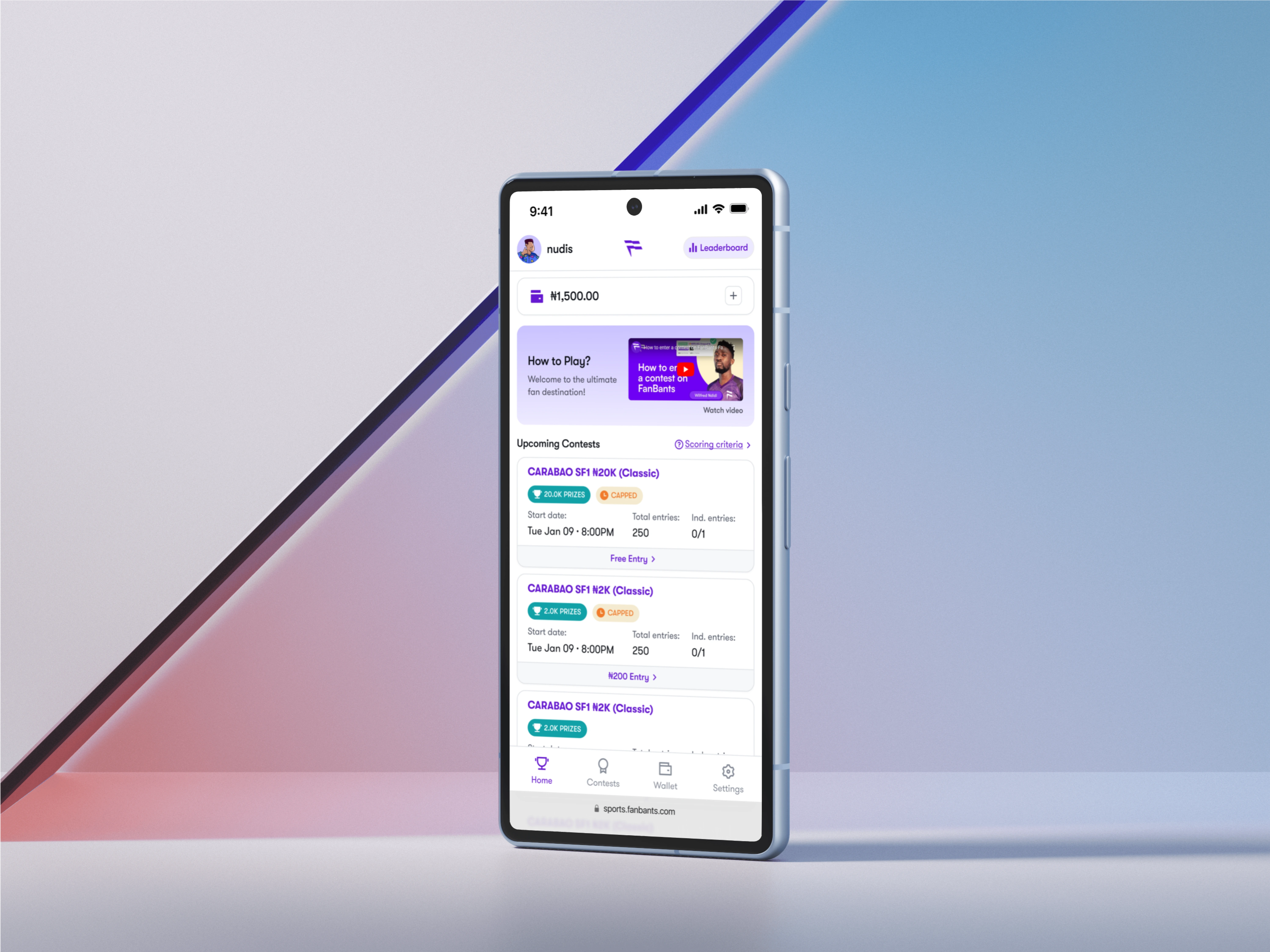
Match Selection Page:
The match selection page is the first point of interaction for users. The redesign focuses on improving the visual appeal and usability of this page. Some key considerations I took for the redesign include:
Analyzed the current design and identified areas for improvement, such as visual clutter, lack of visual hierarchy, inconsistent design elements, and accessibility issues.
Used typography, color and spacing techniques to focus attention.
Reworked the instructional video section, to allow for more screen space to accommodate more contents.
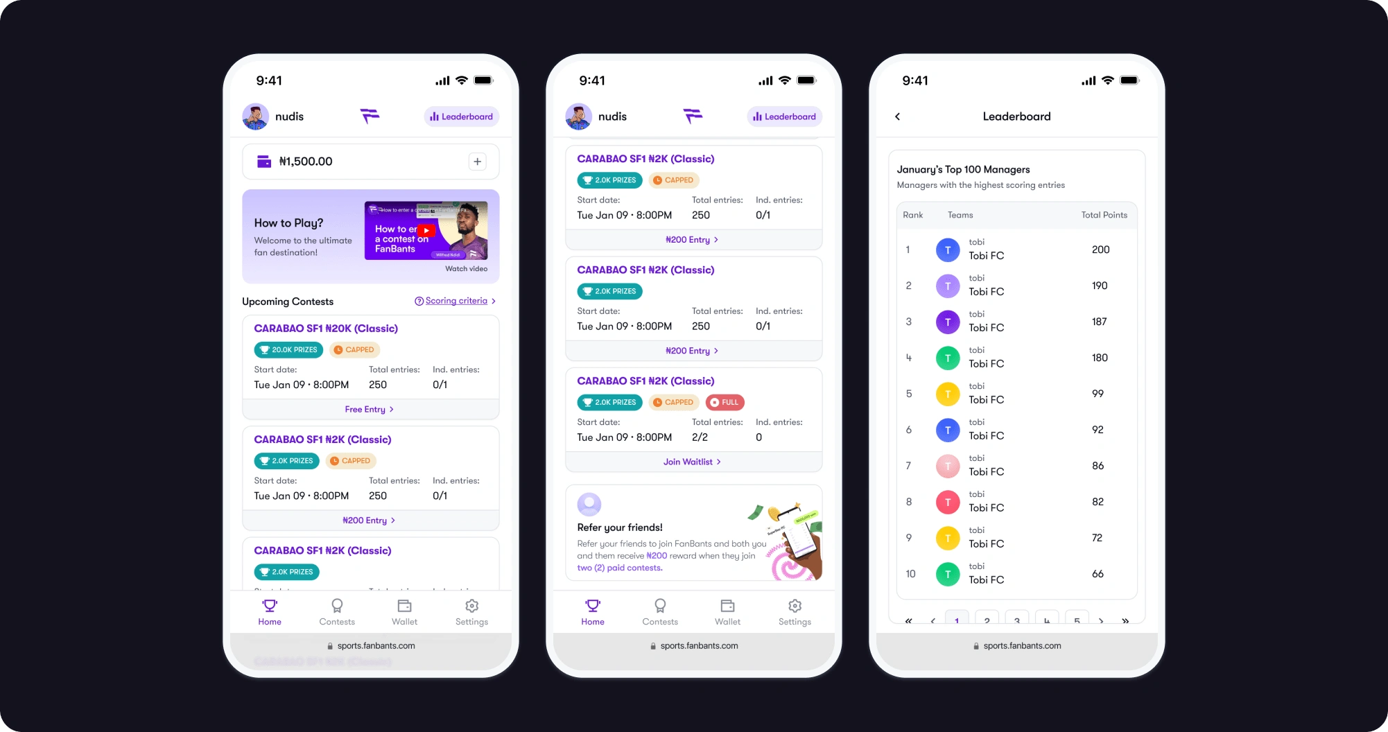
Repositioned the “Leaderboard button” and made it into a standalone alone page for easy access and readability.
Used only club names and player names to represent teams instead of using logos, images, or jerseys, keeping in line with the task brief.
Incorporated some of the already existing business decisions being considered on the app to maintain consistency.
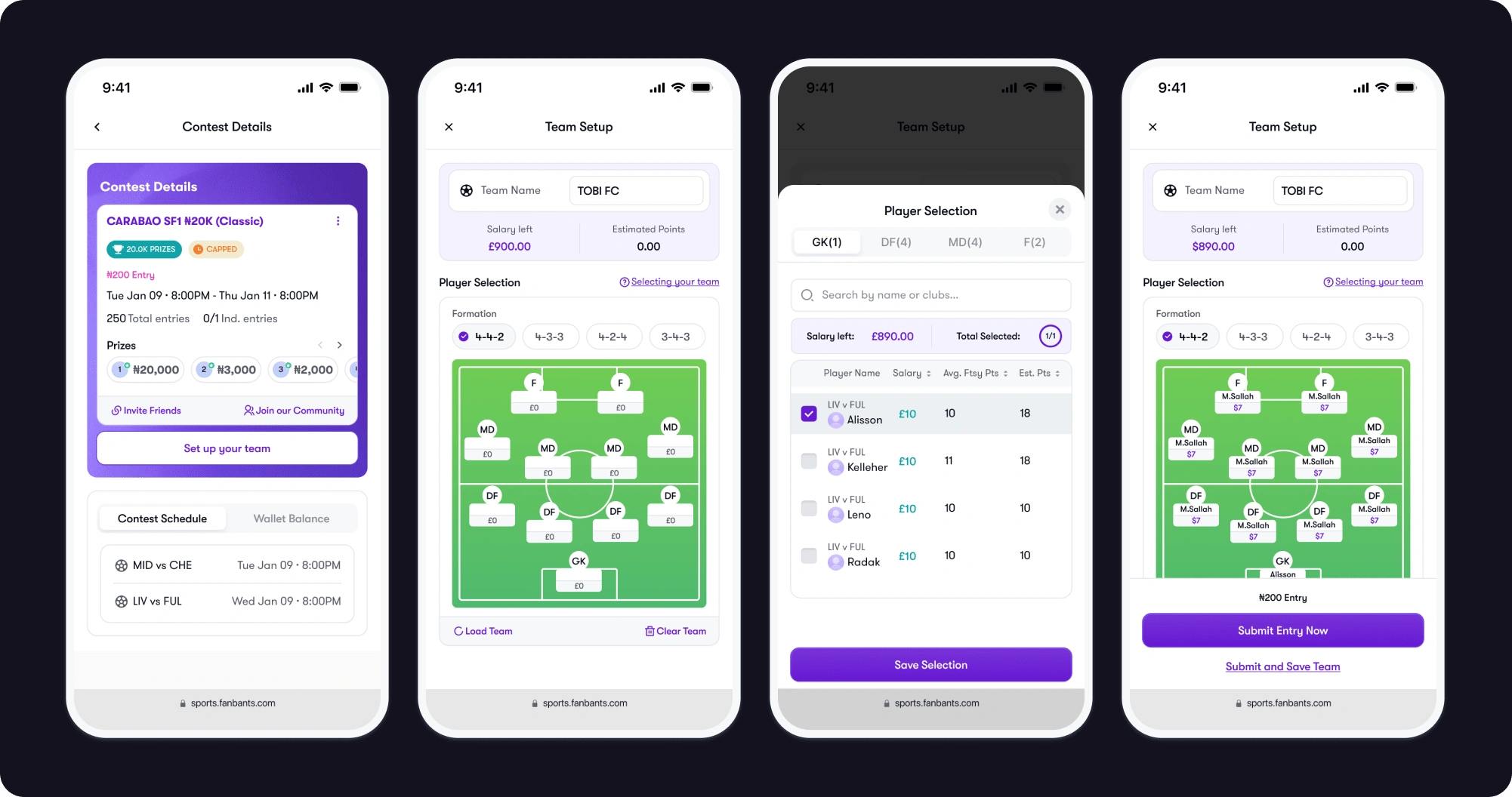
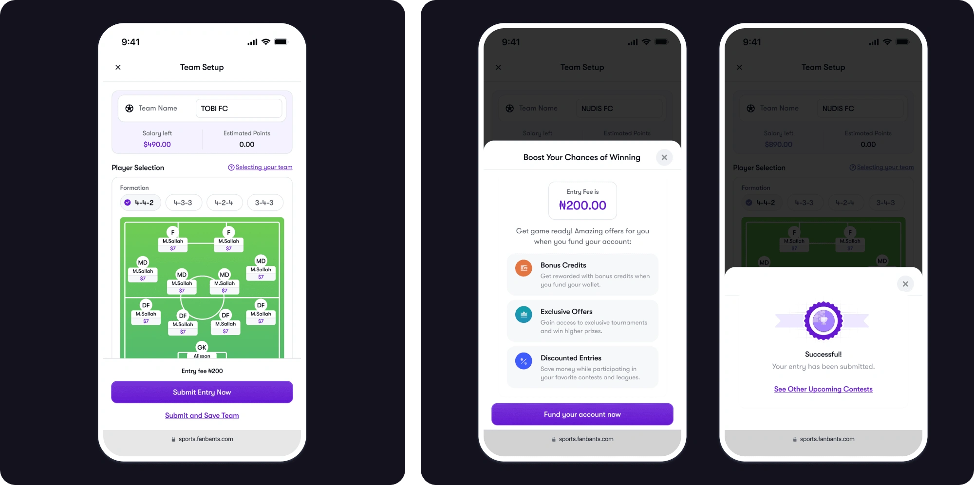
Contest Entry Page (Before the Match Starts):
The contest entry page before the match starts is where users select their players and create their fantasy team. The redesign aims to streamline the player selection flow and enhance the overall user experience. Here are some aspects I focused on:
Analyzed the current design and identified areas for improvement, such as visual clutter, lack of visual hierarchy, inconsistent design elements.
Displayed relevant information about the contest, such as entry fee, prize pool, timeline, and contest rules.
Streamlined the player selection flow and made it more intuitive using switch toggles, allowing less clicks and to be able to select all players on a single modal for users to enter contests.
Incorporated interactive elements such as progress indicators and check boxes for easy player selection.
Included circular step indicators to guide users through the process.
Used club names, icons and player names to represent teams instead of using logos, images, or jerseys.
Maintained consistency with the existing business decisions on the app.
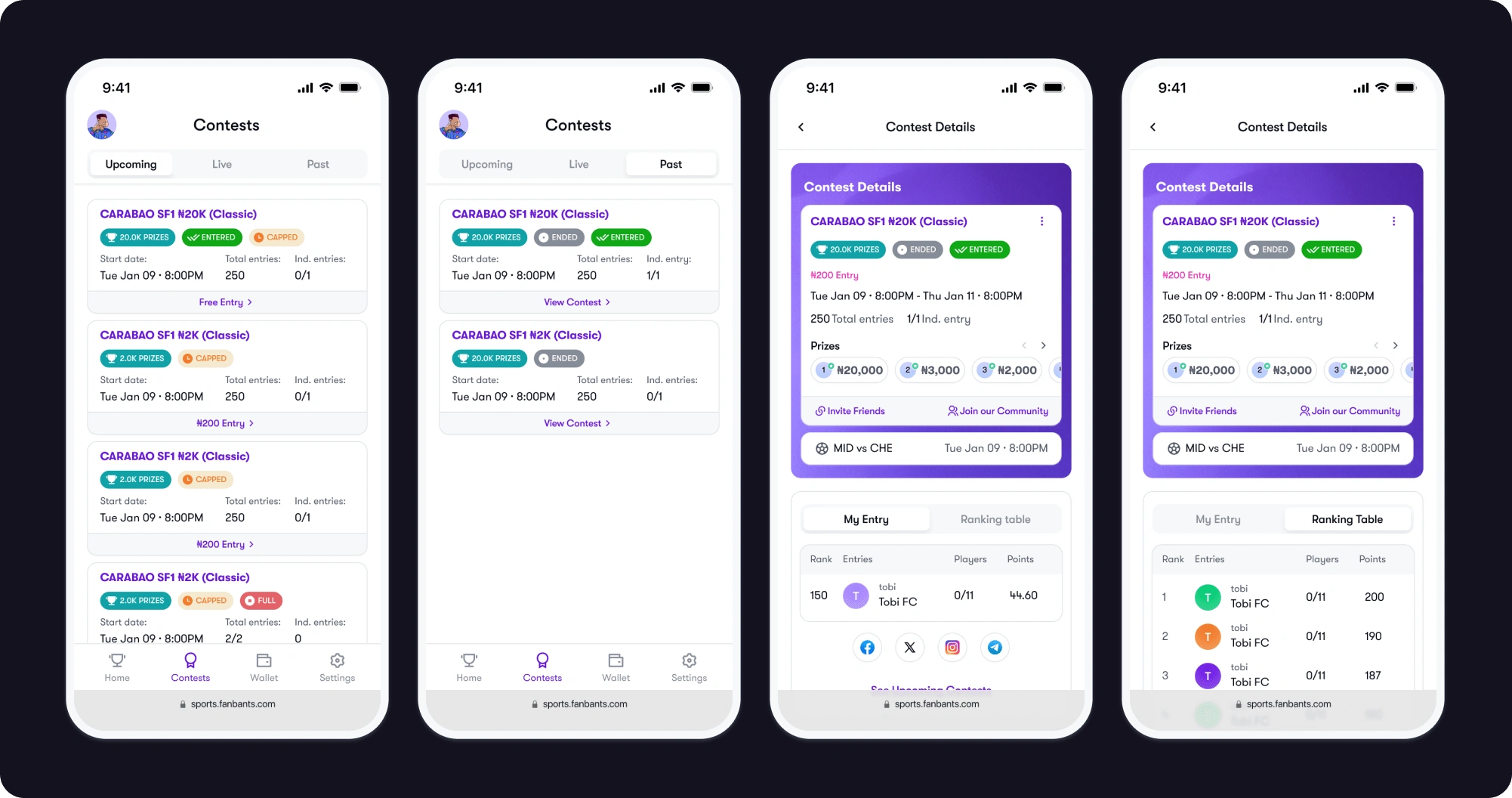
Contest Entry Page (After the Match Ends):
The contest entry page after the match ends provides users with information about their performance and rewards. The redesign focuses on presenting this information in a visually appealing and informative manner. I considered the following:
Reviewed the current design and identified areas for improvement, such as visual clutter, lack of visual hierarchy, inconsistent design elements.
Displayed the user's performance metrics, such as points earned and rank achieved, in a clear and concise manner.
Included social sharing buttons to allow users to share their contest results and achievements on social media platforms.
Easy access to view upcoming contests without having to go back to the home page.
Ensured consistency with the existing business decisions on the app.
Reframing Wallet Funding:
When a user has insufficient funds in their wallet to play a funded game, the feedback should be reframed to encourage positive action and increase funding rates. Currently, when a user has insufficient funds in their wallet, they receive a notification. However, this experience is not the best as it doesn’t make the user want to continue. Here are some ideas I explored:
I assumed new business decisions around wallet funding that are different from what is currently on the application.
Made use of positive and persuasive messaging, instead of showing an “insufficient funds” notification, I highlighted the benefits of funding your wallet into a modal, and titled it “Boost your chances of winning”.
Explored the idea of offering incentives for wallet funding, such as offering bonus credits, exclusive bonuses, discounted contest entries and displayed them in a visually appealing way, this would further encourage users to fund their wallets.
Also, ensured that users cannot play games where they can win money without funding their wallets, aligning with the business decisions of the application.
Conclusion
Through the redesign of the FanBants Sports app, I strived to improve the user experience by creating an attractive and intuitive interface. The positive reframing of wallet funding notifications aimed to engage users and encourage wallet funding. By aligning with existing business decisions and implementing innovative design solutions, the redesigned app offers an enjoyable and rewarding fantasy sports football experience for users. The app could consider adding new features such as live streaming of games, interactive player statistics and real-time updates, as to better enhance the user experience.
Like this project
Posted May 1, 2024
FanBants is a fantasy football game where you pick a team of 11 players and earn points based on how your players perform in real life.