Design of Dash - Financial Dashboard
Kimberlee
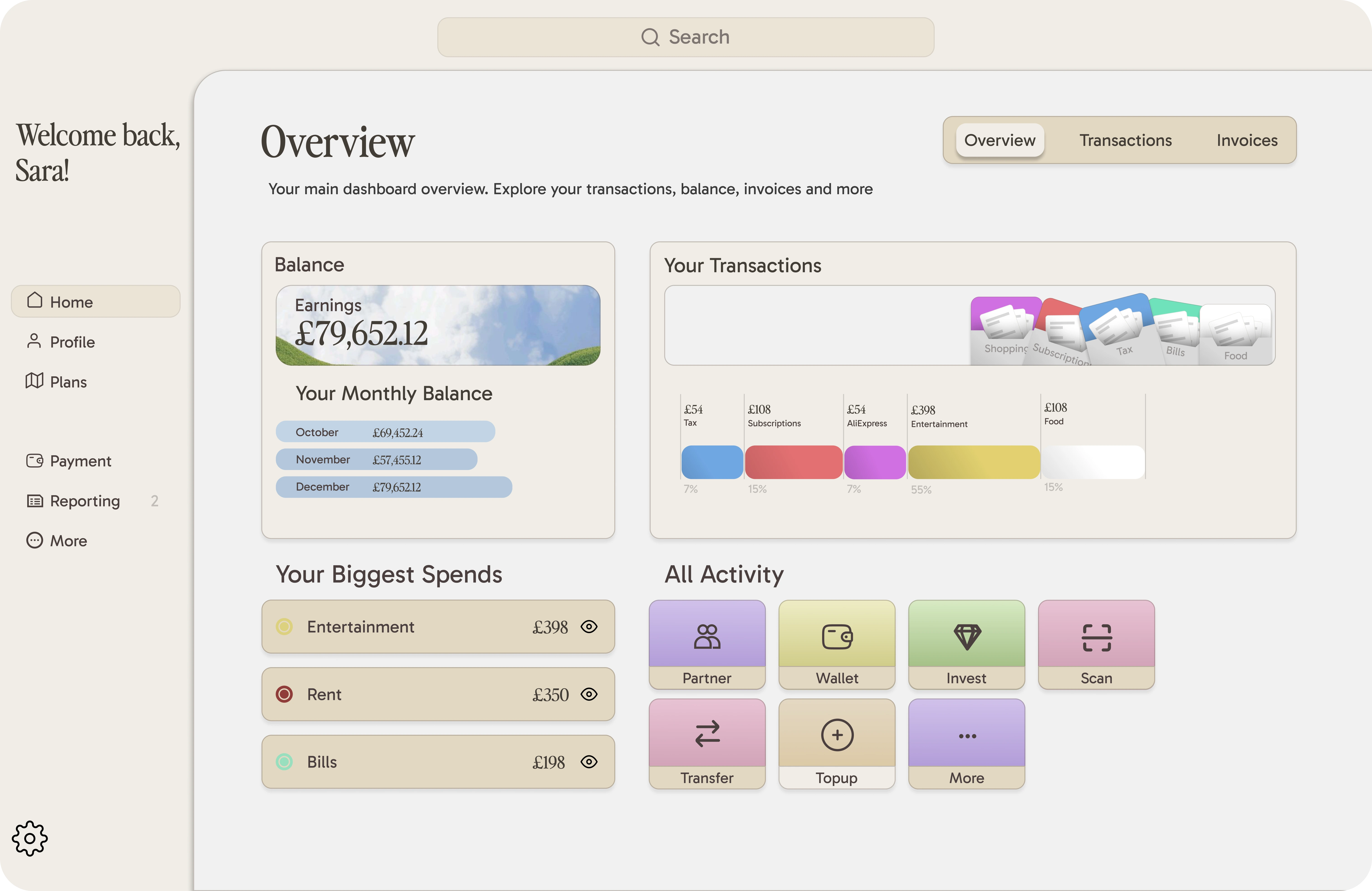
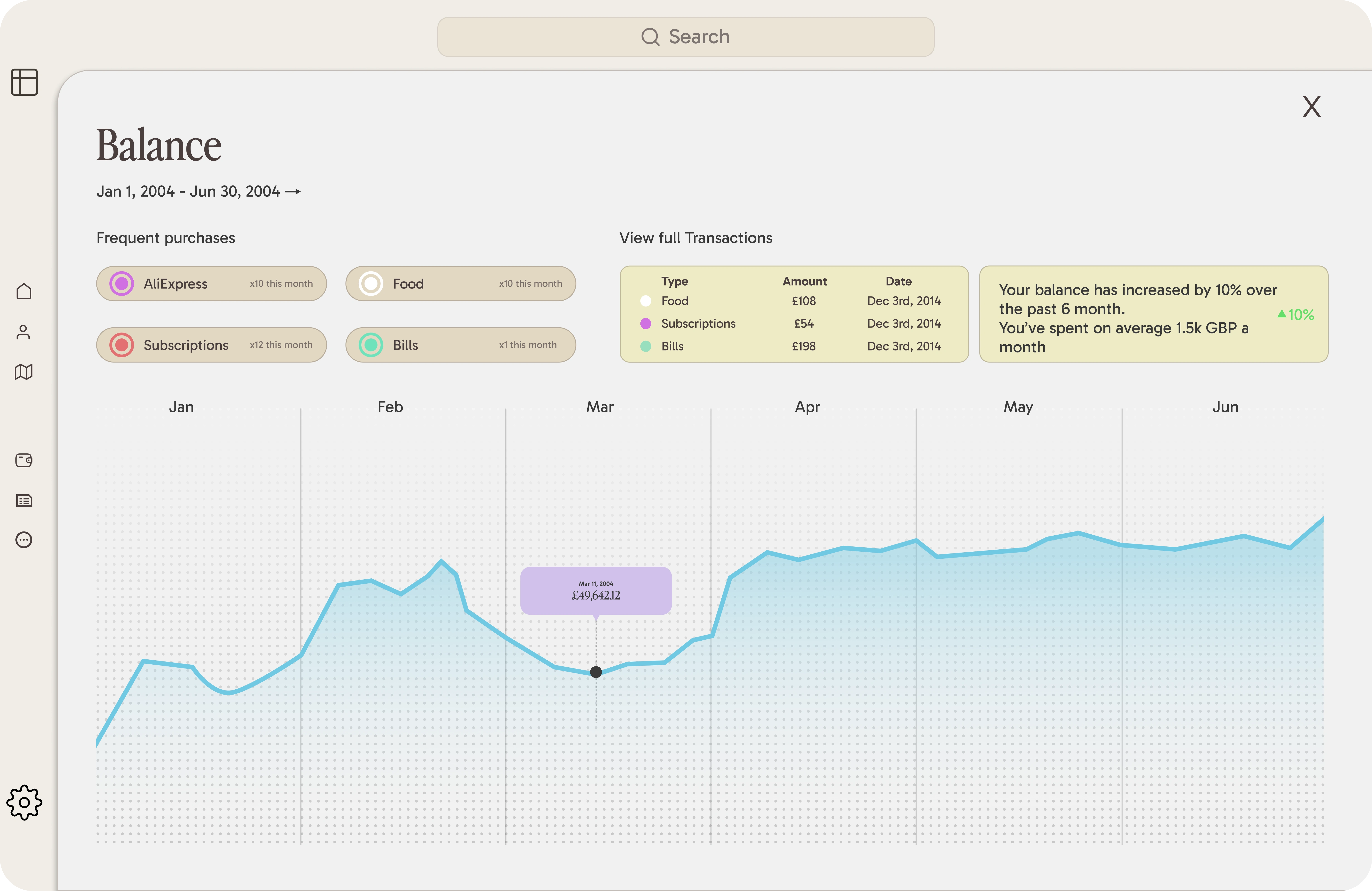
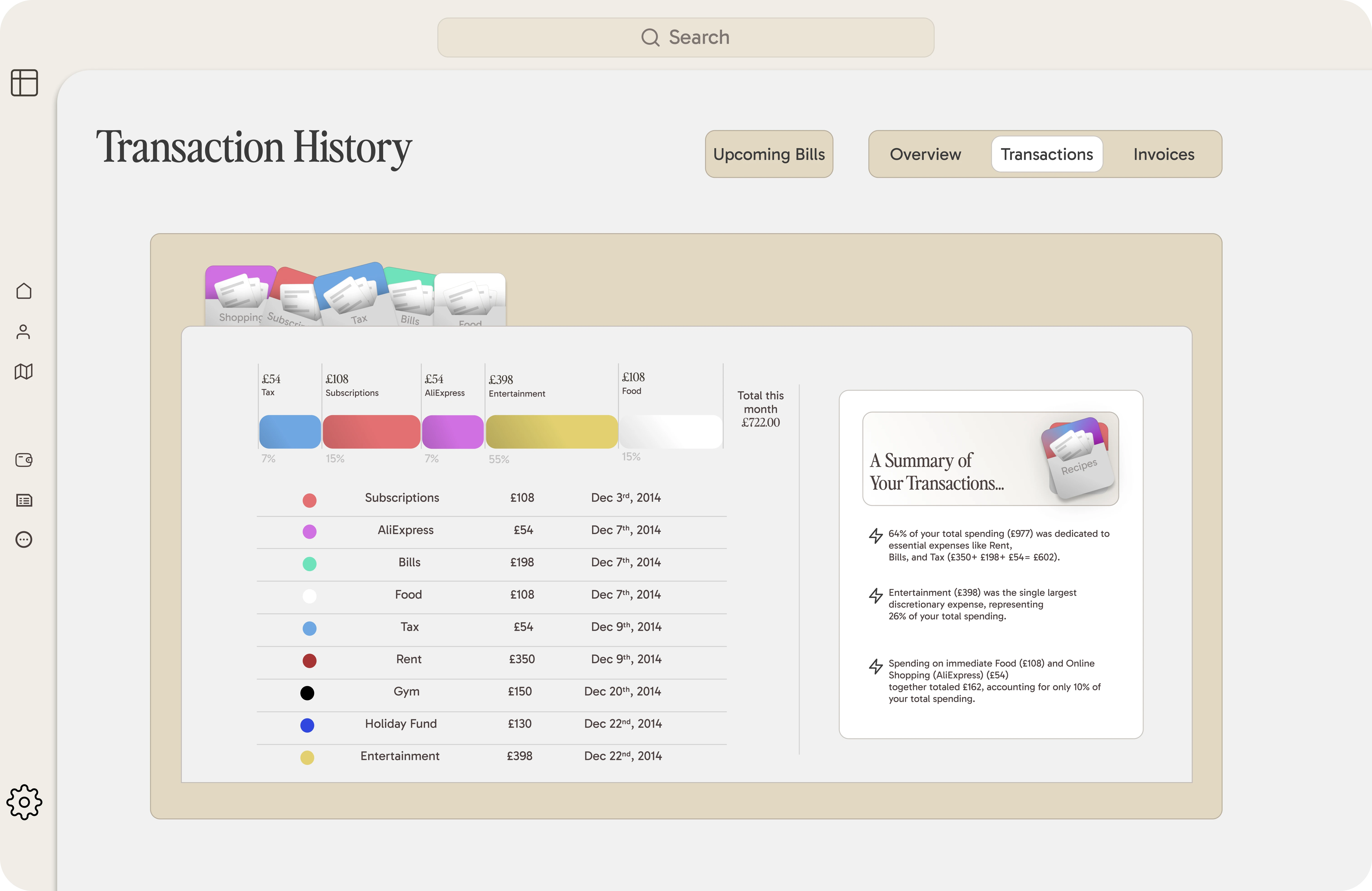
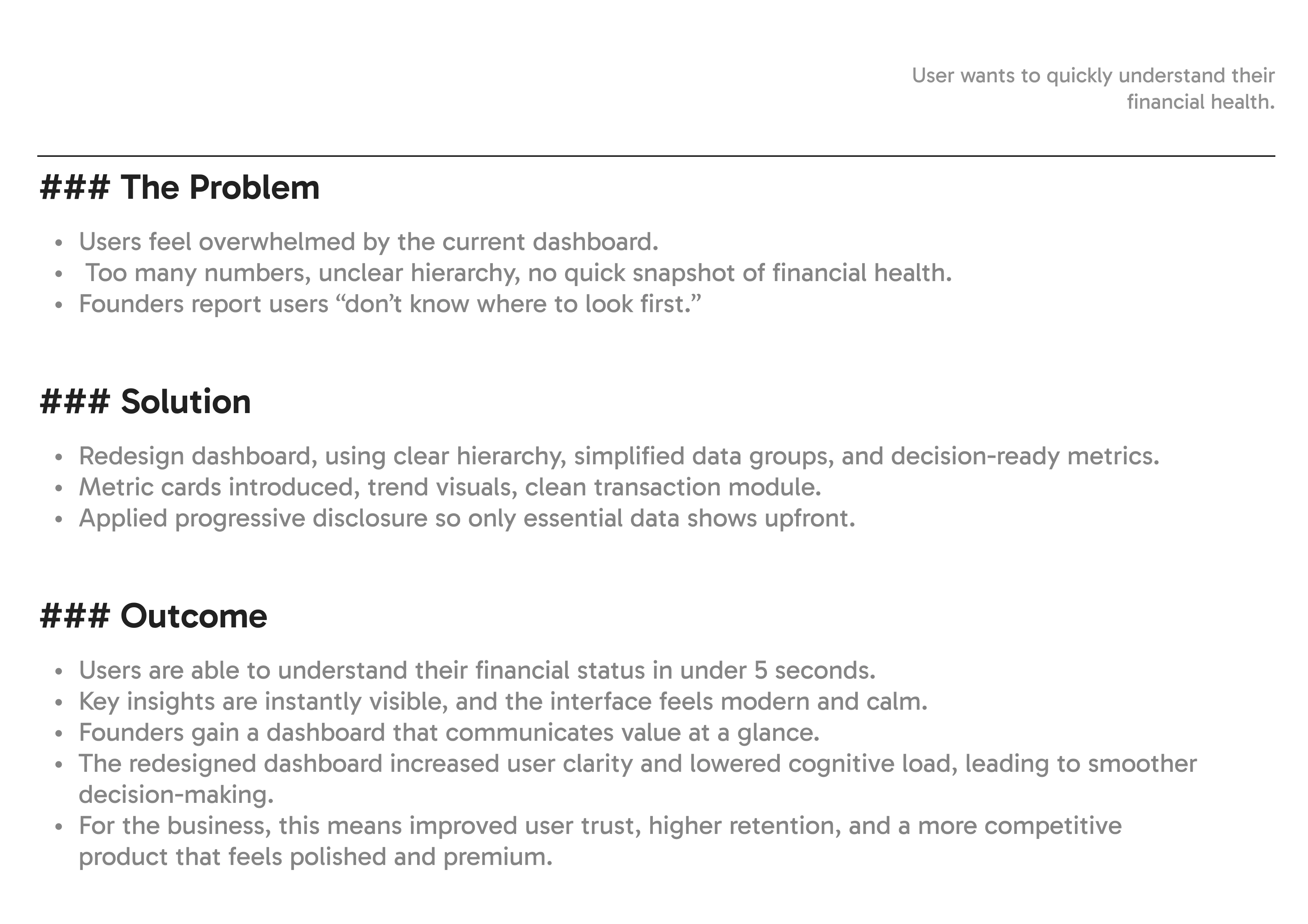
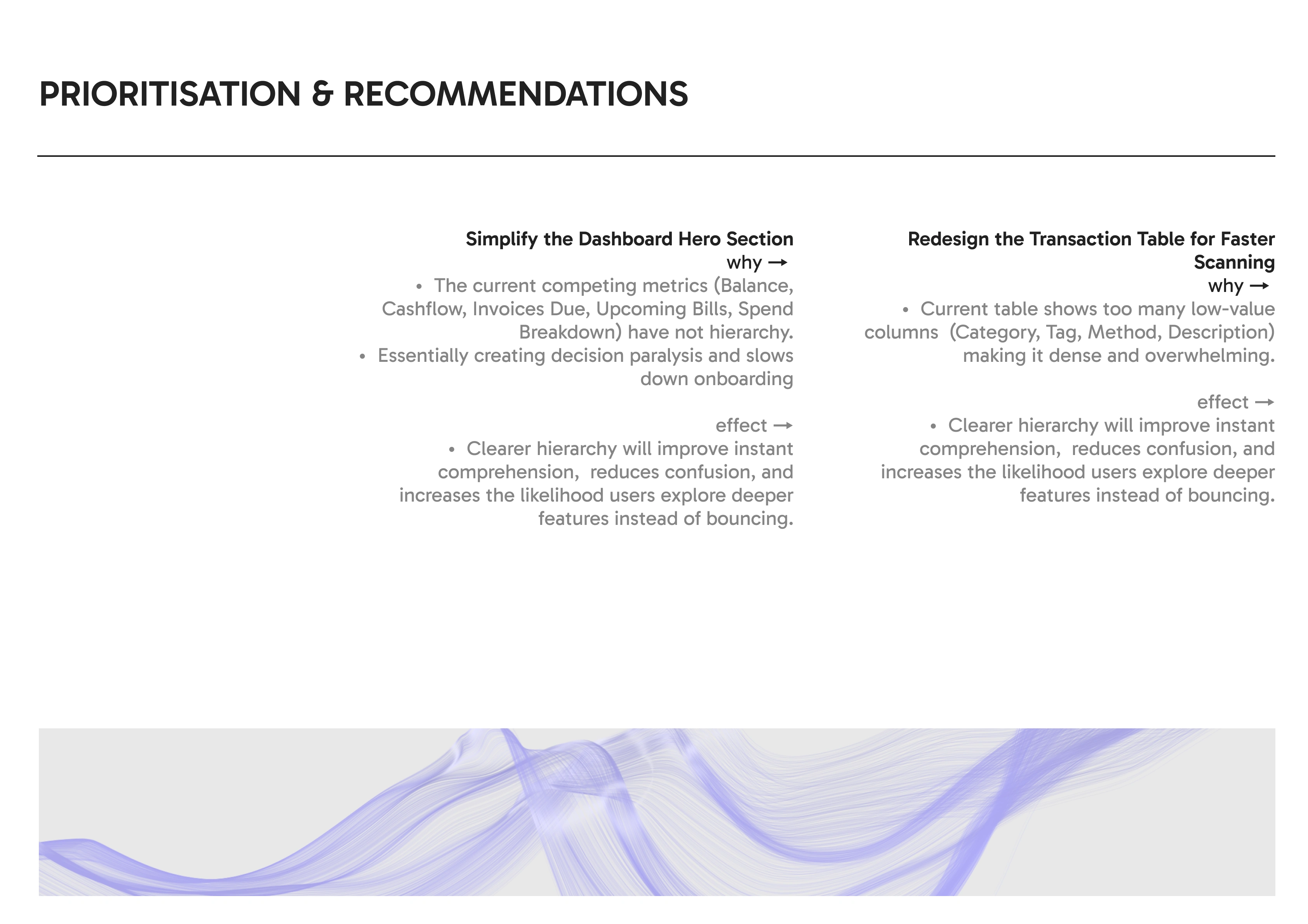
Dash is a digital dashboard designed to translate your important financial data into calm, actionable insight. Thoughtful visual hierarchy, and intuitive data storytelling, displays real-time metrics, allowing users to understand their financial position at a glance.
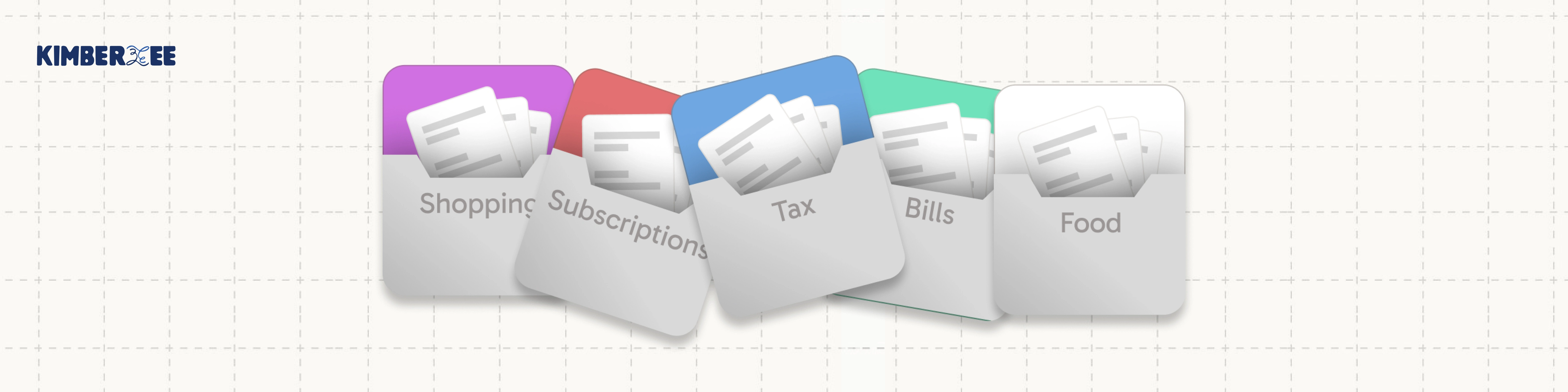
Illustration and System-First Designs
Designing
I approached the interface with consistent visual rules to ensure financial data felt structured, legible, and trustworthy. Focusing on restrained graphical elements, rather than decorative illustration, such as modular cards, calibrated charts, and subtle visual cues - ultimately creating clarity without visual noise. Peer feedback aided in the refinement of hierarchy and contrast, ensuring insights remained easy to interpret while preserving depth for more advanced users.

Like this project
Posted Dec 16, 2025
Created a digital dashboard to translate financial data into clear, actionable insights. Approach with an 'illustration-first' design process.
Likes
1
Views
3