Brand Identity for LIV Mental Wellness

Kajal Baliyan
Verified


Overview |
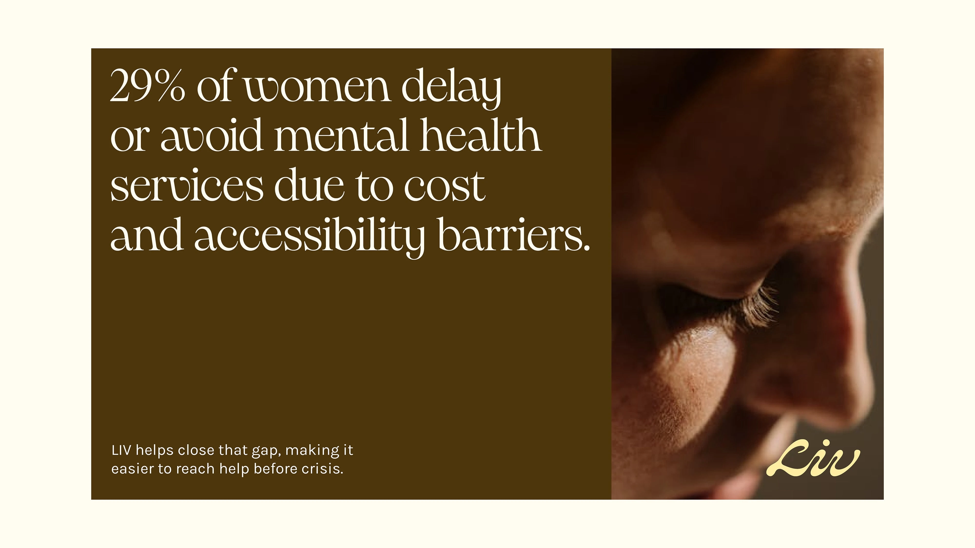
LIV Mental Wellness is founded by Emma Clark, a psychotherapist who spent years running a solo practice before expanding her work into a more integrated model of care. Through her clinical experience, she saw that many clients were thoughtful and self-aware, yet still felt stuck in cycles of anxiety, burnout, and self-doubt. They had tried therapy, journaling, and other tools, but often lacked a clear understanding of the deeper patterns shaping their experience.
Emma created LIV to address the underlying mechanisms of lasting change — focusing on nervous system regulation, lifestyle support, education, and community. LIV was built on the belief that mental health is not isolated to the mind, but shaped by the relationship between mind, body, habits, and relationships.
I partnered with Emma to develop a visual and conceptual framework that could express LIV’s approach in a way that felt structured, intelligent, and deeply human.
The Big Idea |
Research into the mental health and wellness landscape revealed a clear pattern in how most brands communicate their message. Many rely on abstract or symbolic imagery — soft gradients, organic waves, or generic representations of calm. While visually pleasant, these approaches often reduce mental health to a single emotional outcome, rather than reflecting the underlying structure that shapes it.
LIV’s clinical model approaches mental health differently. It focuses on helping clients understand how thoughts, physical sensations, habits, and relationships interact over time. The visual identity needed to reflect this structure — not as metaphor, but as a system.
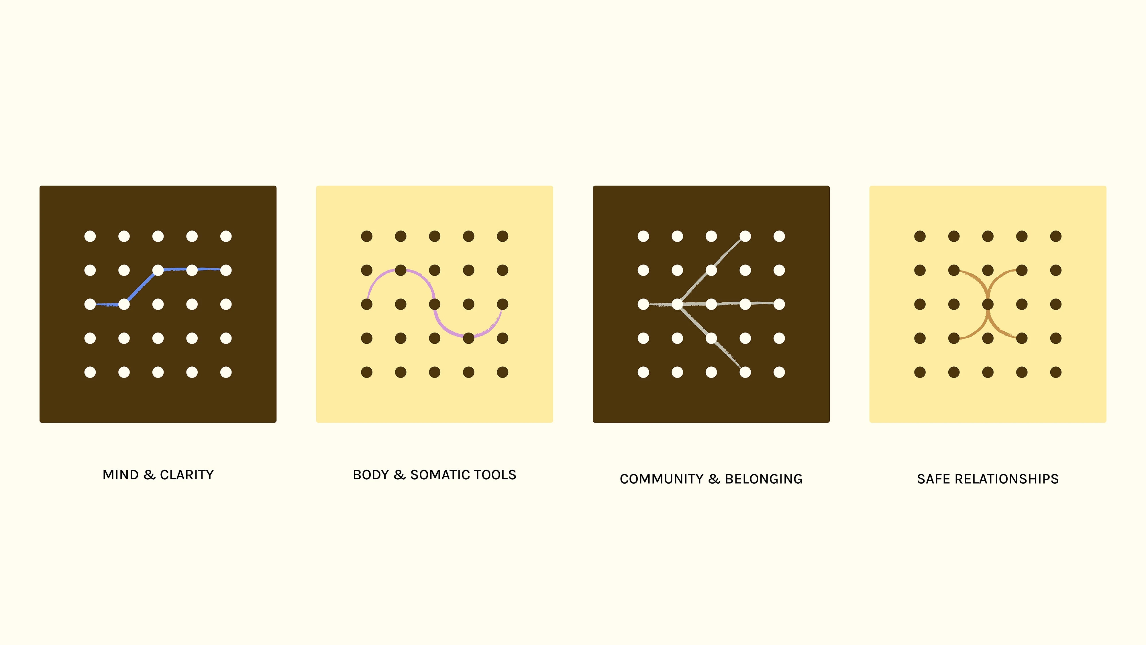
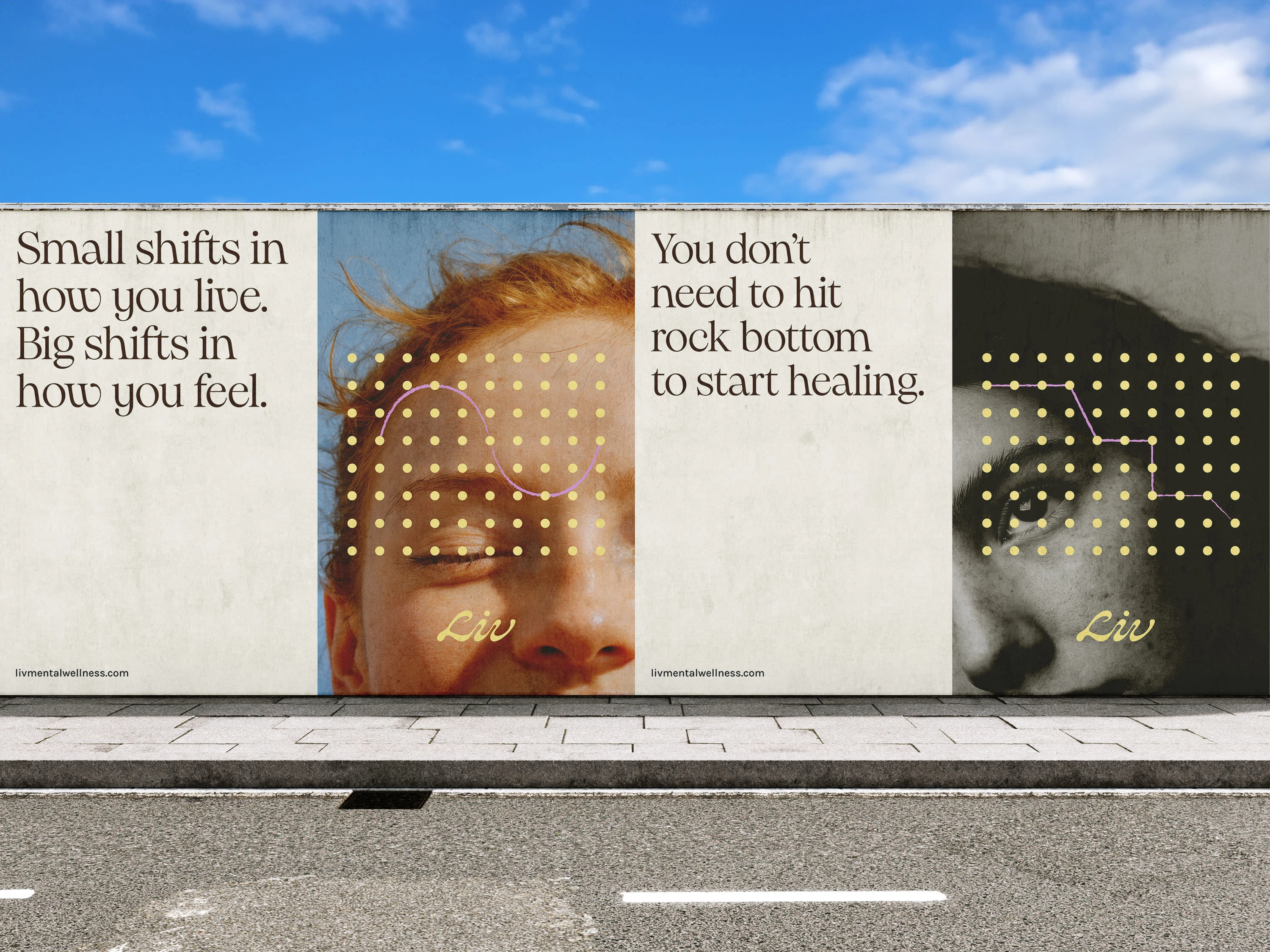
This became the foundation for the creative direction: Points of Connection.
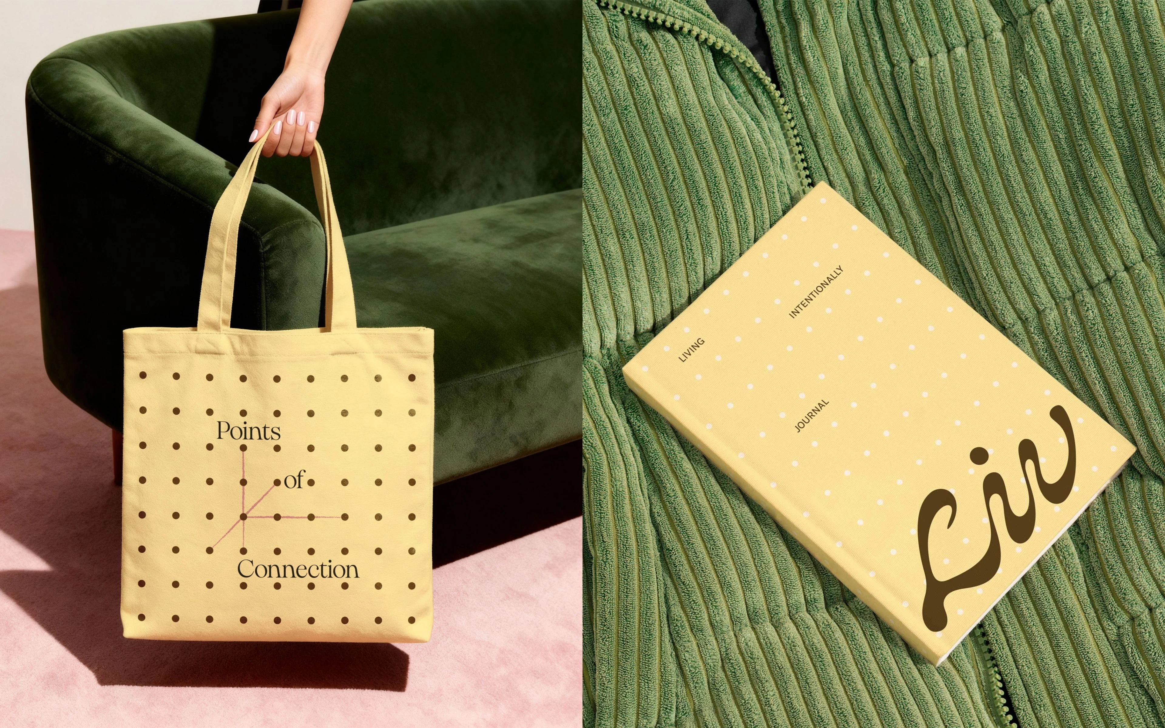
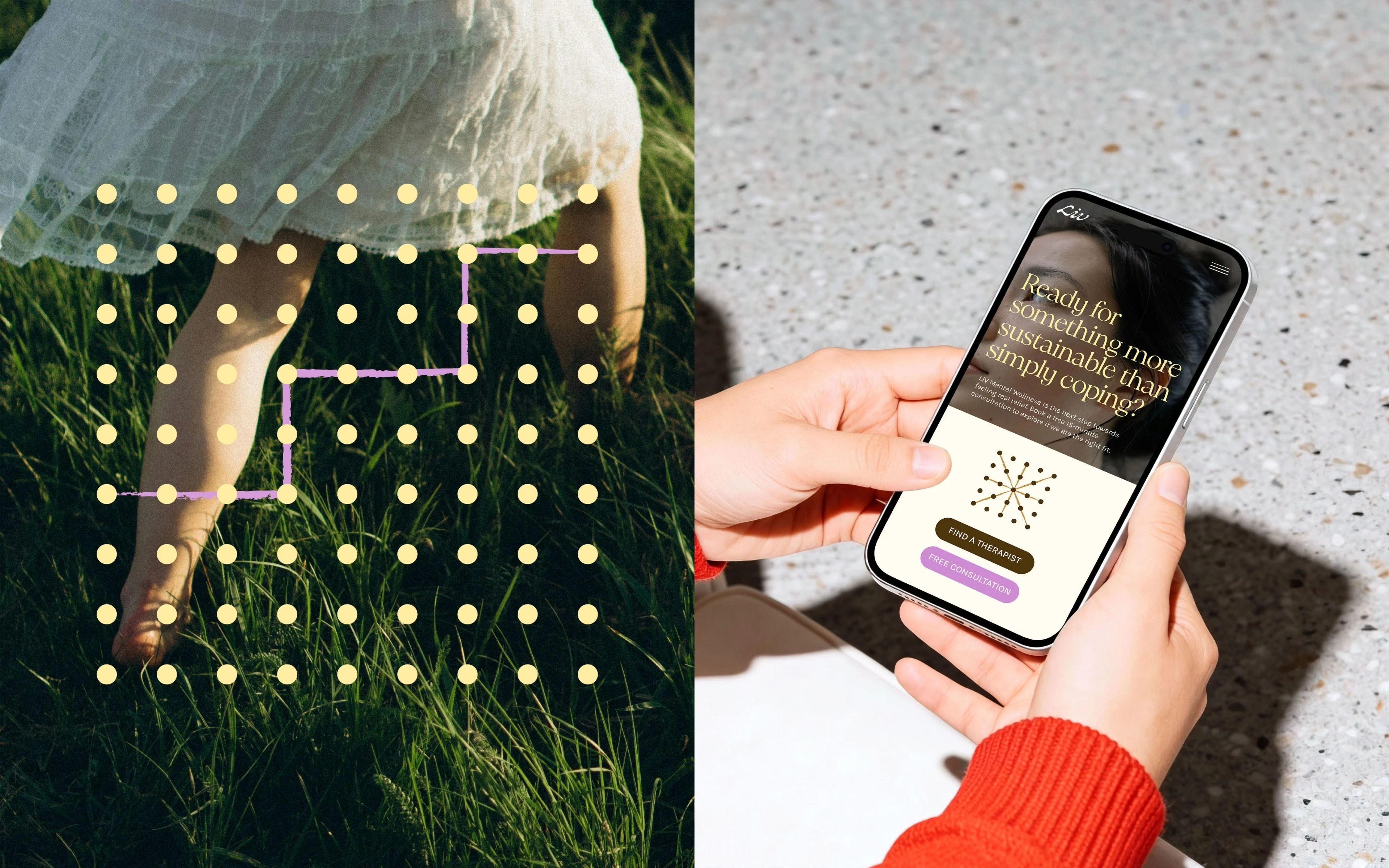
The identity is built around a modular system of dots and connecting lines. Each point represents an element of lived experience, while the connections between them represent the pathways through which clarity, regulation, and change become possible.
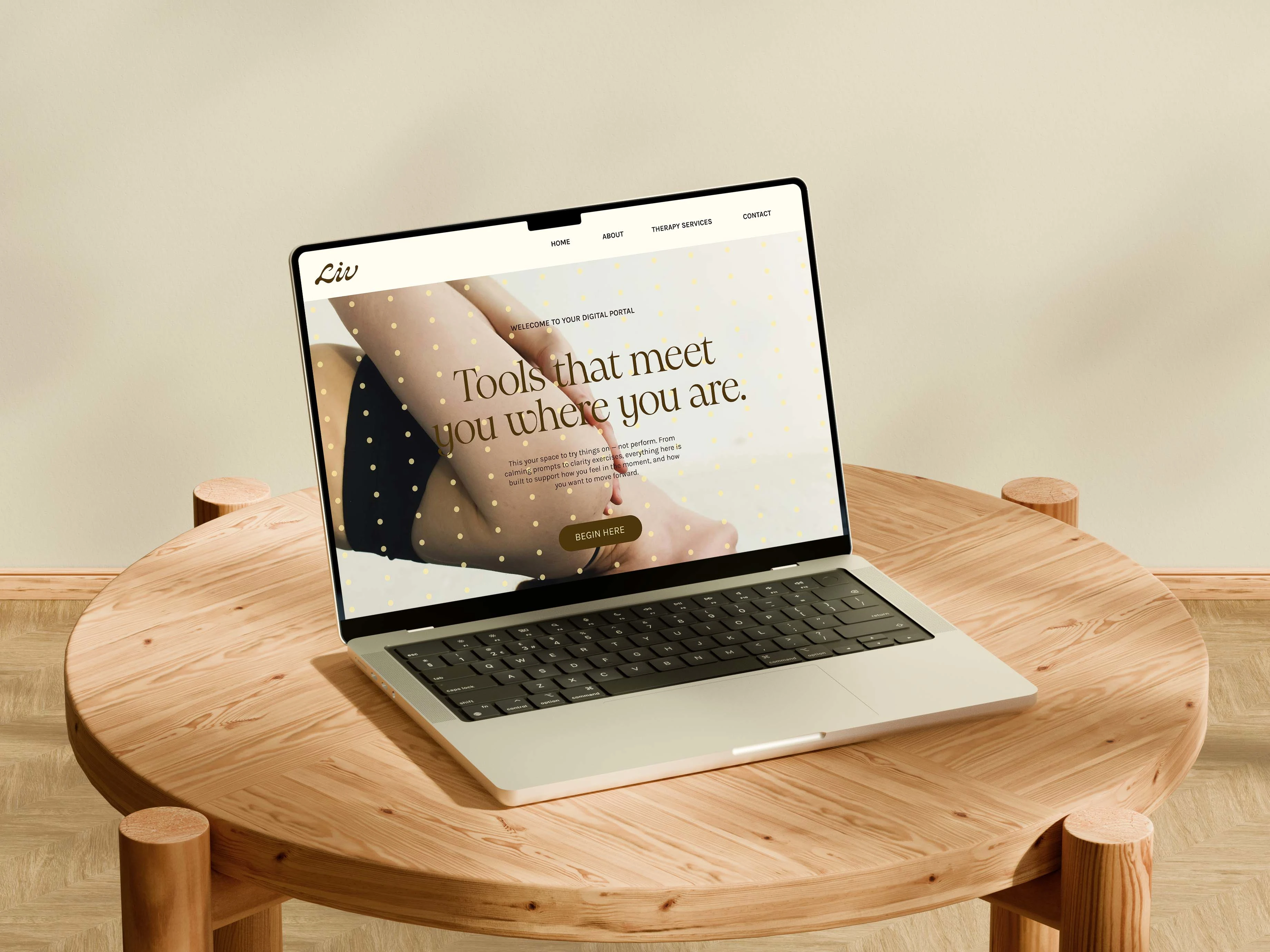
The Visual Identity |
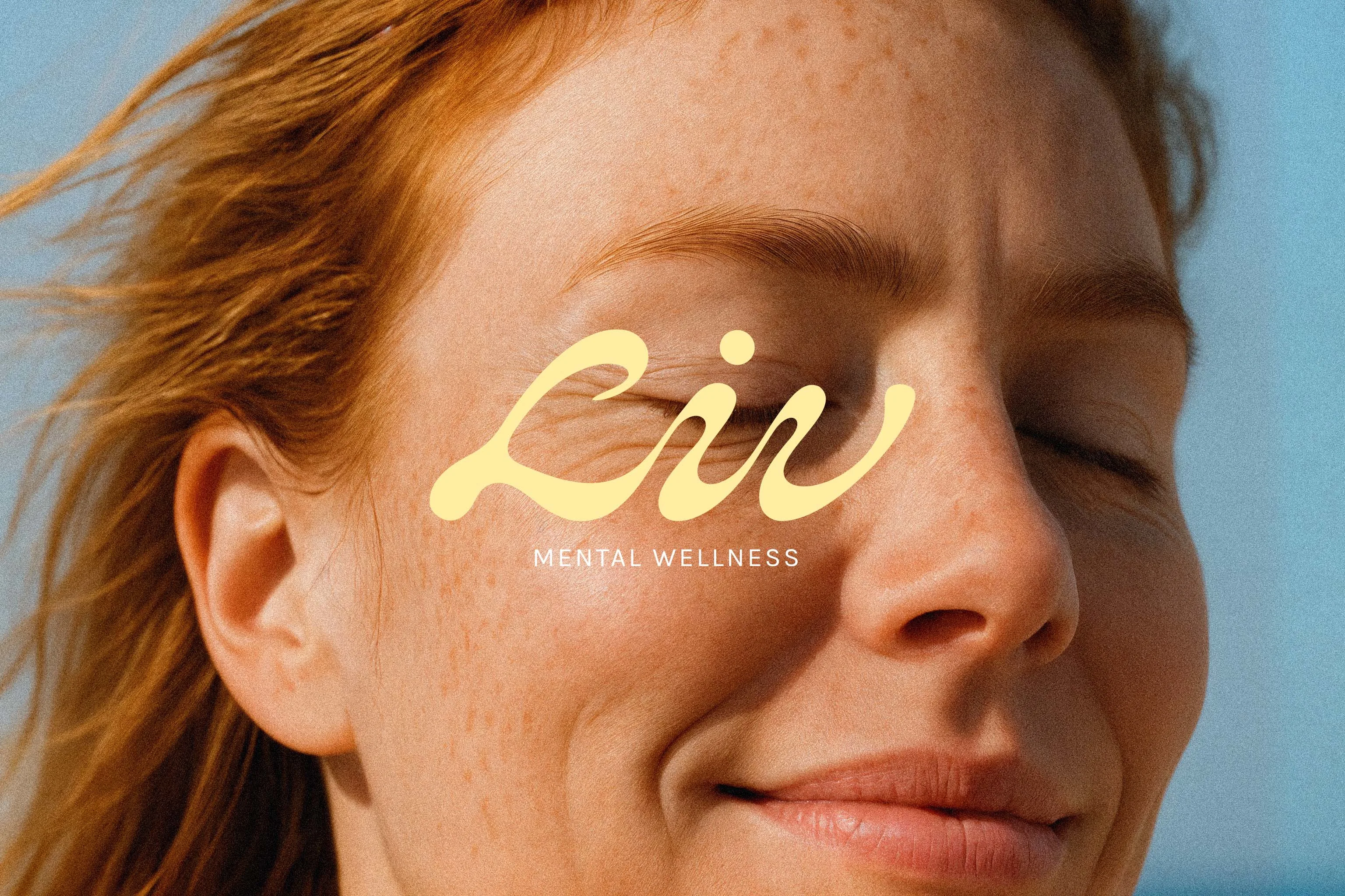
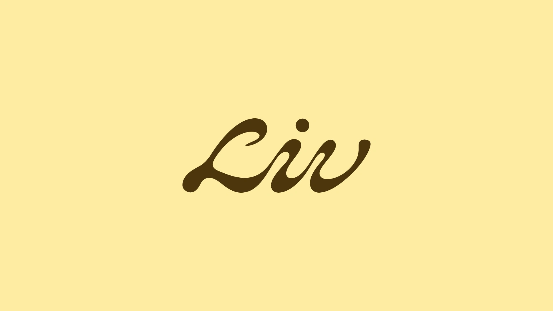
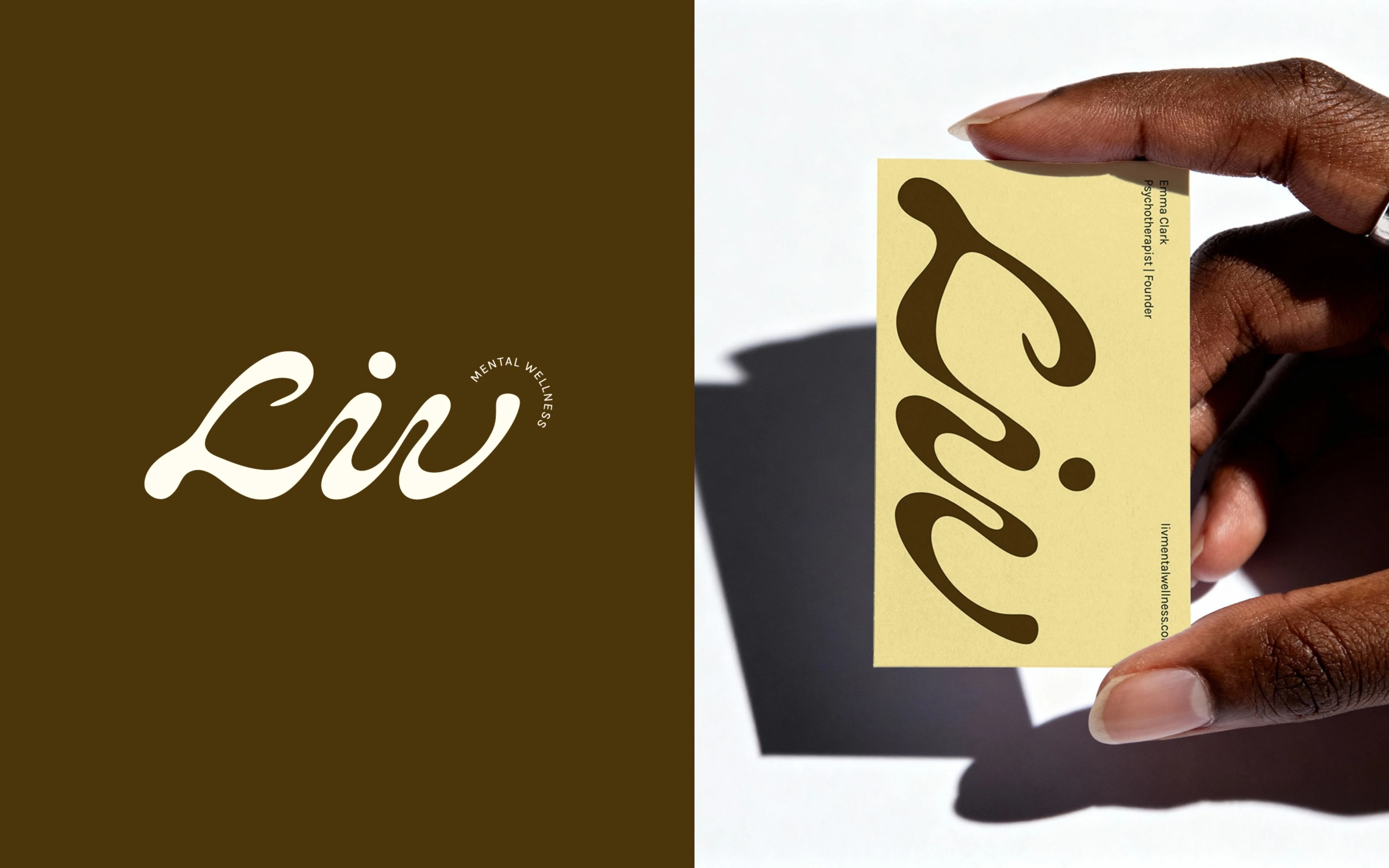
LIV’s primary logo is a custom, hand-drawn wordmark. The smooth, flowing forms transition effortlessly from one letter to the next, echoing the emotional continuity behind our big idea “Points of Connection”.
The graphic system translates the Points of Connection concept into a structured visual language built on a modular dot grid and four distinct connection lines, each representing one of LIV’s core pillars — mind, body, community, and relationships — and the connections between them.
The system follows a clear set of underlying principles that guide how these connections form and flow, ensuring each composition feels intentional and intuitive. This creates a flexible identity that consistently reinforces LIV’s central idea: that mental health emerges through connection.
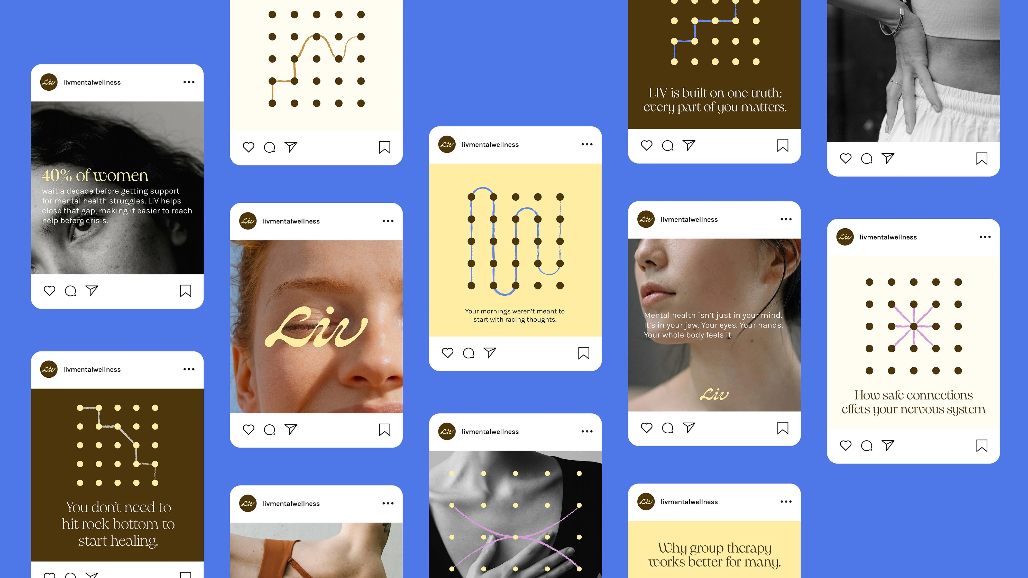
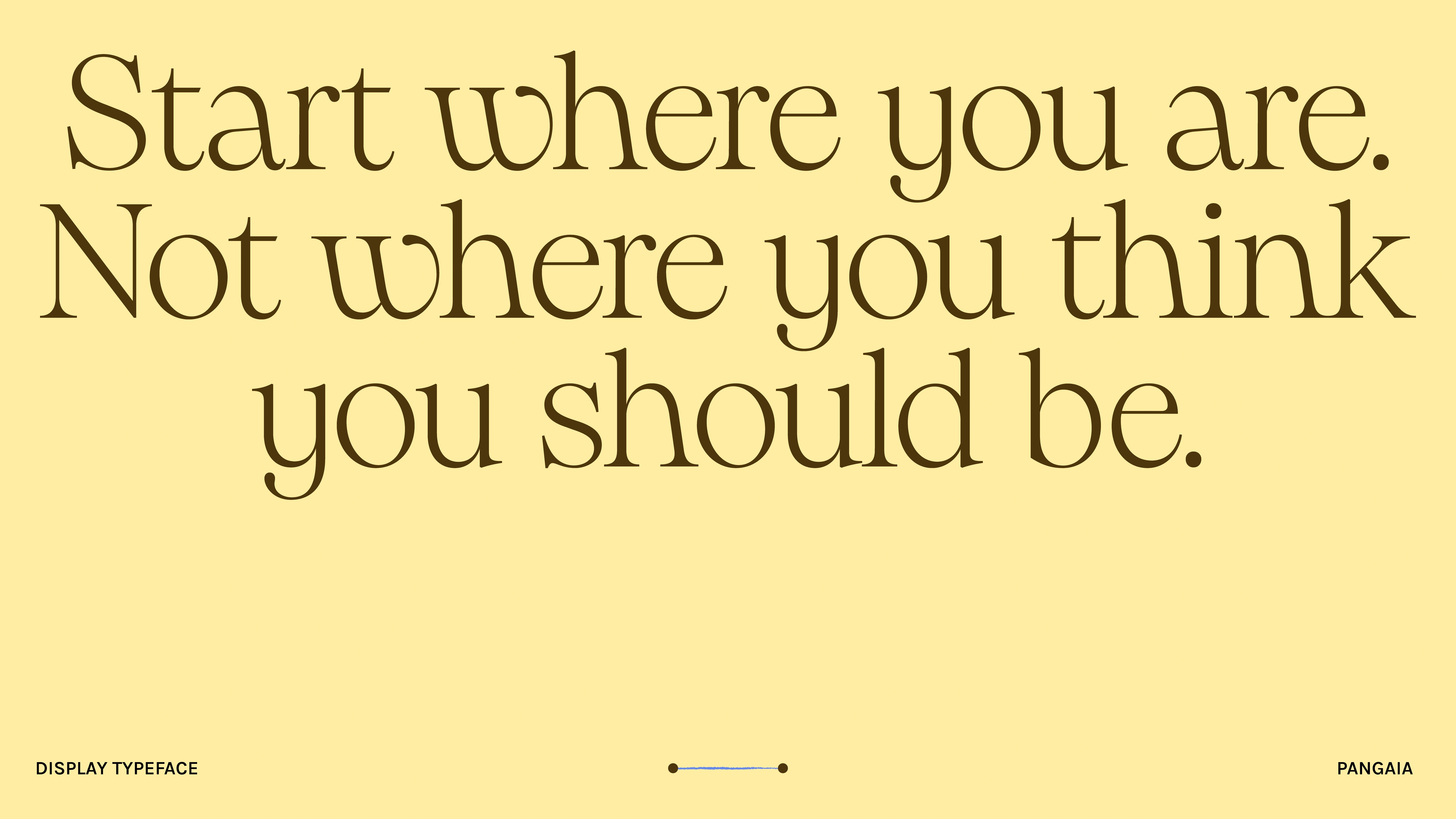
LIV uses Pangram Pangai as its display typeface. It balances warmth and authority — soft curves make it feel approachable and human, while sharper edges bring clarity and confidence. The result reflects LIV’s tone: calm, empathetic, and grounded in expertise.
The color palette was designed to feel warm, clear, and intelligent, avoiding the clinical blues and greens commonly associated with the category. It is anchored in a fresh, buttery yellow — a shade that feels optimistic and inviting, bringing a sense of lightness to the brand while remaining refined and modern.
Like this project
What the client had to say
I had a great experience working with Kajal! She made the process easy and took the time to really understand what I was looking for and bring it to life.

Emma Clark
Jun 27, 2025, Client
Posted Feb 18, 2026
Designed a modern brand identity for LIV Mental Wellness centered on connection, clarity, and an intuitive modular visual system.
Likes
1
Views
11
Timeline
Apr 23, 2025 - Jun 27, 2025
Clients
LIV Mental Wellness