Marino Sunrise - Luxurious Resort
Marino Sunrise
THE CLIENT: As a passion project, Marino Sunrise has been crafted into a luxurious Italian resort nestled along the enchanting coast of Sardinia. Its commitment to excellence creates an ambiance of serene romance, allowing the guests to fully immerse themselves in the splendor of their surroundings. Marino Sunrise offers a tranquil haven where every moment is an opportunity to relax, unwind, and savor the beauty of this idyllic destination.
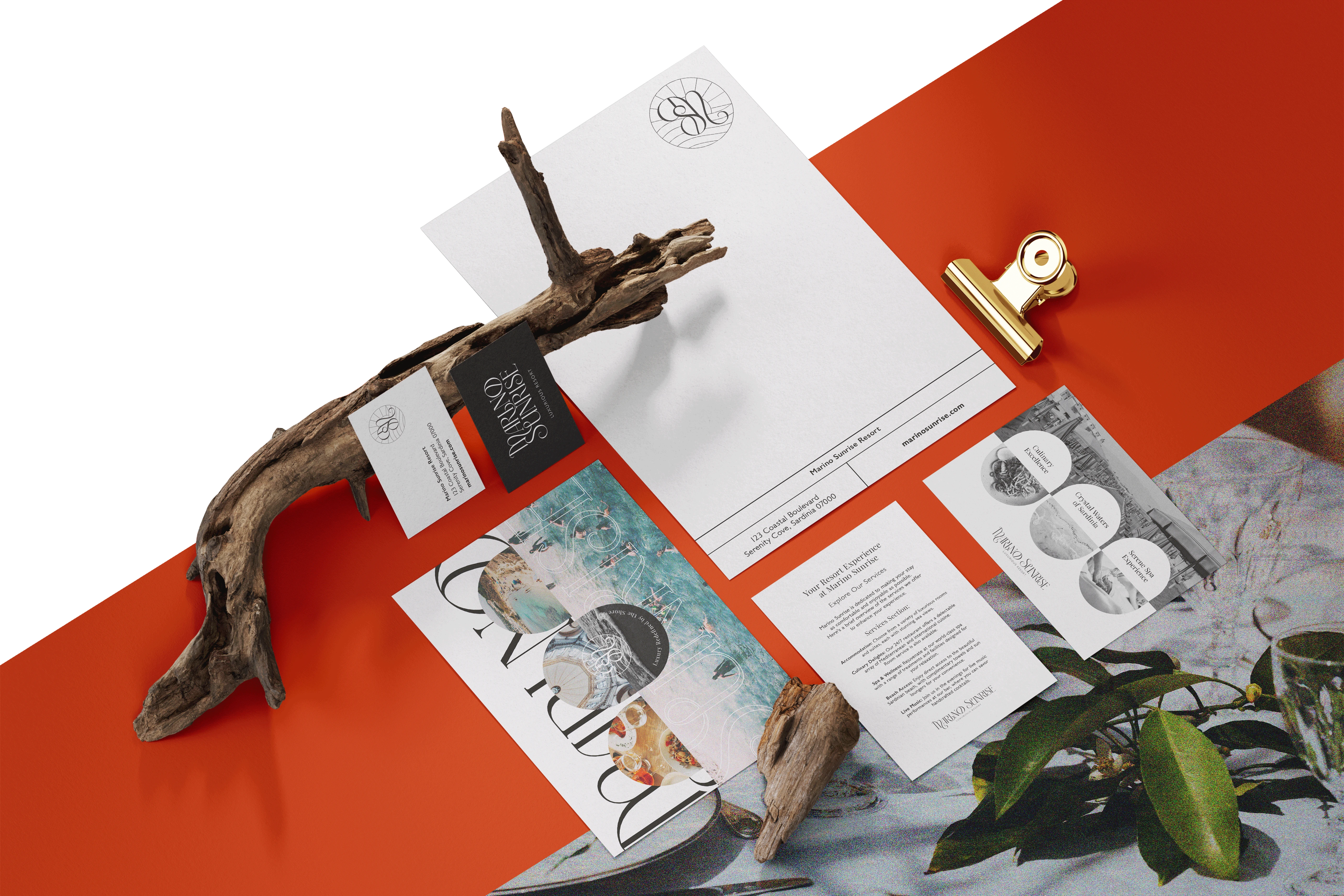
BRAND VALUES: Above all, Marino Sunrise is dedicated to providing the highest level of luxury, ensuring that every moment spent there is marked by opulence, sophistication, and comfort. It also embrace the serenity of the coastal location, offering a peaceful escape where guests can relax, rejuvenate, and connect with nature. These values represent the heart and soul of Marino Sunrise, driving the mission to provide a one-of-a-kind, unforgettable, and truly Italian coastal experience the its clientele.
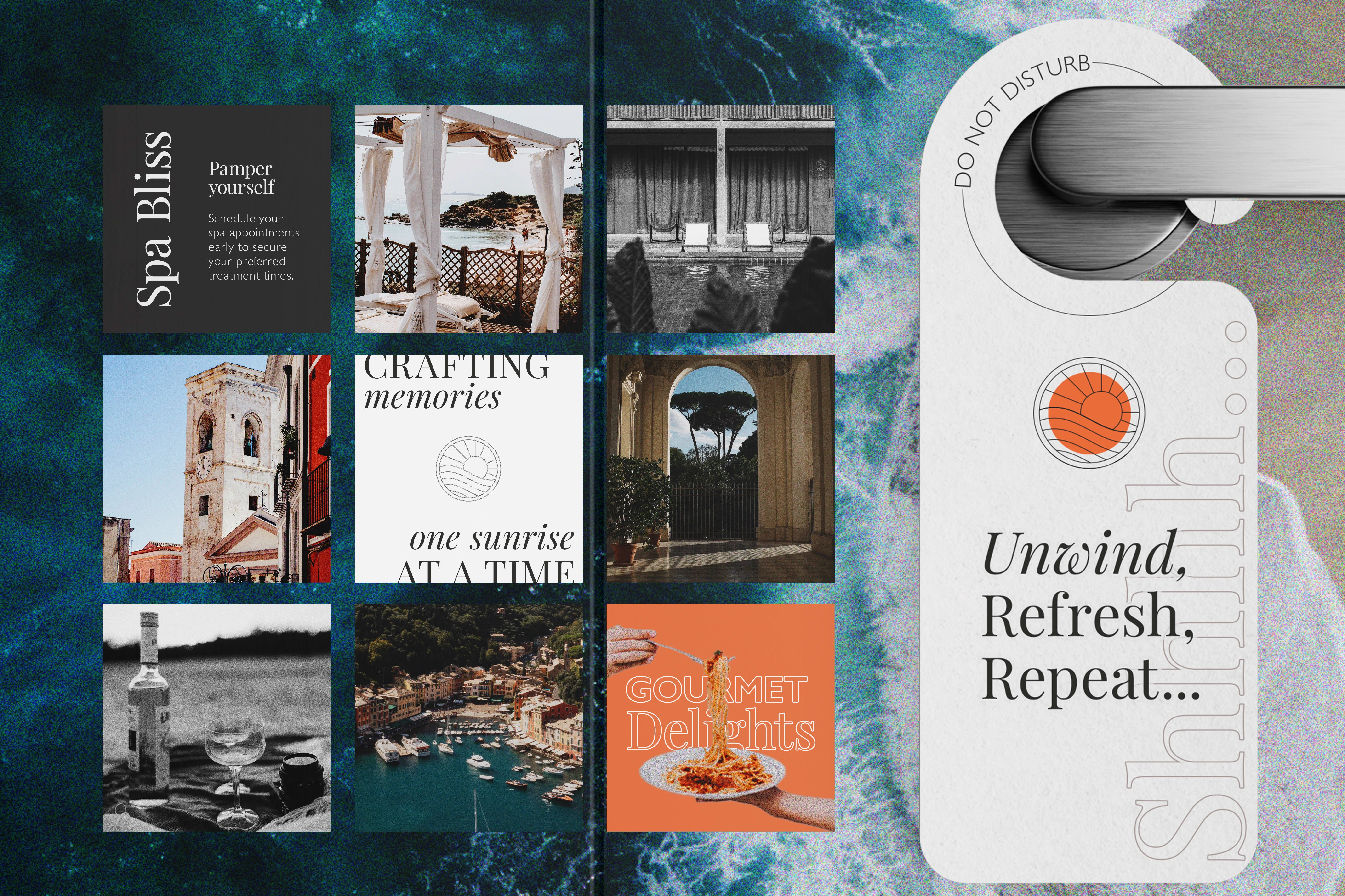
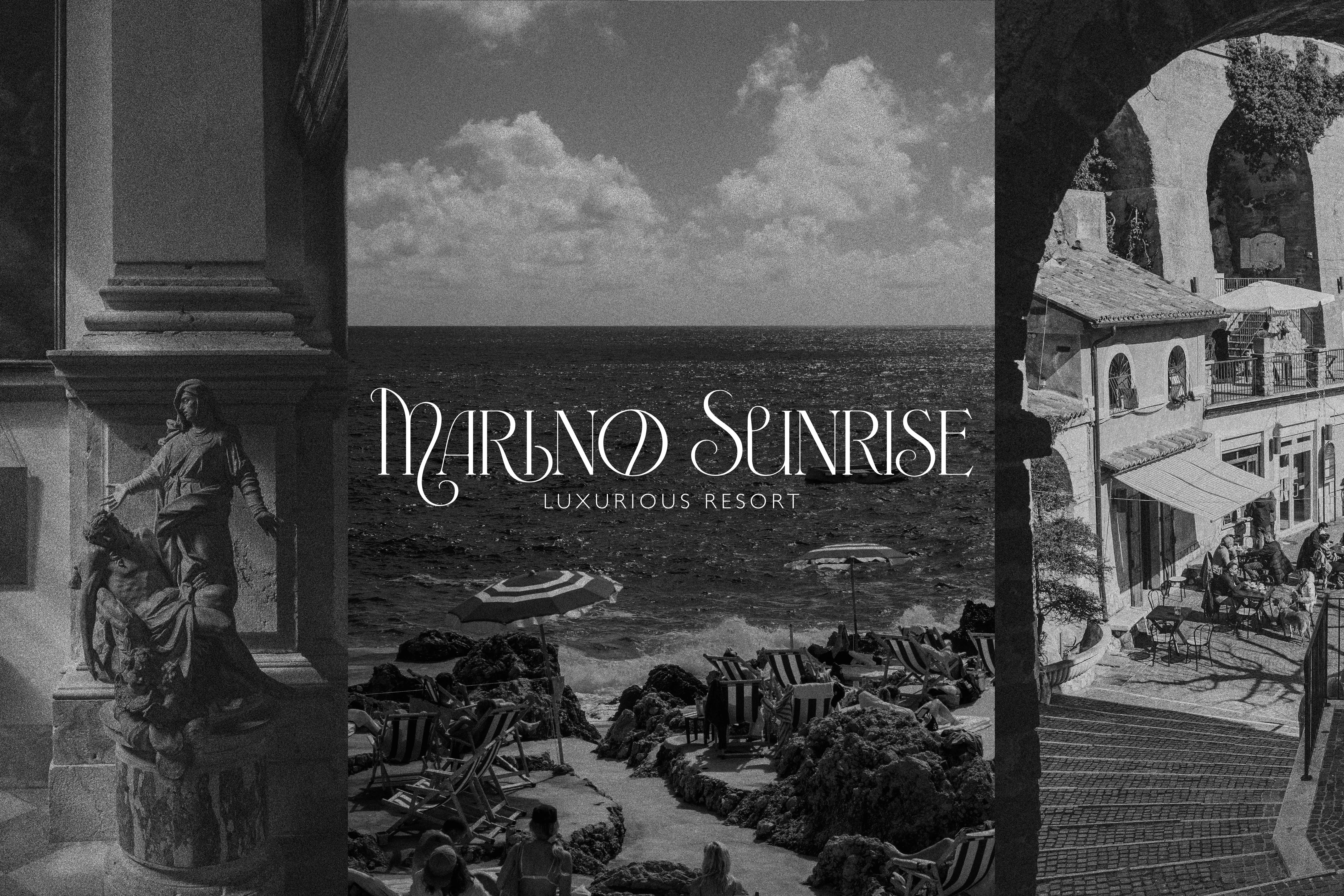
LOGO: The Marino Sunrise logo has three variants, each of them utilizes an elegant serif font, exuding a touch of romance that harmonizes beautifully with the brand's theme. The tagline, presented in a simple and minimalist font, complements the main logo, achieving a perfect synergy that reflects the commitment to sophistication and elegance. The third version, features intertwined letters 'M' and 'S' within a distinctive brandmark. The brandmark itself is an oval shape, with a rising sun emerging from the tranquil sea. These elements collectively underline our brand's connection to the sea, dedication to sophistication, and commitment to minimalism.
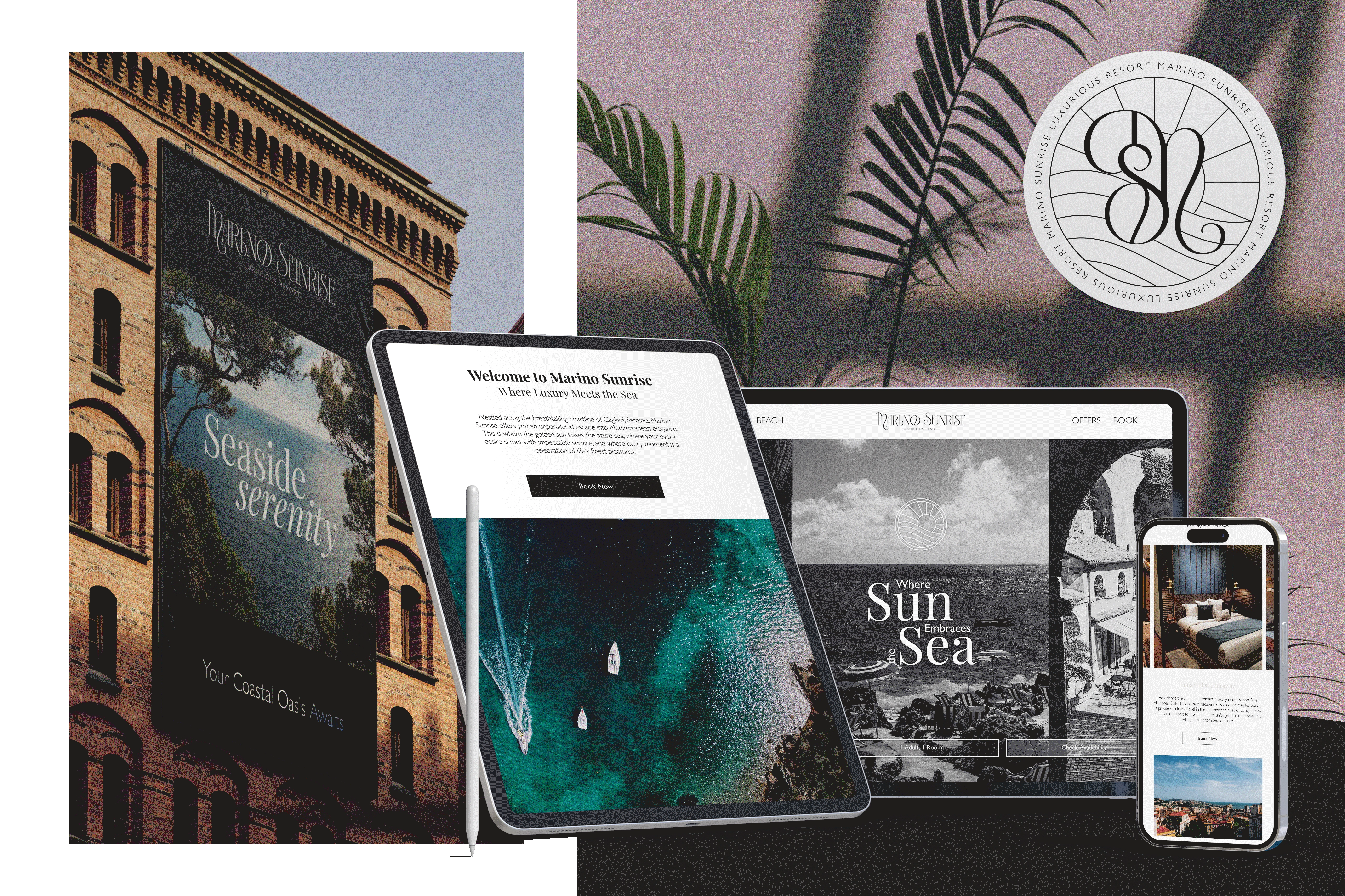
BRAND COLORS: The color palette of Marino Sunrise has been thoughtfully curated to embody a sense of chic sophistication. It adheres to a minimalist aesthetic, primarily featuring classic black and white as the foundational colors. This monochromatic tone gracefully extends to numerous accompanying visuals, where black and white photography adds an element of timelessness. To punctuate the brand with a touch of vibrancy and connection to the coastal ambiance, subtle accents of orange have been thoughtfully introduced. Orange, reminiscent of the warm hues that grace the sky during sunrise, is an ideal choice to represent the 'Sunrise' component of the resort's name. This inclusion of orange in the branding invites guests to forge a deeper connection with the natural beauty of the Mediterranean surroundings, invoking the gentle warmth of the sun and the golden allure of a seaside sunset.
Like this project
Posted Oct 22, 2023
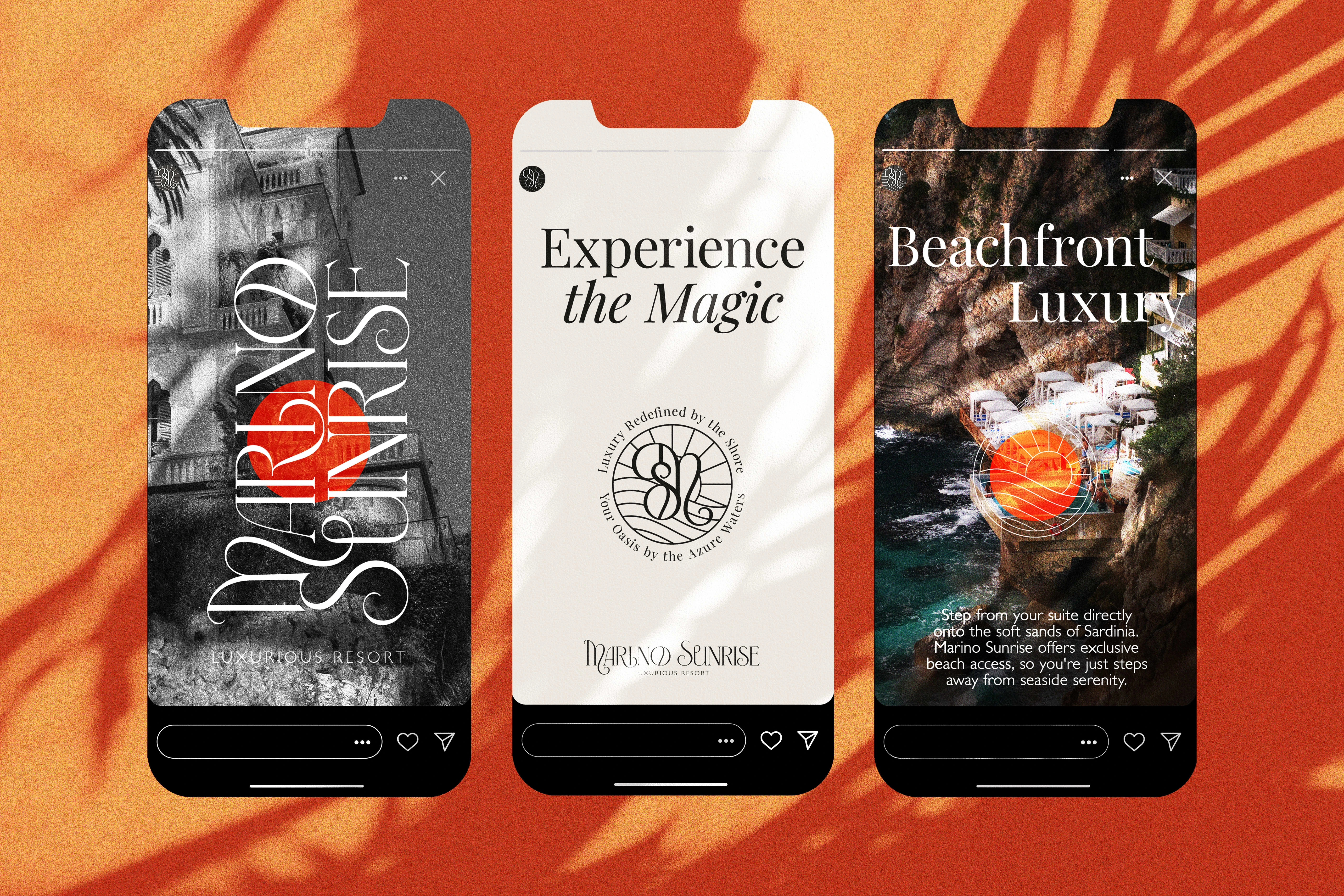
Branding for a passion project - Marino Sunrise. I prepared an entire brand identity, complete with logo pack, stationery, social media posts & website design.

