Karo - Complex Branding
THE CLIENT: This branding I created for my friend who is a personal shopper. Karolina is a bright and funny person who loves sustainable fashion. She already has a successful TikTok account and is working on gaining followers on Instagram.
BRAND VALUES: As personal shopper Karolina aims to help her clients find their own style and learn how to express themselves through clothes. She does not conform to beauty standards and is a firm believer in being yourself. Karolina wants to educate her customers about the dangers of fast fashion and clothes hoarding, while also being understanding of budget limitations and different preferences among people. Bottom line is - Karolina wants her customers to be able to make informed choices. And because she loves to focus on sustainable materials and conscious fashion, as well as body positivity and building confidence, the entire mood of the brand is safe, inviting and friendly.
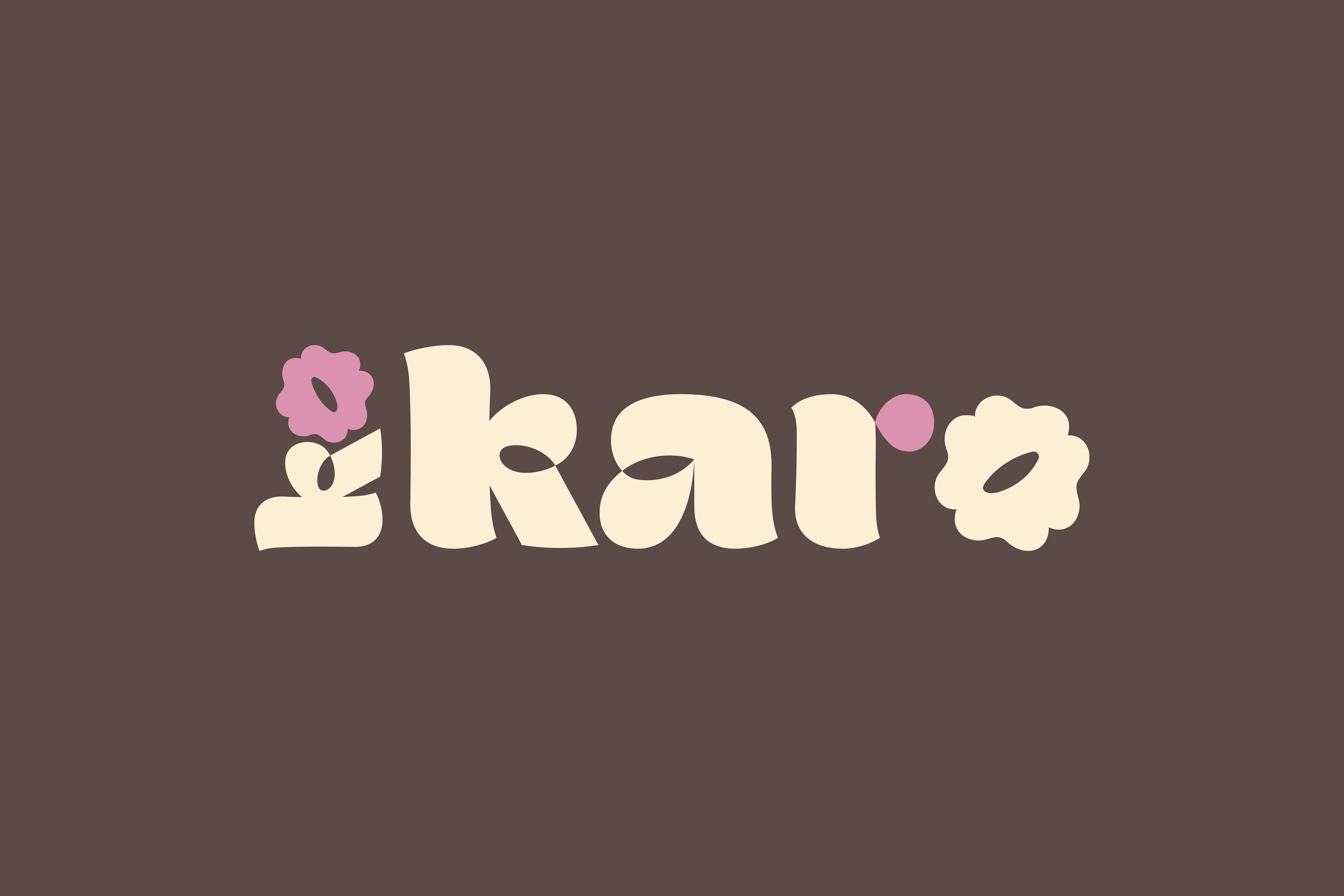
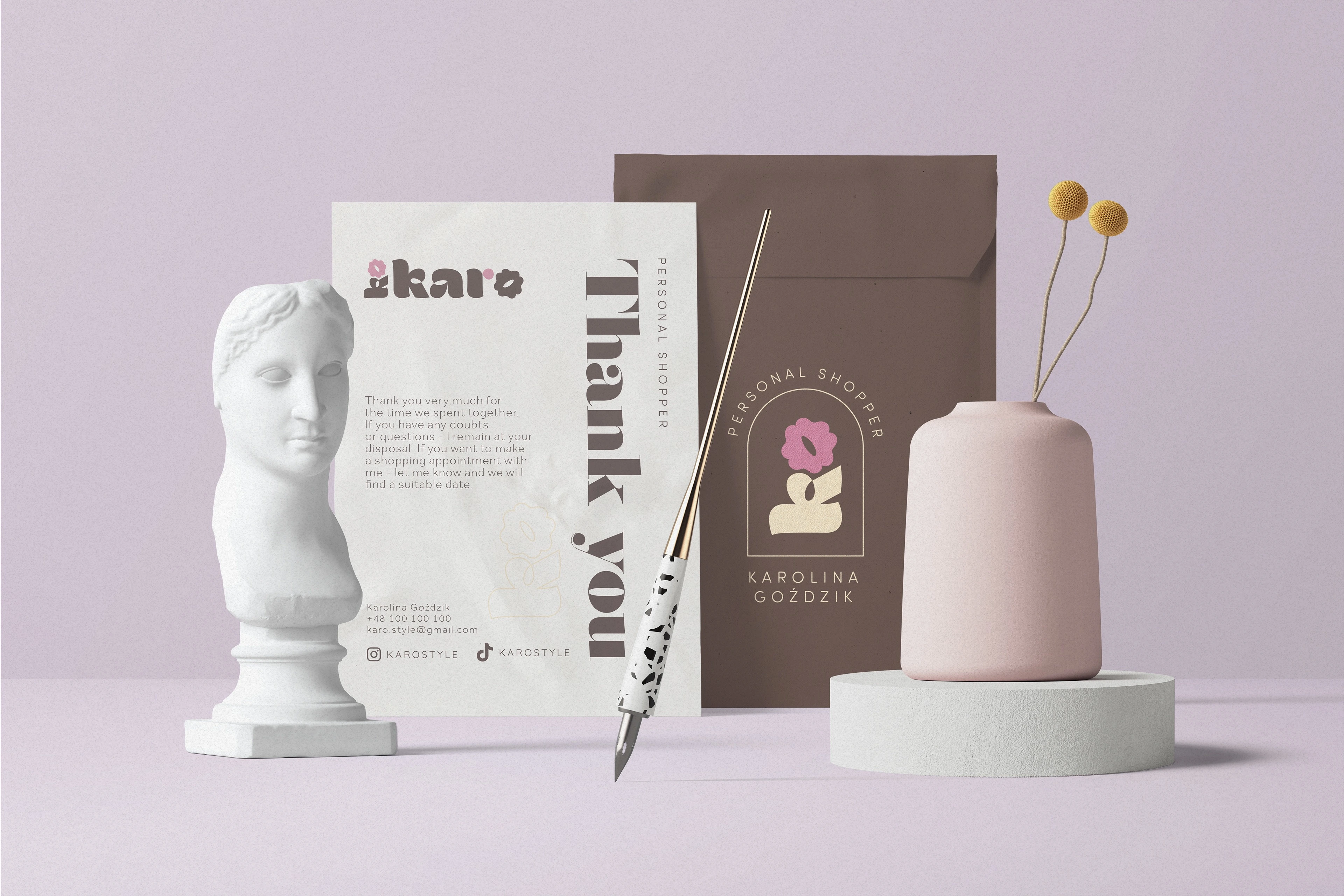
LOGO: The name of the brand is based on Karolina's name - hence Karo. Interestingly, her last name translates to carnation, which inspired the brand mark. Font used in the logo is refreshing and cheerful - just like Karolina's personality. A script lettering looks happy and cheerful, which makes the viewer feel invited and curious. The letters are bold and cartoonish, inspired by y2k fashion popular amongst the gen z (a big portion of Karo's existing following on TikTok). Letter O is shaped like a flower crown and together with the first letter K, when rotated they form a flower.
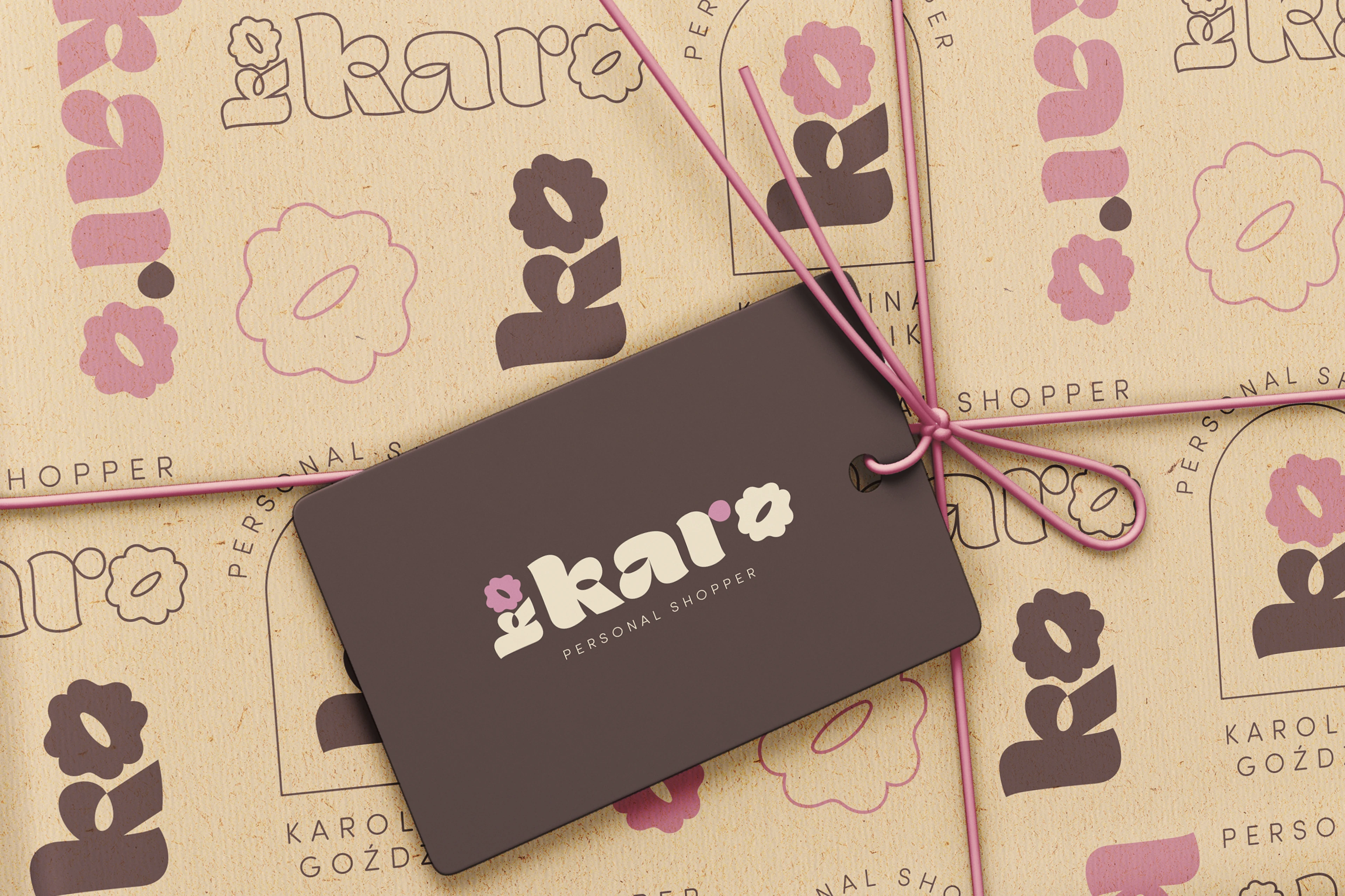
BRAND COLORS: Having your wardrobe seen and your style judged by a stranger is a stressful procedure, so in this branding we needed to invoke trust instead of making Karolina feel intimidating. Which is why, in opposition to the strong lettering, KARO's colours are warm and gentle. However, beige and muted brown bring some elegance to the otherwise light-hearted design to emphasize Karolina's professionalism and class. A pastel shade of pink is an eye-catching colour distinguishing certain elements.
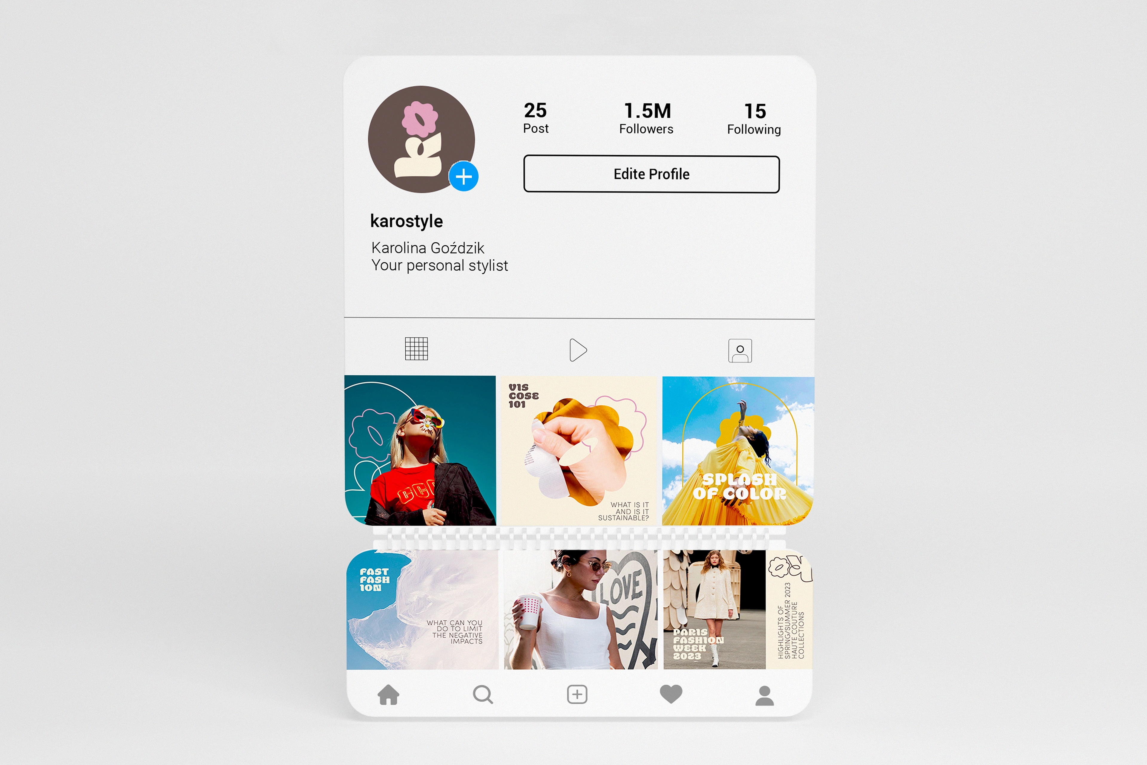
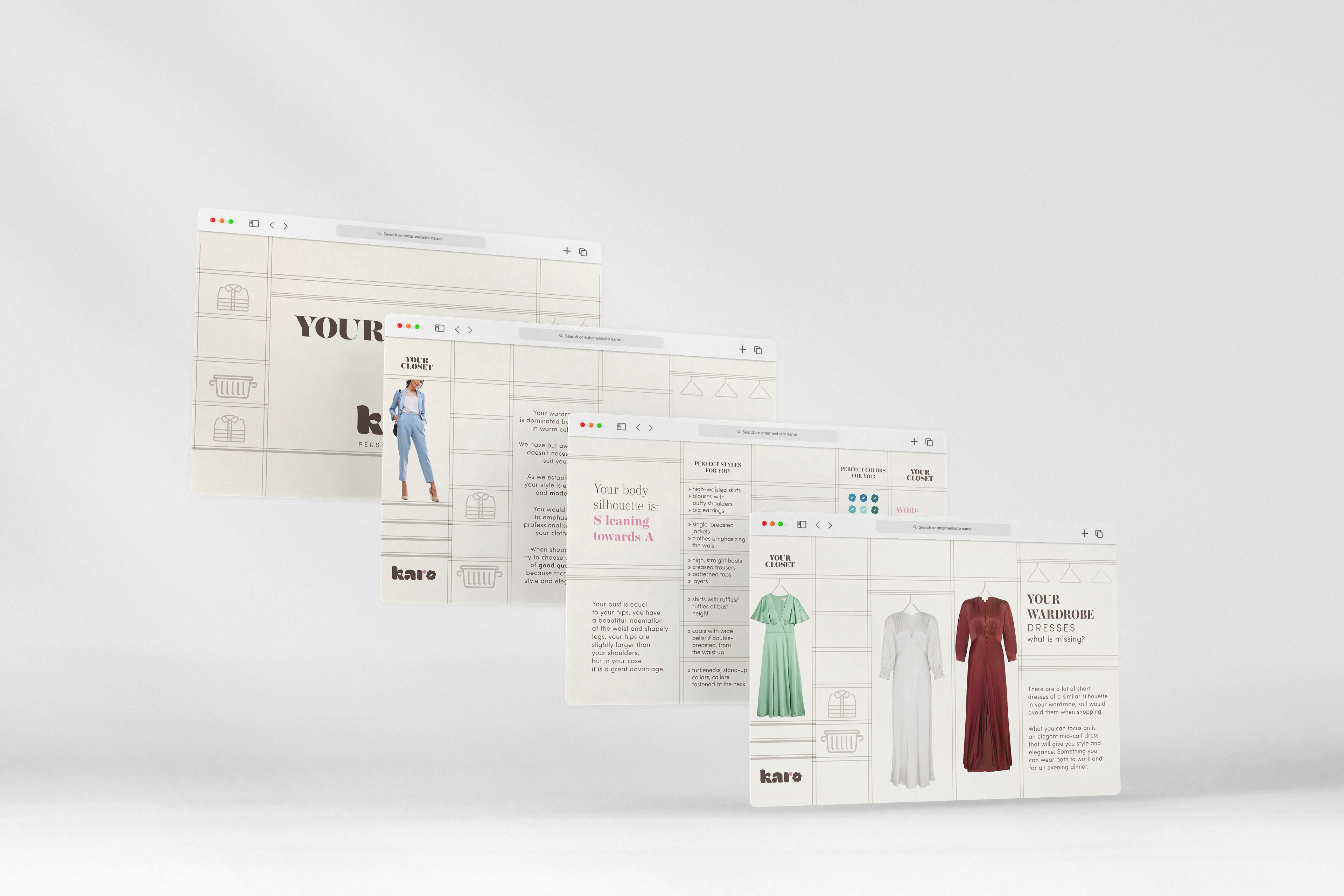
BRAND ELEMENTS: What Karolina needed the most at this stage, was a template of a presentation she can send to her customers. What she calls "Your Wardrobe" is essentially a virtual tour of a closet with collection of the client's clothes, a section of what is currently missing, outfit ideas and tips on what to avoid.
Like this project
Posted Aug 23, 2023
Branding created for a personal shopper. I prepared an entire brand strategy, complete with a logo pack, stationery, social media and presentation templates.

