Melissa Kelly - Brand Identity
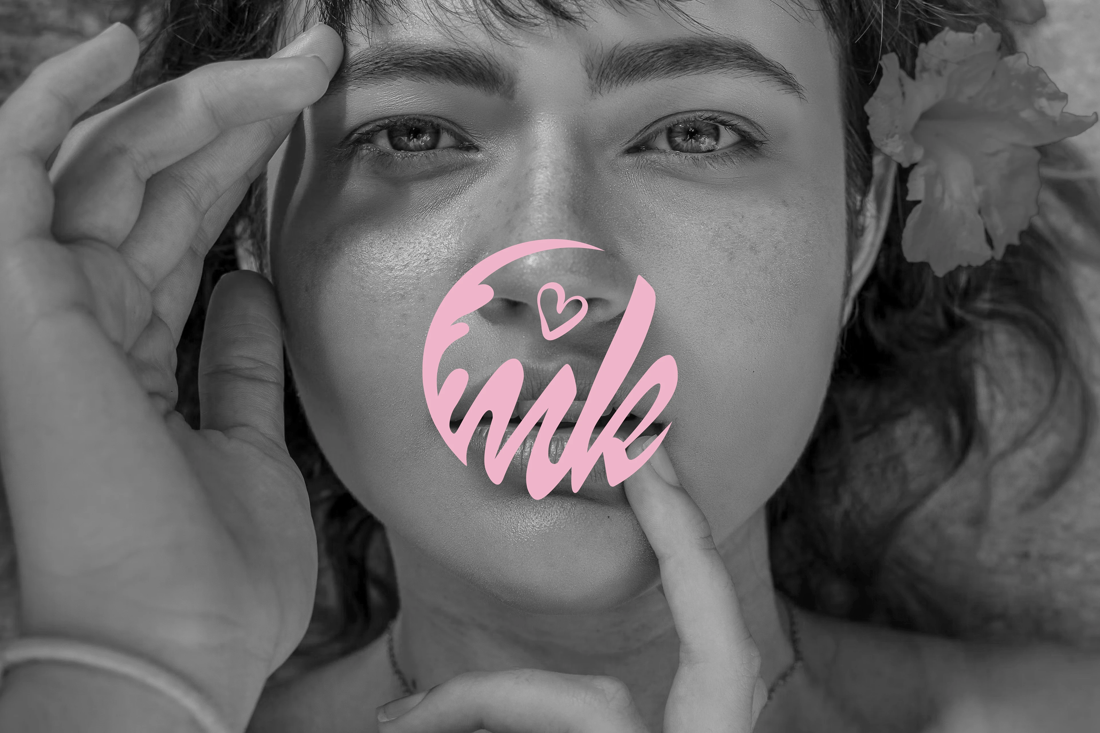
THE CLIENT: This project has been inspired by my friend's journey to become a self-employed cosmetologist. Melissa is full of smiles and energetic, but above all she's an ambitious person, who is constantly improving her skills never stops learning.
BRAND VALUES: Melissa, like many other beauticians, works hard to bring out what's best from her customers. However, it's the never ending pursuit of knowledge is what makes her unique and gives her clients an opportunity to experience all benefits of modern cosmetology. She strives to incorporate latest innovations and new technologies to help her clients feel better in their skin. Melissa's grasp of skin biology and complexity of human bodies impresses customers whenever she chooses suitable procedures and explains treatments, building the trust people put in her.
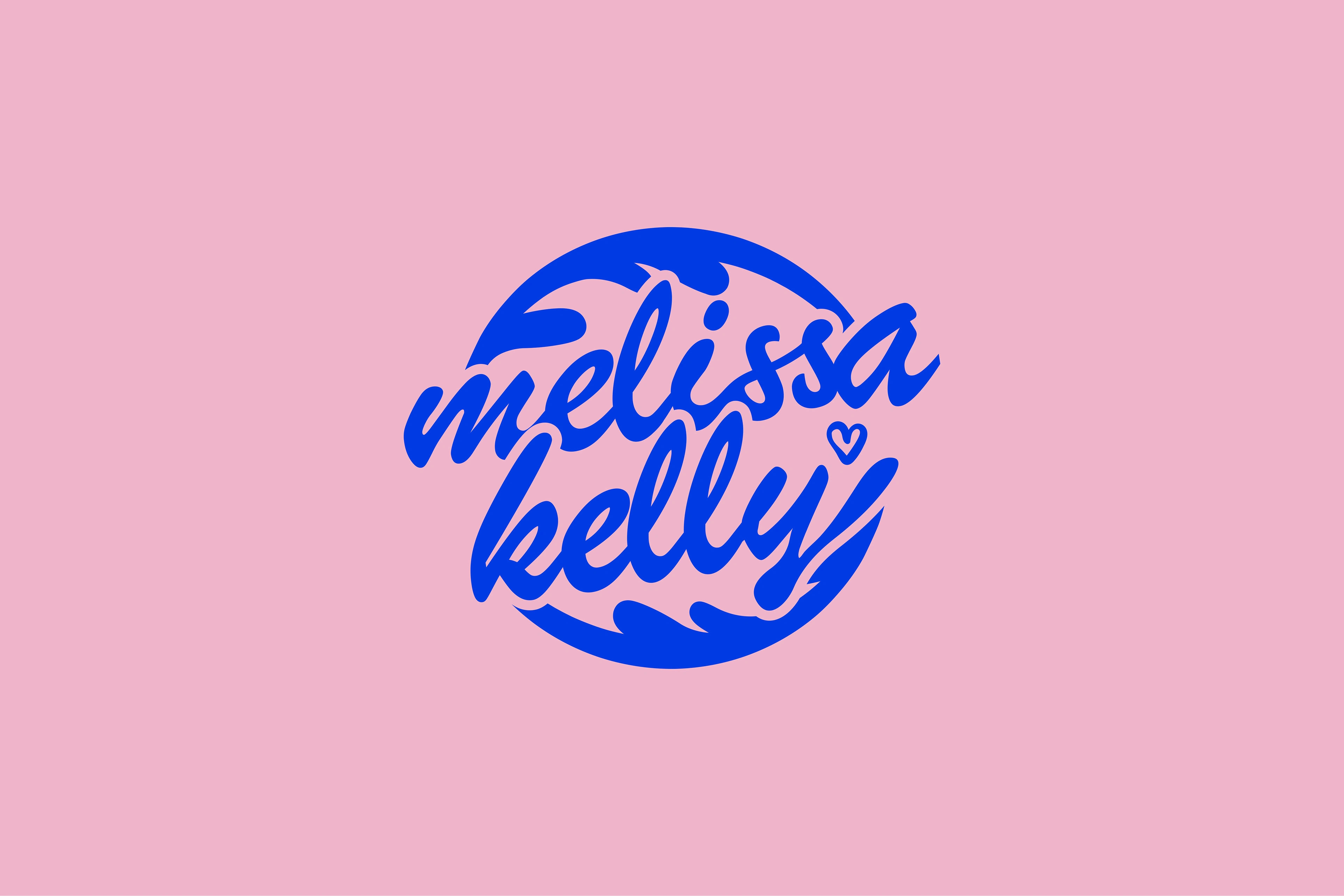
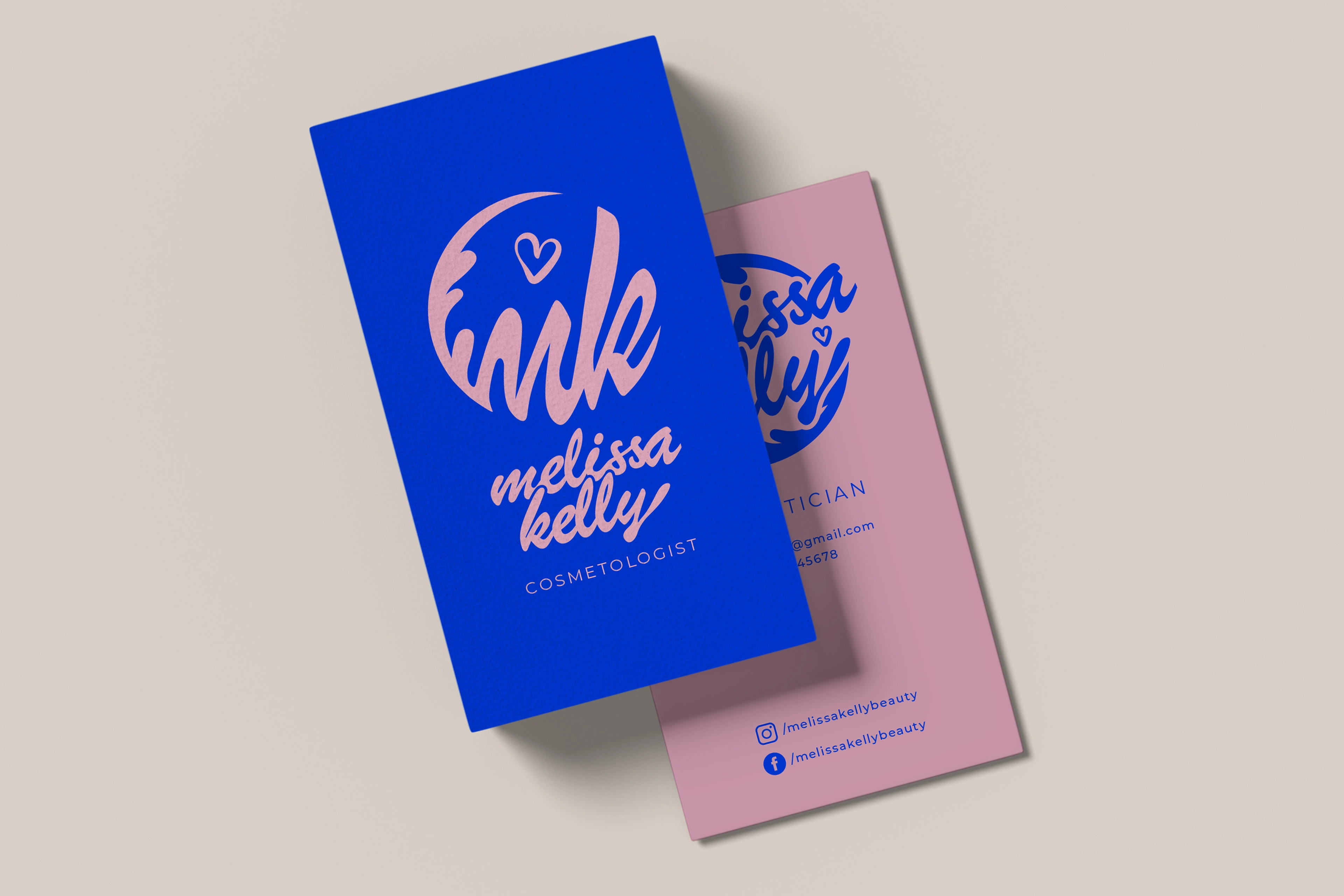
LOGO: There are two variant of the logo. One focuses on the brand mark, which consists of letters M and K (Melissa's initials), a branch with leaves and a hand-drawn heart. Together they live in a circle, which makes the brand mark easy to use on social media, stickers, etc.. The second version utilizes the shape of a circle made of leaves, however in the middle, instead of initials, we have Melissa's full name. The elegant handwritten text is feminine and a little but fancy, so in order to emphasize Melissa's easy-going personality and her warm approach to the clients, no letters have been capitalised.
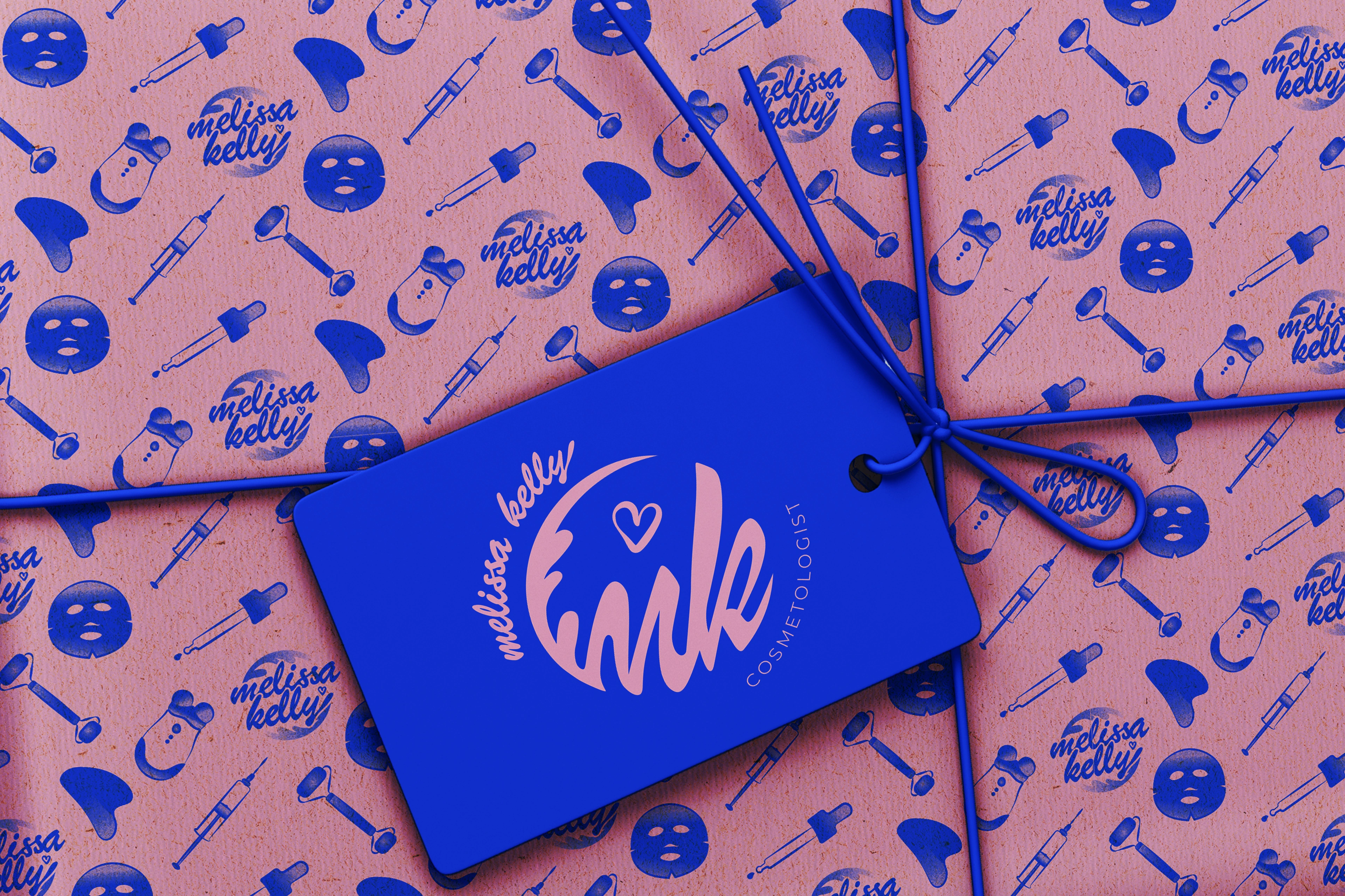
BRAND COLORS: To differentiate Melissa from other beauticians, the colours of her brand are an eye-catching pair: a bold electric blue - here a slightly more interesting variation of the hue associated with medical field, a one that will express her love for modern discoveries - and powdery baby pink - a tone serving as a touch of femininity and softness. Those two contrasting colours create a distinguishable composition, which ultimately make Melissa's brand stand out from the crowd of similar looking beauticians.
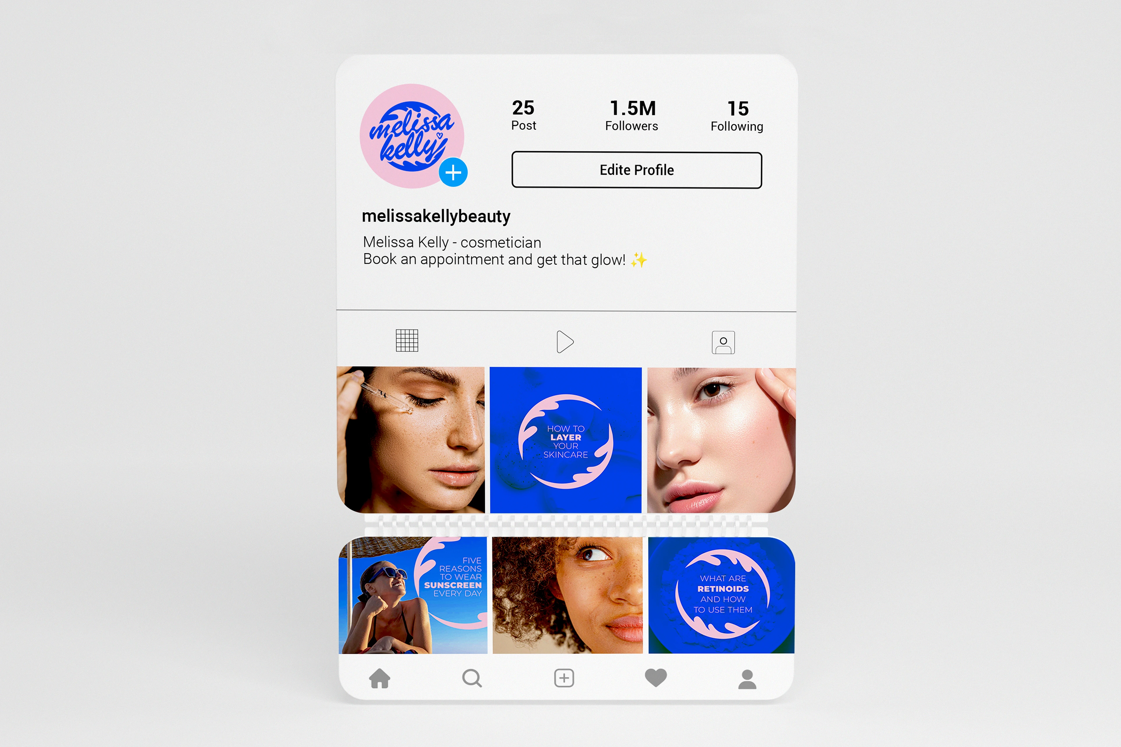
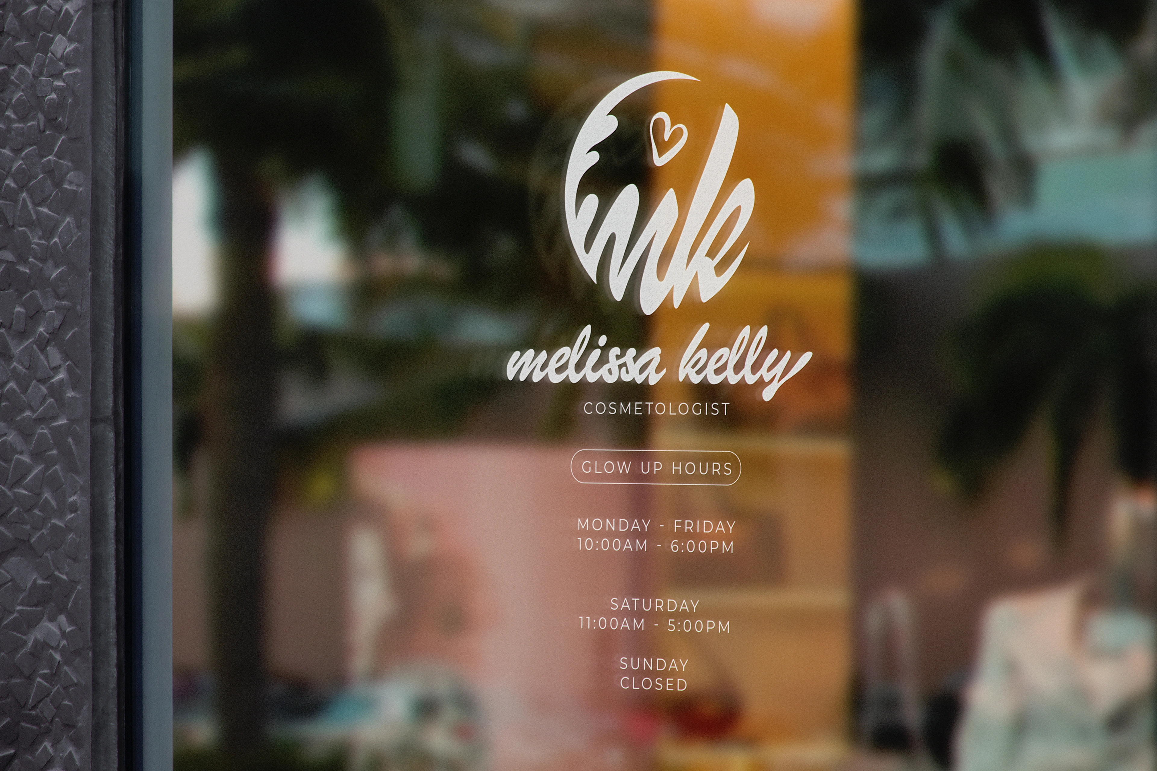
BRAND ELEMENTS: As additinal element of branding, I've drawn a set of icons representing skincare tools that have also been turned into a pattern. Each icon can also be used separately, for example in social media and for other advertising purposes. As the logo is quite prominent, other forms of communication use a simple, sans serif font, that will harmoniously accompany the rest of the branding and not overshadow it by creating a visual competition for the viewer.
Like this project
Posted Aug 23, 2023
Complex Brand Identity created for a beauty specialist.

