Designing a Marketplace Platform for Better Conversion
Ferdi @Inkspace
Story
For a creative platform, discovery is everything, helping people find something that makes them think: this is it. For RRSlide, that wasn’t happening.
Funnel is scattered, and users were dropping off instead of being guided deeper into the flow within the website.
In terms of the brand, it didn’t help them either. In RRSlide’s case, the visuals felt too generic, didn’t signal trust, and didn’t match expectations for a creative platform. Instead of building confidence, the brand created doubt.
From that discovery, we led the full redesign initiatives from the branding, design, illustration, to the full code implementation of the platform.
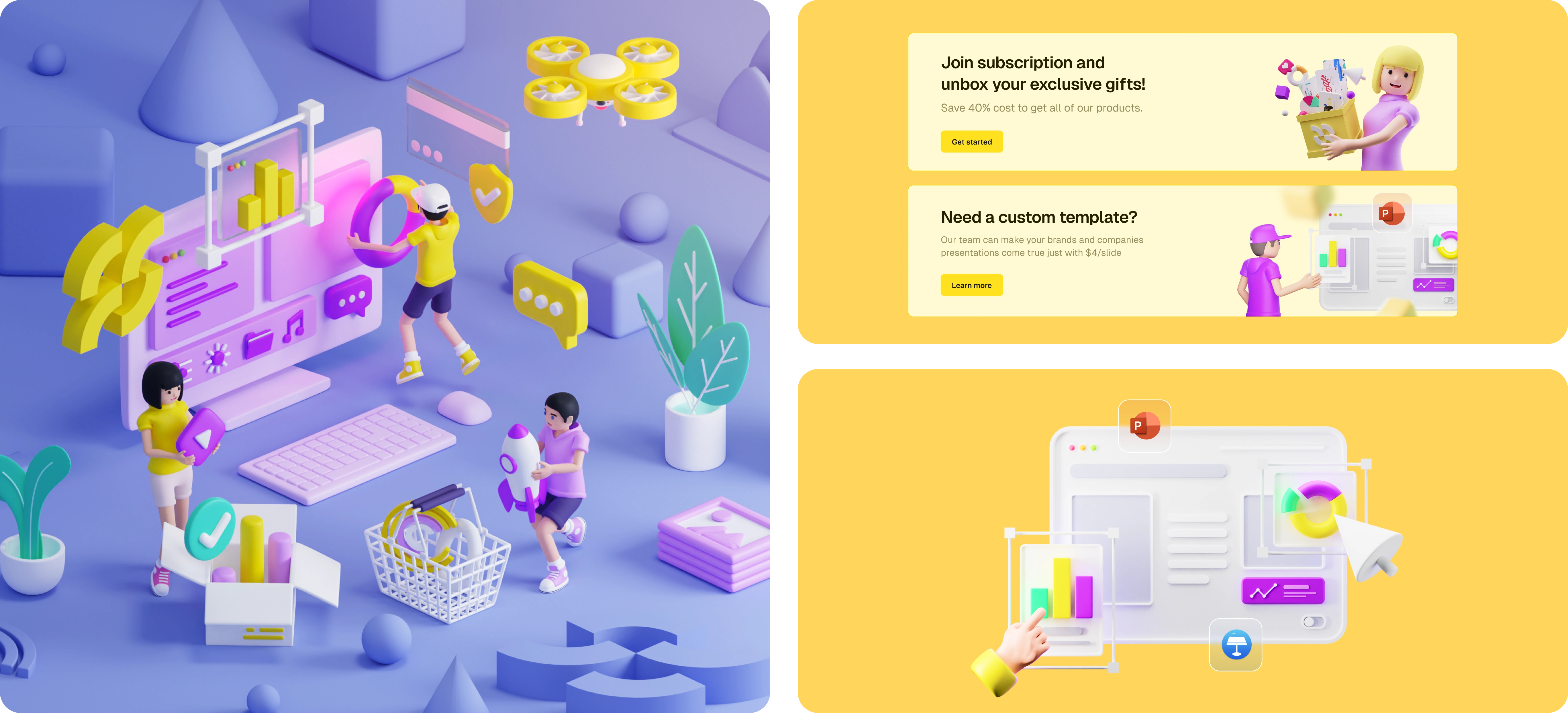
A more navigable home for a complex product ecosystem
The previous homepage relied too much on search, which made it harder for people to naturally discover items. We changed the main CTA to Explore all items so users could browse more freely and guided down the funnel. We also added item categories to the header, making it easier to jump into what they’re actually looking for without needing to search.
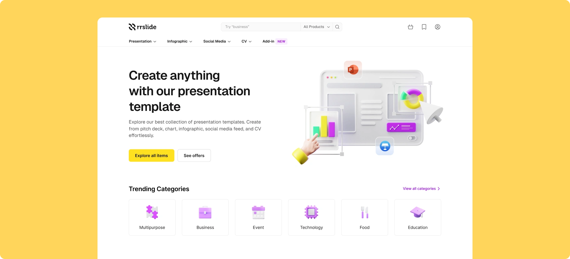
The homepage
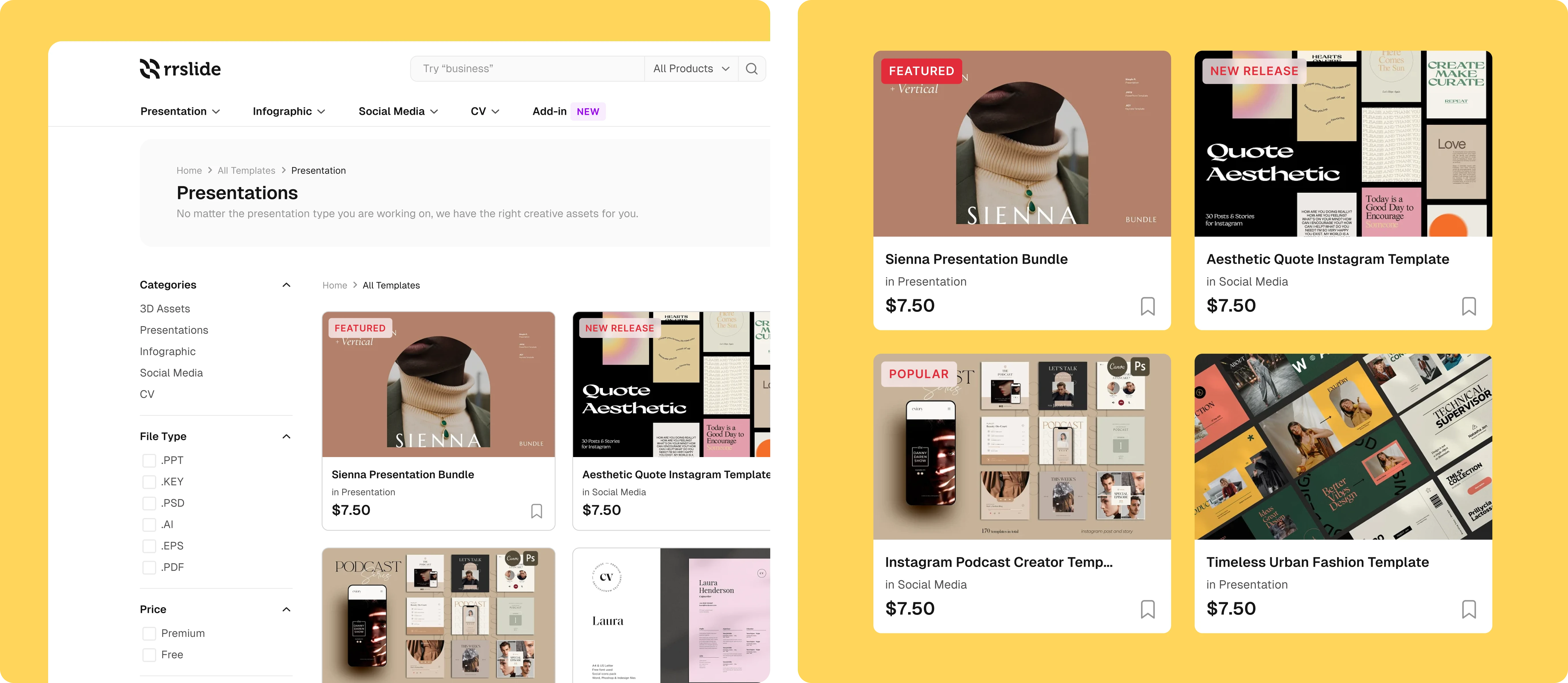
Improving how items are discovered
Item discovery is where marketplaces usually win or lose. If people can’t find what they’re looking for, the funnel breaks early. We saw this happening on the explore page, where search results often felt slightly off from users intent.
To fix that, we added filters right after search, clarified and improved the item categories on the backend, and introduced subtle badge cues to gently steer users toward better options.
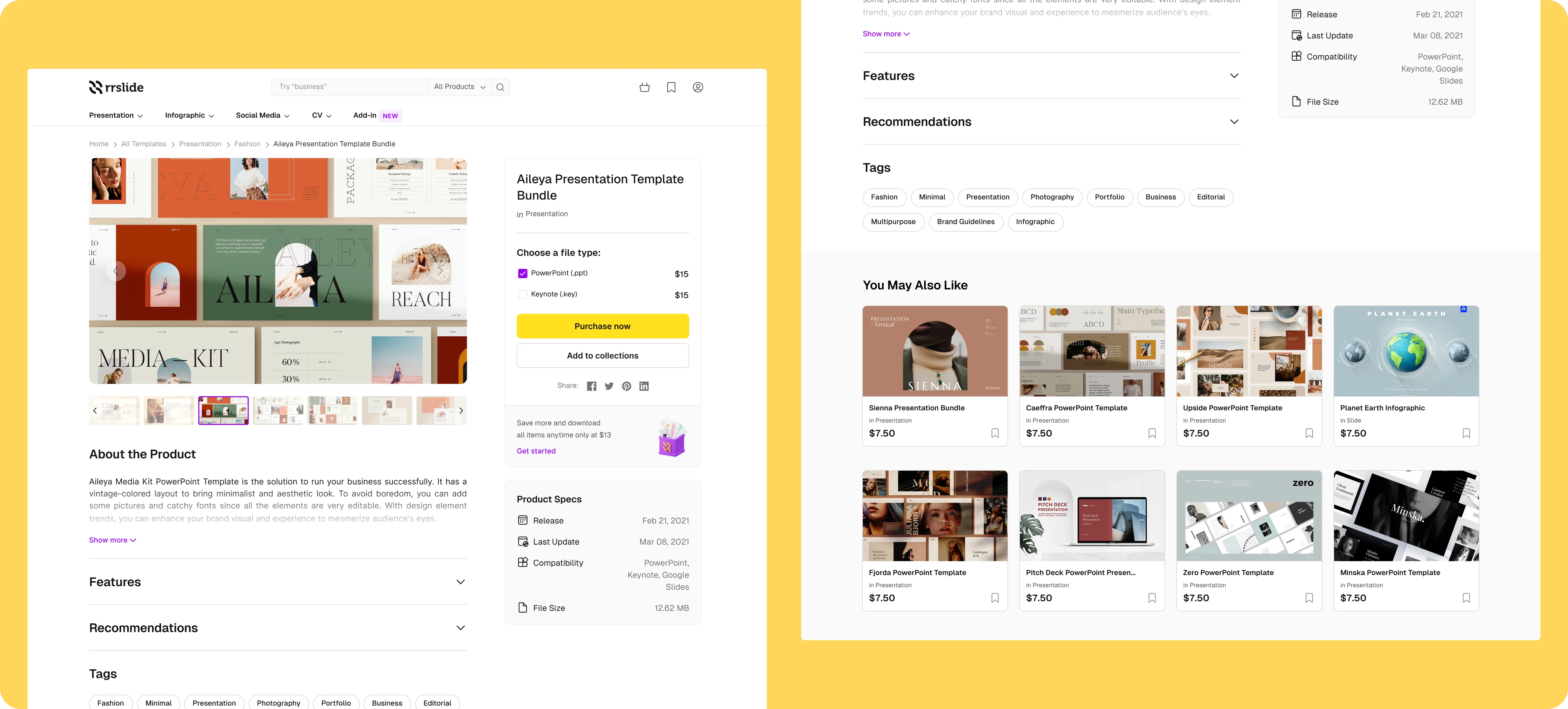
Making purchase decisions easier on item details page
We designed the item details page around familiar creative marketplace patterns so users can quickly grasp the information.
Purchase now clearly standing out as the main action within the page. When an item doesn’t meet expectations, instead of pushing users back, we guide them forward through tag-based personalization and a You may also like section to keep exploration going.
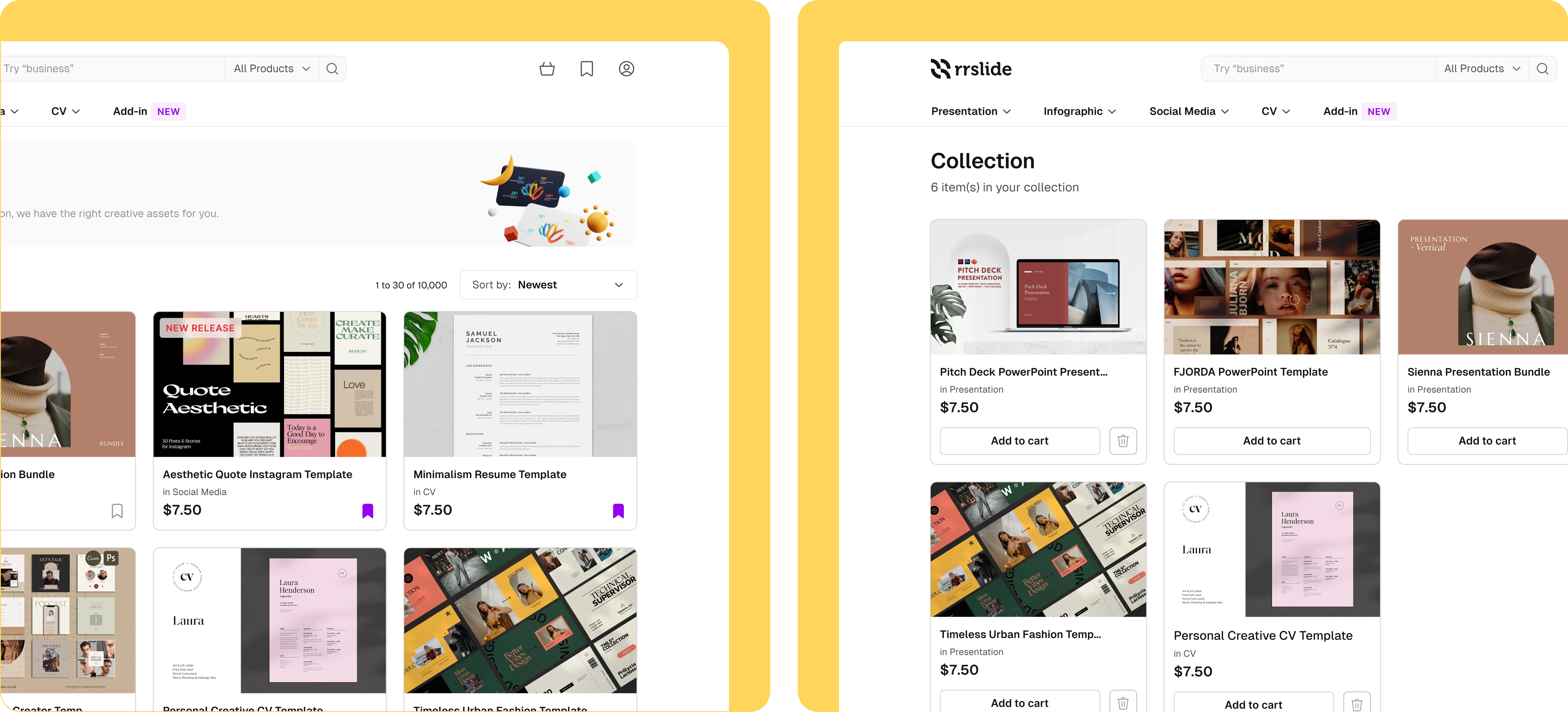
Adding items to collections
We learned that not everyone is ready to buy right away. For lower-intent users, the risk for RRSlide is leaving without taking any action.
To address this, we introduced Collections: allowing users to save items and come back to them later, and add them to the cart when they’re ready. This creates a lower-commitment step while keeping users engaged instead of bouncing.
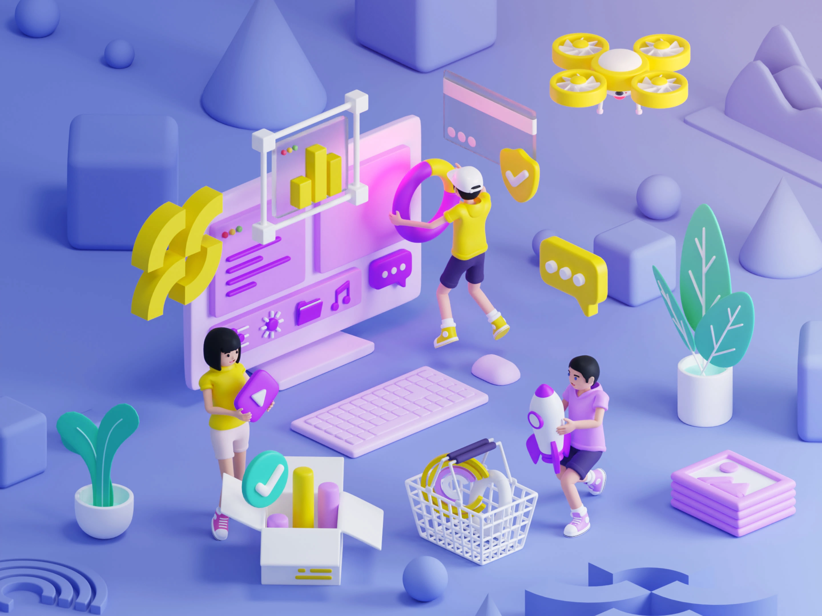
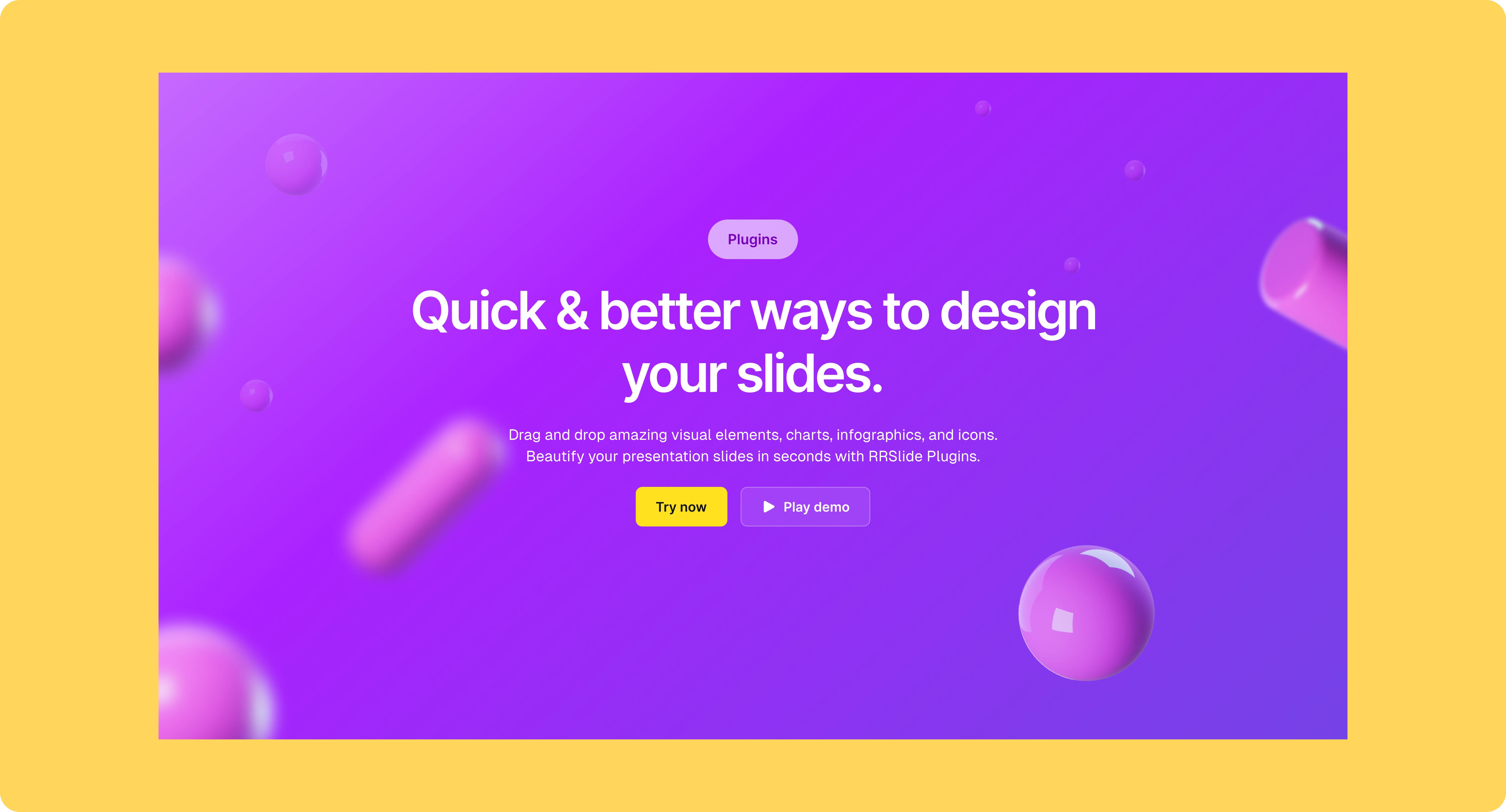
Visuals & illustration
Our audience is made up of creative people, so the visual direction needed to feel expressive rather than rigid. We leaned into warm yellow and purple tones paired with playful 3D illustrations to create a sense of joy and creativity as people explore RRSlide.
What changed after launch
After three months, the impact showed up clearly in how people used the product. Engagement across the platform increased, and the number of items purchased grew by 3x.
Beyond the numbers, the design system we put in place also became the foundation for RRGraph’s next product: Plugin, helping the team move faster and stay consistent.
(We’re just so happy with all the positive results and the experience working with the team)
Want your products designed for better usability, conversion, and visual polish?
If you’re building design that deserves more thoughtful thinking behind the design while also optimized for your business goals, let’s talk.
Contact us directly or visit 🌐 inkspace.design
Like this project
Posted Jan 10, 2026
Redesigned RRSlide, a creative marketplace platform from the whole brand and web experience to enhance usability and conversion.
Likes
0
Views
1
Clients
RRGraph Design