Sibyl: Simplifying Legal Access to Trusted Practitioners
Ferdi @Inkspace
Story
Sibyl started with a belief that finding the right legal help shouldn't feel like navigating a maze. The platform is built to connect people who need legal advice with practitioners they can trust. Cutting through the noise, the paperwork, and the uncertainty that comes with it.
We worked with the team from day-one to shape their first product experience from the ground up
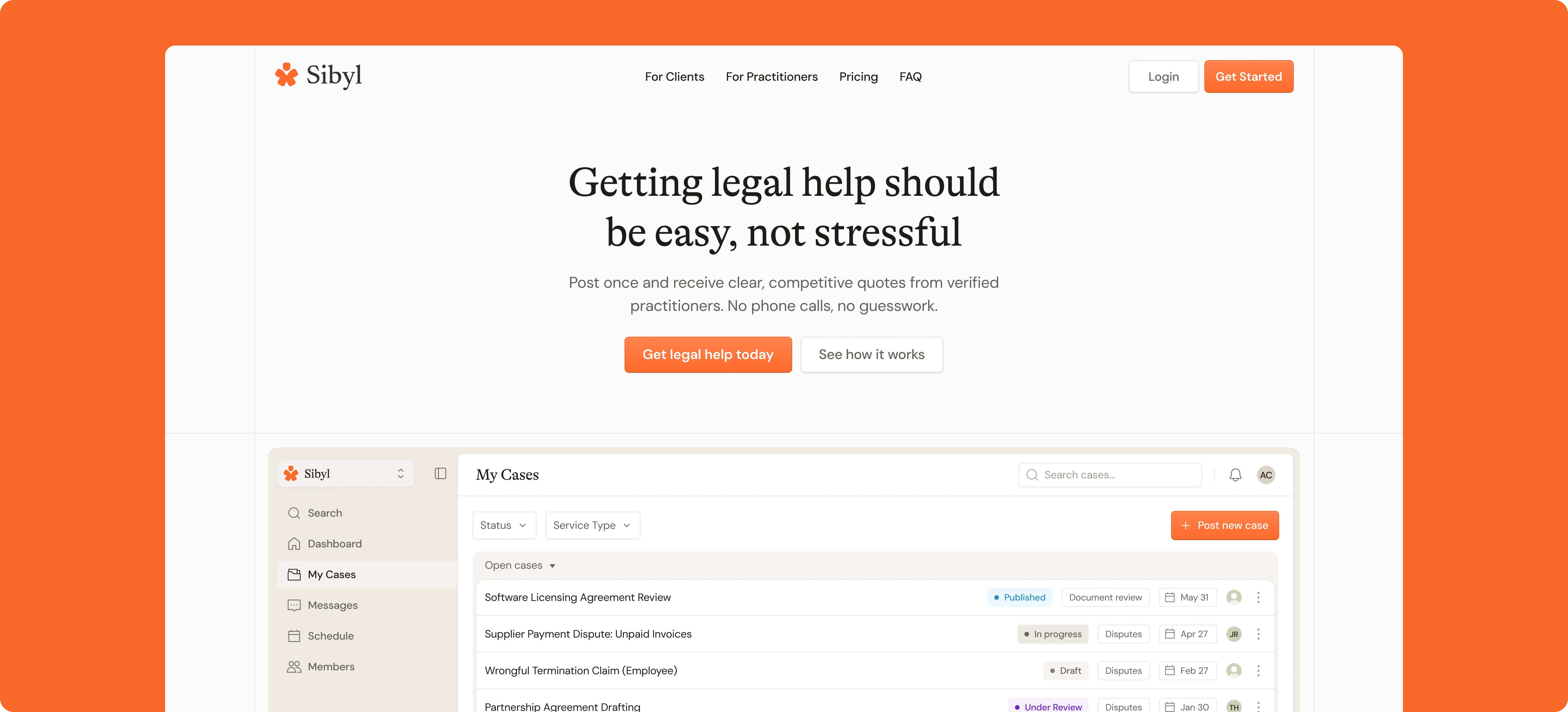
Landing page: Getting straight to what matters
Finding legal help usually means asking around for recommendations, dealing with invisible processes, and adding stress on top of stress. The landing page opens with reassurance: this process is easy.
It explains the value in plain terms: post once, receive quotes from verified practitioners, no phone calls required. The message is clear before anyone has to click anything.
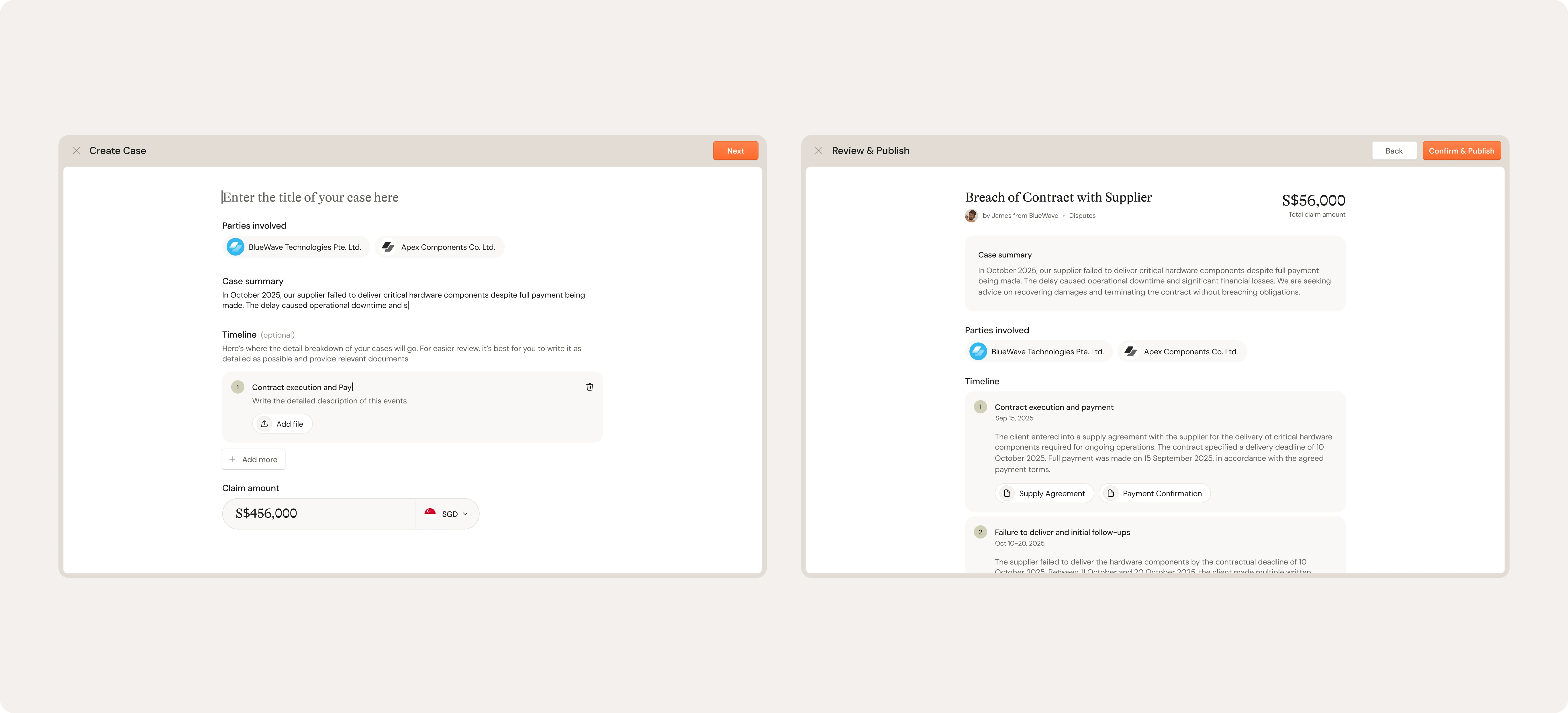
Create a case without the usual hassle
Sibyl is about connecting people with legal practitioners without the usual friction. We thought about how most legal processes feel: scattered, unclear, and full of unnecessary back-and-forth.
We designed case creation to work the opposite way. People or companies can create a case directly within the platform, include all the relevant details in one go, and Sibyl handles the rest.
Manual documentation? Not anymore
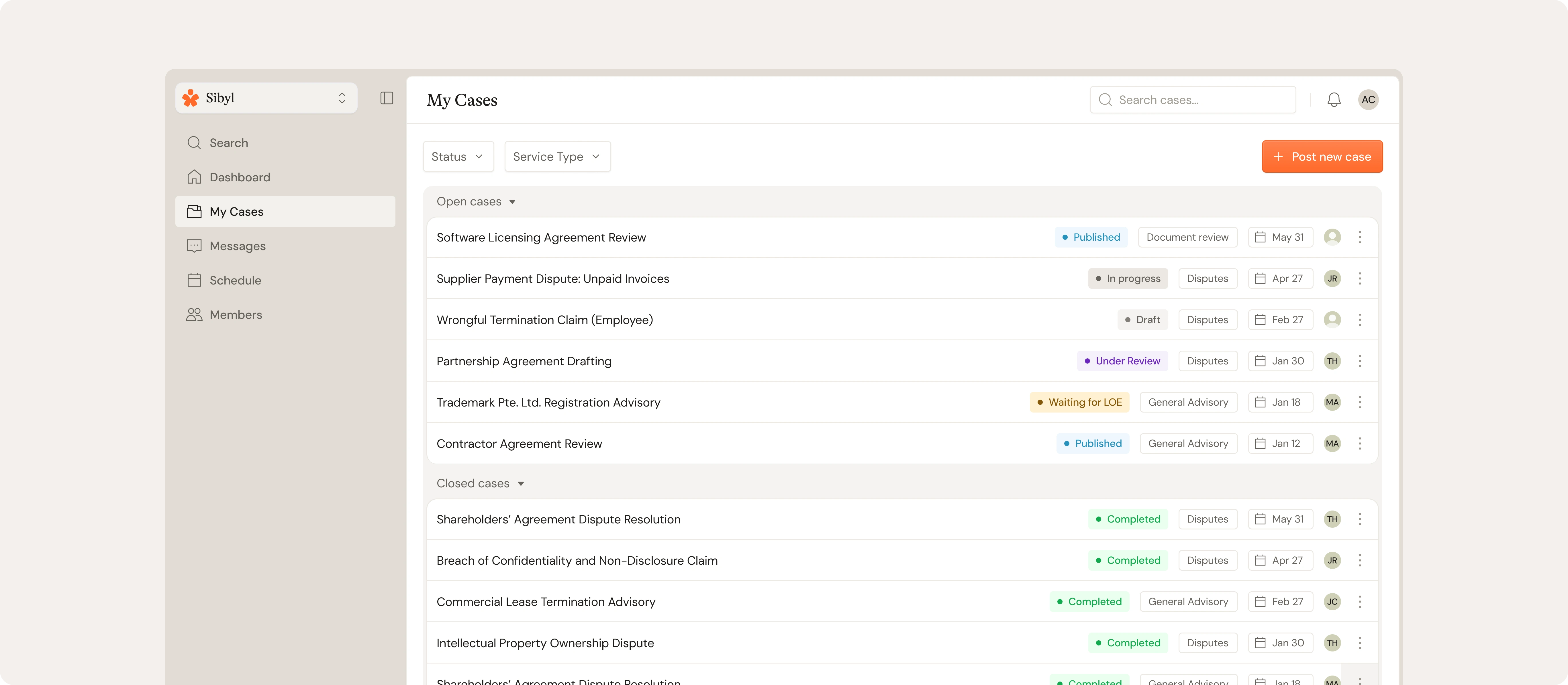
The old way of managing legal cases meant printing, filing, archiving physical documents, and keeping track of everything manually.
We thought about how much time that wastes, and how easy it is to lose something in the process.
The dashboard gives people a single view of every case they've submitted. We grouped it into open cases (the ones you're actively monitoring) and closed cases (your digital archive), so you're not digging through piles to find what you need.
Synced cases page inside
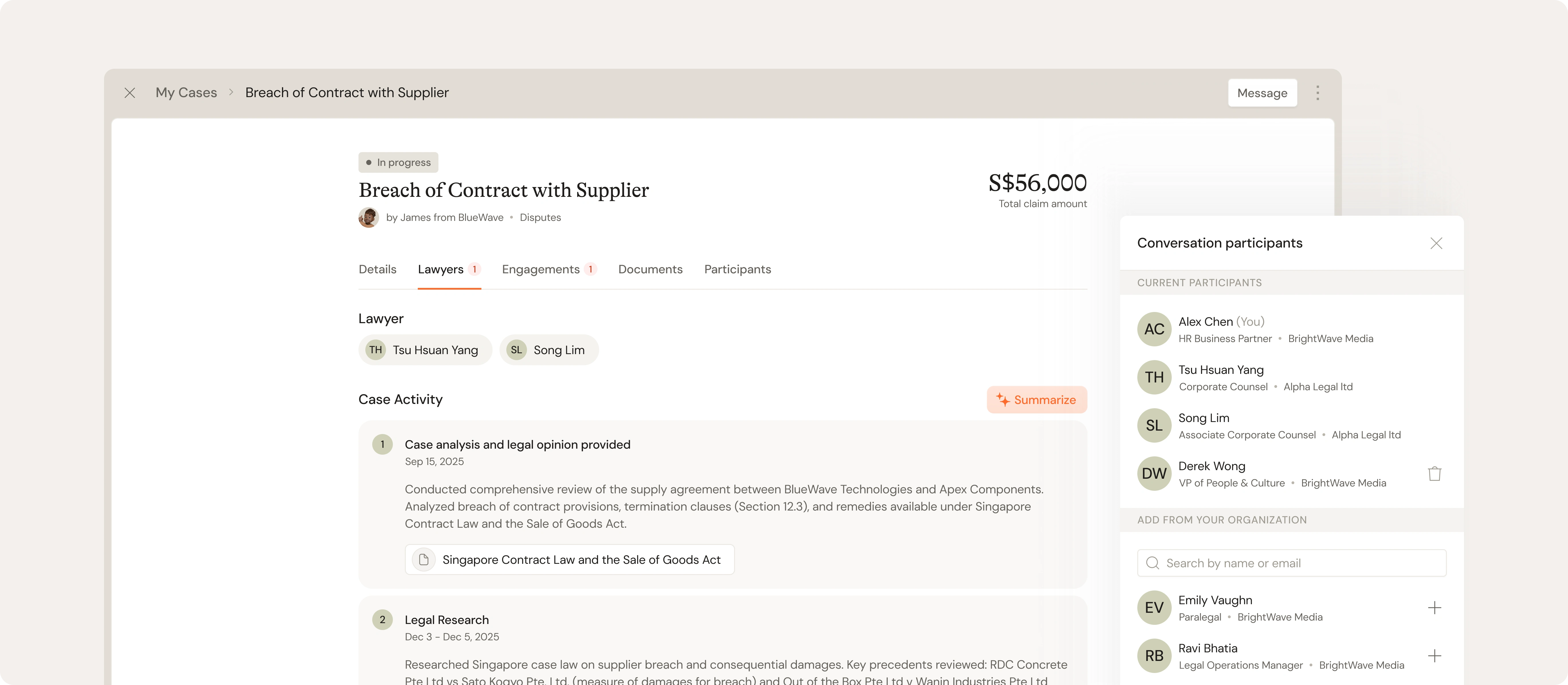
Legal cases don't move in silence: there’s constant back and forth, updates, documents, and decisions made. We thought about how scattered that usually feels, especially when communication happens across emails, calls, and different platforms.
We designed the detail page to centralize everything. People can message practitioner directly, see every update as it happens, and track the full progress of their case in one place.
For practitioners, it's where they document their work, share analysis, upload research, and keep clients in the loop without jumping between tools.
Intelligence at the breaking points
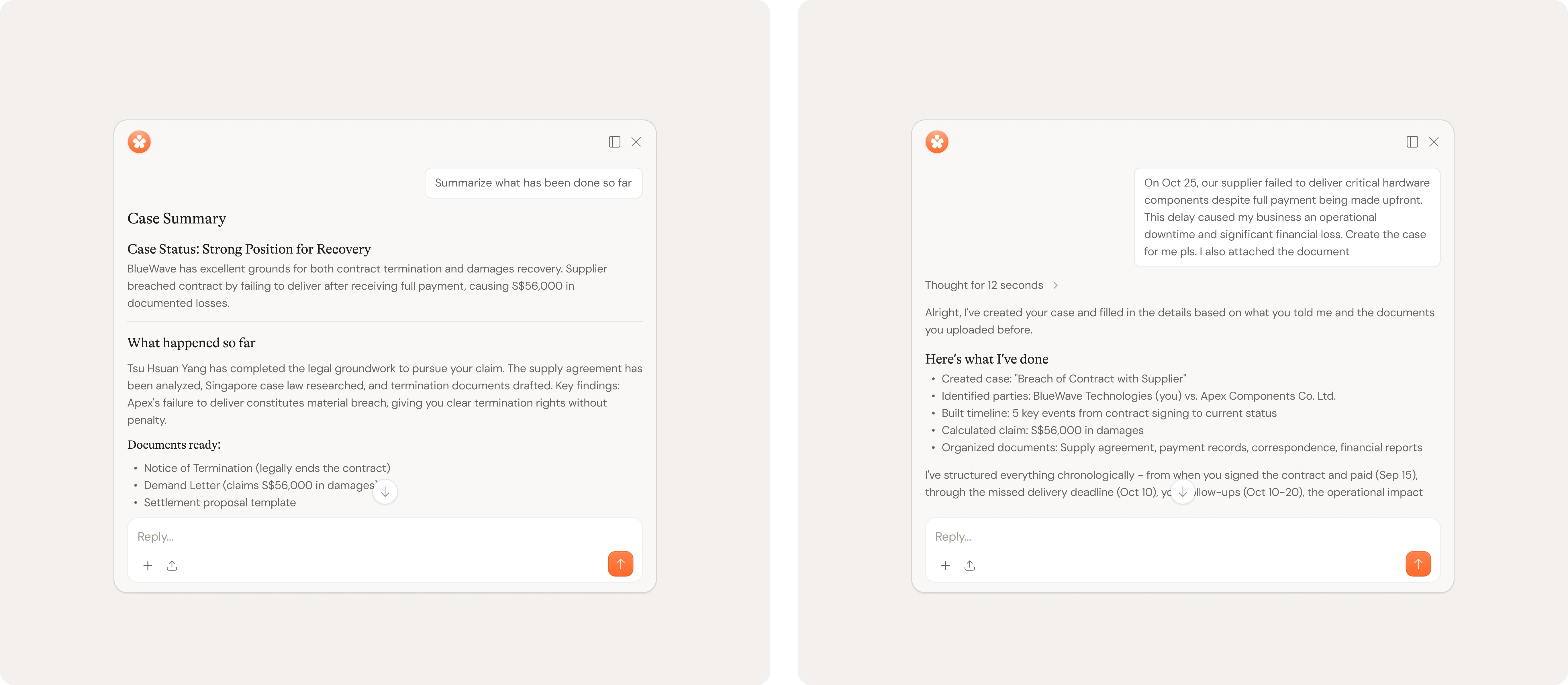
We found that people couldn't make sense of dense legal documentation and updates from practitioners, and they didn't know how to describe their situation in terms lawyers could work with.
This is where AI hits the sweet spot. In the detail page, it summarizes case progress and legal updates so users aren't drowning in jargon. When creating a case, it helps users draft everything clearly even if legal language isn't their thing.
Access cases that match your expertise
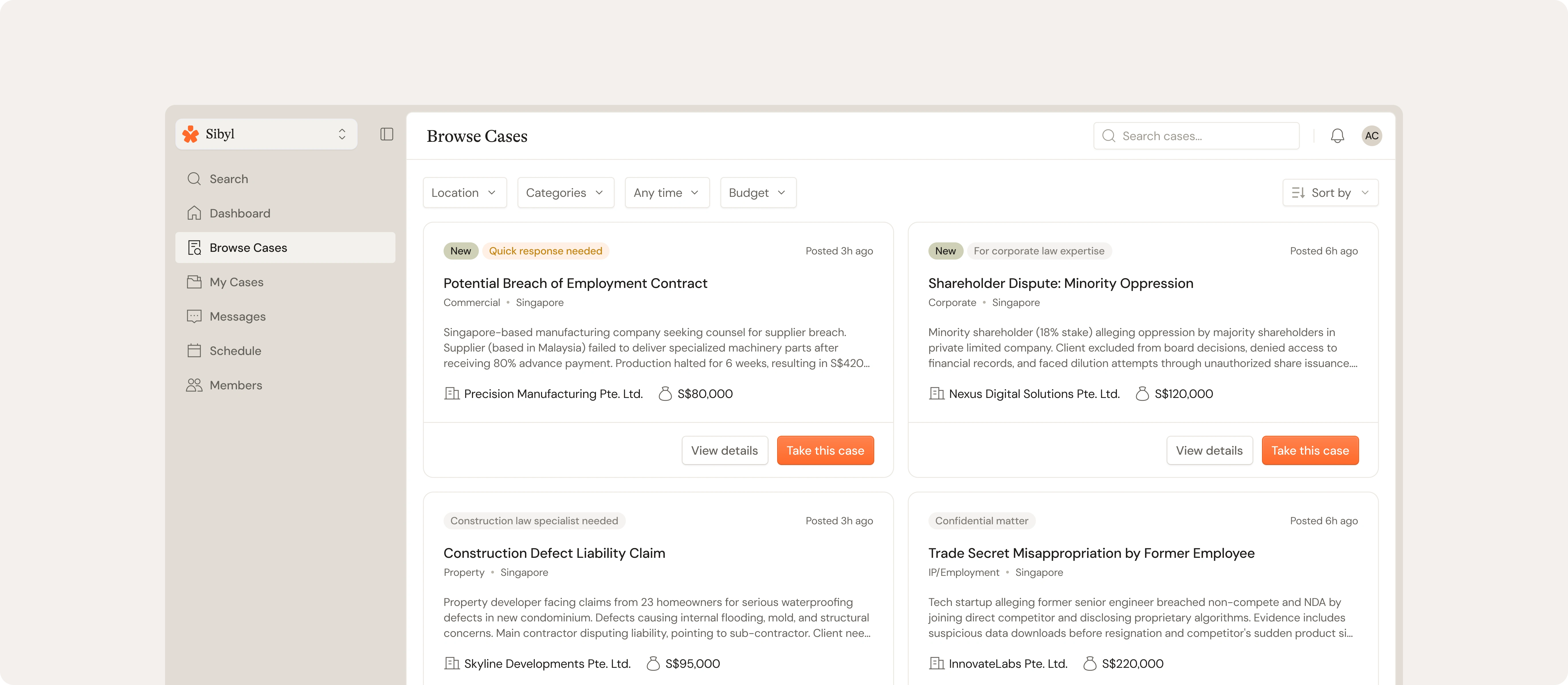
For practitioner-facing dashboard, Sibyl works the other way around.
Instead of chasing leads or waiting for referrals, they get direct access to a marketplace of cases posted by people and companies who need help. Browse available cases, filter by area of expertise, and see all the details upfront: what the issue is, who's involved, and what's needed. Less back-and-forth just to figure out if it's a fit.
Building the foundation for what’s next
Sibyl is still early, so we're not measuring impact in conversion rates or user growth yet. Instead, the work we've done sets the direction for how the platform evolves.
The systems we built: from case creation to AI-assisted workflows, give the team a clear foundation to test assumptions, refine features, and scale thoughtfully as real users start flowing through.
Right now, the platform is being rolled out to a small-targeted group across three segments: individuals, businesses, and legal practitioners. This early access phase is designed to surface the friction points, and shape what gets built next.
Need a hand?
If you need a hand on the product design side, especially when:
You're guessing about your product positioning
Your product isn’t performing and it’s unclear what to prioritize or fix
You’re seeing early traction, but UX is slowing growth down
Users like the product, but struggle to understand how to use it
Your brand no longer reflects where the product is headed
You need a focused 2–3 months of design work, or ongoing design support
I'm able to help and would be glad to explore where we can help in above areas.
Contact us directly or visit 🌐 inkspace.design
Like this project
Posted Jan 10, 2026
Designed end-to-end Sibyl's experience, aimed to provide seamless connection for people looking for legal help to trusted practitioners.