Ballpark — Logotype


Background info & Brief
When I got an email in my inbox with the title "Guess who", and saw it was from Murat Mutlu, I got excited and even a little nostalgic. A little background info—Murat founded Marvel App, and back in 2016 (almost 10 years ago?!), we worked together on the Marvel App logotype. Murat has now co-founded Ballpark. Ballpark is the fastest way to capture high-quality feedback on product questions, marketing copy, designs, and Figma prototypes.
The brief was pretty flexible and open—modern, fun, and, since the name Ballparkis often tied to baseball, we could play around with the idea of giving a wink to baseball.
First ideation
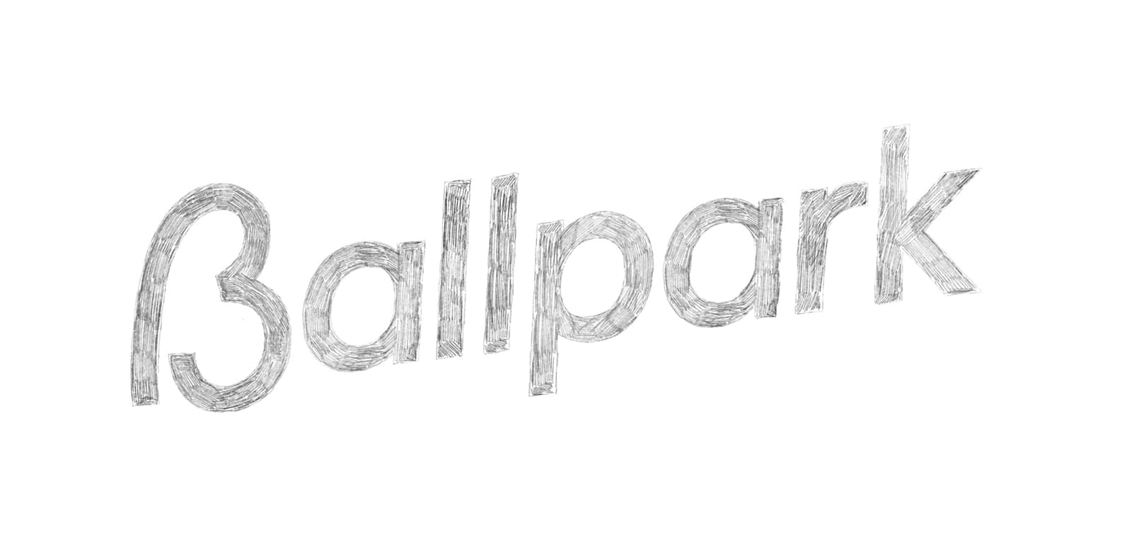
My first idea was to visually capture that baseball feel and vibe within the typography. It definitely did, but it lacked a bit of that fun element and leaned a little too much into the baseball theme.
Second ideation
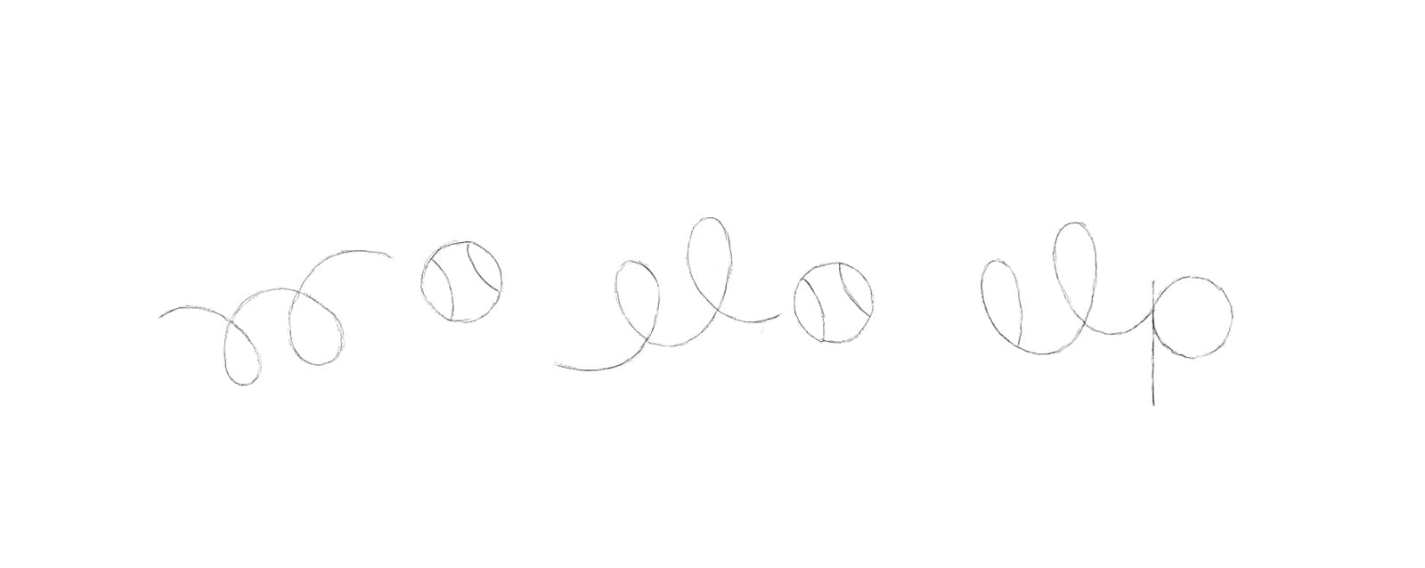
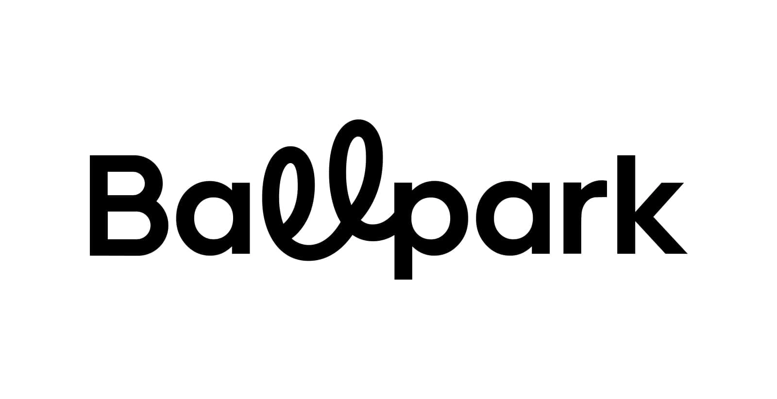
After doodling, I stumbled upon the idea of portraying a bouncing ball, where I noticed an upside-down, double-looped 'l'. If flipped, it could be used, and since the 'p' has a circular counter, it could function as the 'ball'. This created a fun way to incorporate a unique, baseball-related element without making it feel overly like a baseball brand.
Sketch development
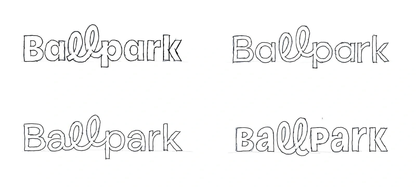
Now it’s time to translate that doodle into something closer to an actual logotype/wordmark. I sketched several rough outlines, experimenting with different foundational setups—bolder, thinner, mixed uppercase and lowercase—while also testing various approaches for the double 'l' and exploring ways to connect it.
Concept development & refinement
After some consideration, the top-right rough sketch felt like the best fit and was refined into a more detailed sketch. This sketch was then traced into a digital vector format, making it easier to fine-tune and refine further.
Overall, the initial sketch felt a bit flat. The top-left rough sketch had more built-in fun, but it was a bit too much. This was due to the bolder vertical stems, which we incorporated to a lesser degree in the detailed sketch—adding just the right amount of depth and playfulness.
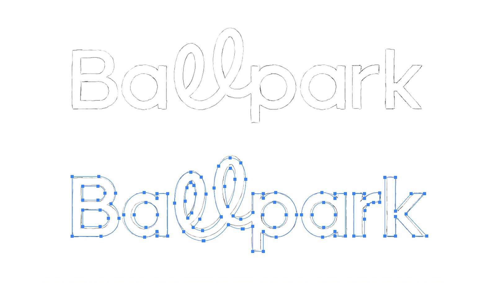
The double 'l' loop underwent further refinements, and the stroke connecting the stem and legs of the 'k' was removed.
Final result
I didn’t want to overly polish the loops, as I liked the authenticity of those little imperfections combined with the more refined sans-serif letters.
Small display icon
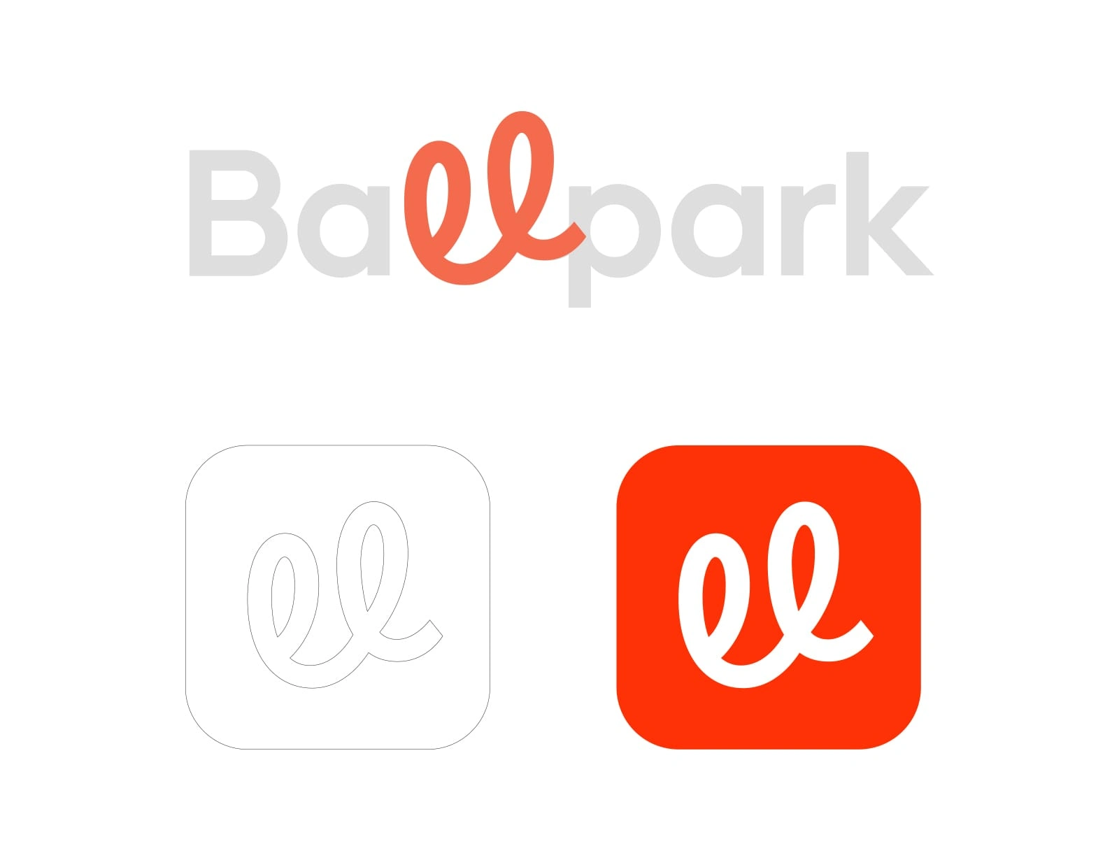
Since we placed so much emphasis on the double-looped 'l' and kept the 'B' fairly simple, it made sense to use the double 'l' as the small display icon. I also made some minor tweaks to the end-tail.
Shout out to Nacho Darras for the animation.
Like this project
2
Posted Mar 20, 2025
Custom logotype for Ballpark, Ballpark is the fastest way to capture high-quality feedback on product questions, marketing copy, designs, and Figma prototypes.
Likes
2
Views
2
Timeline
Nov 24, 2023 - Jan 30, 2024
Clients
Ballpark


An insight into redesigning the Midland Appliance logotype.

A case study about redesigning the script logo of Malbon Golf.
Marvel, an insight into my process.