Malbon Golf

Paul von Excite


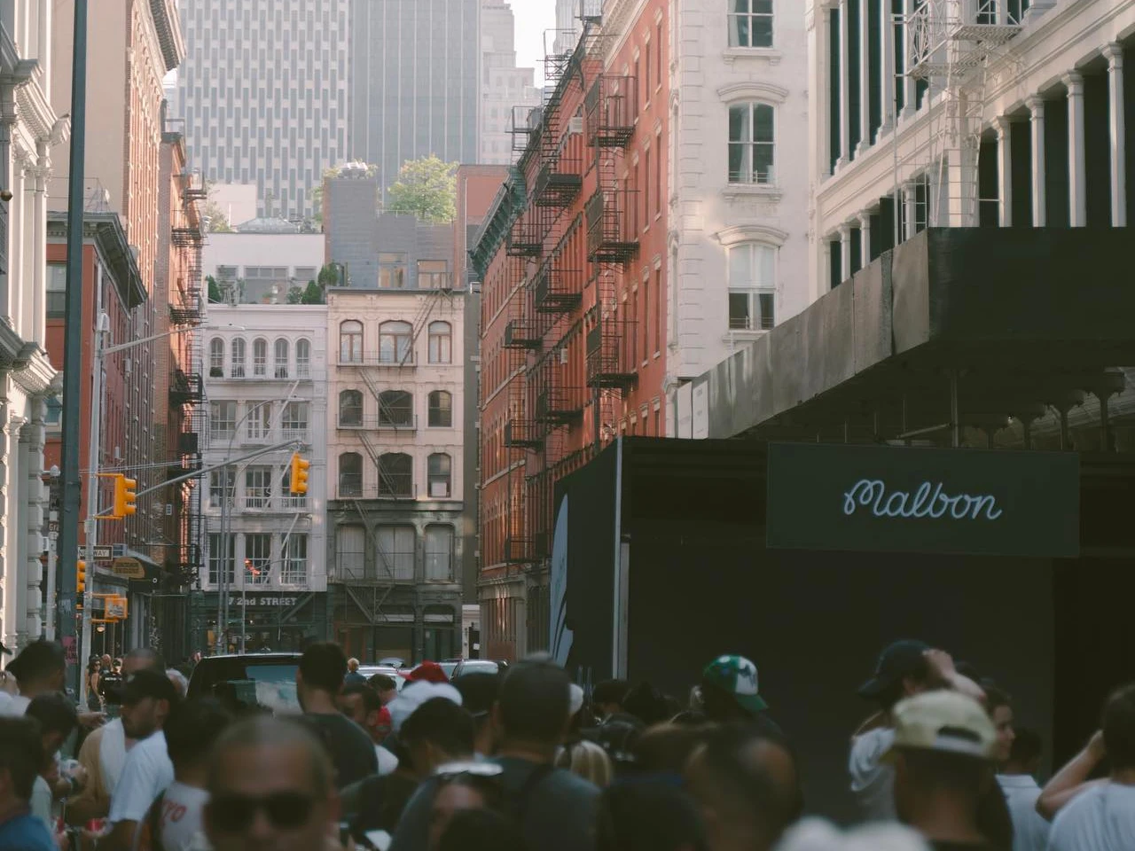
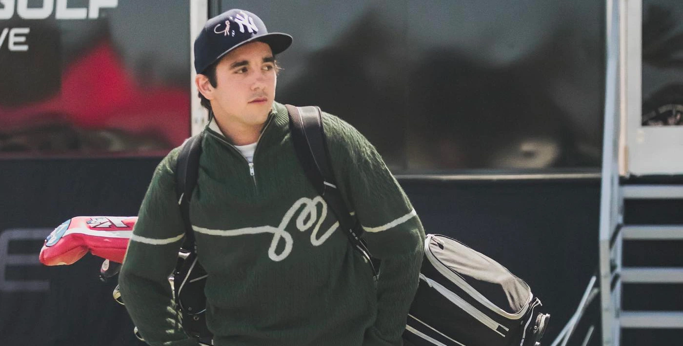
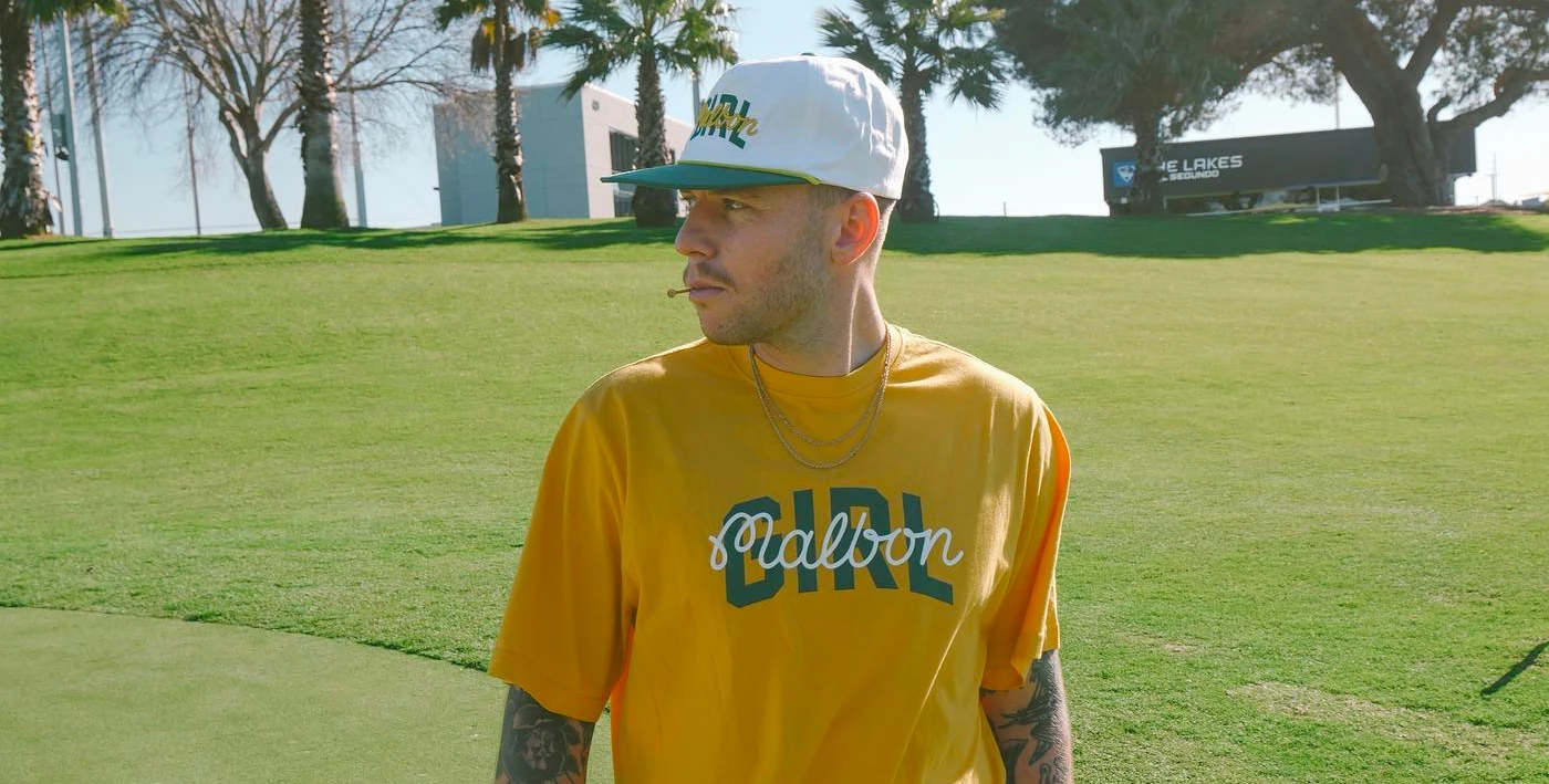
Malbon Golf — is a lifestyle brand inspired by the game of golf. They provide quality products, tell stories, and invite customers to take part in the community of like-minded thinkers.
Briefing and Analysis
The goal was pretty straight-forward; make sure the current Malbon type is redrawn in a way it is better readable and looks more modern, without losing its core identity. (Especially the "M" needed to keep the current shape.)
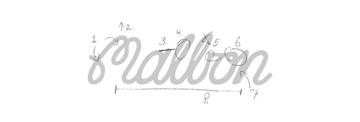
As a first step, it is smart to do a quick analyse on the current script. It's a great reference point, and it does provide a clear step by step path towards our end goal.
Sketching
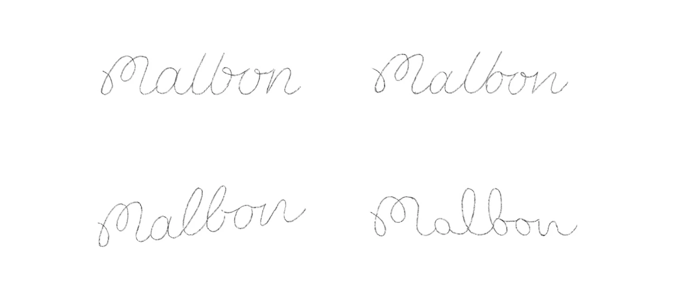
Free flow sketching immediately gives a great view on how the characters work together. I was especially interested in how the readability of the "b" could be improved. Below are just a few of many sketches made.
Concept Development
I am using the pen tool to re-draw the script in Illustrator, and being thin is actually an advantage for smoothen the curves.
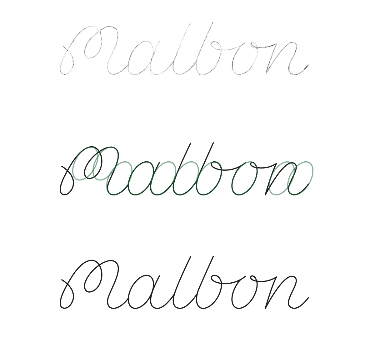
The "o" is used as a reference to create the consistency I am after.
Concept Refinement
Now that the foundation is set, I am able to increase the weight. This will bring the weight on par with the old script logo. Next to adding weight, I am also adding a radius to the edges.
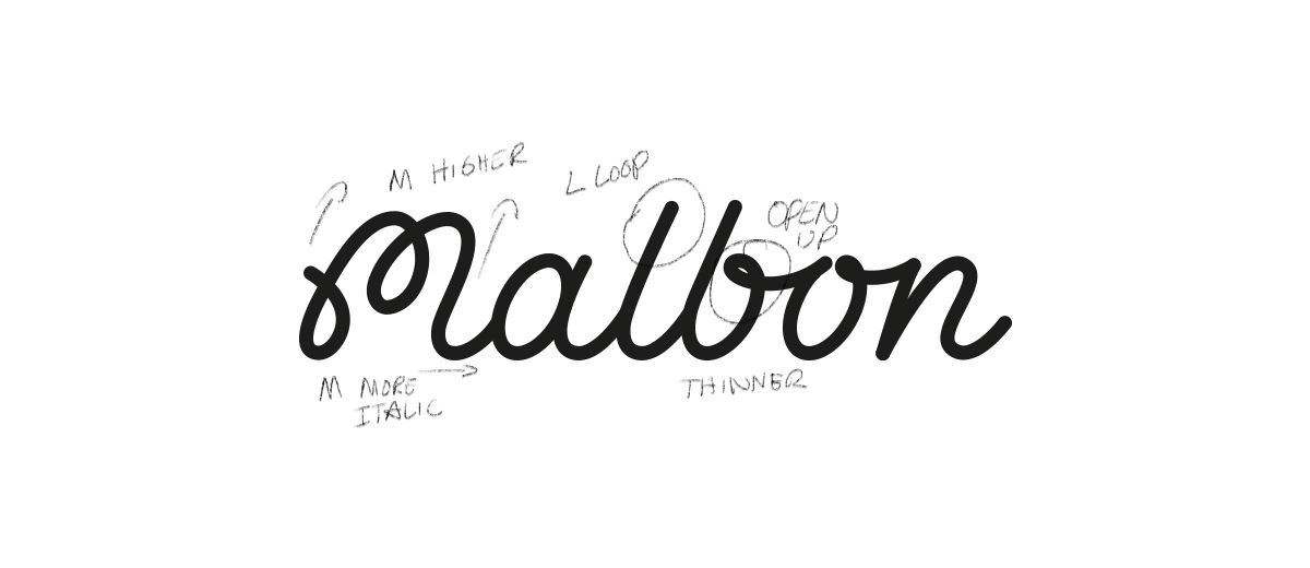
A few points of interest/feedback:
M needs to be slightly higher and give the M a little more slant/italic.
Loop on the "L" and open up the loop of the "B" slightly.
Reducing the weight slightly.
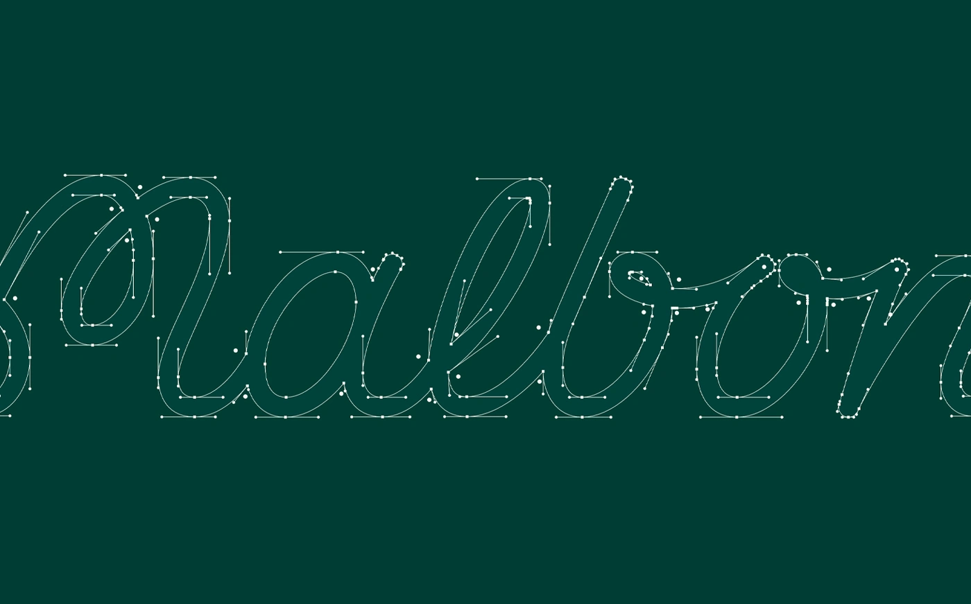
Also did some final tweaks to the line work; a very tedious and time-consuming task but definitely worth it.
The M icon/symbol
The M is very iconic and works very well as a stand-alone mark. There is no need to make extra adjustments to the M.
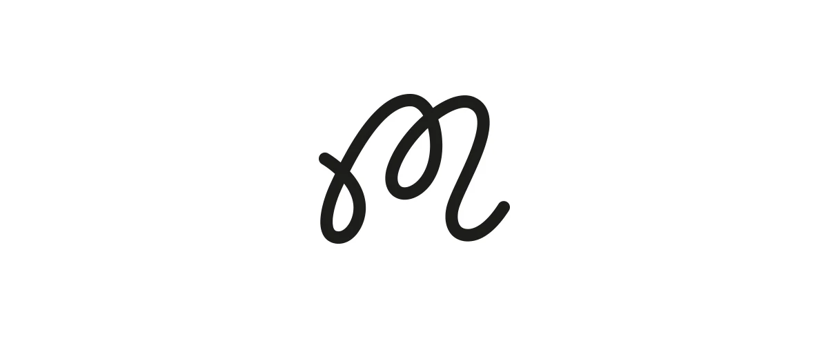
The M will be used for small digital occasions like the Favicon but in general; think of profile pictures, Malbon will be written in full. Print wise, the M is used as an equal alternative to the full script logo.
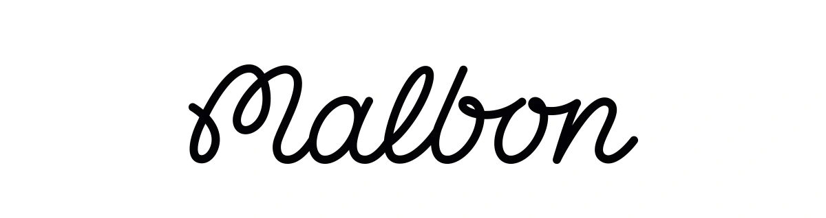
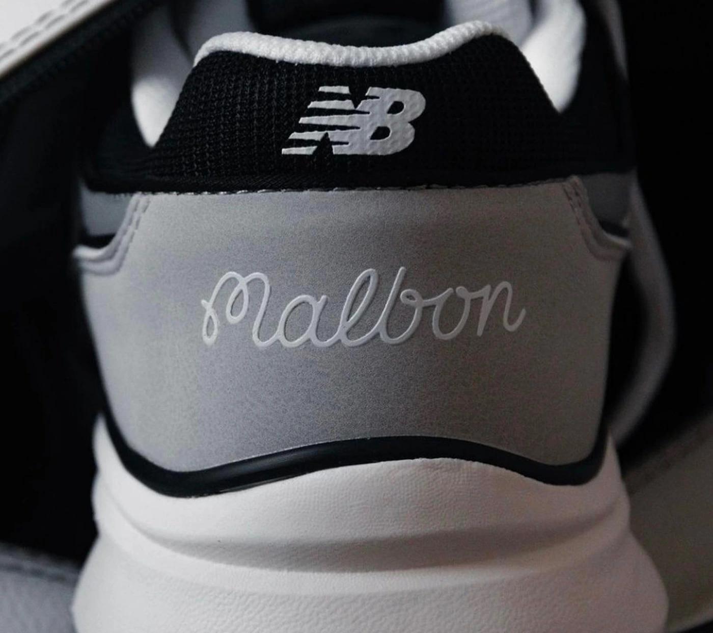
The Final Logo
By crafting the letters with more spacing, reducing the weight and adding a more pronounced "b" the readability improved massively.
The final result is a beautiful script that will last a lifetime. Mission Accomplished!
Like this project
2
Posted Oct 15, 2024
Take a deep dive into my process of designing the new logo of Malbon Golf. From the briefing to the final result, and everything in between.
Likes
2
Views
4
Timeline
Jun 15, 2019 - Sep 11, 2019
Clients
Malbon Golf

Marvel App
Ballpark