An insight into redesigning the Midland Appliance logotype.


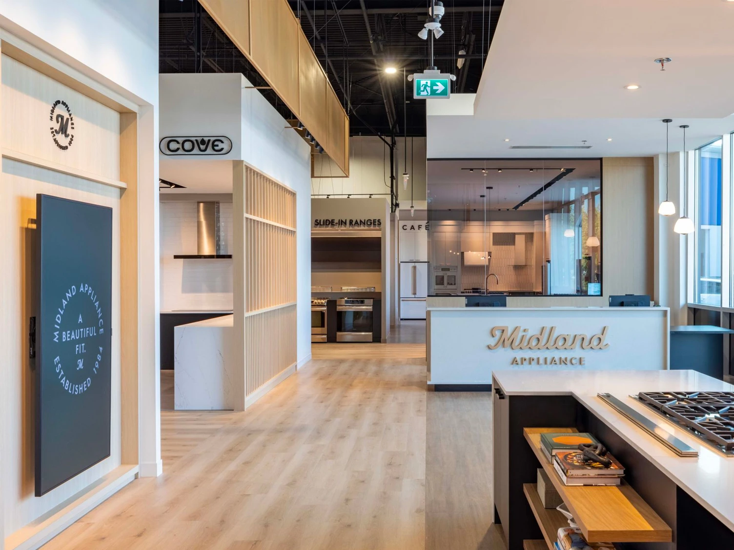
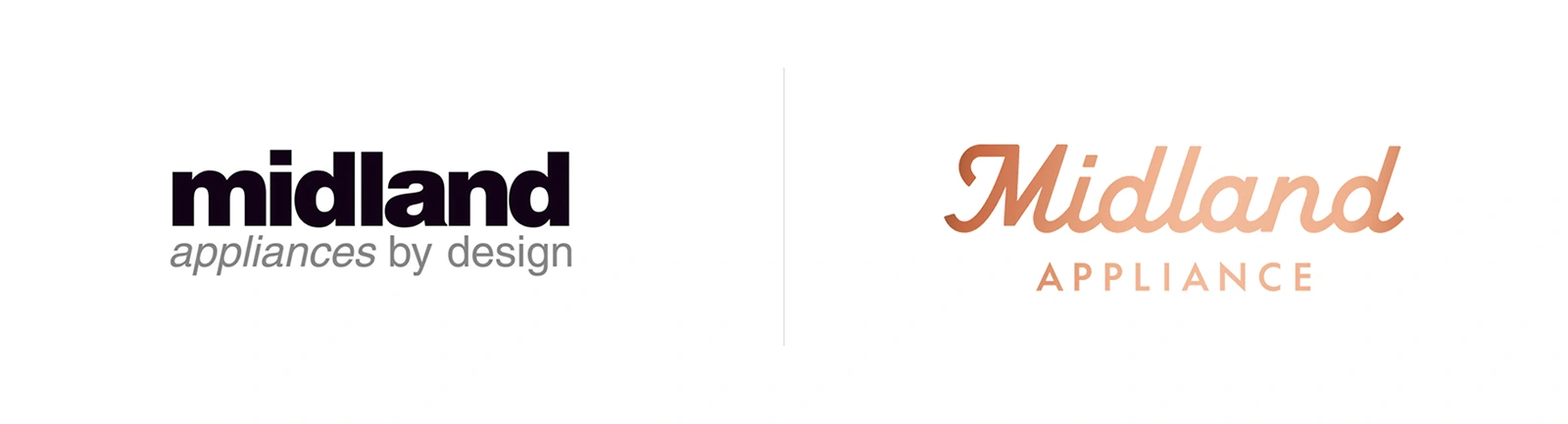
Full Punch got in touch for assistance on redesigning the logo of Midland Appliance. Founded in 1972, Midland is a household appliance dealer located in Canada, focusing on the upscale and luxury segment.
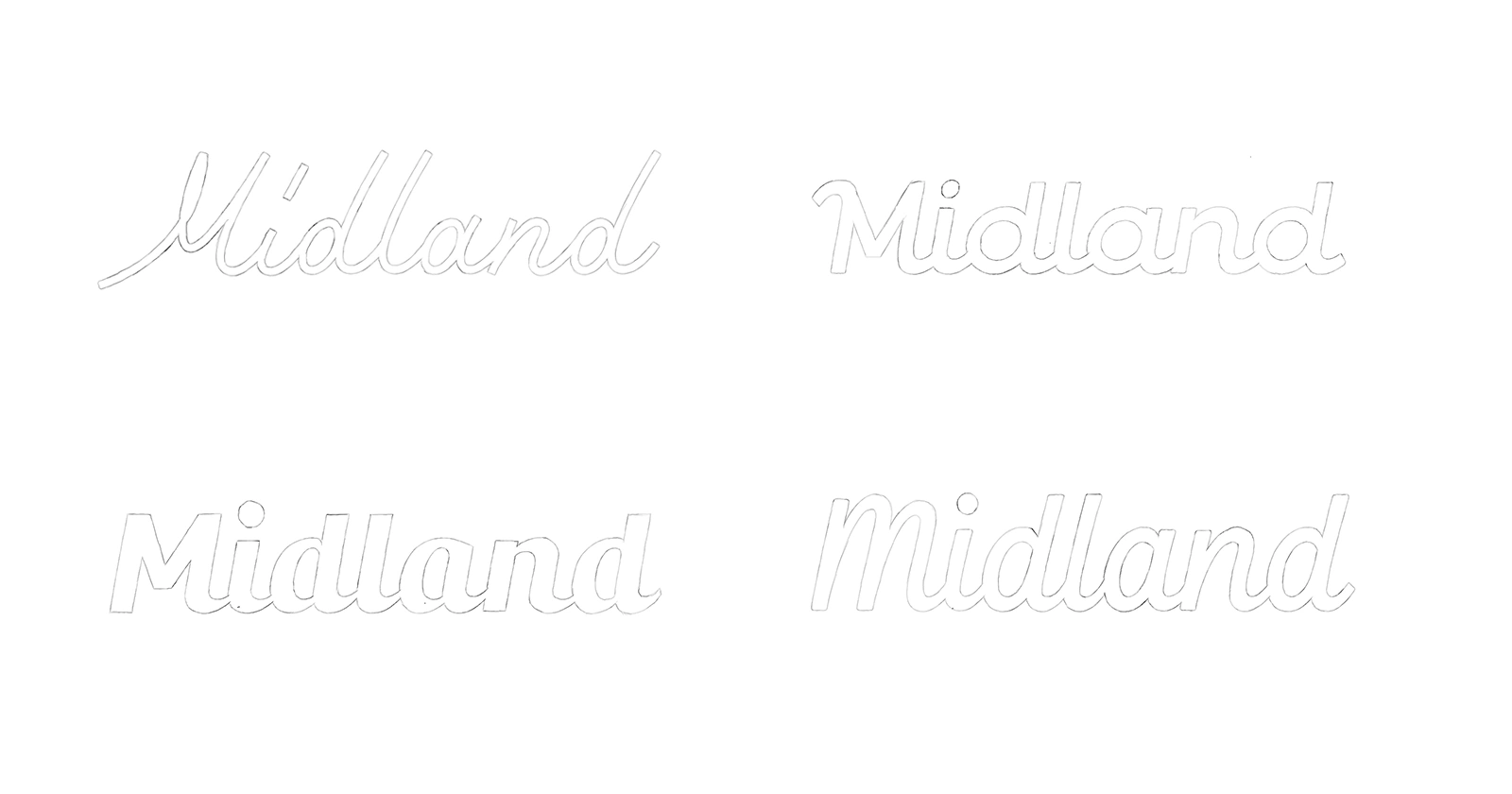
Sketching
After reviewing the briefing, I started to get a sense of how the letters would work together in a different variety of styles. This immediately gave away we needed to use the natural flow of the letters to our benefit.
Concept Development
It was clear we needed to find a middle ground between the top two sketches. Using the flow of the top left sketch and the mono-line thickness of the top right sketch. Besides, adding a more pronounced M which could be used as a stand-alone icon.
Although definitely an improvement, the "M" felt a bit lost compared to the other characters. I decided to use the top right sketch "M" I made earlier as a reference because it felt more cohesive.
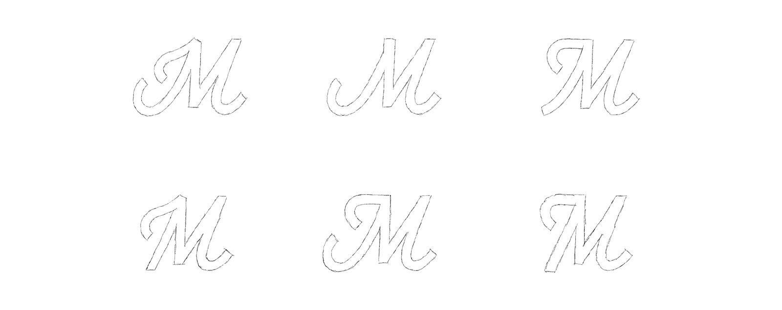
The middle bottom M felt the best as a wordmark and also as a stand-alone icon. With a small touch, reducing the length of the bottom left stroke, the foundation was set.

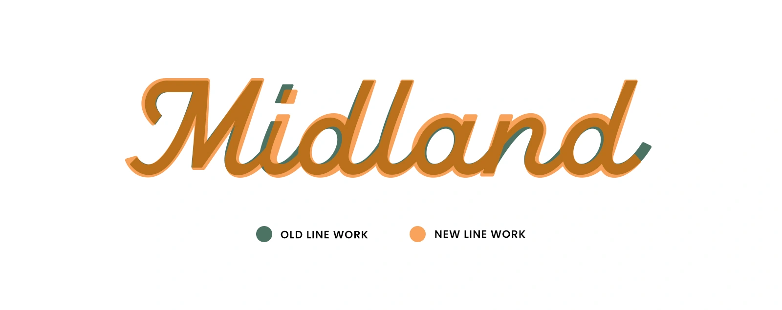
Refinement
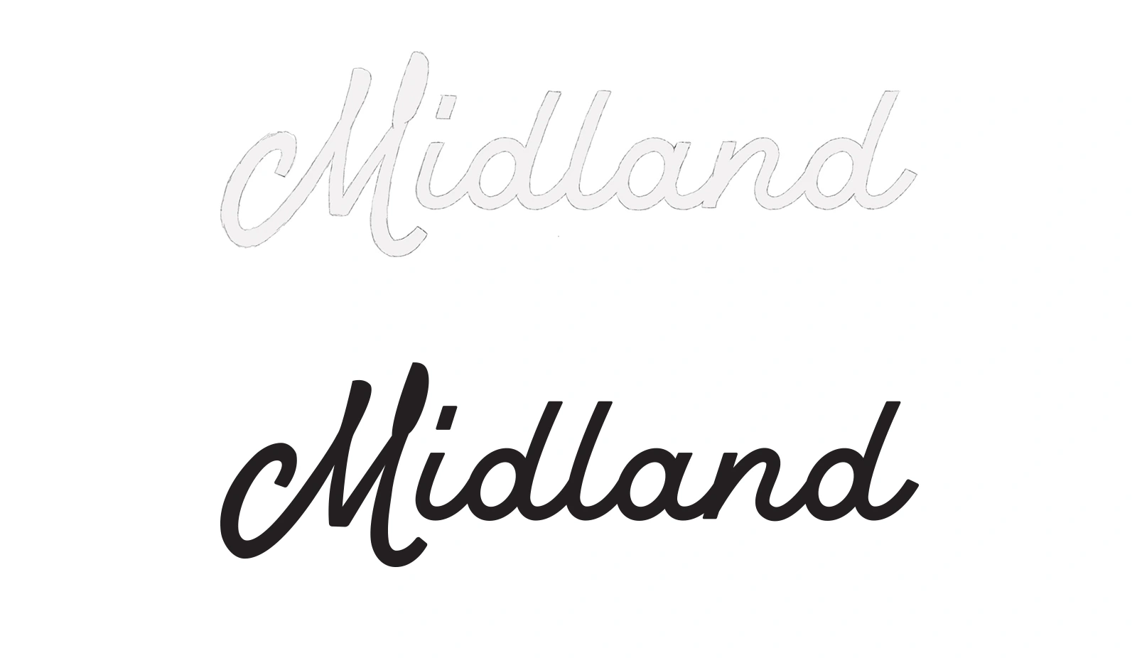
It still feels a bit wonky overall, which we are going to solve in the final stage.
A few pointers:
The ascenders are slightly bent, which need to be straight.
Add extra weight and look at all the line work.
Make sure all the characters have the same italic slant.
Increase top-line of the M.
Reduce size of the "i" dot.
The Final Logo
The time spend to get it visually to this level was totally worth it. It feels cohesive as a whole and the consistency is massively improved. The project got featured at Underconsideration (BrandNew)

Like this project
2
Posted Oct 15, 2024
FP got in touch for assistance on redesigning the logo of Midland Appliance. Midland is a household appliance dealer located in Canada.


A case study about redesigning the script logo of Malbon Golf.

Marvel, an insight into my process.
Ballpark — Logotype