Taste of Korea
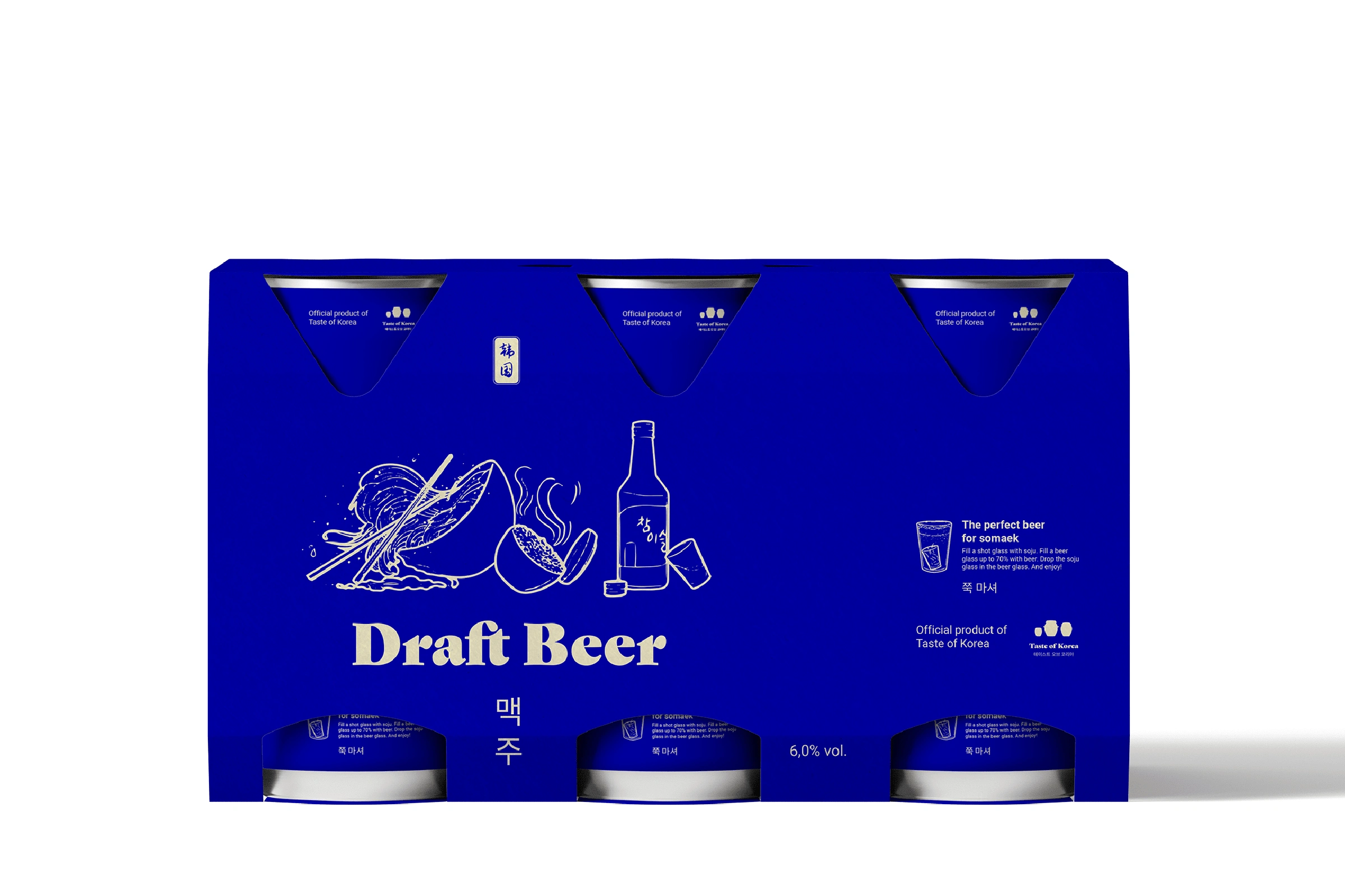
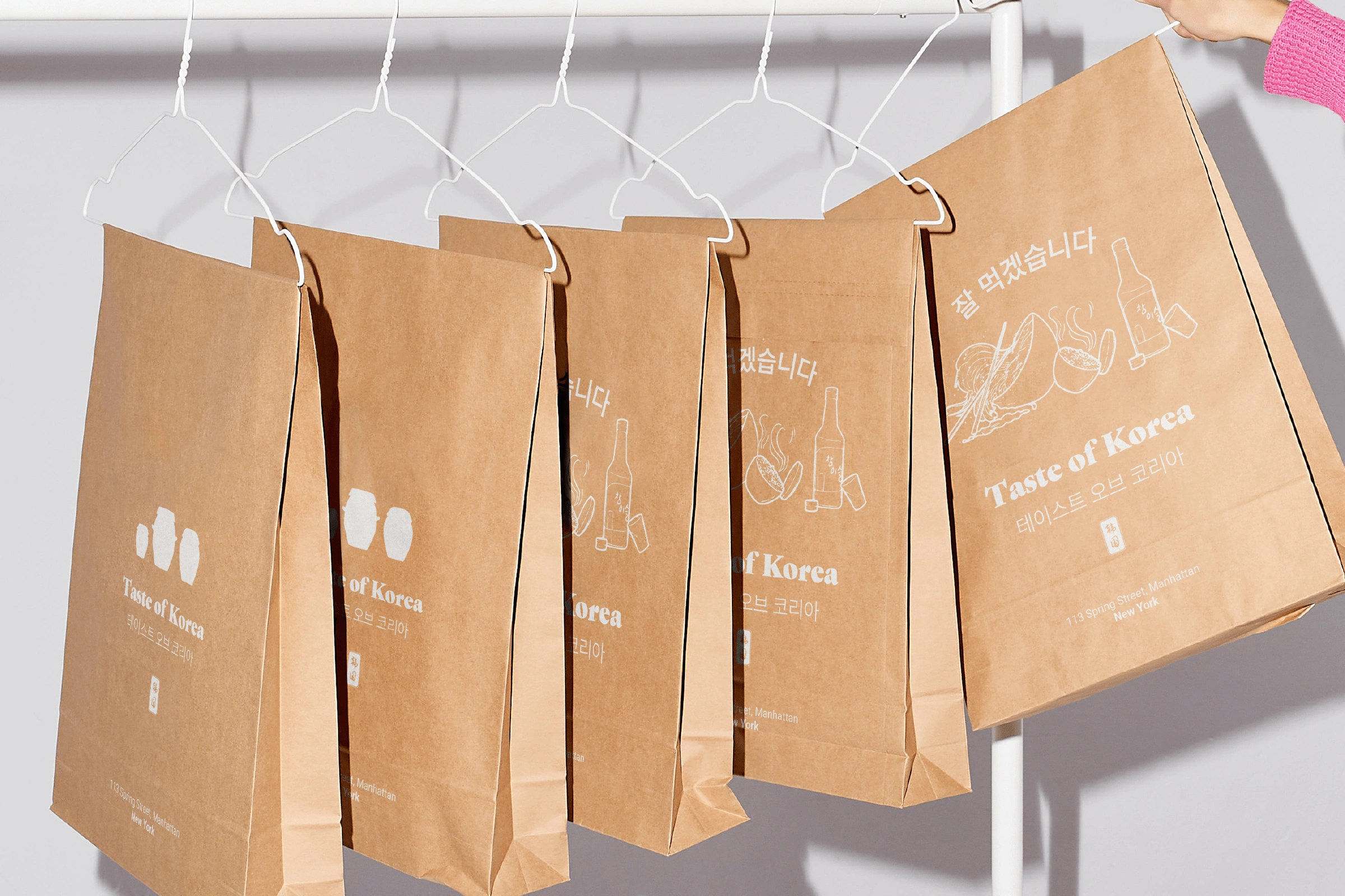
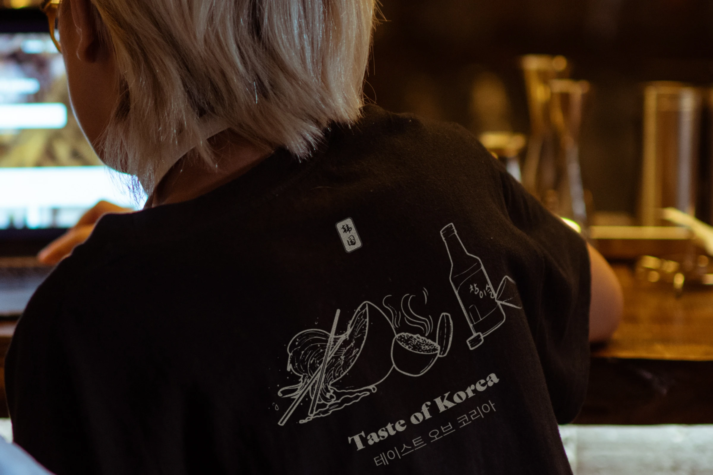
Taste of Korea is a traditional Korean restaurant. From serving street food to home made kimchi, they have it all. And to top it off, they even serve their own beer.
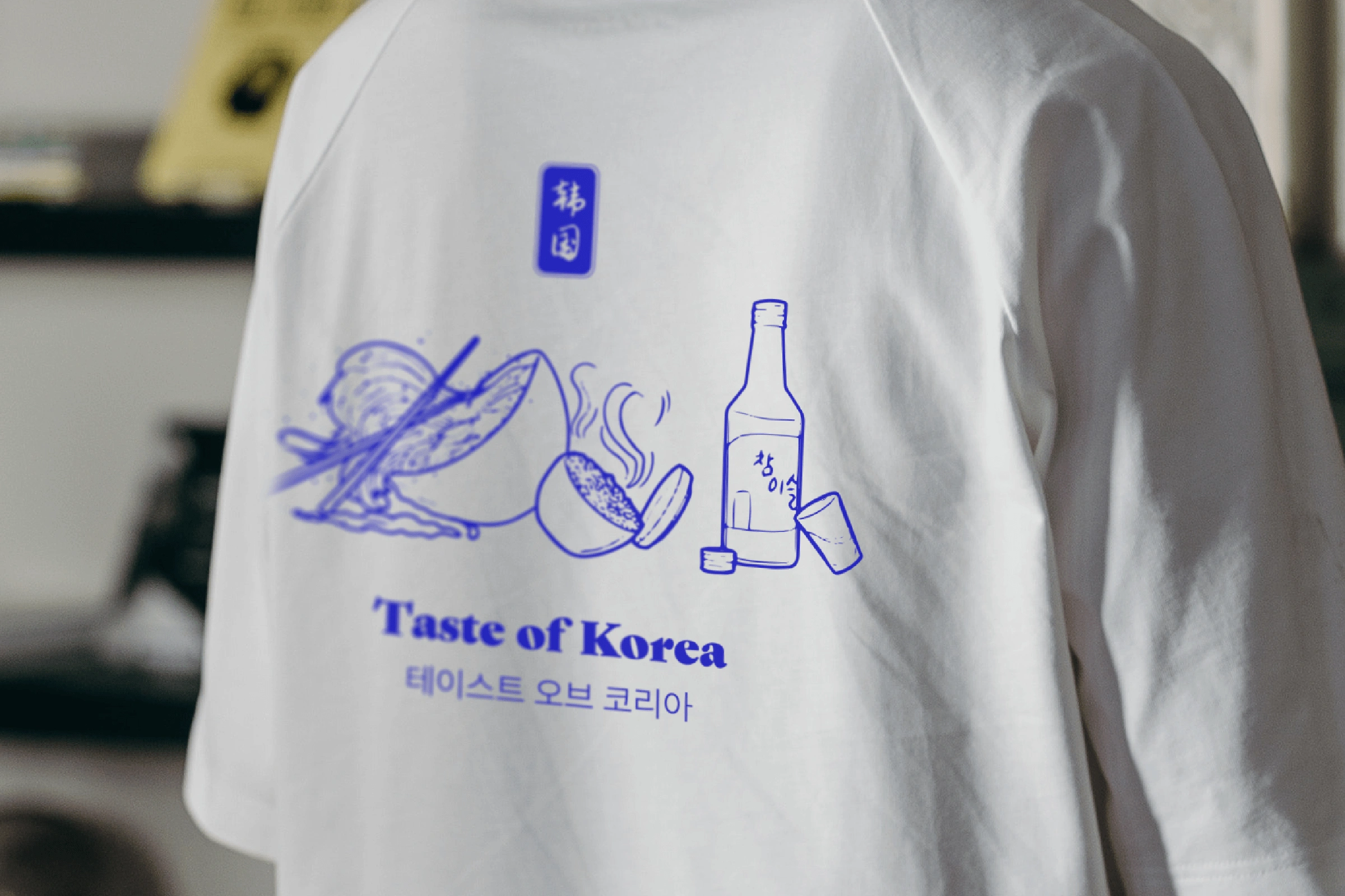
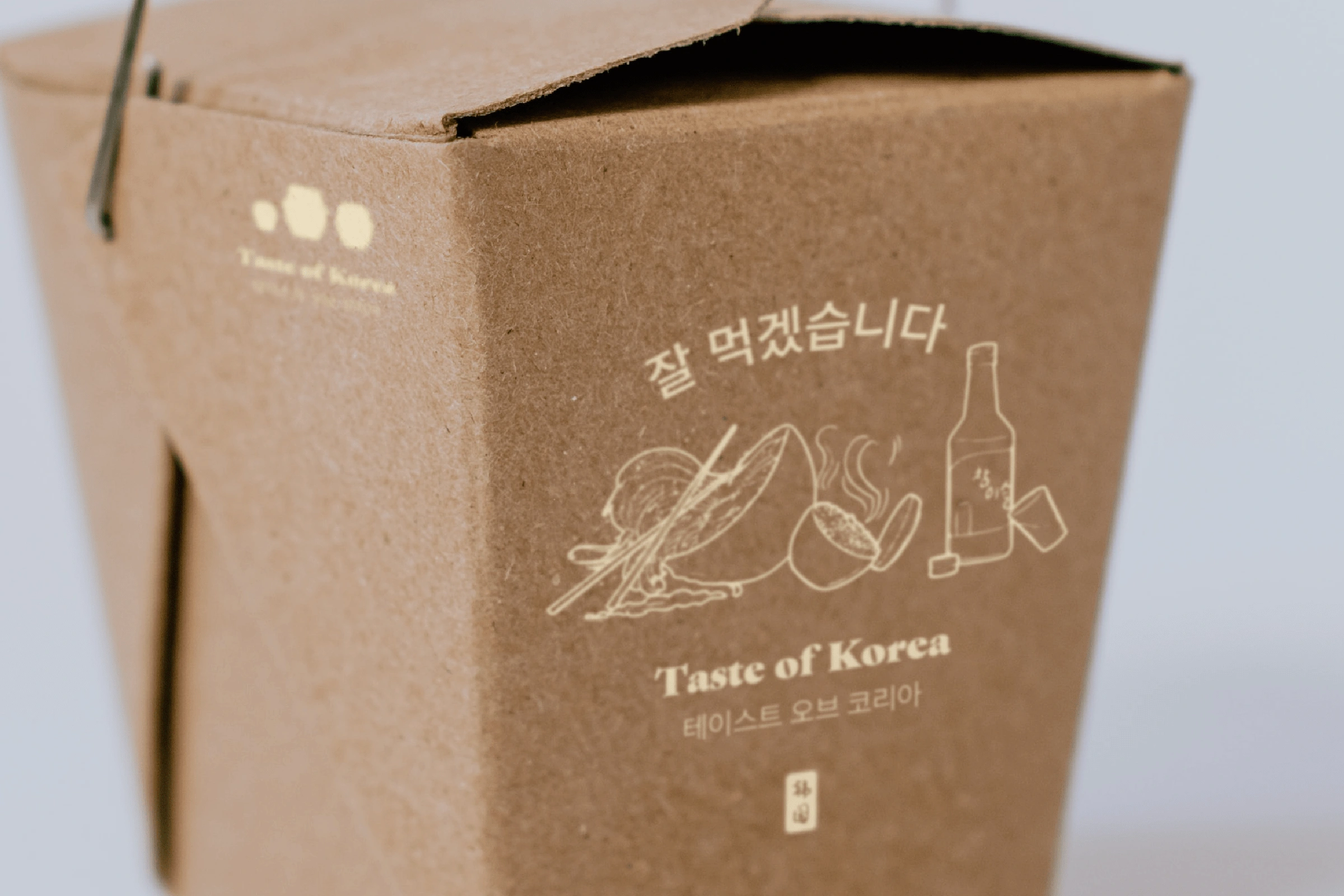
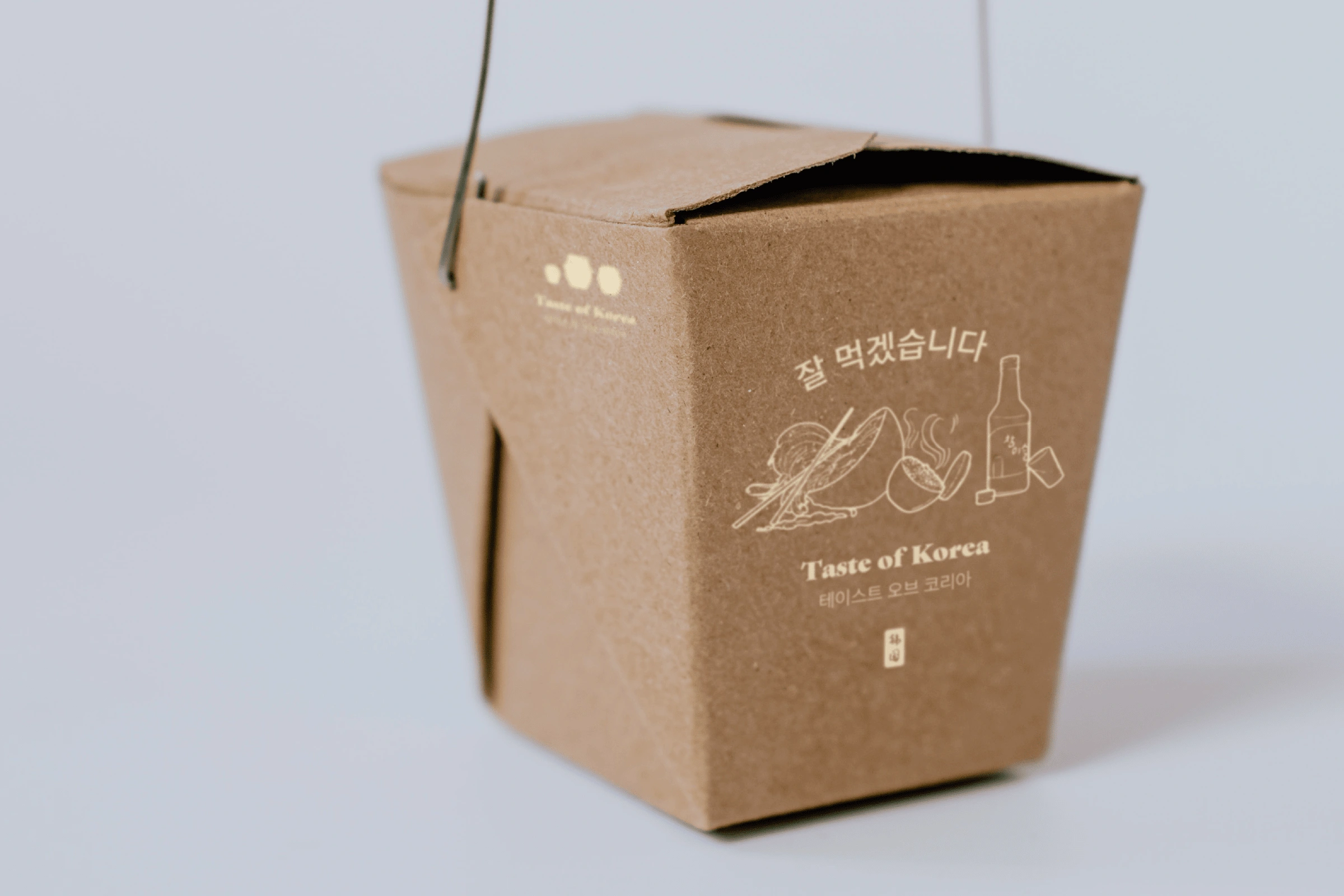
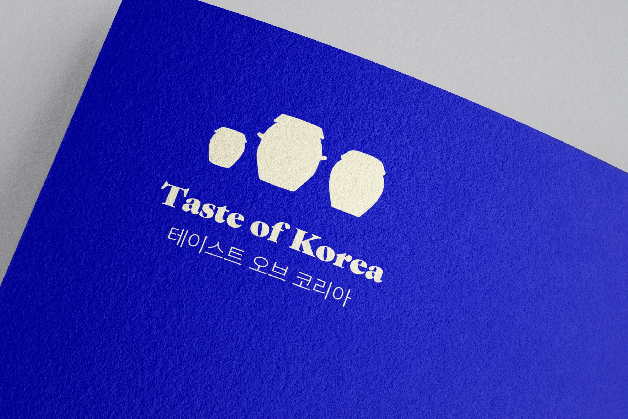
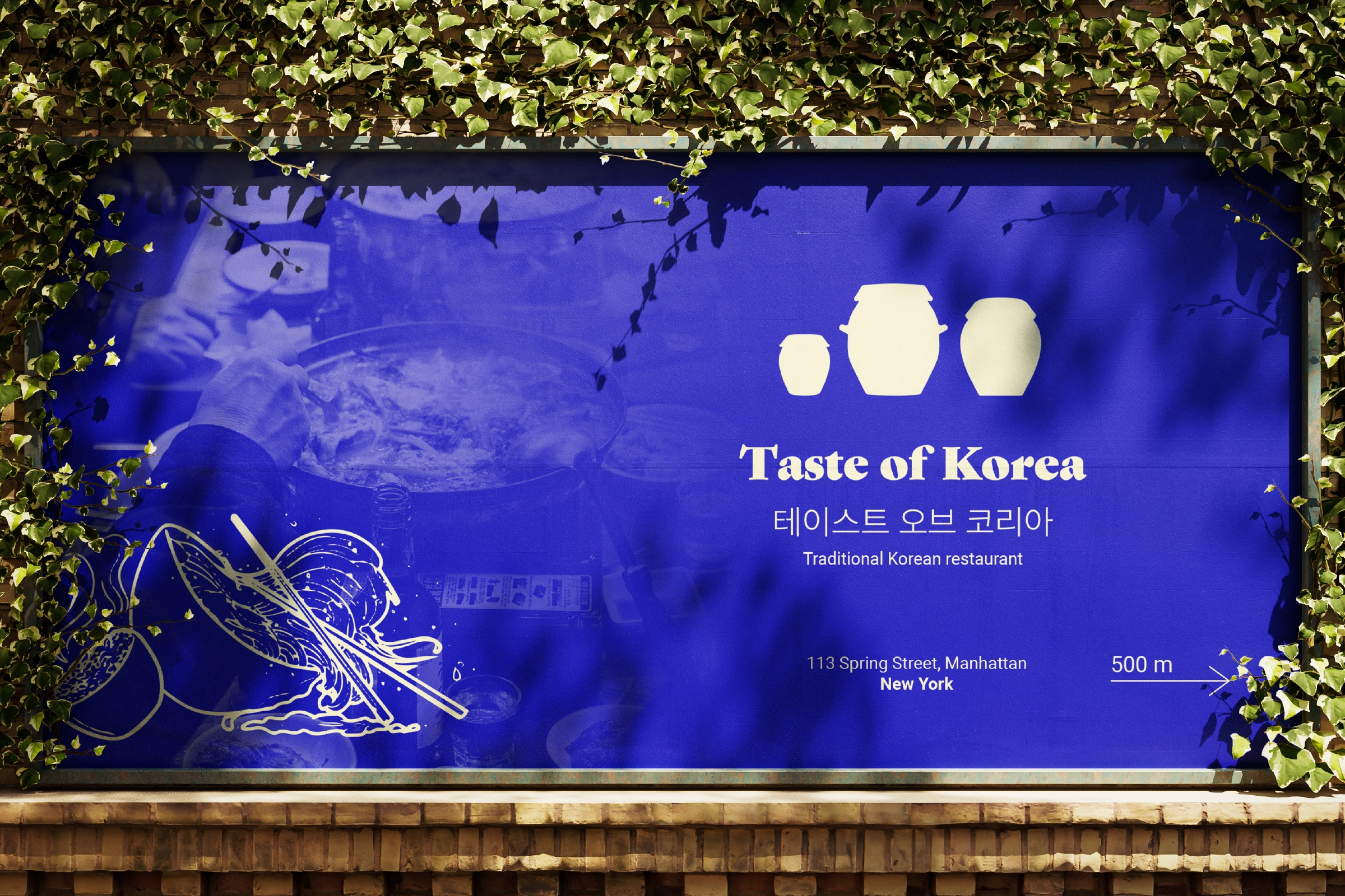
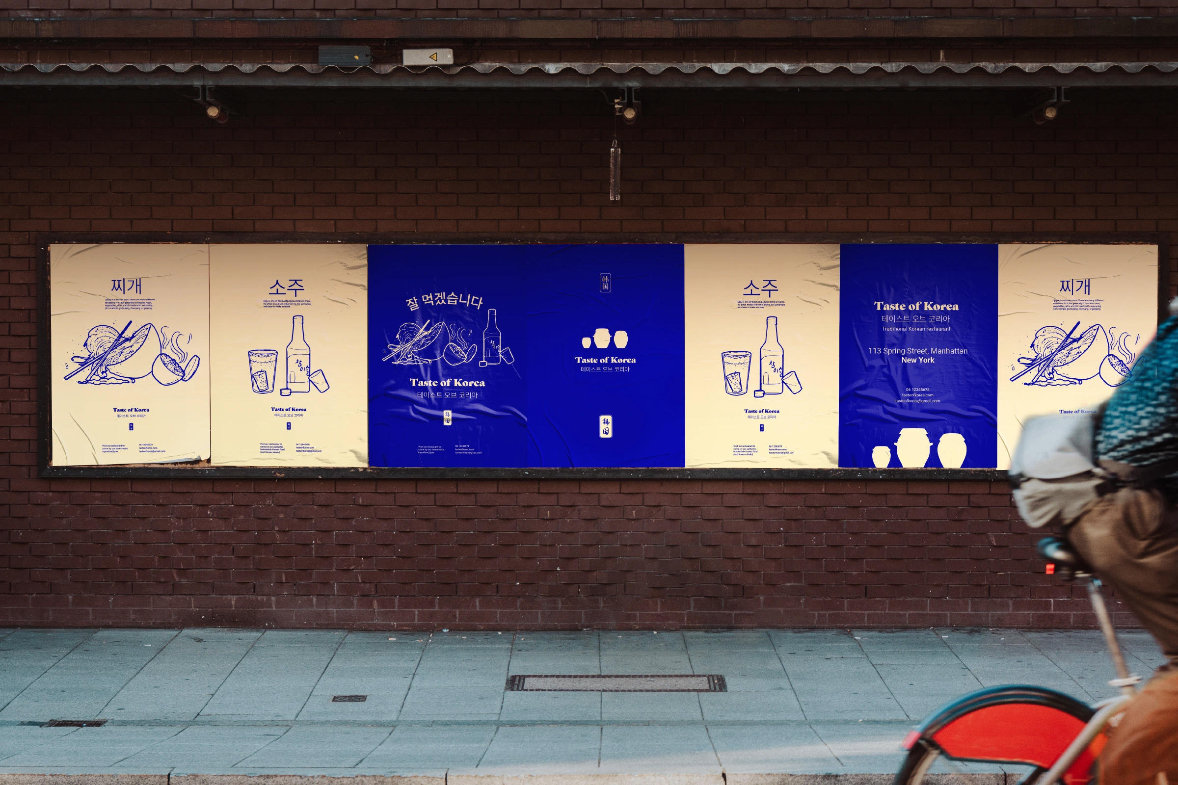
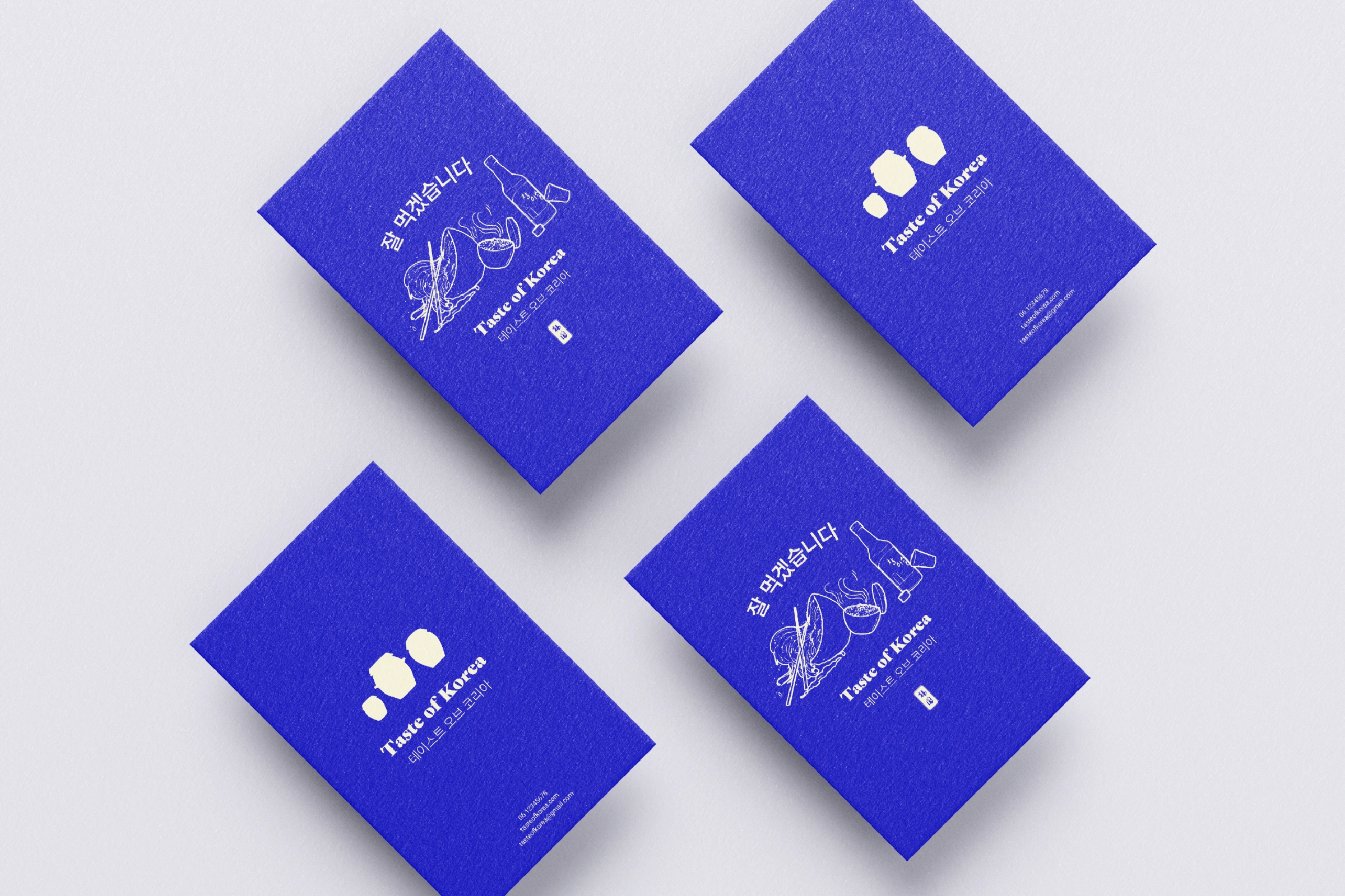
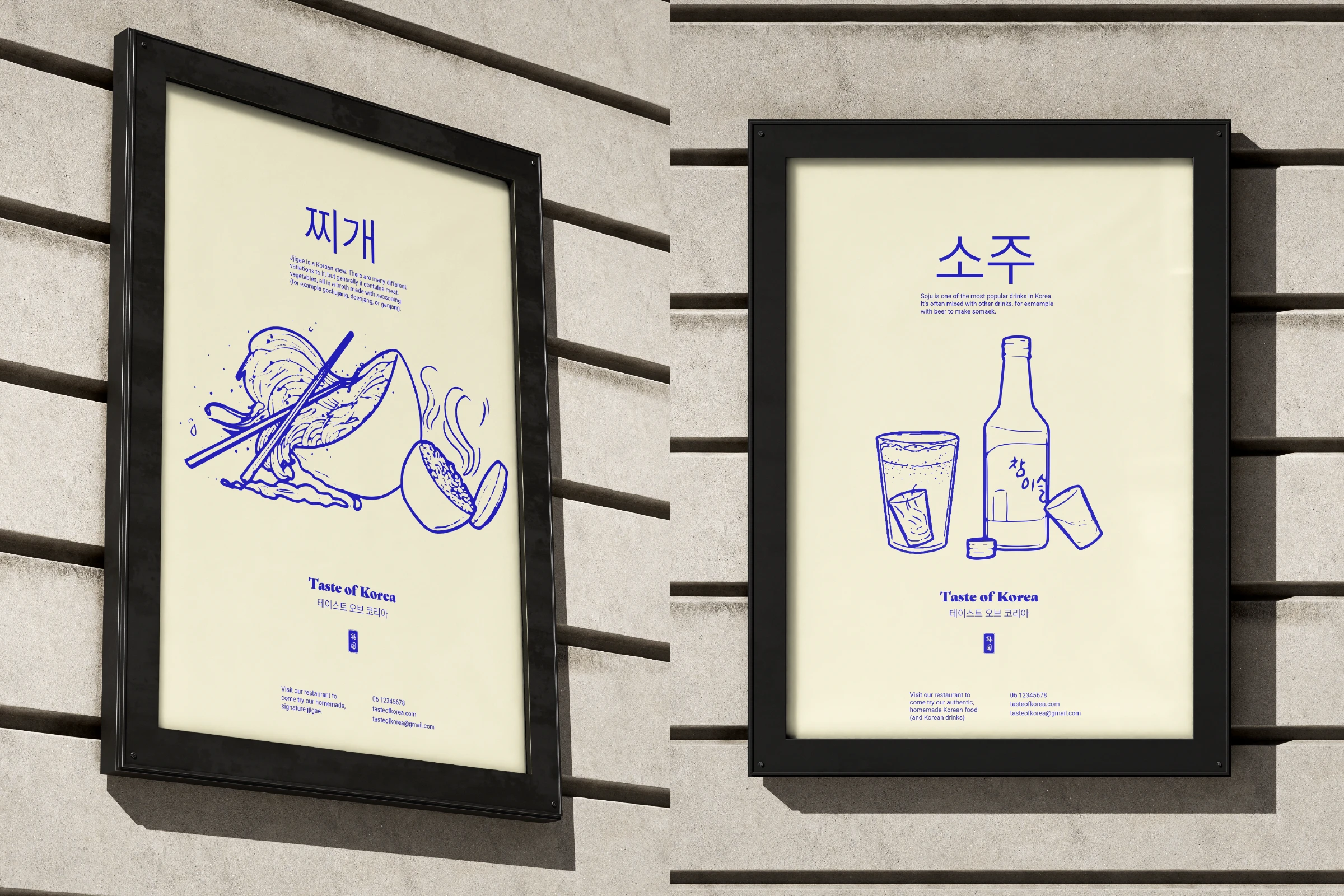
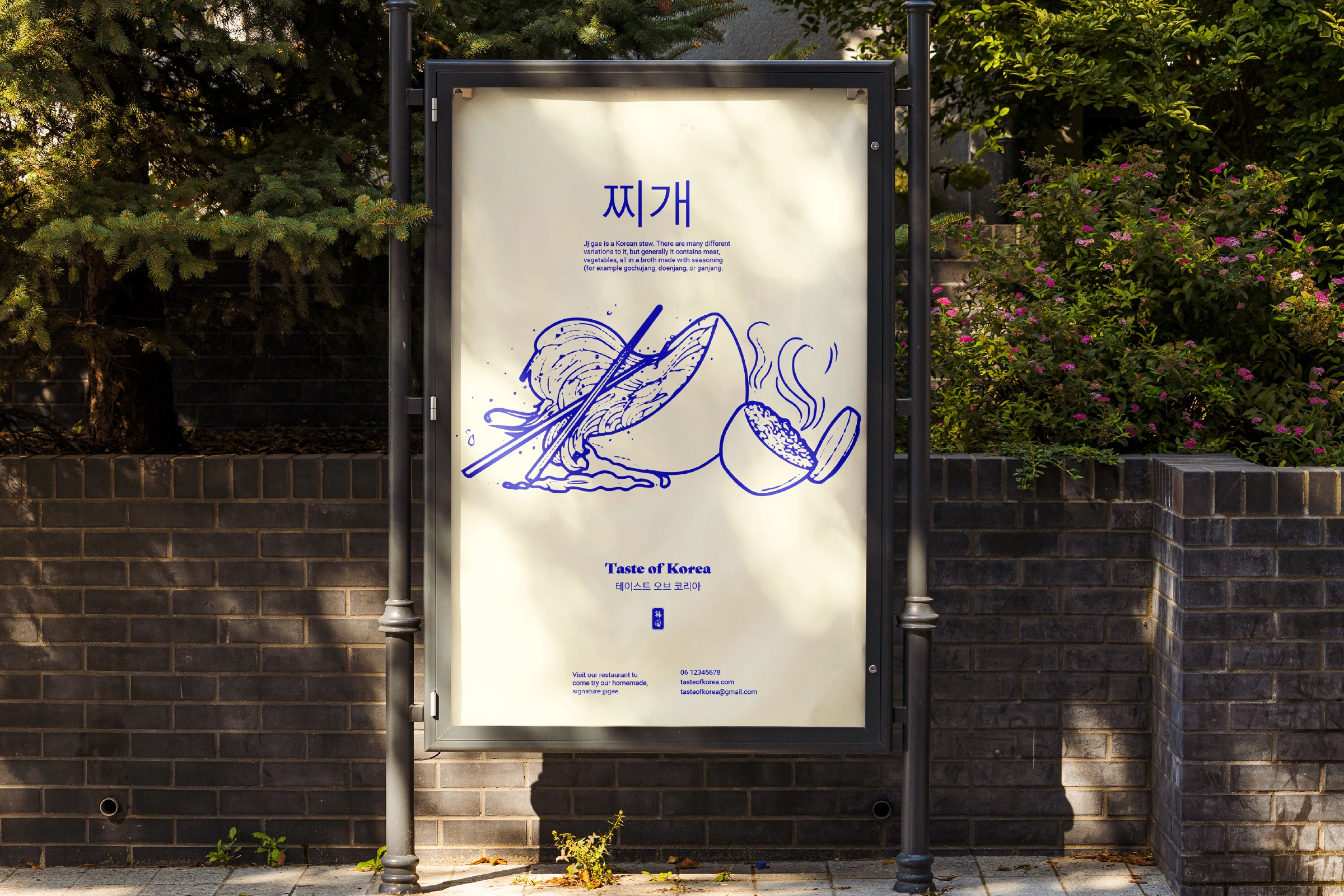
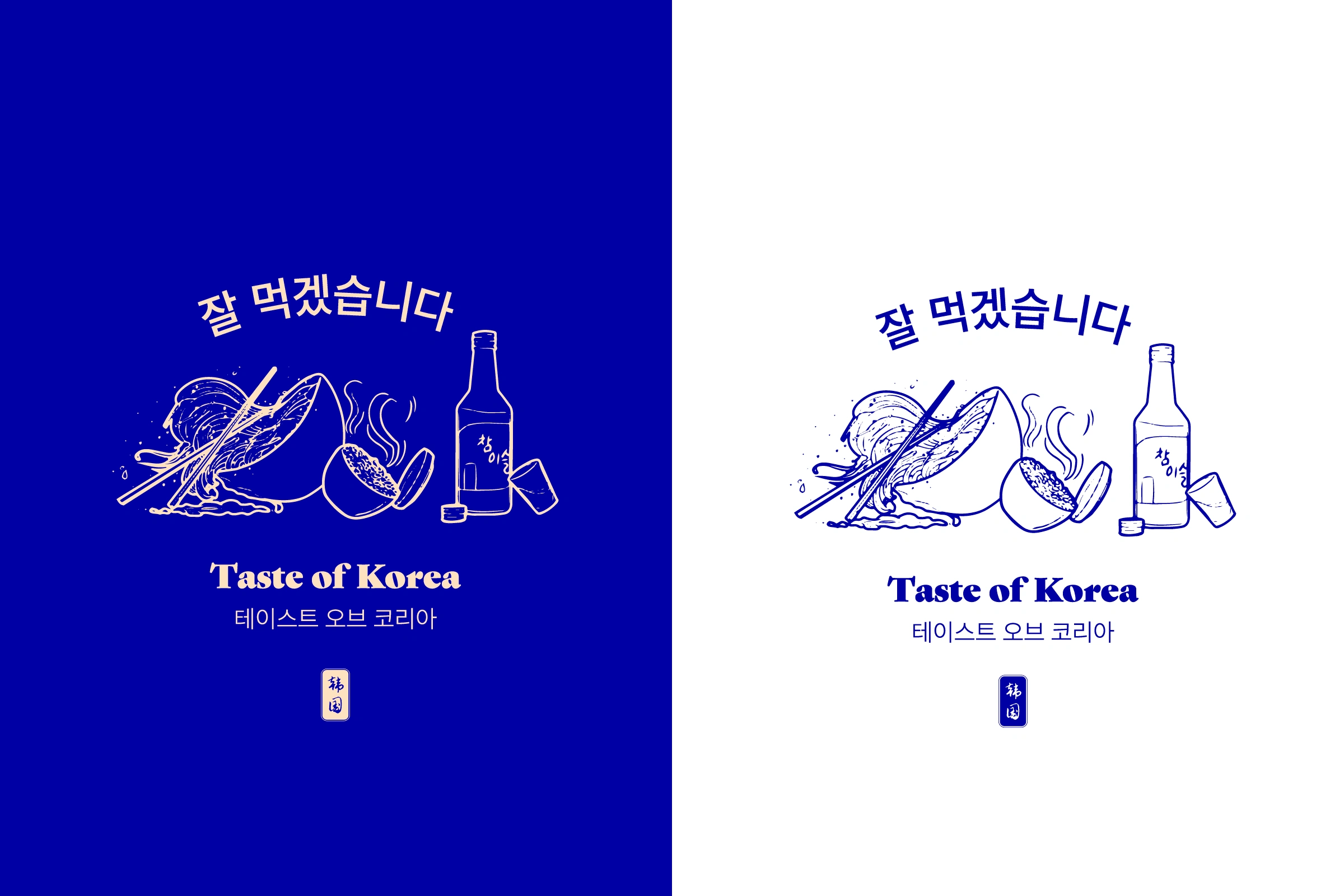
The more obvious choice for this brand would be to go for a red colour palette because it would represent the colour of the often spicy Korean food. Instead, I decided to go for a blue colour palette, as inspired by the Korean flag. It gives the brand a refreshing feeling and this goes hand in hand with the brand visuals.
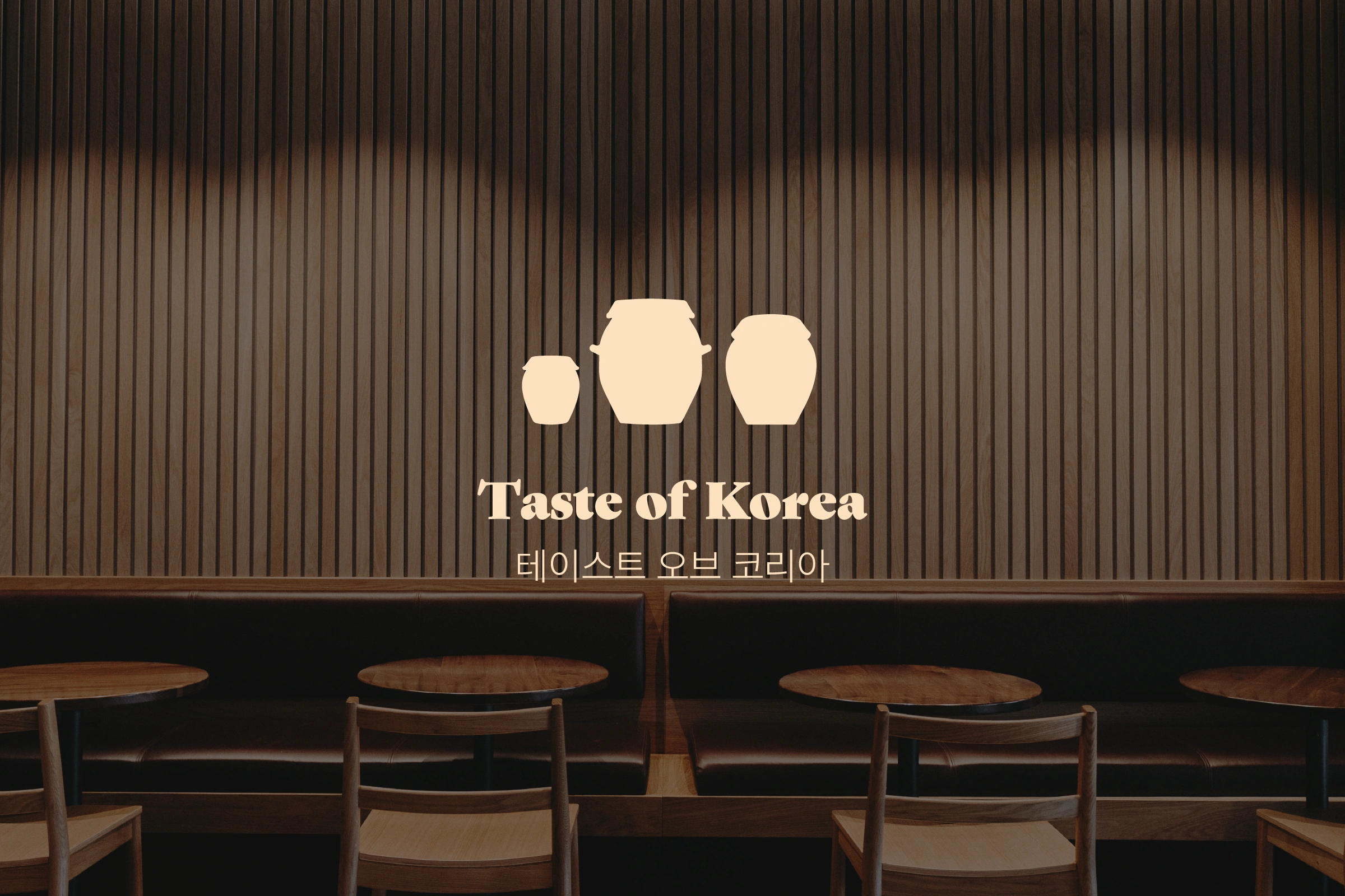
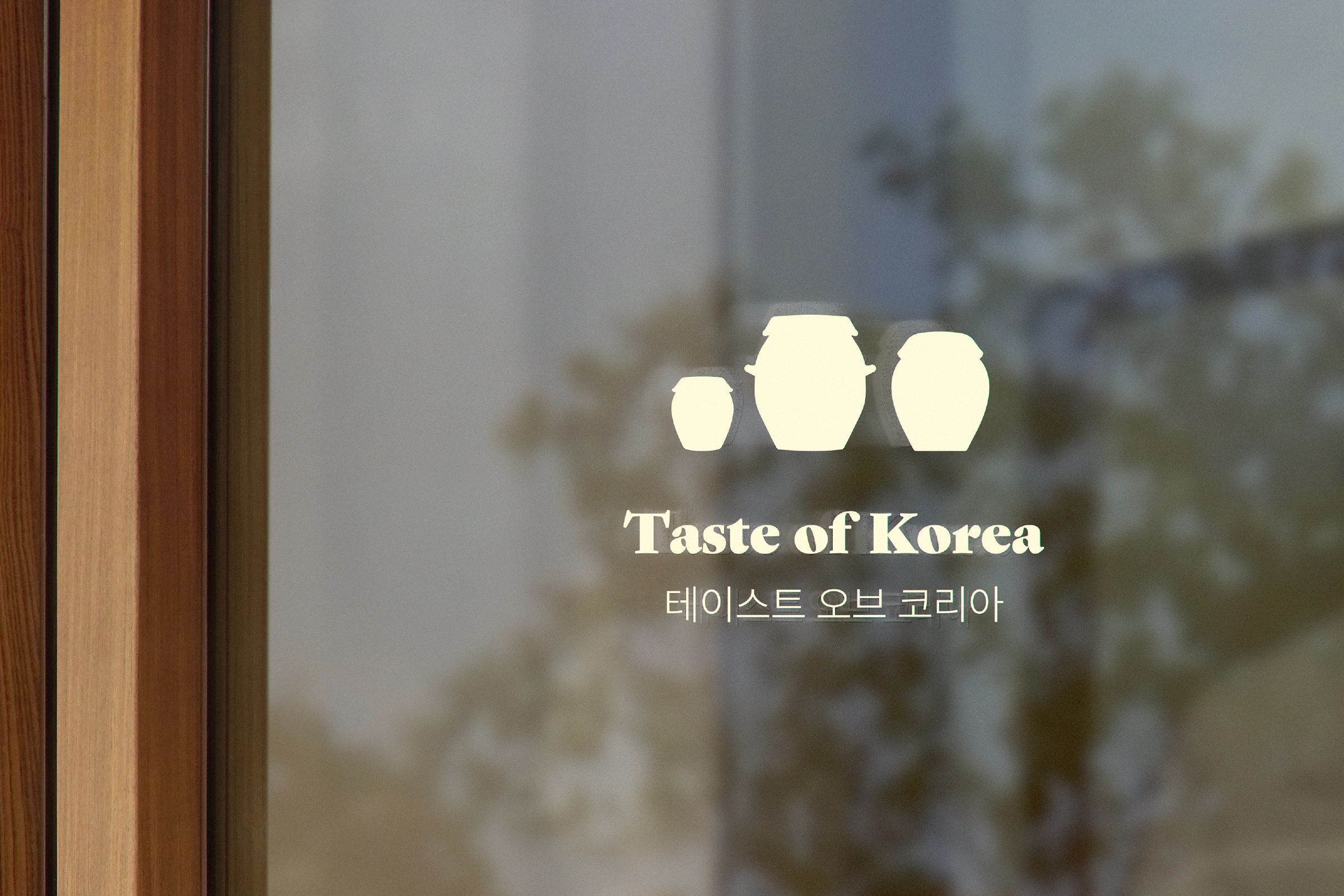
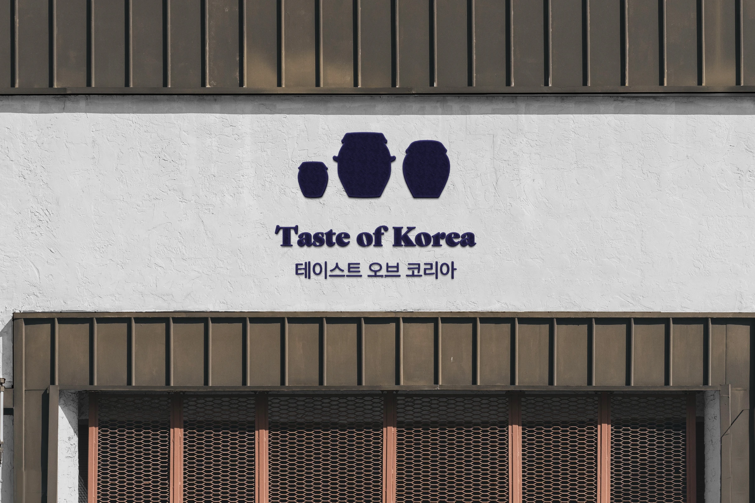
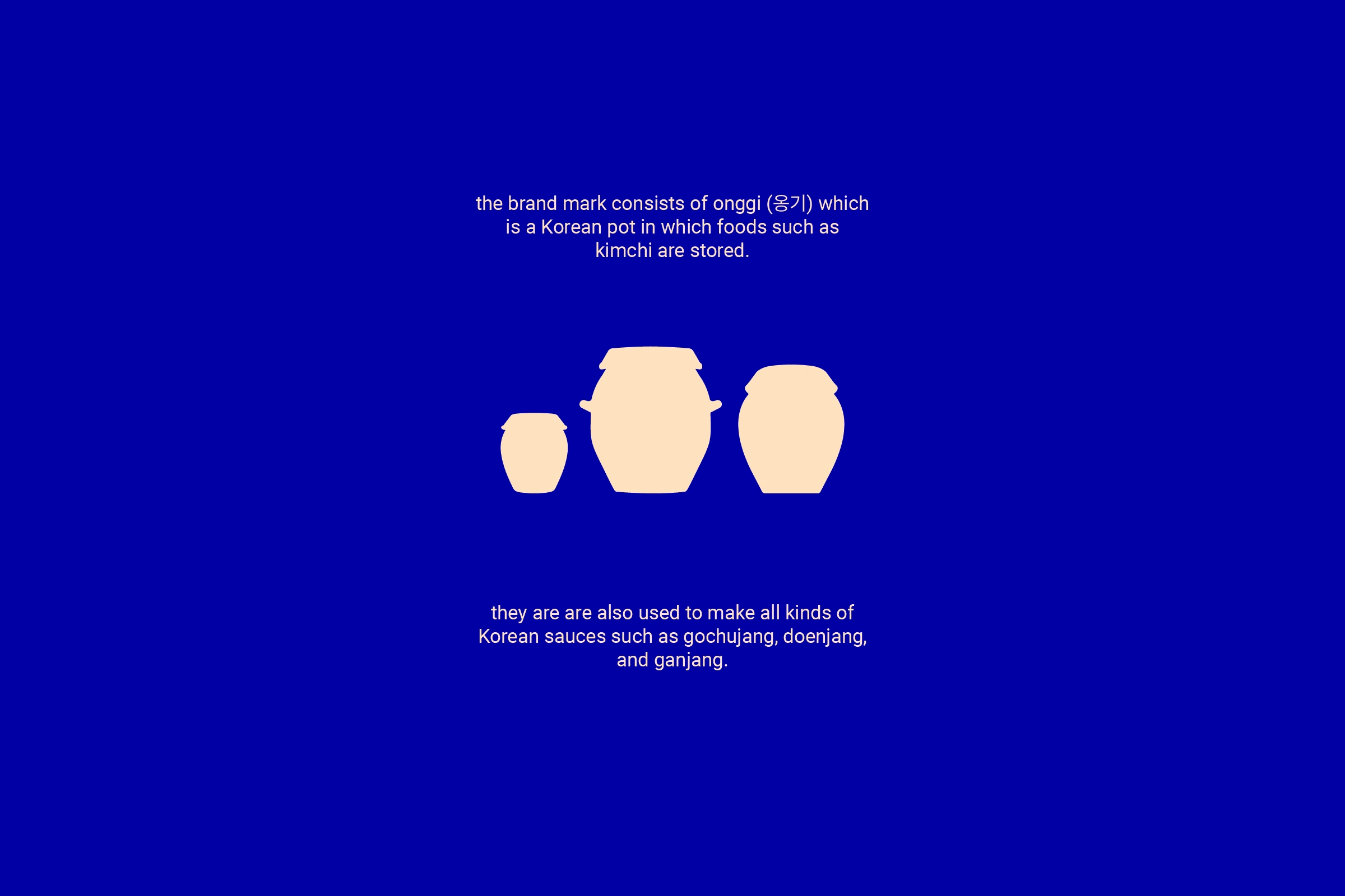
The brand mark that I created for this brand are onggi (옹기) which are Korean pots to store foods in. I chose this because it represents the Korean kitchen very well and my goal was to show the Korean culture in a more modern jacket. With this, I created a slightly luxurious feeling - especially with the rich blue colour - yet with an accessible atmosphere, where you are immersed in the Korean cuisine.






Like this project
Posted Jun 12, 2023
Taste of Korea is a traditional Korean restaurant. From serving street food to home made kimchi, they have it all. Huge plus: they even serve their own beer.

